Provincial Government Headquarters, Seville
Cruz y Ortiz Arquitectos- Type Administration building Institutional
- Date 1991 - 1995
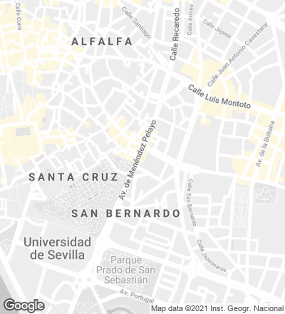
- City Seville
- Country Spain
- Photograph Duccio Malagamba


And what of the provincial government headquarters of Seville? When we saw this project we mused on the possible influence of Salvisberg, on a certain essentiality we might classify as professionist.
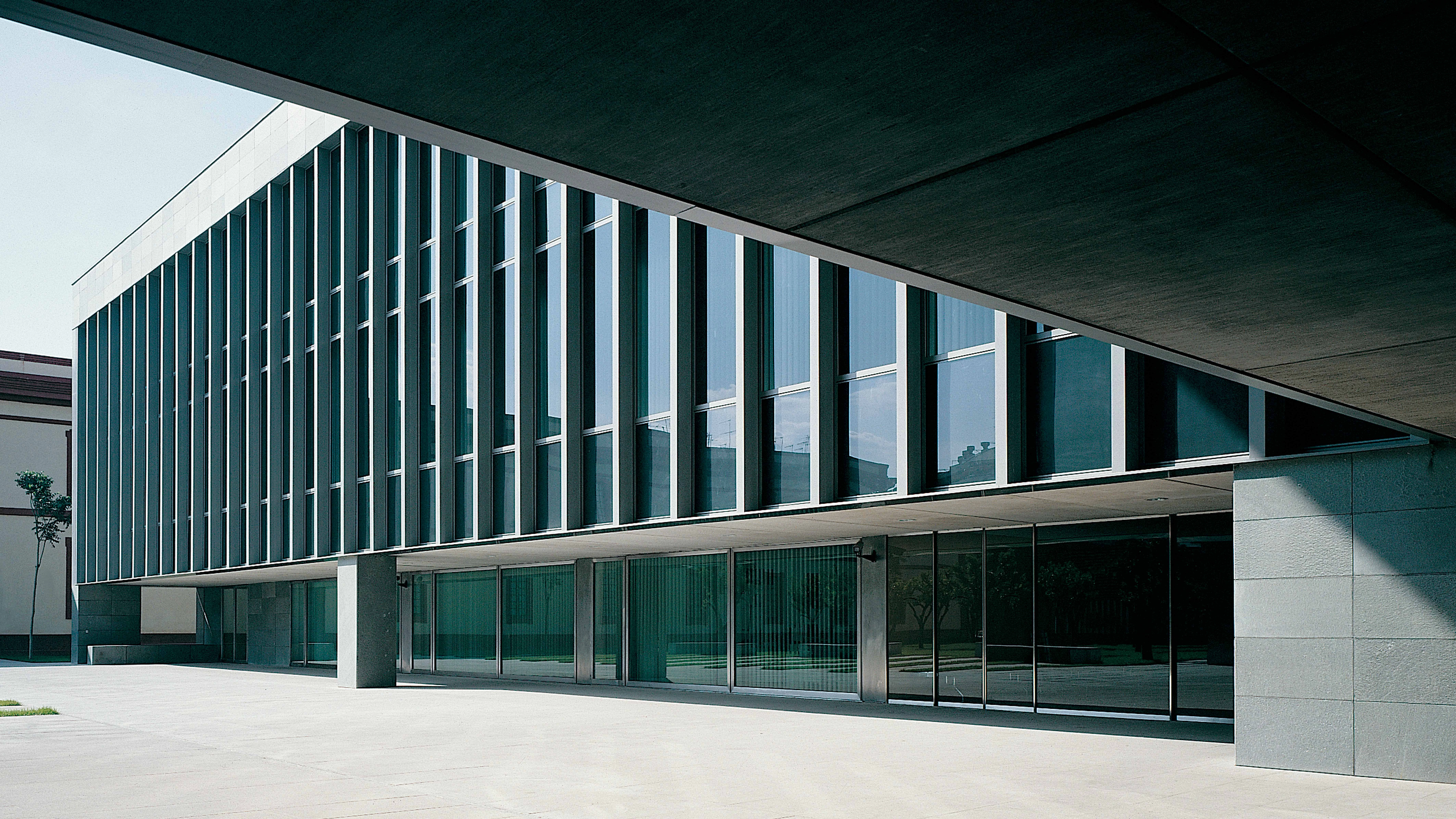
—Not directly. It’s difficult to talk about the Seville building, possibly because there are things in it that no longer interest us. However, the most interesting thing is the floor plan. The extension’s floor plan is organized in opposition to the preexisting cosntruction, a neoclassical building some aspects of which were converted into something very different. The central courtyard of the old barracks leads on to a side patio in the new building. One thus goes from central to tangential, with the axis of circulation maintained all the while. The new courtyard opens onto a large atrium, and you’re still on the same axis.
—Is the floor plan derived from Spanish-Muslim architecture?
—One could perhaps speak of a certain picturesqueness opposed to the neoclassicism of the old building.
—Is the play of symmetries and asymmetries a picturesque or an intellectual thing?
—Picturesqueness is as intellectual as neoclassicism. Schinkel combined them well. Rafael Moneo said that in this case there was a shift from a linear floor plan, typical of 18th century architecture, to one based on juxtaposed surfaces, more in keeping with modern building. A unit where the architecture of planes is juxtaposed with that of axes and alignments.
—And everything frontal becomes tangential.
—And all this is transferred on to the elevations, composed of juxtaposed planes.
—It’s quite grandiloquent...
—That’s true. Today we realize we were being grandiloquent at certain points. But it’s also true that the elevations are composed of planes, not lines, and in this sense the correspondence with the floor plan is interesting. Structure is hidden. There’s some kind of trick like that pillar which supports the curtain wall, elements that reveal the effort (the trick seems too evident, it’s all too obvious that there’s a cat in the hat).
—You have said that there’s a bit of minimalism, but it also has a Nordic look.
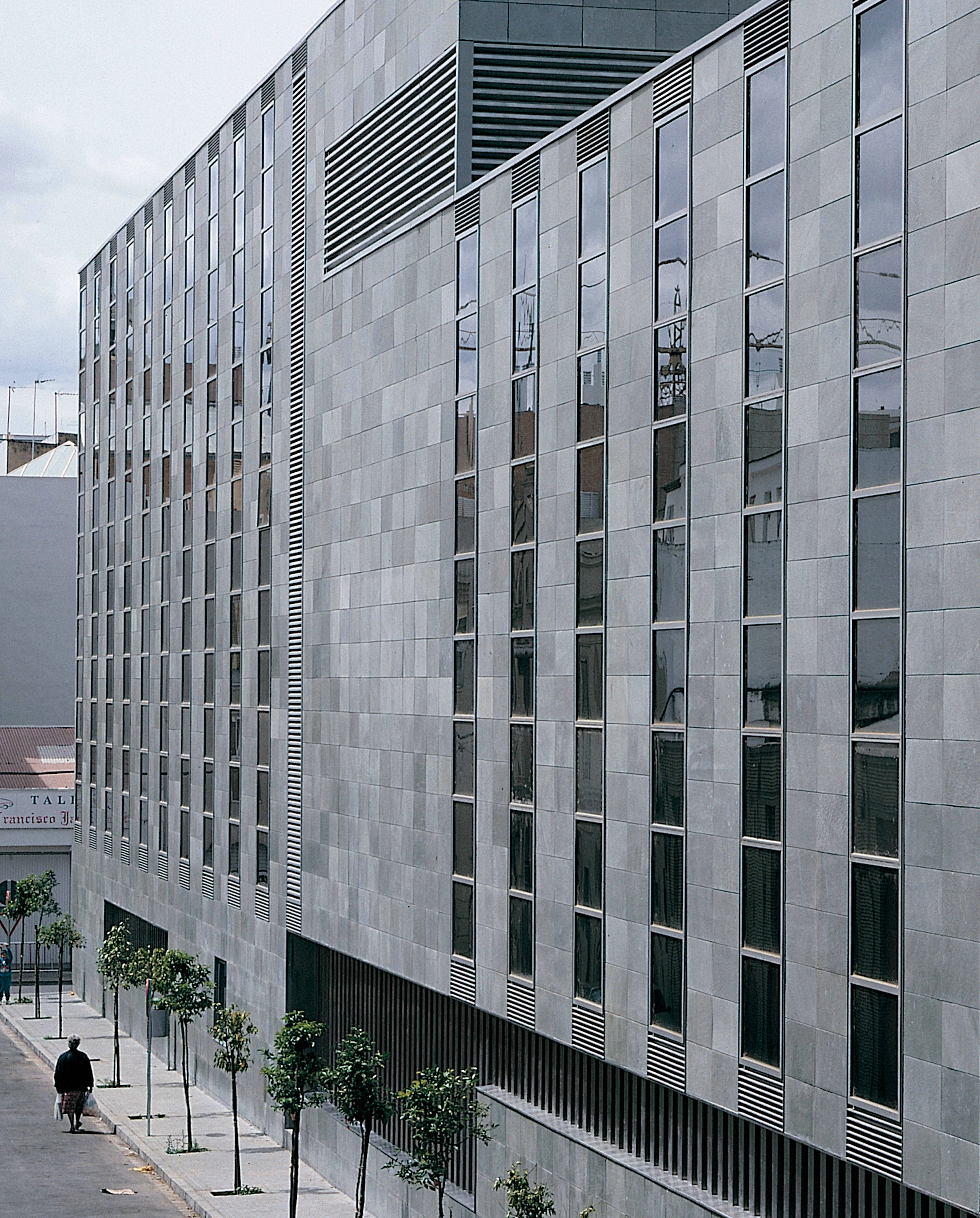
—Yes, in some ways. You mentioned Otto Salvisberg but many people have thought of Jacobsen, and others have pointed out American influences on account of the dark stone and the stainless steel of the facade.
—Is the facade built with quartzite?
—Norwegian quartzite. We first used this stone in the pavement the Santa Justa, per Renfe specifications.
—We were surprised at the treatment you gave those surfaces, so dark against those of the military barracks, all the way to the molding of the corners, the fascias and the cornices.
—It was the first ventilated facade we did in Seville, which supposedly allows the use of darker materials. This is a monochromatic building. The barrack is ocher and red, typical colors called albero and almagra, whereas the extension is of gray stone with gray window frames and gray-dyed windows. In a rather pedantic manner we used to say that this building endeavored to be an elegantly mute presence beside its neighbor...
Conversation of the authors with Luis Moreno Mansilla and Emilio Tuñón.
[+]
Cliente Client
Diputación Provincial
Arquitectos Architects
Antonio Cruz & Antonio Ortiz
Colaboradores Collaborators
Blanca Sánchez (arquitecta architect); J. A. Molina, M. Delgado, C. Castro (aparejadores quantity surveyors)
Contratista Contractor
Cubiertas y MZOV
Fotos Photos
Duccio Malagamba


