Santa Justa Railway Station, Sevilla
Cruz y Ortiz Arquitectos- Type Station Infraestructure
- Material GRC Brick
- Date 1987 - 1991
- City Seville
- Country Spain
- Photograph Duccio Malagamba Hisao Suzuki

Going back to structures, but in large-scale works like Santa Justa, how did you conceive them?
—Santa Justa is a turning point in our career because it involved a huge change of scale. We never wish to give structure too much presence, or let it impose on the observer. We prefer to push it to the background. All we want of the structure are its benefits, the wonderful feeling of being under an enormous span. In the station, for example, there are immense spans of forty or fifty meters which are kept completely unexplained.
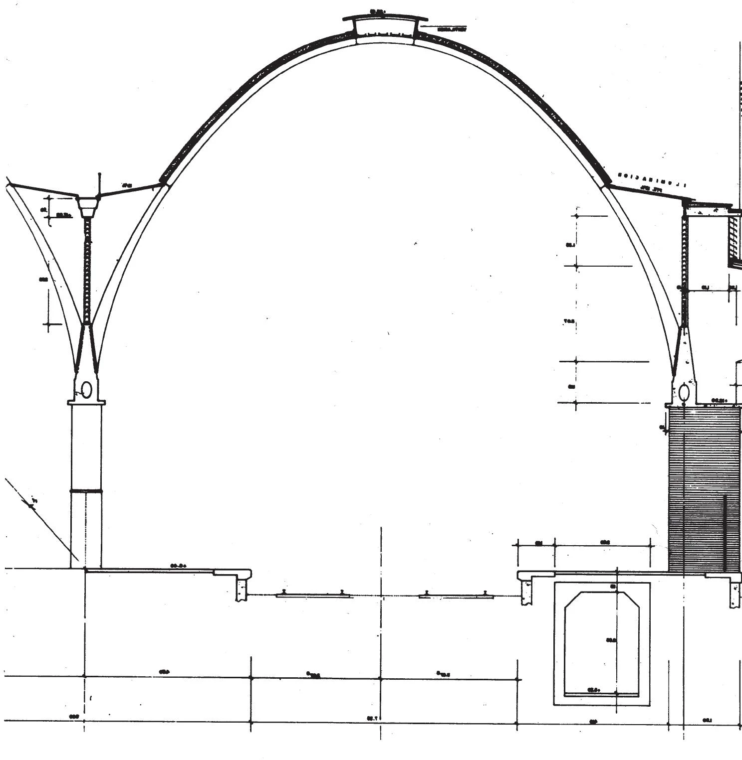
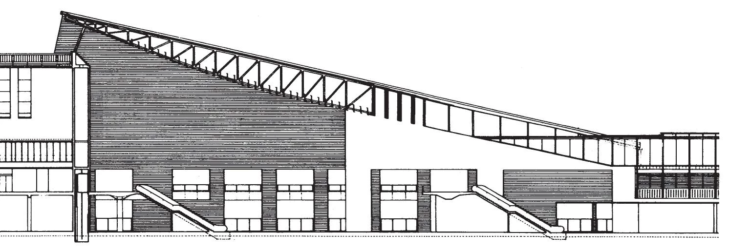
—The vaulted spaces over the platforms are very attractive, but narrative in a way, and yet the waiting area is very enigmatic, a large room with a dilated GRC plane suspended who knows how...
—In this sense we probably prefer these zones to the actual platforms, where the functioning of structure is in fact explained. We are interested in those spaces where no structural feat is evident. If restoration is a field given to narrative effects, so is structure. But again, we are weighed down by structures where the behavior of each element is made evident: which element functions through traction, which one through compression, how the central section of a piece is increased so that it won’t sag... We find such narration of how loads are transferred to ground-level boring. It is hard to believe that a shear stress should become a source of wonder. The Spanish pavilion in Hannover is exemplary in this sense, because while a structurally exigent building, no account of how it is sustained is given... and it is also a more modern attitude towards technology because whereas the locomotive perfectly narrated its own functioning, there is nothing more hermetic than a computer.

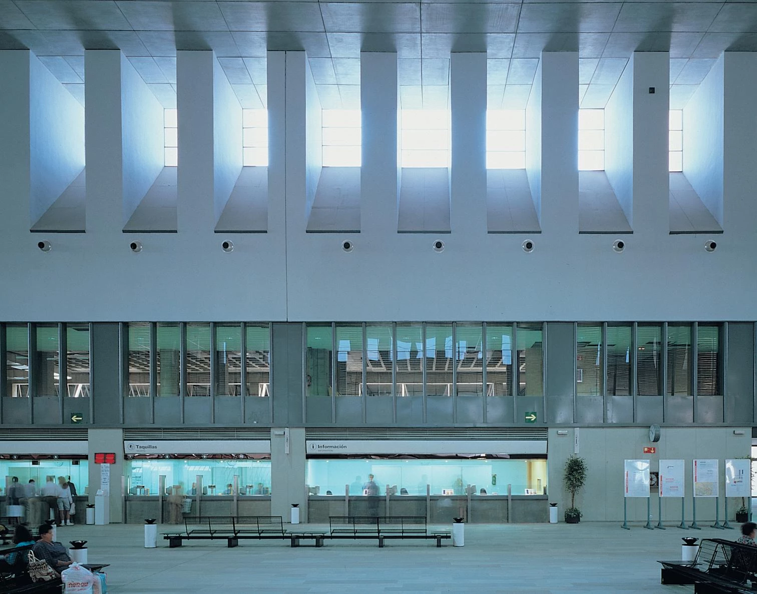
—Santa Justa is a work that is widely appreciated by both professionals and users.
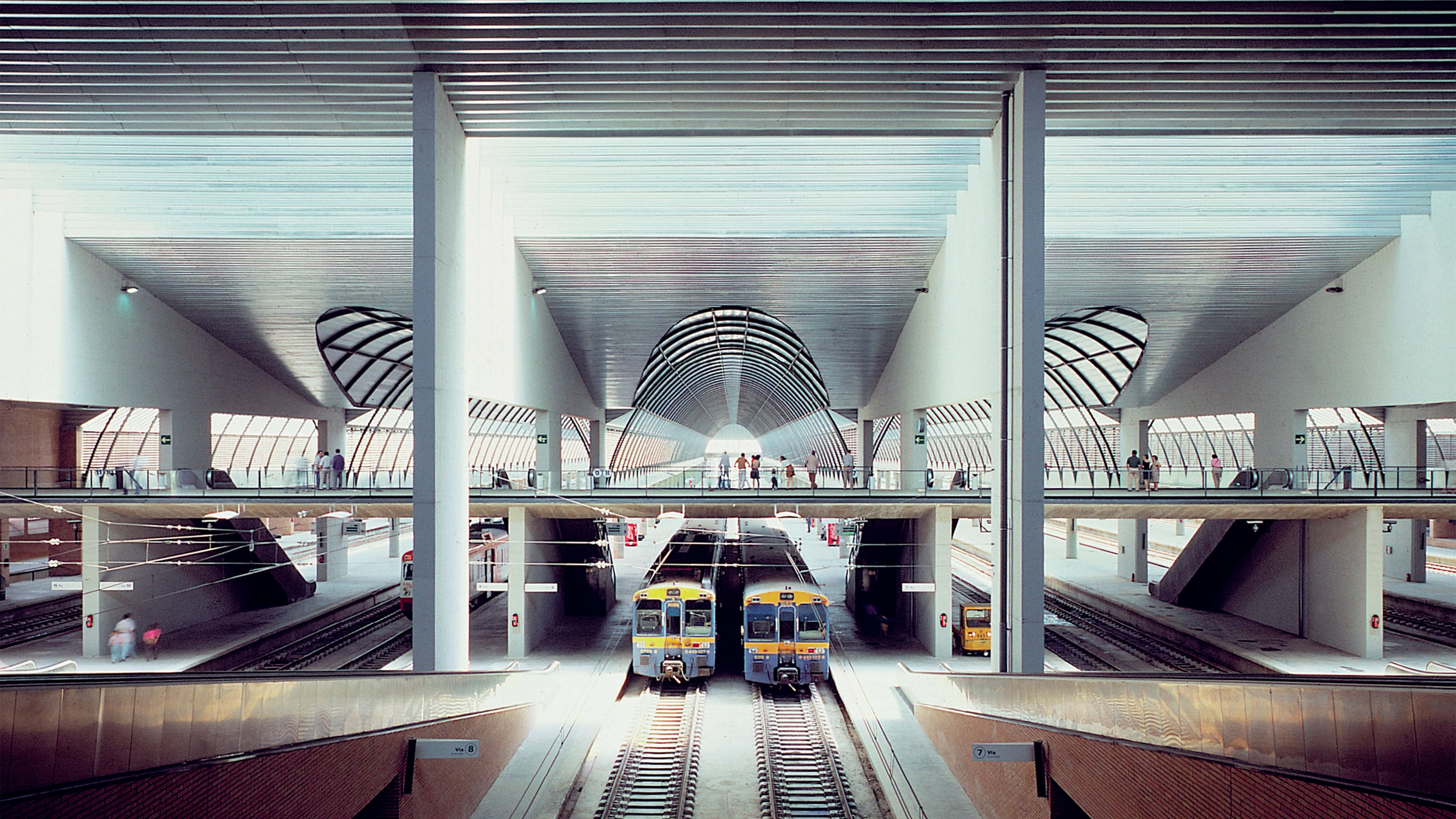
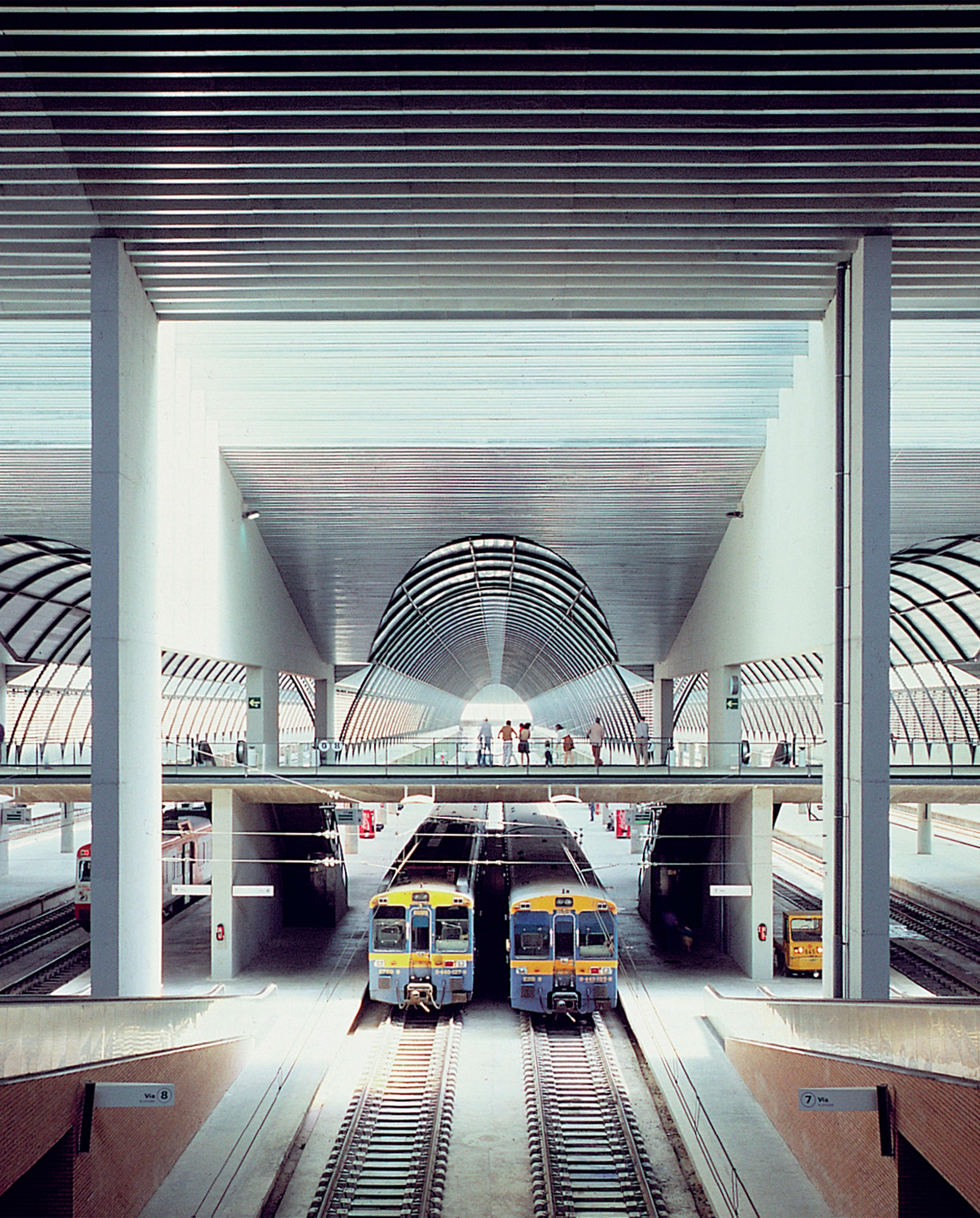
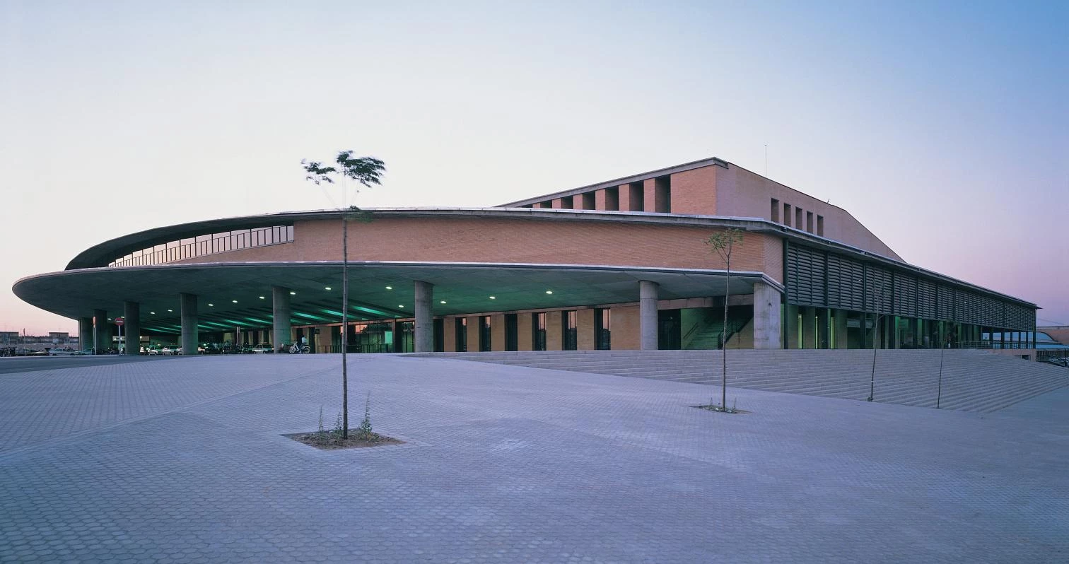
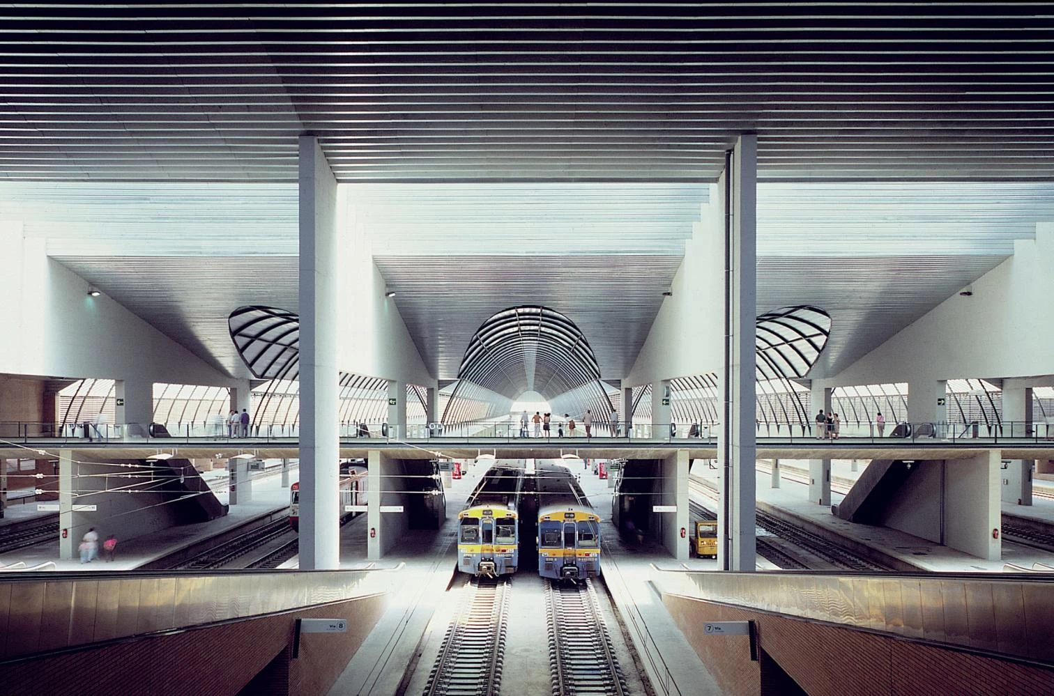
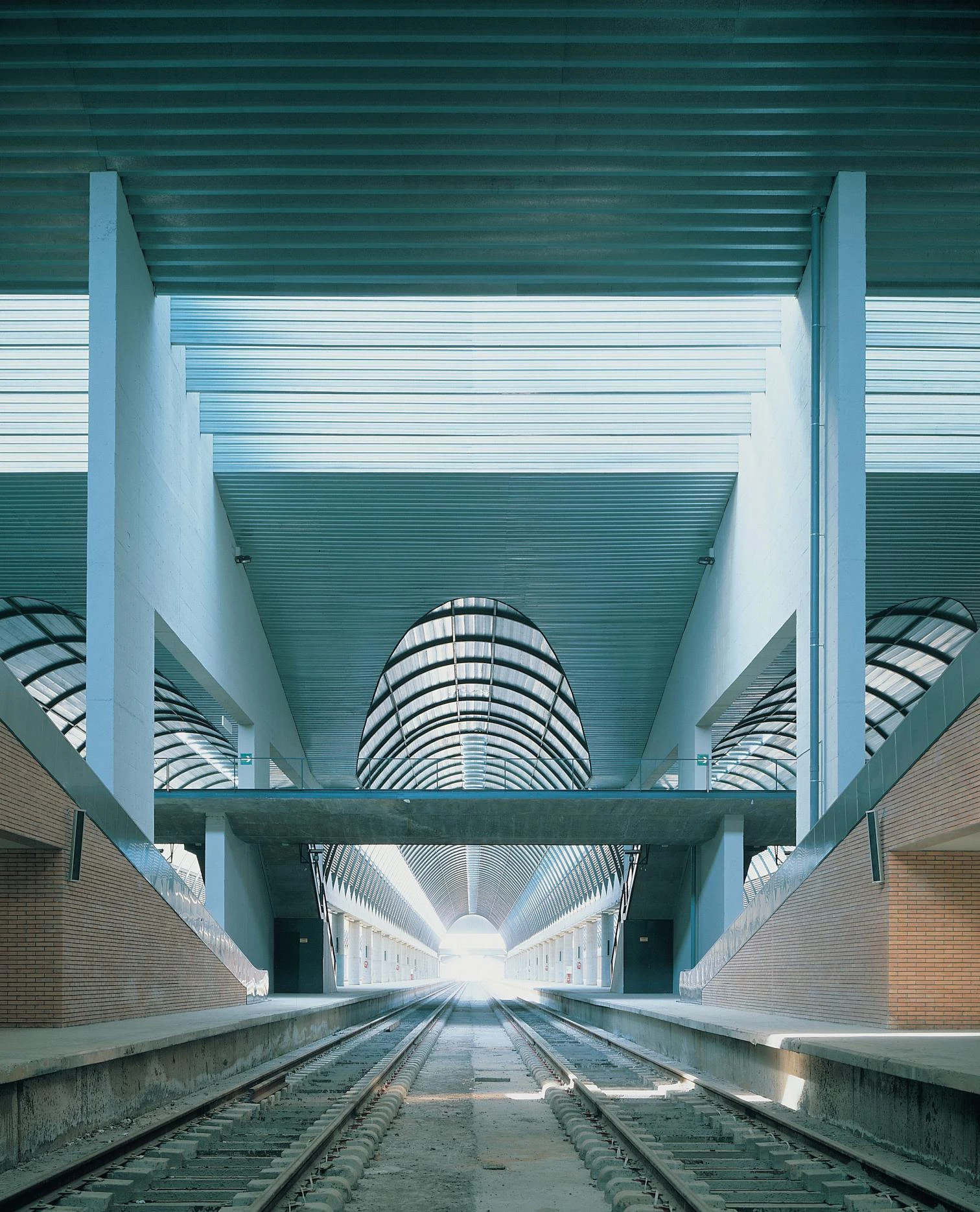
—Indeed. Santa Justa also explores the differences between exterior and interior. If the outside presents a certain expressionism, the inside employs the same mechanism as the Hannover pavilion, with a canonical space difficult to imagine from the street – an absolutely prismatic hall with no more brick that comes as a surprise to the user. Nevertheless, the Santa Justa building can be said to be a metaphor of movement – departure and arrival – that contains a static and canonical room within it. It is a sequence of spaces chained together. First the canopy, followed by a more compressed space, then you get to the prismatic hall, and eventually you reach the trains. The spaces are arranged perpendicularly to the direction of the flow of movement. The catwalk over the platforms is also transversal to them, and when crossing these bridges you find yourself just three meters under lintels, quite low for a building of this size. The transversal direction of the sequence enriches it. The spaces being perpendicular to the circulation of passengers produces a progressive discovery of these heretofore concealed spaces.

—What about natural lighting?
—The control of natural light is very important in this building, further emphasizing the transversal arrangement of the spaces. There is a skylight right over the catwalk. Then the lighting divides into six longitudinal bands, already in the platform area, where the building is no longer one but six. This is precisely what we believe people appreciate in Santa Justa, though they may not be aware of it. Functionally it is a very simple building reinforced by the entrance of light. In this way users can understand the coincidence of function, form and lighting.

—But there is something strange about it...
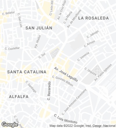
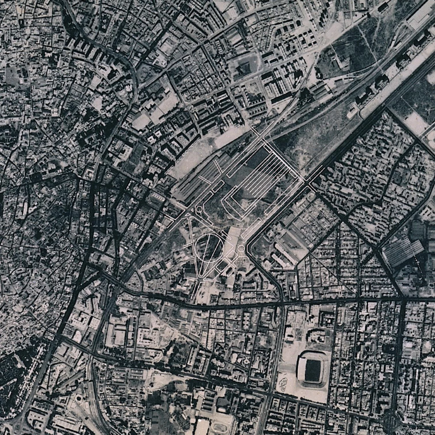
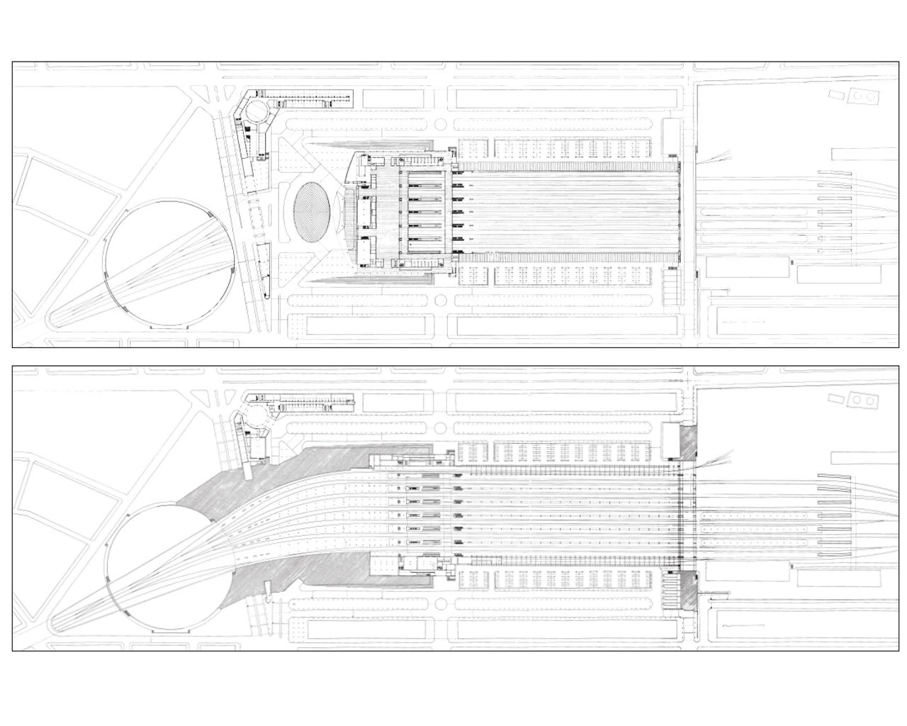
—Santa Justa is not a very usual sort of station. Stations tend to be either of two kinds: the terminal kind, or lateral to the tracks. The first are easy to understand, whereas the second are more confusing, because the user always has to pass above or under the platforms in order to get to them. Ours is a lateral station built over the tracks, a rare sort, but this makes it possible for it to look like the terminal kind, and formally it almost works as if it were.
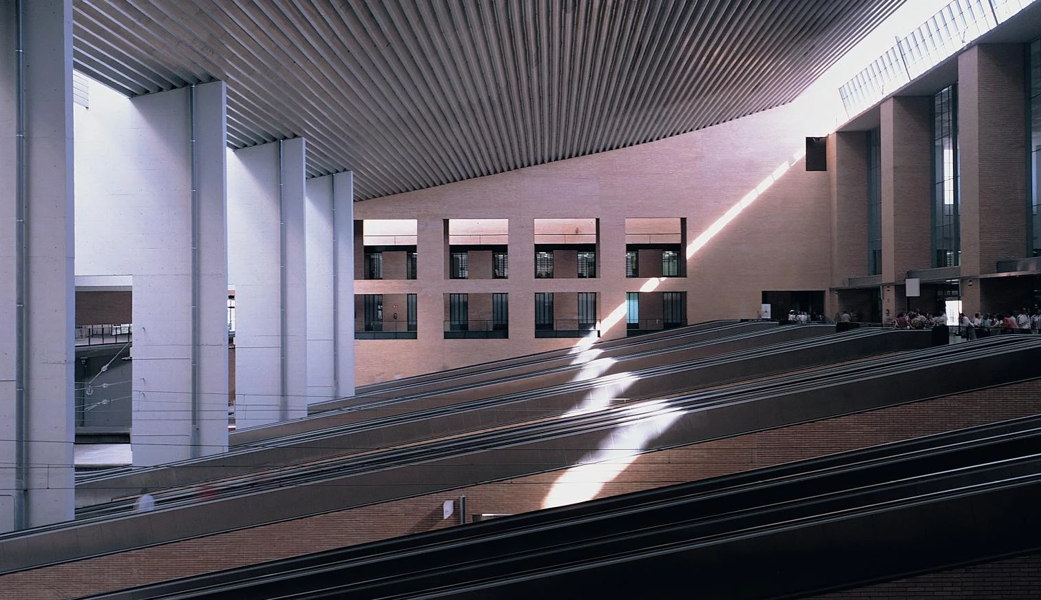
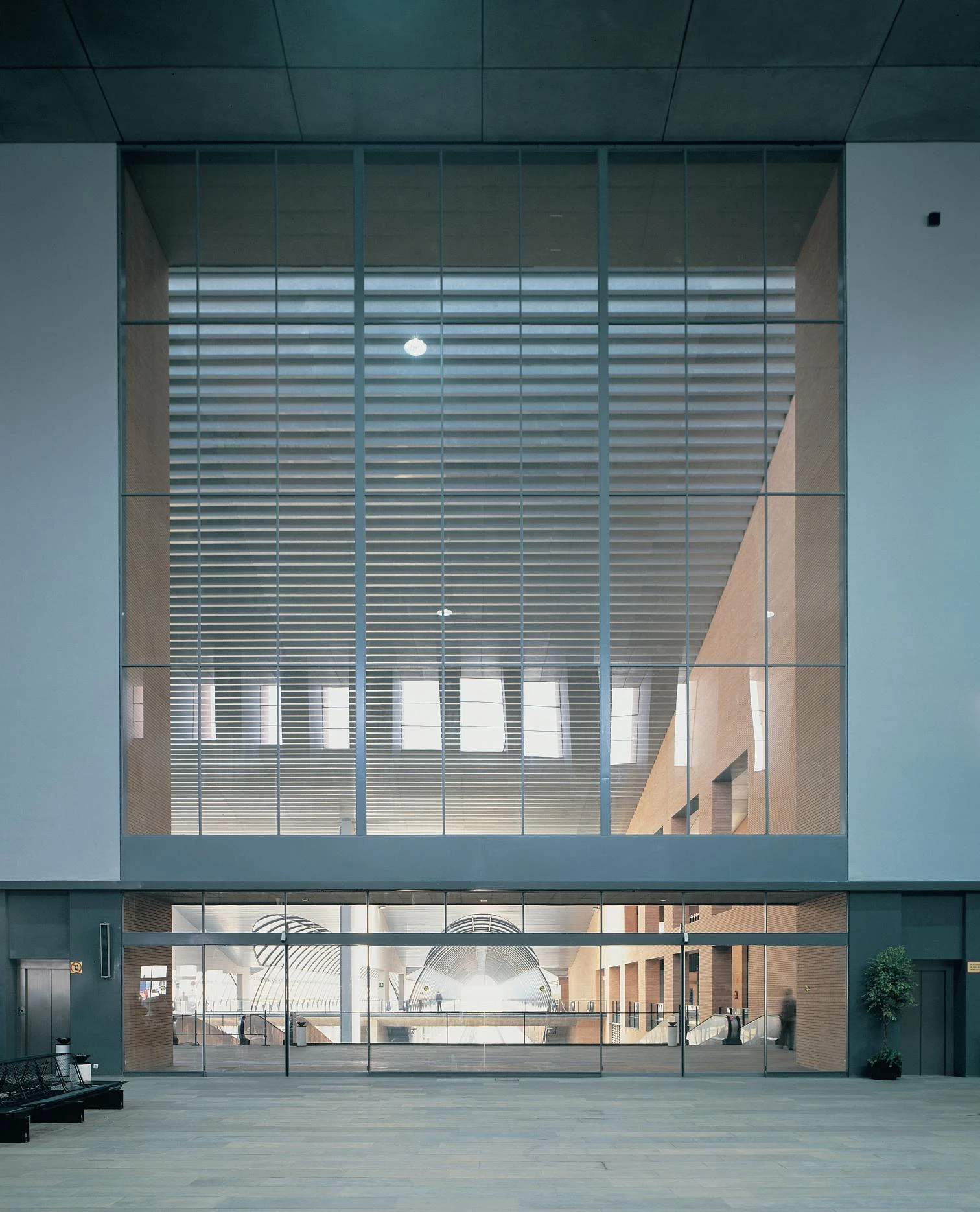
—Being a station over tracks, it is thought out in section.
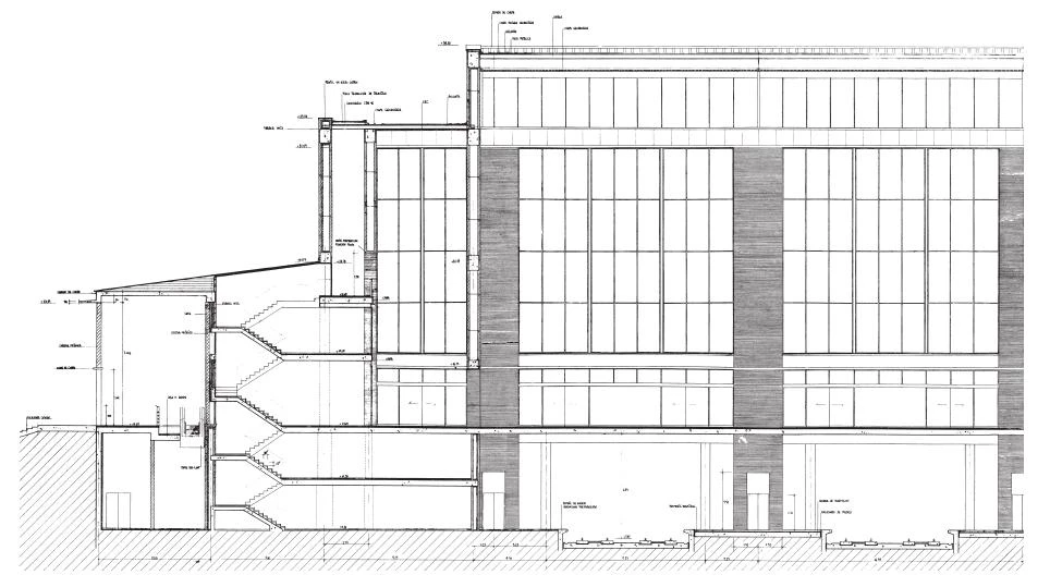
—We were talking about lighting... lighting is precisely to pay attention to the section. Normally, the floor plan of a train station is of little importance because it is very defined. Santa Justa is almost totally symmetrical, the only exception being the shifting entrance canopy. The problem had to be solved by way of the section... Old railway stations were resolved in this manner, and Santa Justa revives that. In general one can say that the railway station is a section problem, and the bus station a floor plan one.
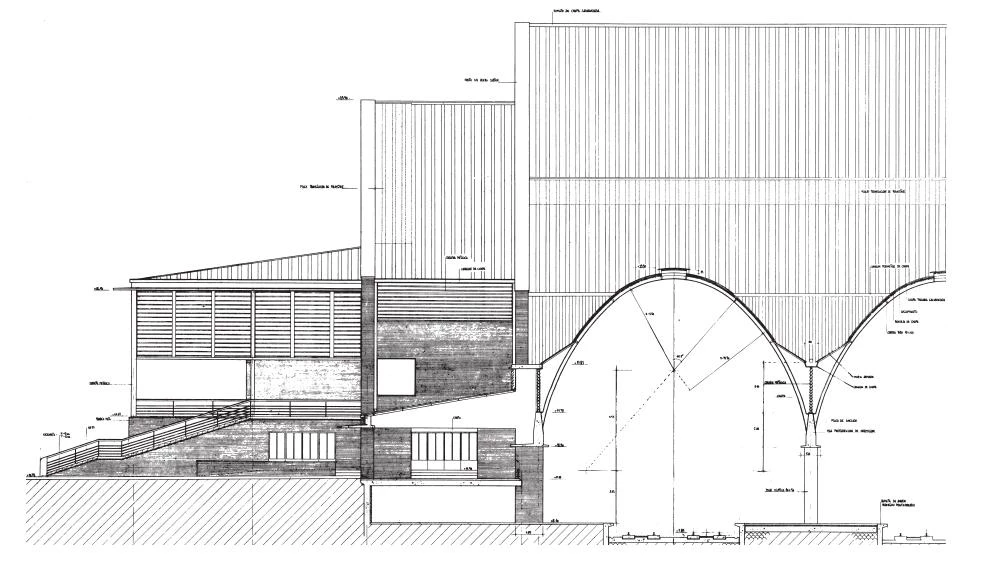
—And the shape of the vaulted structures over the platforms...
—Evidently it alludes to the railway, to stations of the past. It is an invocation of their archaic character, that’s for sure...
Conversation of the authors with Luis Moreno Mansilla and Emilio Tuñón.

Cliente Client
Ministerio de Transportes, Turismo y Comunicaciones
Arquitectos Architects
Antonio Cruz & Antonio Ortiz
Consultores Consultants
Jefatura de Construcción de Transportes Terrestres; F. Martínez, J. A. Rein (ingenieros engineers); R. Mollá, I. Ruiz (dirección de obra site supervision); A. González (coordinación coordination)
Contratista Contractor
Focsa
Fotos Photos
Duccio Malagamba, Hisao Suzuki

