Renovation and extension of the University of Zaragoza’s Philosophy and Letters Faculty
Magén Arquitectos- Type Education University Refurbishment College
- Date 2023
- City Zaragoza
- Country Spain
- Photograph Rubén Pérez Bescós

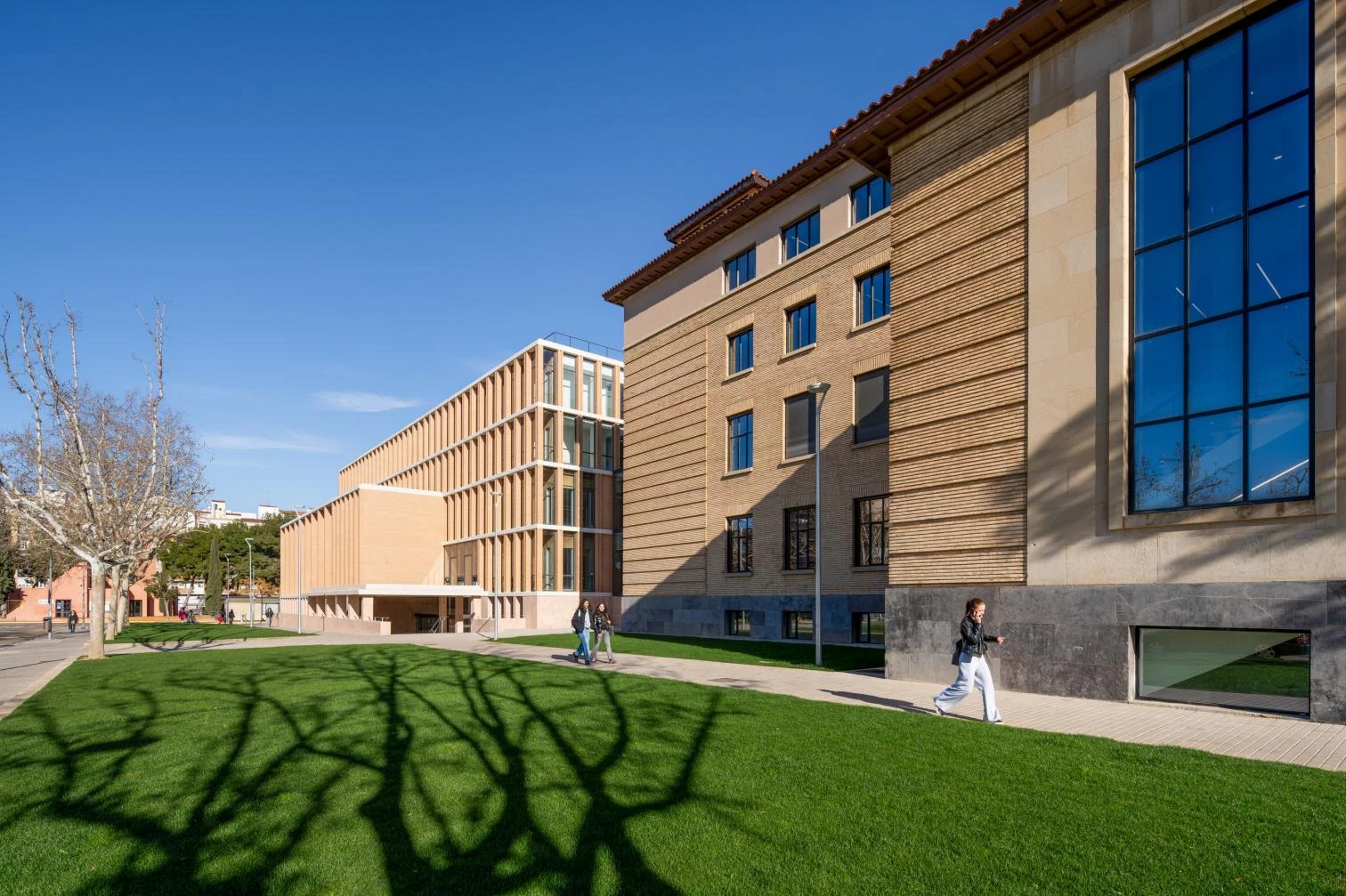
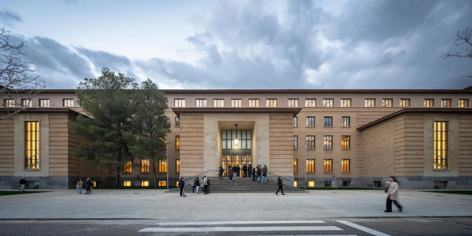
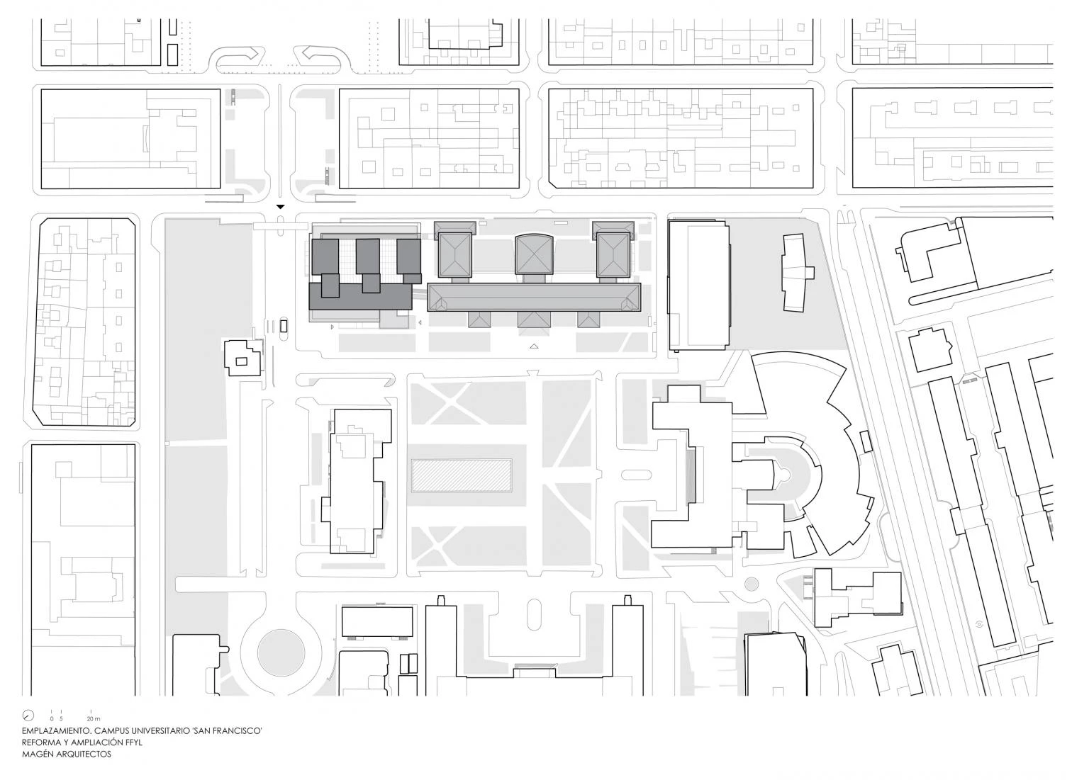
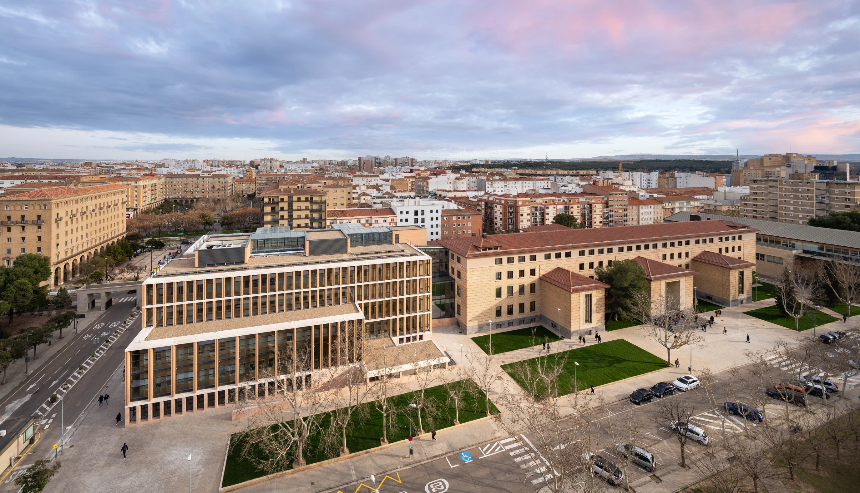
Completed in 1941, the Faculty of Philosophy and Letters was the first school to go up on the University of Zaragoza’s San Francisco campus. Designed by Regino Borobio and José Beltrán, it stretched out longitudinally with a symmetrical layout. Subsequent enlargements – two symmetrical wings at the ends and two floors added atop the long building – shaped the definitive volume, which is listed and protected. In 2016, the university held a competition to refurbish it through and through, with a reorganization of uses that included annexing a new department and fixing up the exterior spaces. Magén Arquitectos won.
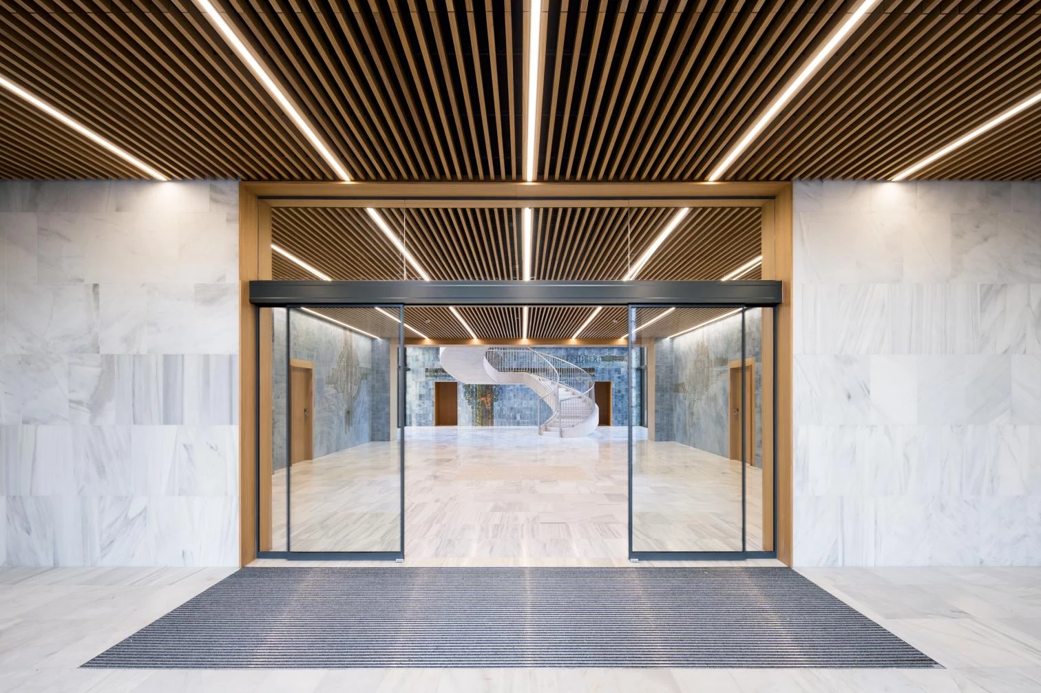
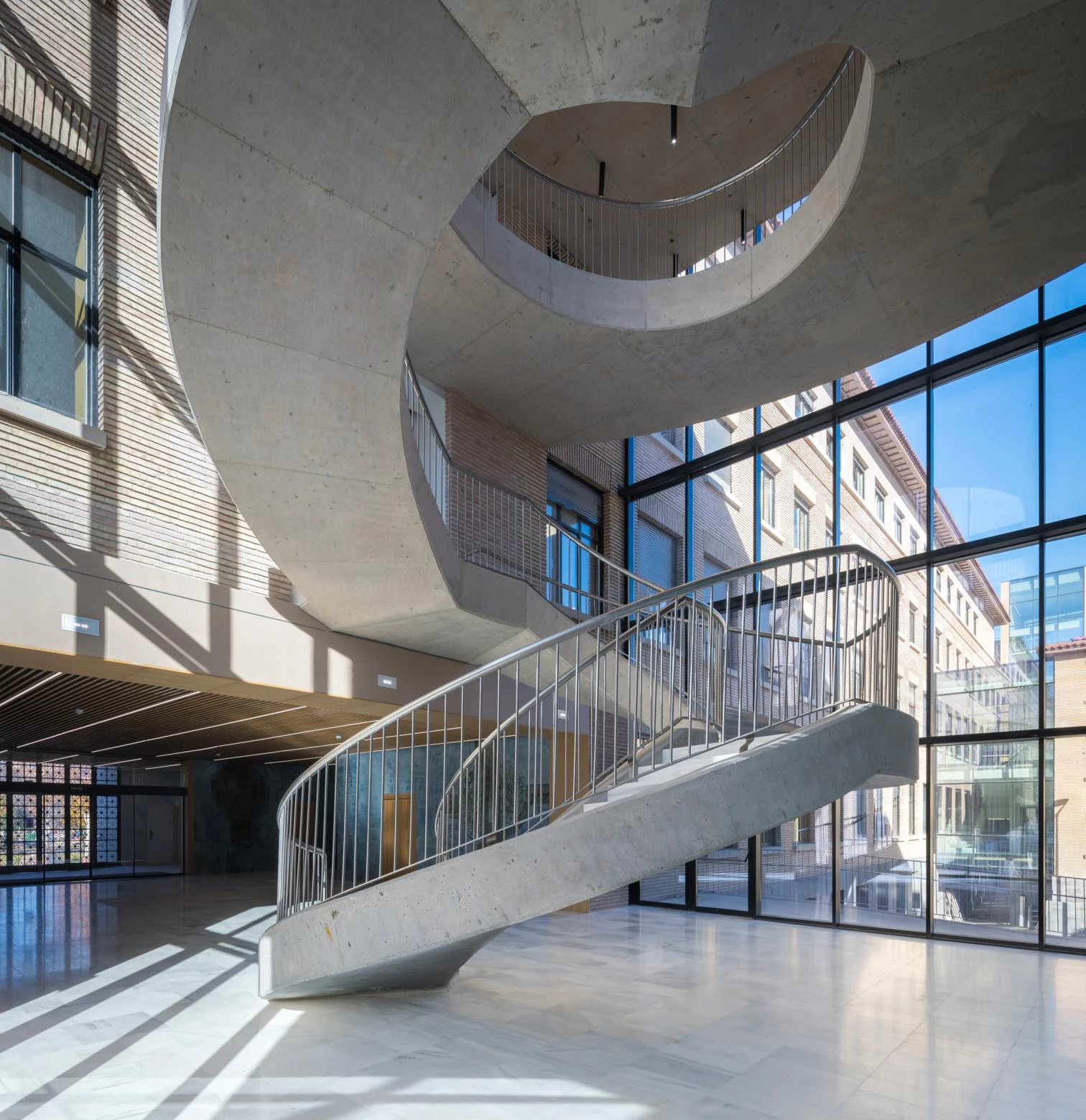
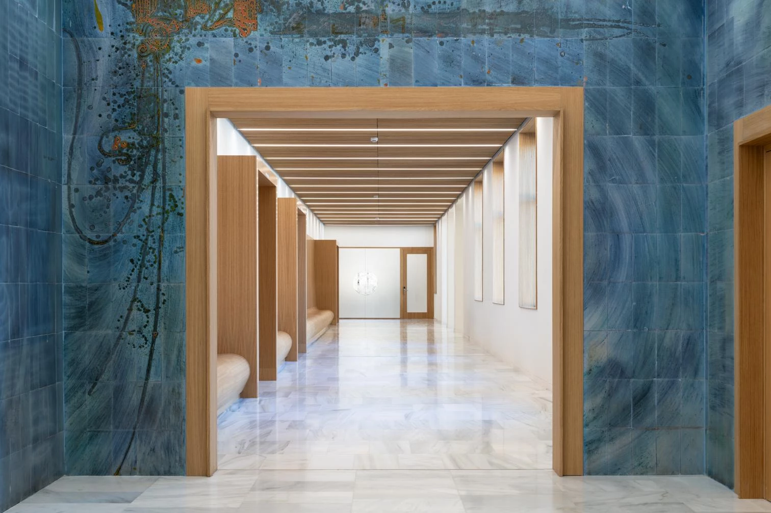
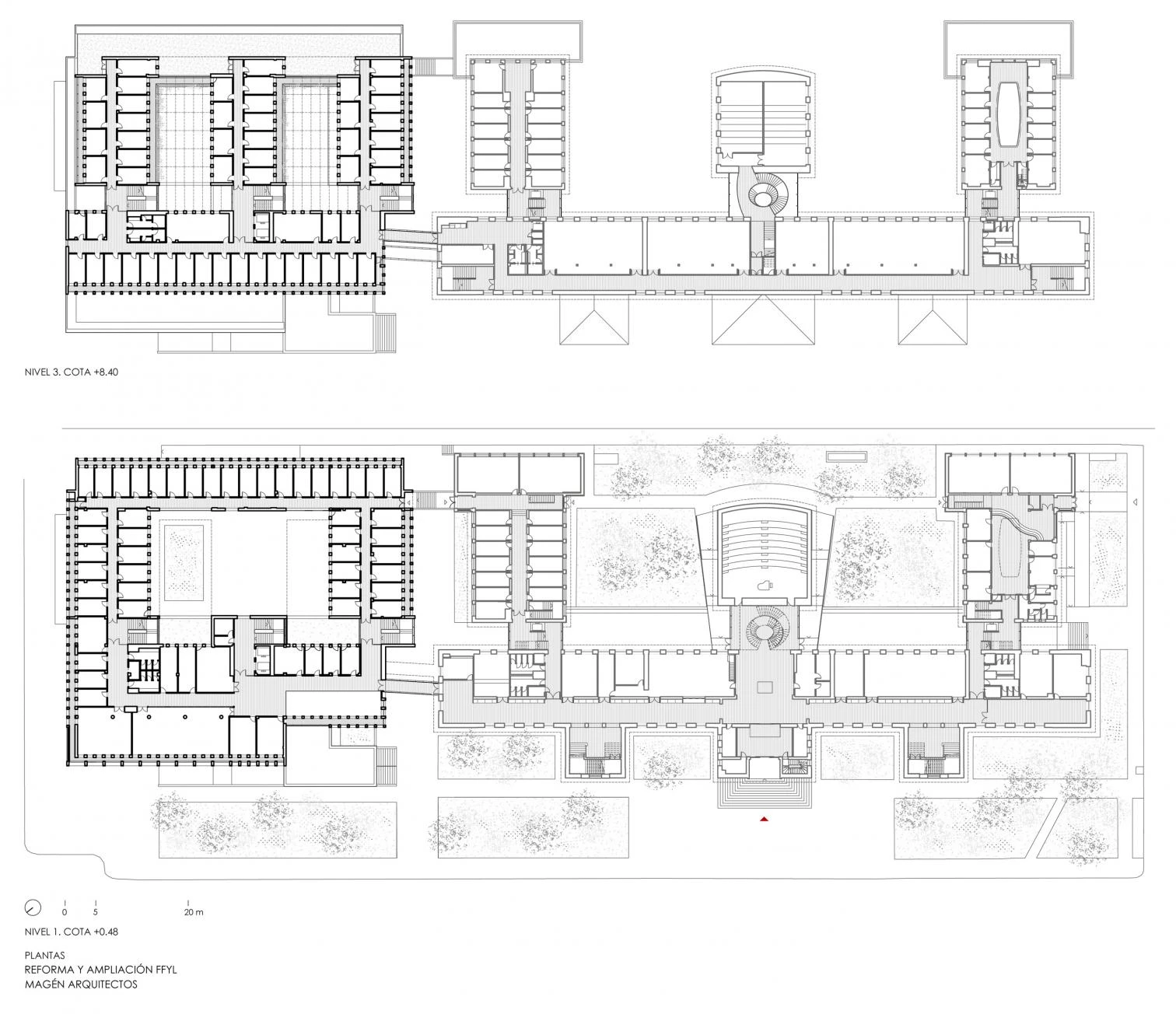
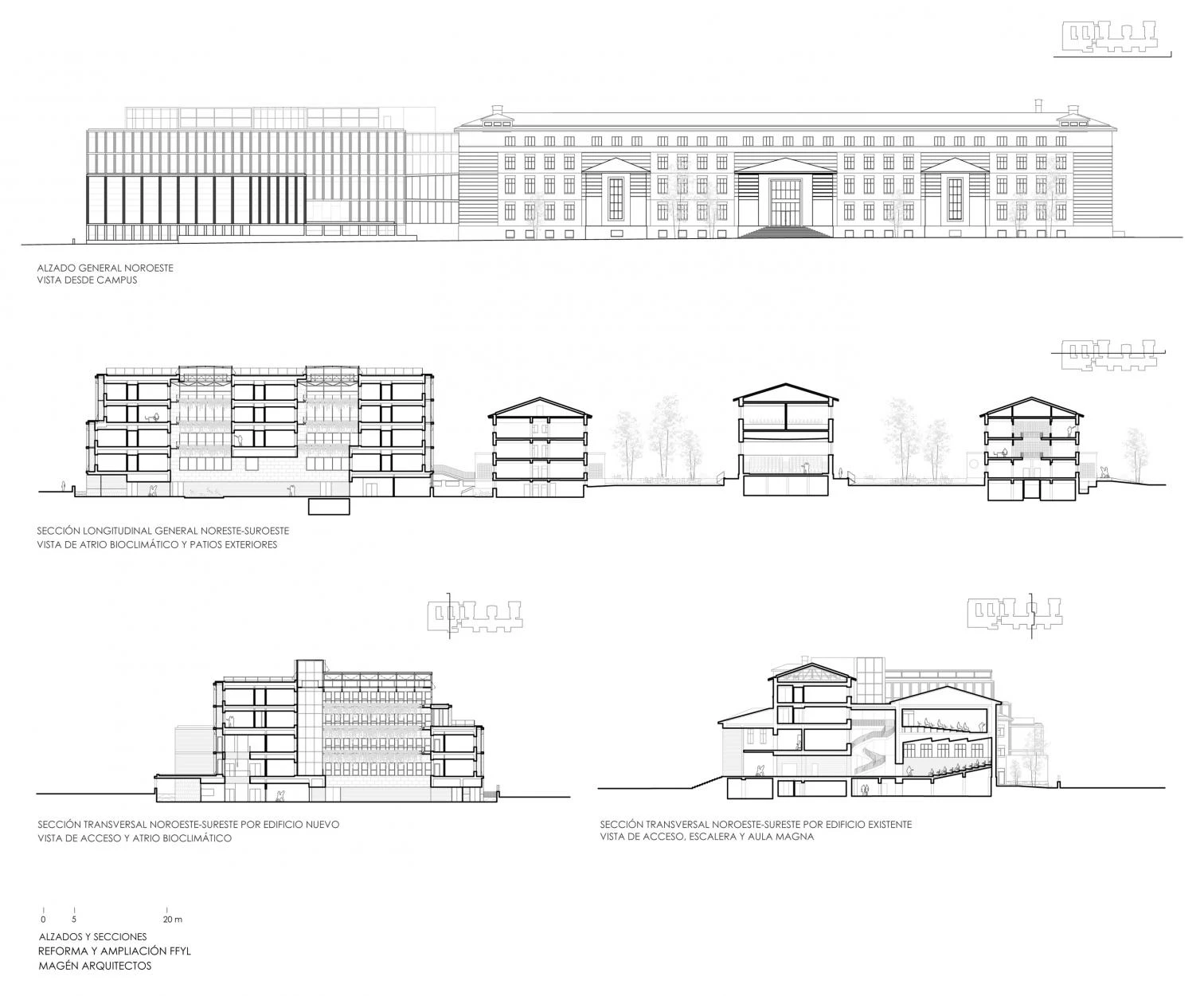
The principal objective was two-fold: the continuity of the old building, and maximum energy efficiency in pursuit of near-zero consumption. In the existing construction, the project highlighted the heritage elements, improved energy efficiency, and activated exterior courtyards. Modifications that had been made inside were eliminated in order to bring back the original floor-plan schemes, reinforce the structure and foundation, improve the properties of the cladding, restore the facades, and complete the redistribution of levels. In addition, procedures were carried out here and there to improve functionality, interconnection, and accessibility of the different parts. The most important operation was in the main foyer. The demolition of an interior piece attached to the Main Lecture Hall created a triple-height void, in which a new spiral sculpture was installed. This made it possible to open up the foyer towards the two rear courtyards. The long corridor got back its original section. A built-in continuous bench along the corridor provides settings for socializing between classes.
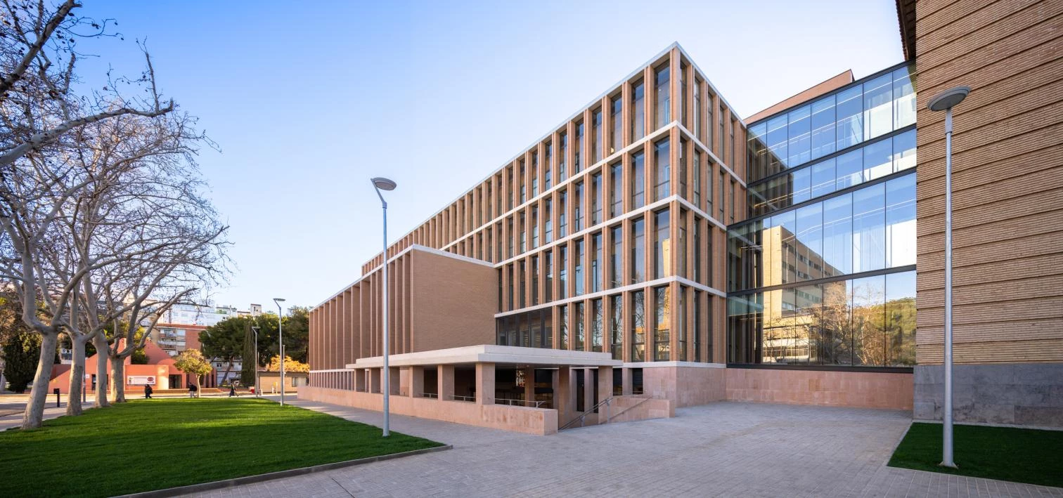
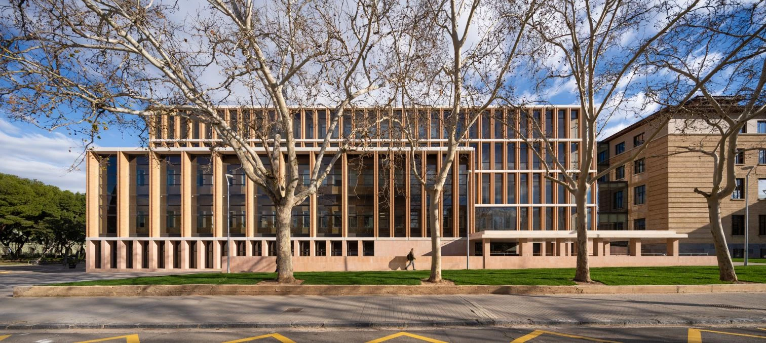
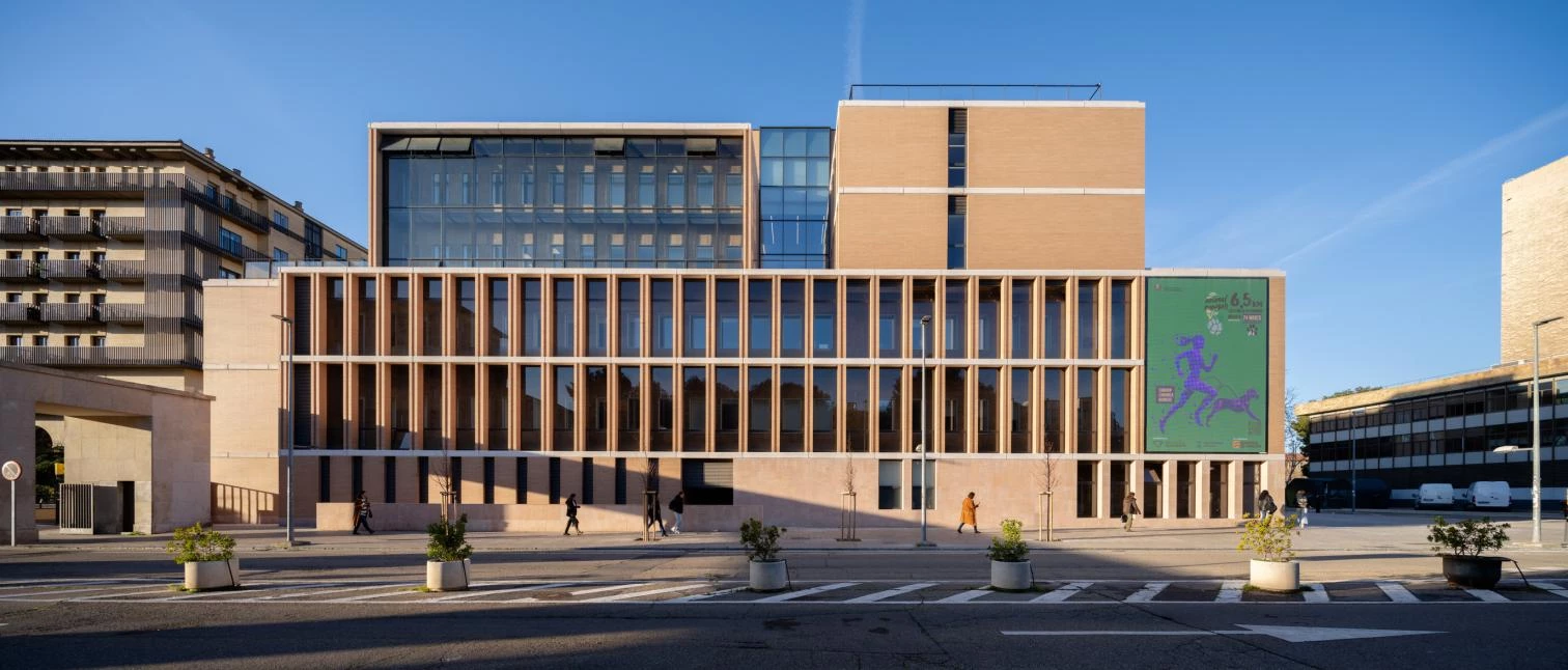
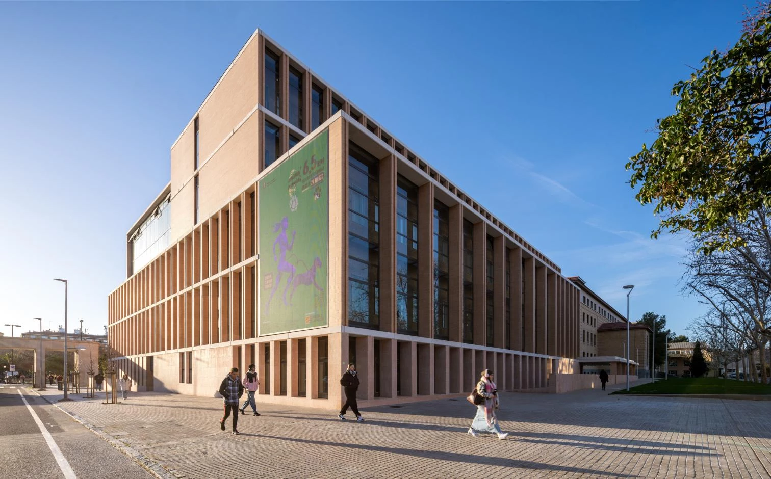
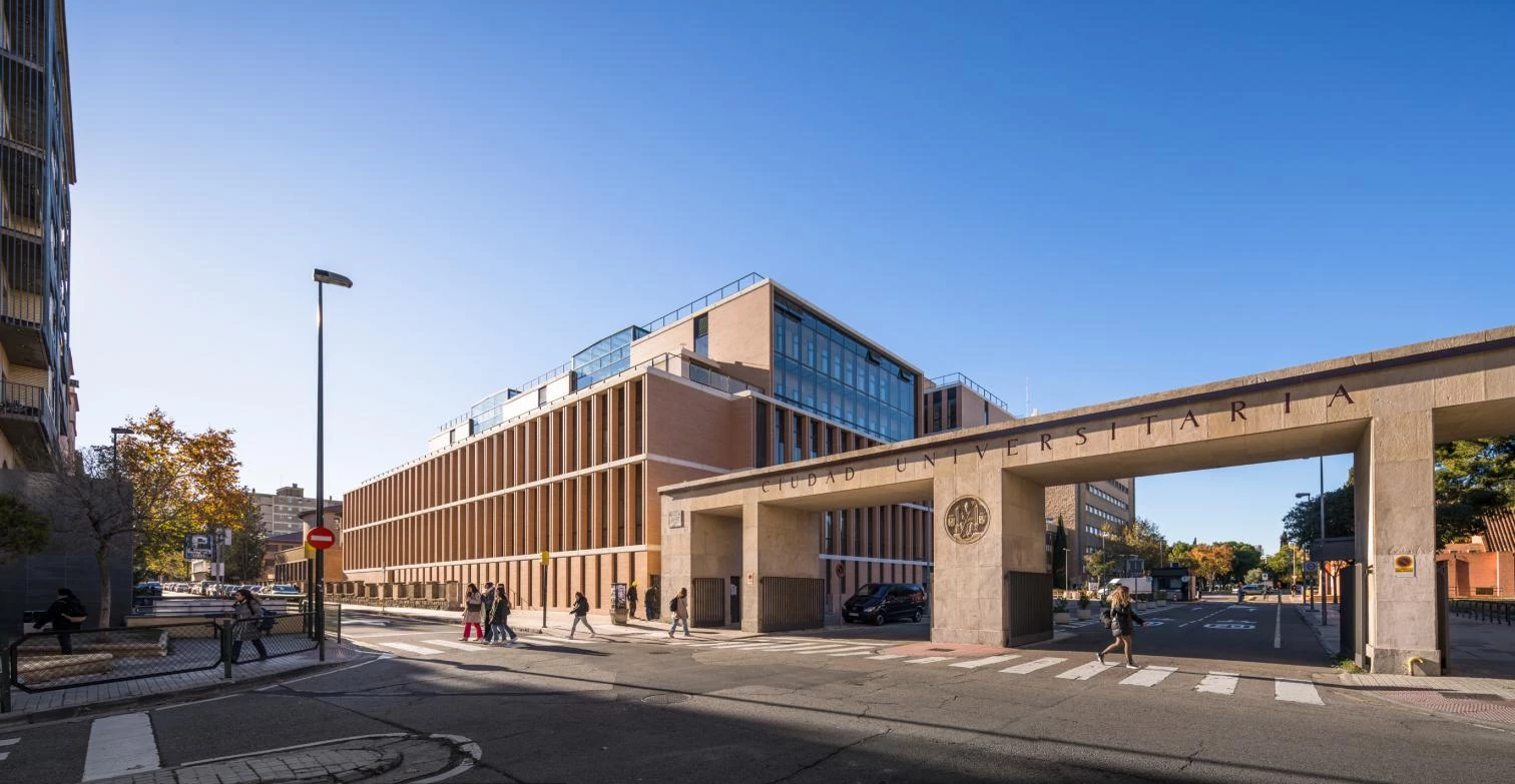
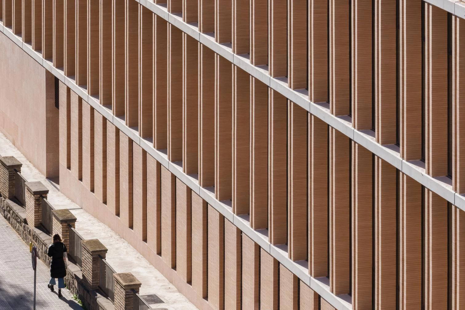
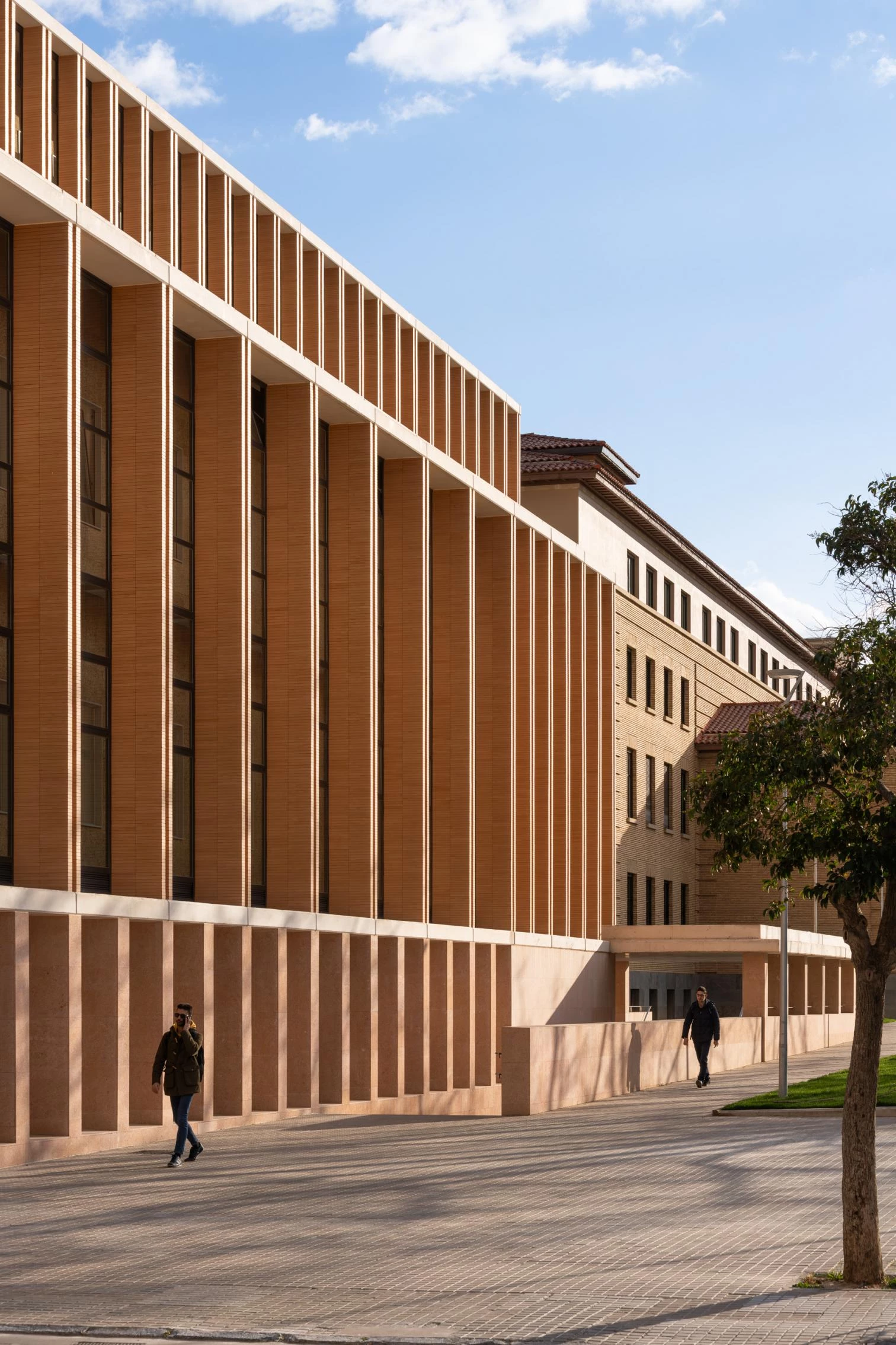
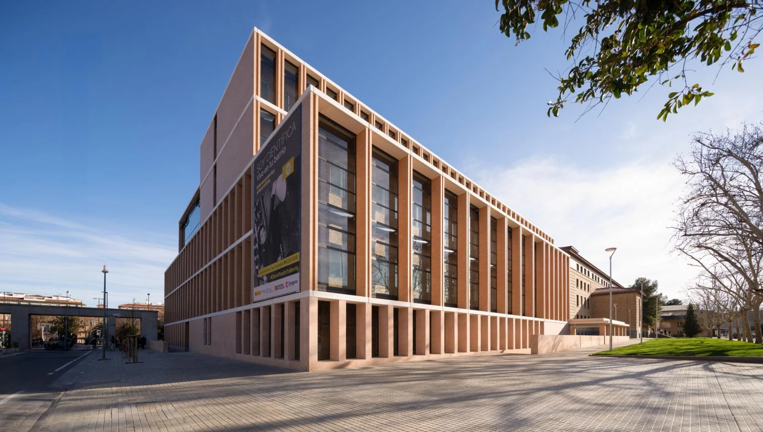
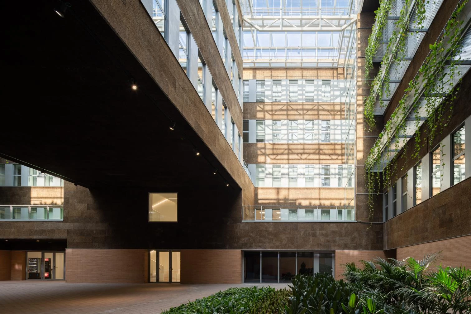
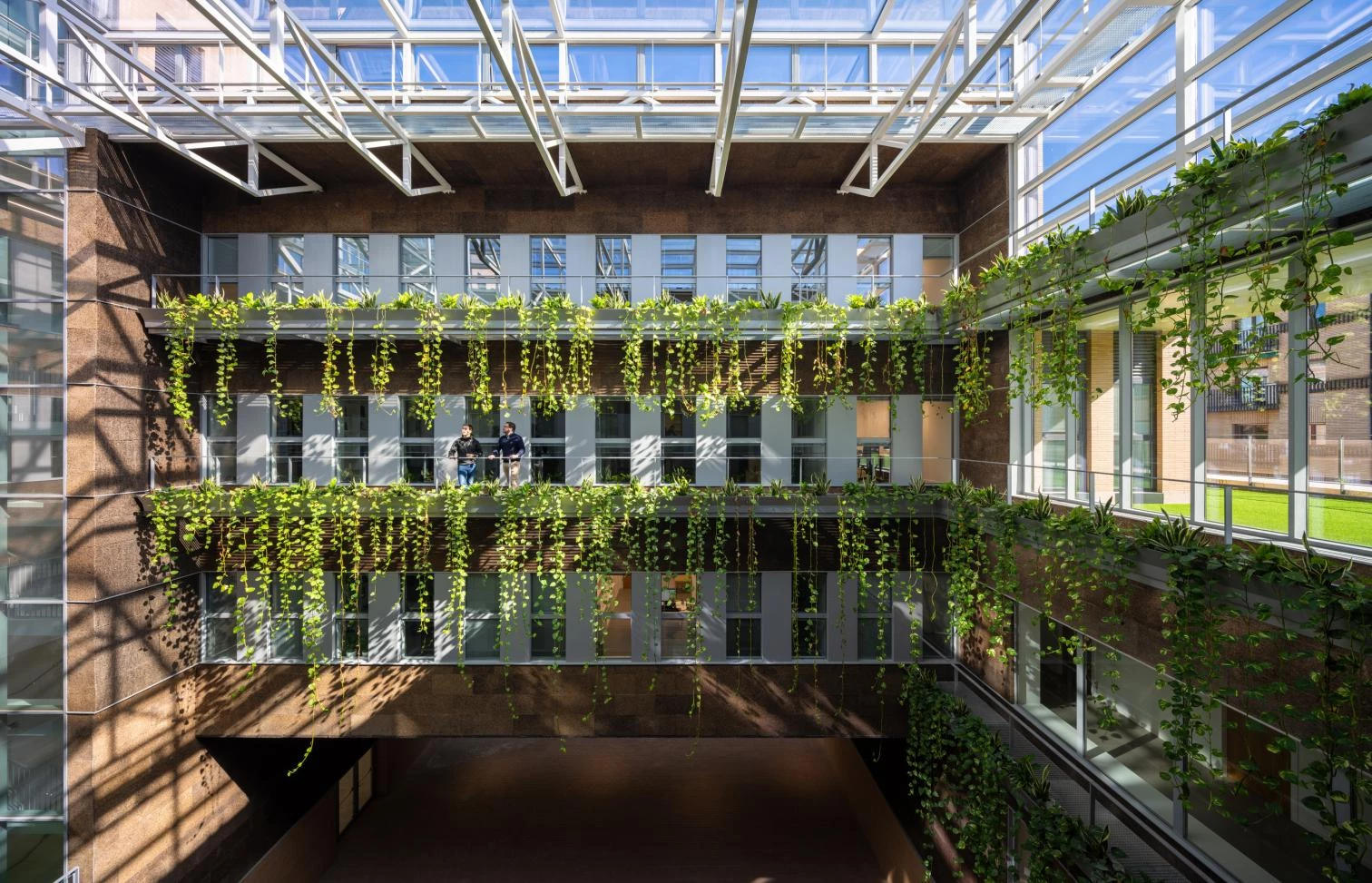
The new departmental annex prolonges the faculty northeastward, all the way to the portico that marks the main entrance into the campus. Its massing engages in dialogue with the heights around while maintaining continuity with the old building’s long figure. The streetward section gives rise to a terrace-lookout. The arrangement on plan, which varies from the ring shape of the lower levels to the comb organization of the upper ones, generates a covered plaza inside, pierced between skylights by the central body of offices. Light shining down from the glass roofs and plants hanging from the higher floors characterize this collective space. The facade is composed of a succession of brick pilasters between horizontal slabs of white concrete. The trabeated tectonics of the facades evokes the construction as a stacking of simple elements. The placing of the joineries behind the pilasters gives the facades the effect of thickness, depth, and shade. In the rooms, the walls are clad in cork panels, a visible thermal insulation.
