Bus Station, Huelva
Cruz y Ortiz Arquitectos- Type Station Infraestructure
- Date 1990 - 1994
- City Huelva
- Country Spain
- Photograph Duccio Malagamba
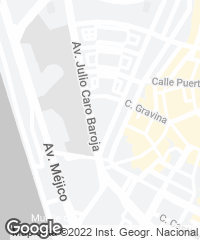

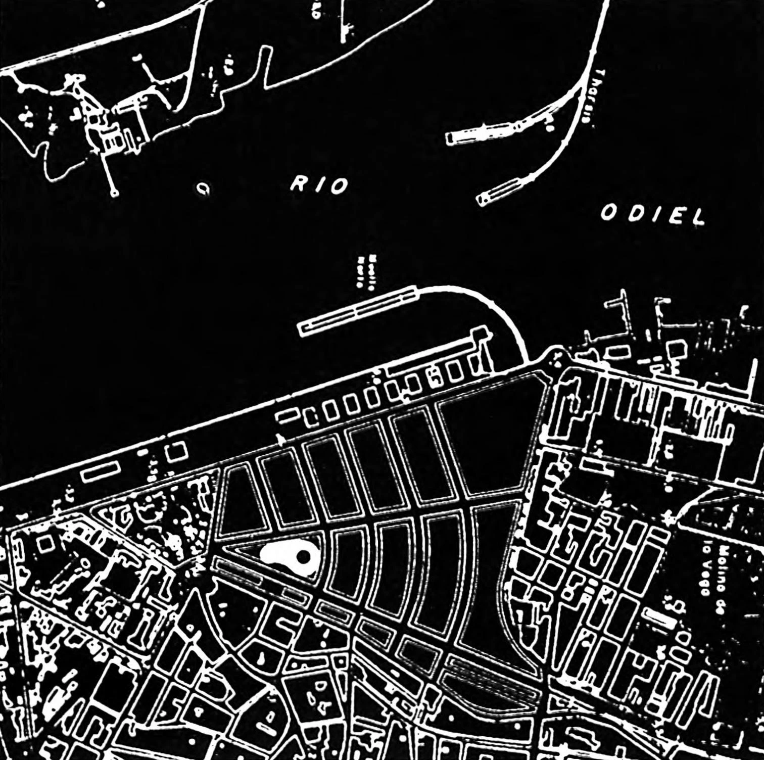
Site plan
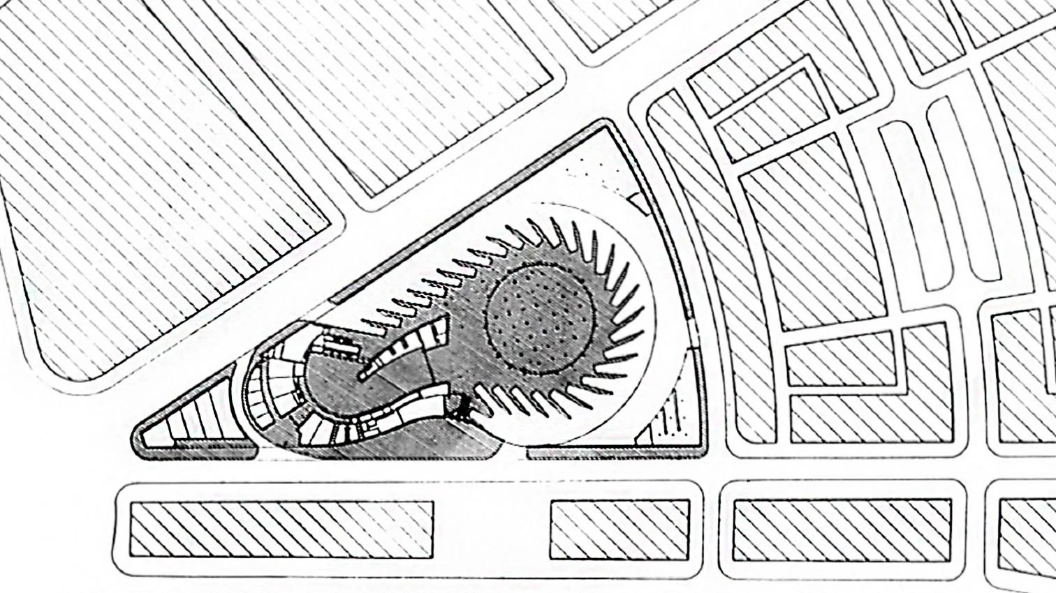
For this bus station complex on a 33-degree angle, wedge-shaped lot with a 200-meter radius, close to the river Odiel, the basic intention was to arrive at a unitary> image, with a single gesture addressing and resolving the difficult conditions of the site.
The idea of a circular vehicular movement was what generated the shape of the floor plan, while serving as a starting point in the elaboration of a complex and varied programme behind the desired unitary image.
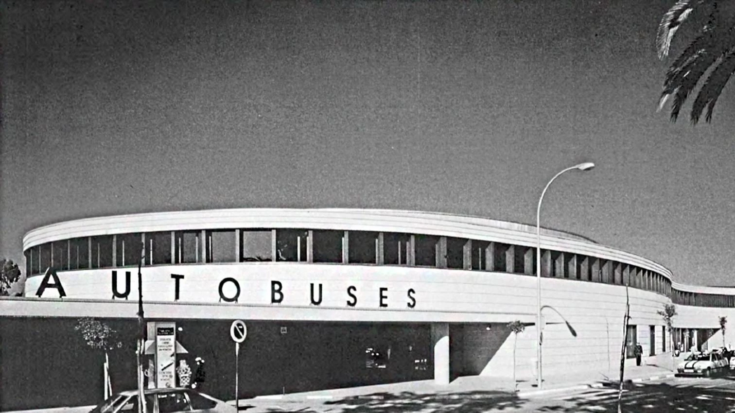
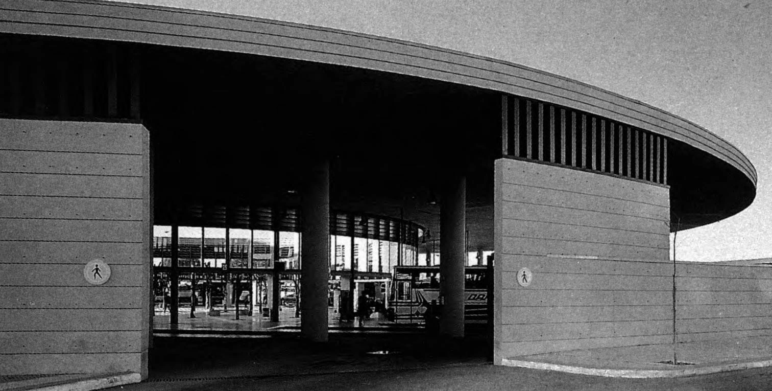
The main idea behind the project, entrenched in a difficult site, was the circular movement of the vehicles, thanks to which it was possible to resolve a complex program and still arrive at a forceful and unitary image.
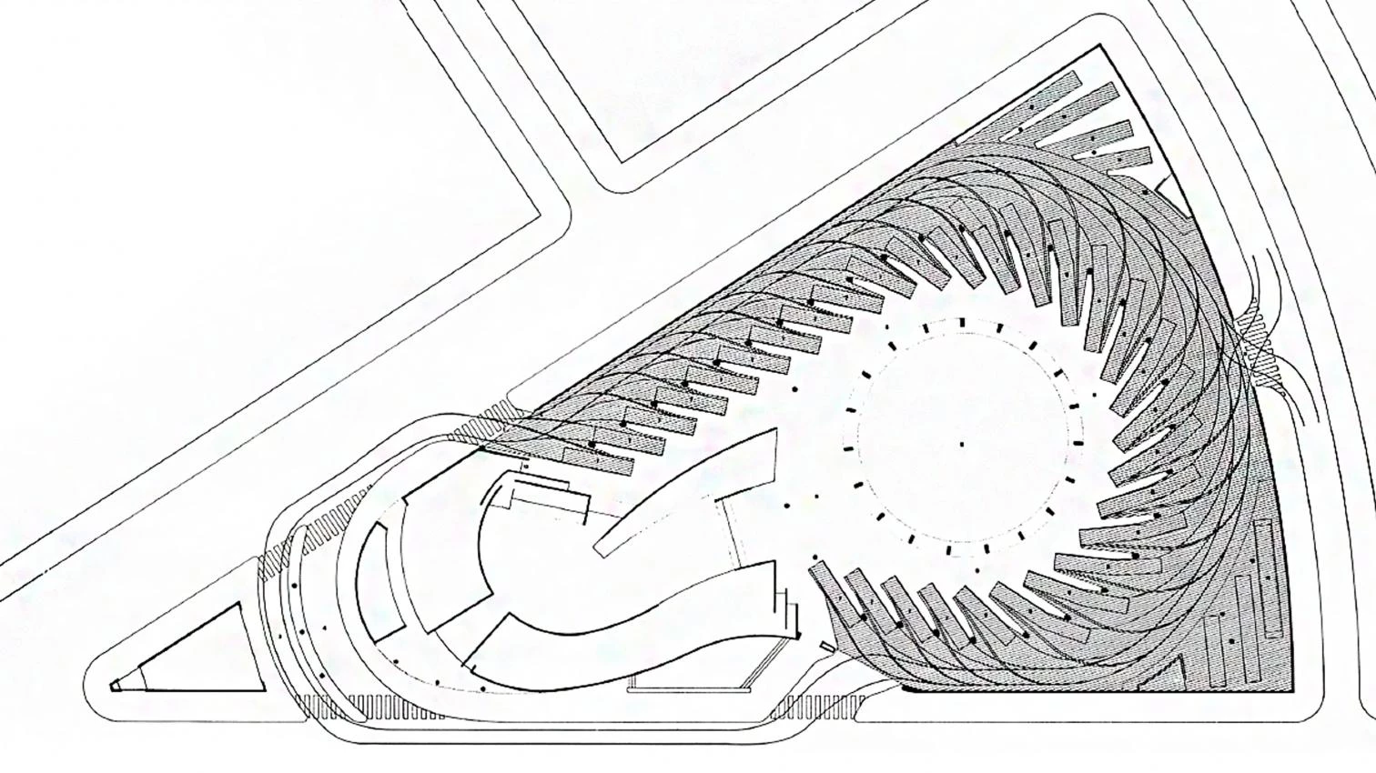
Bus shunting area
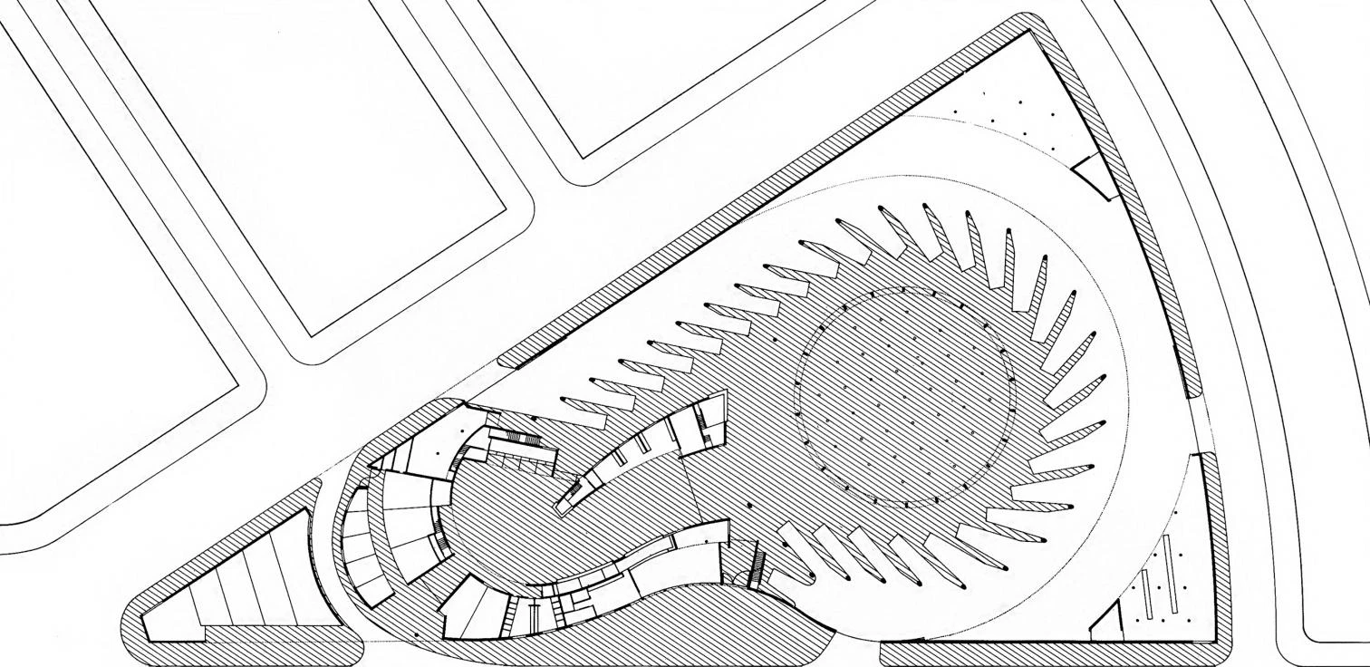
Ground floor
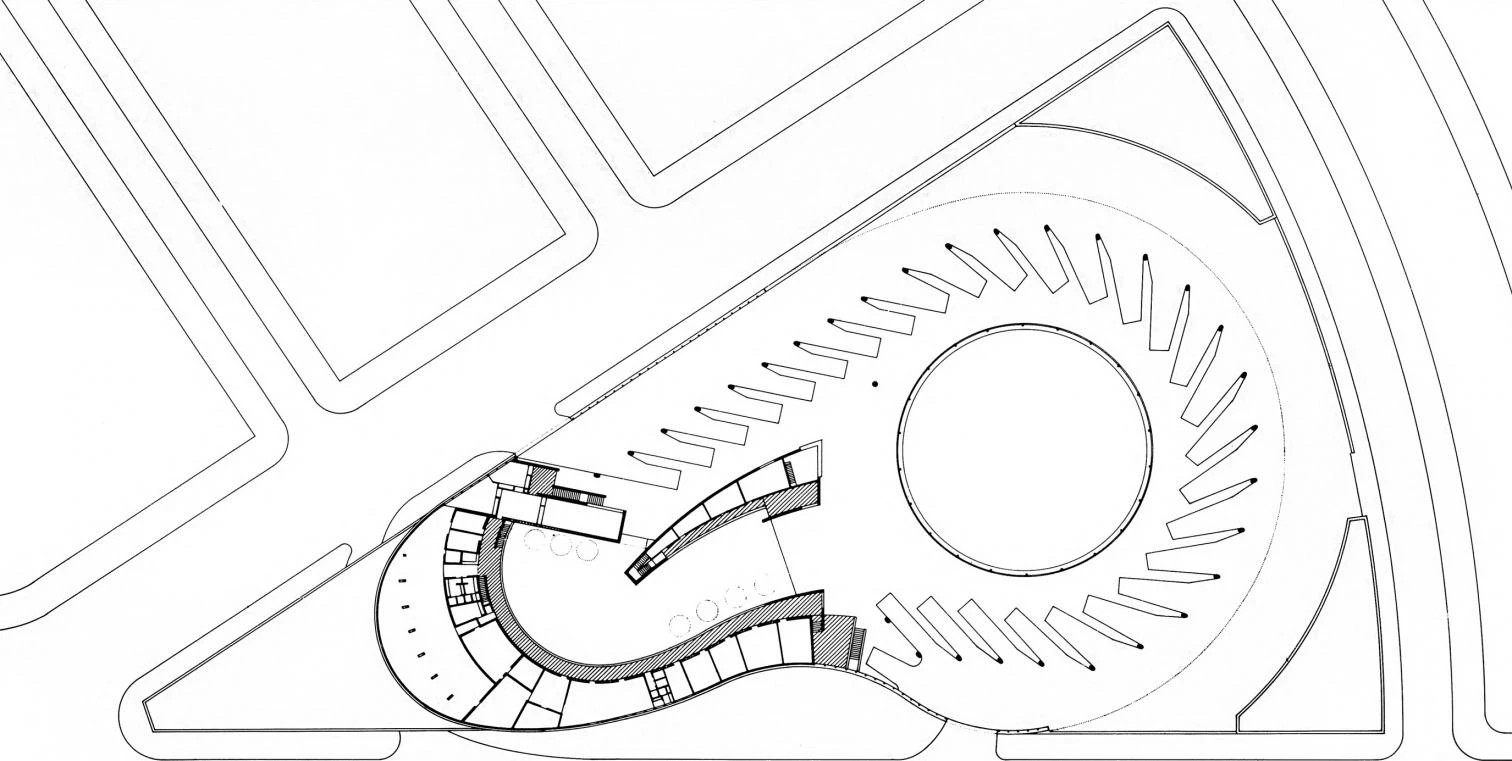
First floor

Rear elevation of the platform area

Elevation to the main avenue

Elevation of the passenger entrance
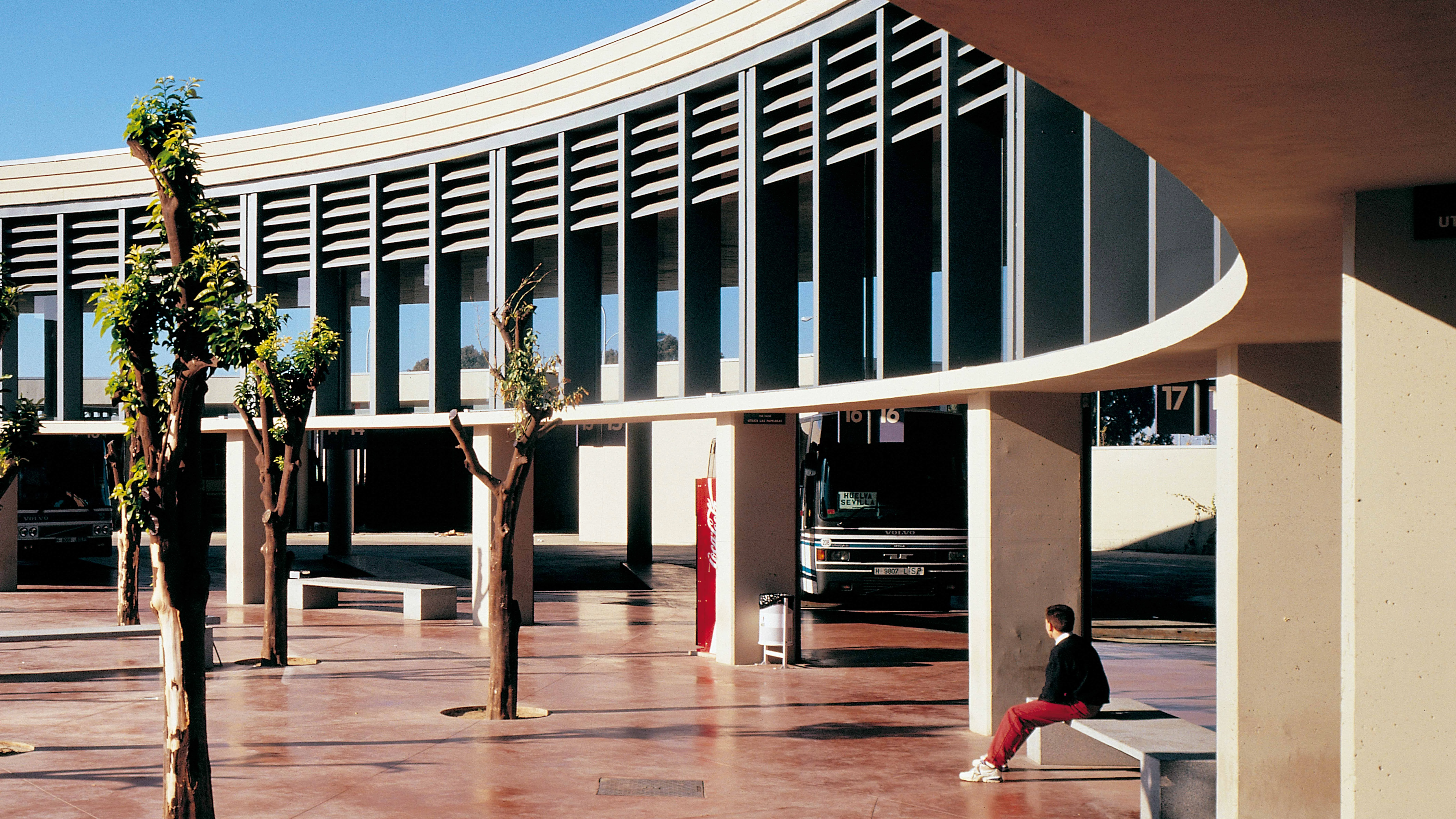
A single, large, flat, uninterrupted ceiling seven meters high spreads over both the hall and the bus platforms, thus avoiding the dual image that tends to characterize buildings of this kind. The only structures found outside the limits of this huge roof are three small, lower volumes at the comers of the lot: a gasoline station, a commercial area, and a space for additional platforms. The fact that these are built in to the perimetral walls of the lot makes their role as auxiliary elements evident.
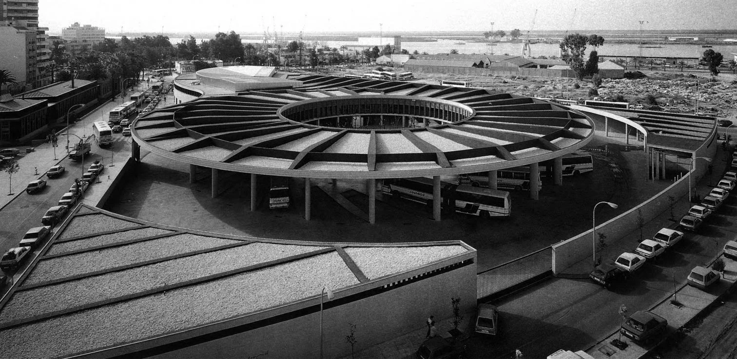
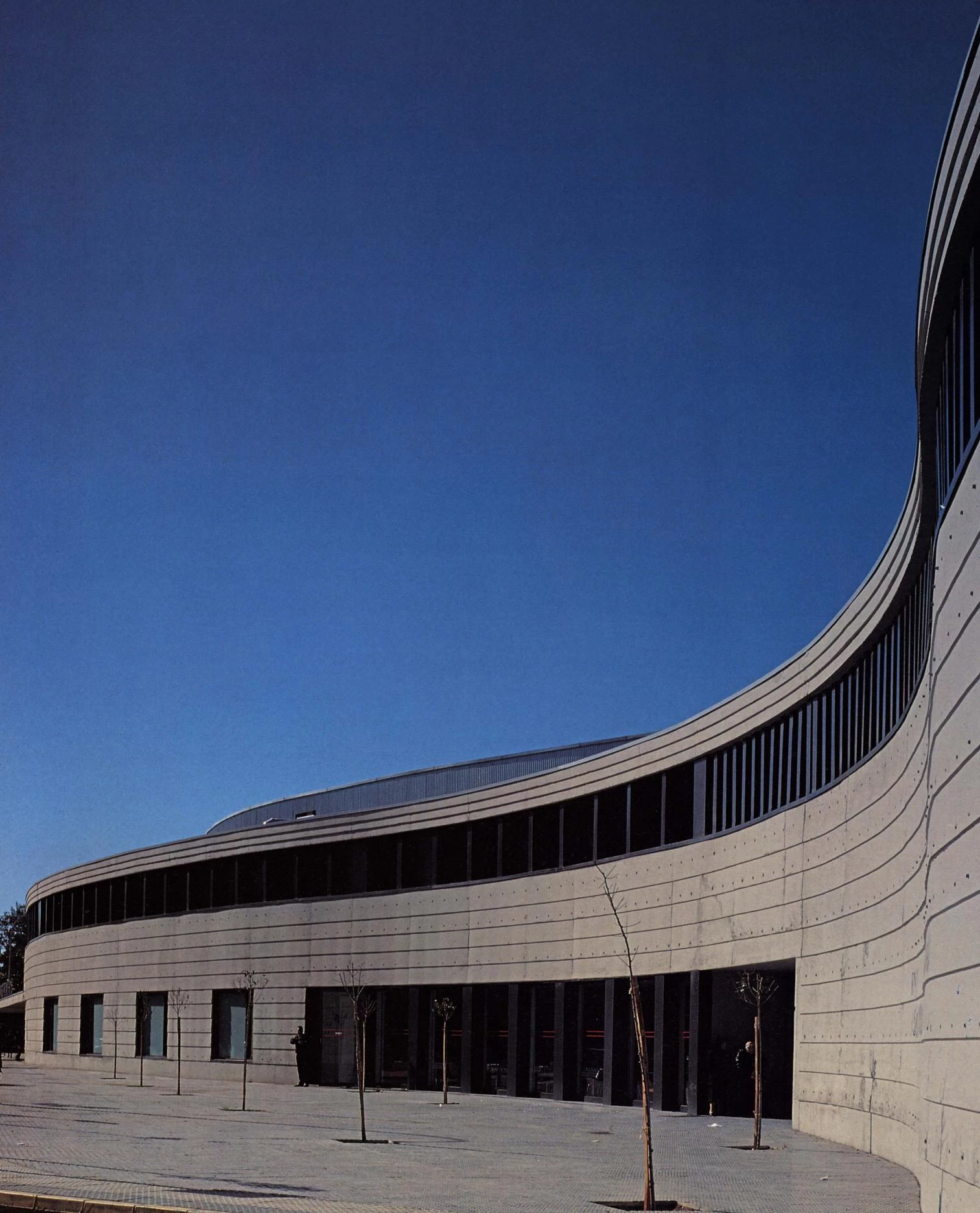
A single large roof covers both the concourse and platform area, so that only two small triangle-shaped structures fall outside of it, at the comers of the lot. The elevations offer an image of serenity and moderation, with the horizontal predominating.
Curving around the hall is a large volume that squeezes in toward the narrower part of the lot, and a smaller one on the other side that flanks the connection between the hall and the platforms. These two curved volumes contain all passenger services at ground level, with transport company offices and personnel dressing rooms and lounges located upstairs.
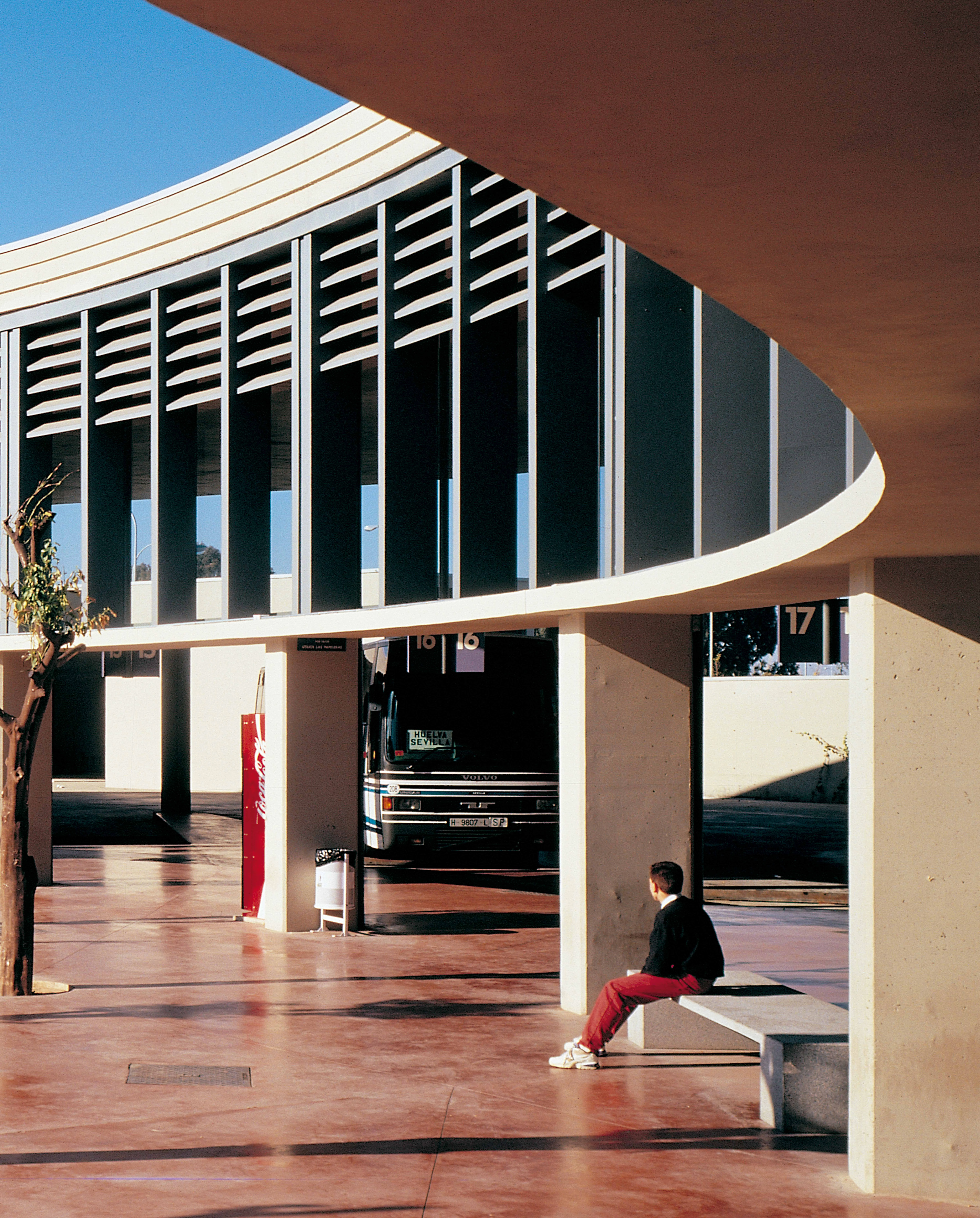
There is a formal continuity between the passenger concourse and platform area, and the buses circulate around the latter to avoid interference with pedestrian movement, an important thing to take into account when designing facilities of this kind.
The landscaped courtyard is an exterior prolongation of the passenger concourse. Outside, the station resembles a walled premise with perforations at various points.
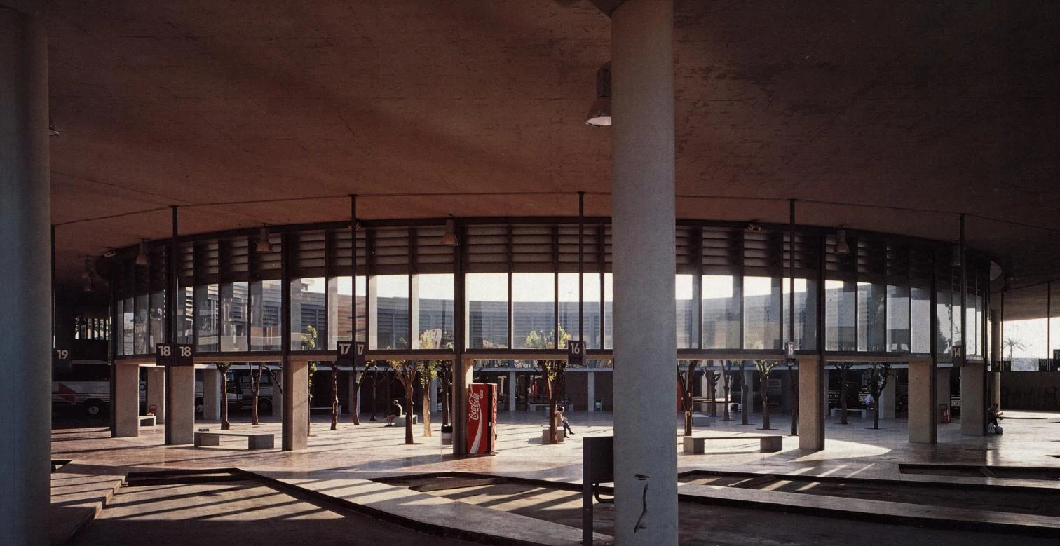
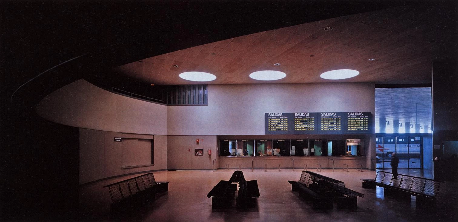
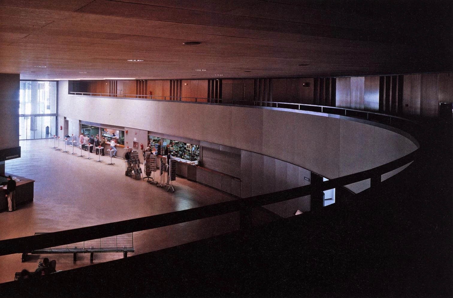
The situation of the platforms around a large round courtyard allows the juxtaposition of garden and buses, and the resulting proximity between vegetation and passengers is considered one of the more attractive features of the project. A wall with access openings at certain points encloses the entire lot, thereby clearly defining the limits between the station and its urban context, with the result that it has the look o f a walled precinct.
The idea of homogeneity and continuity is manifested outside through the economy of expressive elements in the elevations, in contrast to the formal rotundity of the roof. The overall image is thus one of serenity’ and restraint, with a dominant horizontal element mitigated by the vertical rhythm of the pillars that sustain it.
The overall visual and functional continuity facilitate communication between the platforms and the concourse, helping to orient the travelers and avoiding unnecessary crossings.
Cliente Client
Junta de Andalucía
Arquitectos Architects
Antonio Cruz & Antonio Ortiz
Colaboradores Collaborators
Blanca Sánchez (arquitecta architect); Manuel Delgado, Manuel Pino (aparejadores quantity surveyors)
Consultores Consultants
Blas González (ingeniero engineer); Antonio Pérez Escolano (señalización signage)
Contratista Contractor
Cubiertas y MZOV
Fotos Photos
Duccio Malagamba

