Health Center in Palomeras, Madrid
Andrés Perea- Type Health center Health
- Material Concrete Aluminum Steel
- Date 1998
- City Palomeras (Madrid)
- Country Spain
- Photograph Javier Azurmendi
The solution adopted for this health center addresses the desire to simplify routes and optimize the use of space. Two criteria governed the functional layout of the program: the best orientation, and the degree of accessibility deemed adequate to each activity or speciality. All services directly involving the public are placed at ground level. A part of the upper floor is fitted out for consultations, and the rest of it contains facilities reserved for staff use, including the boardroom and the library. The organization of the lower-ground floor is determined by its relation to the exterior as well as by its connection to the rest of the building.
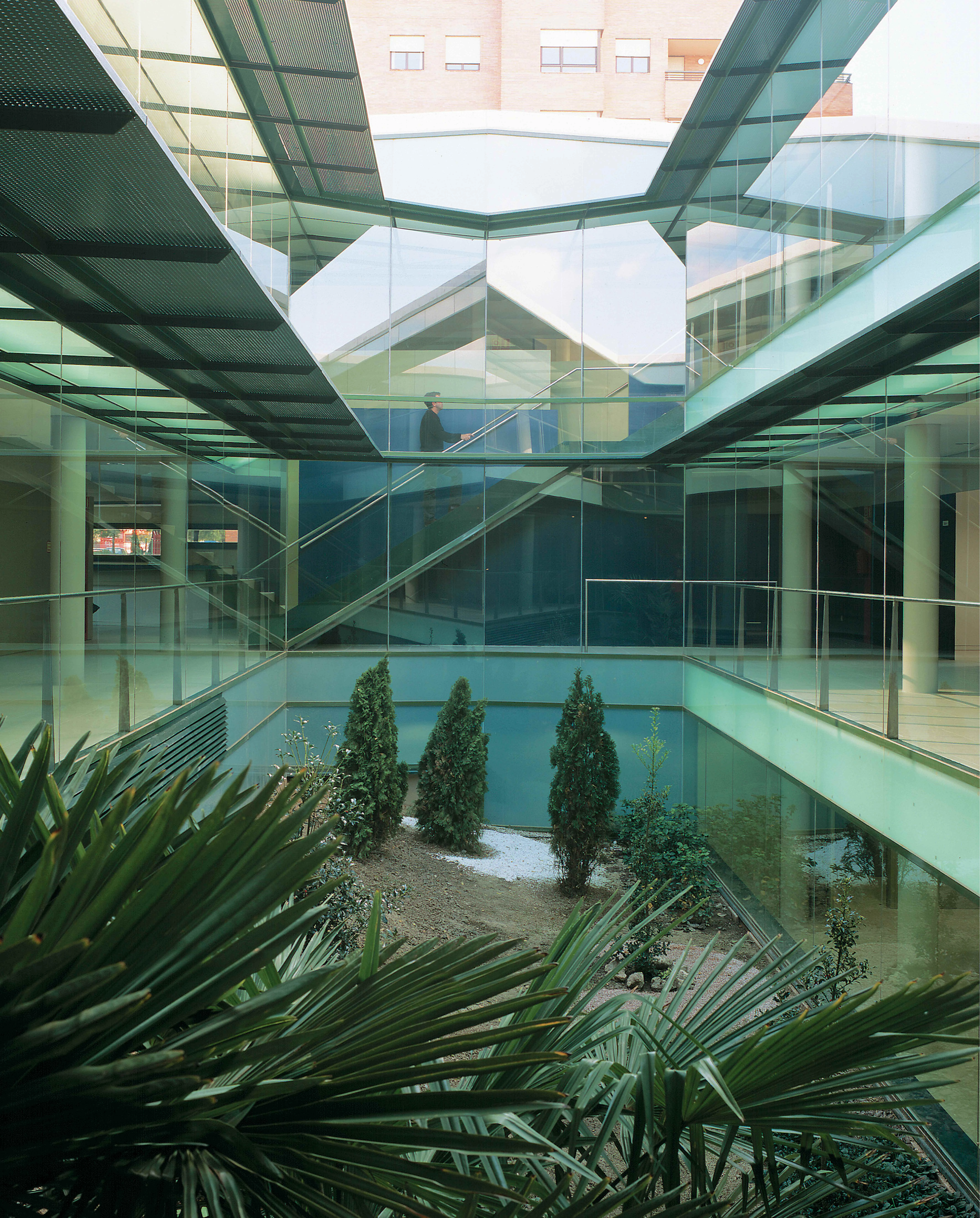
In line with the aim of reaping maximum benefit from the built floor area, the project has tried to relieve the space of structural easements. It has also connected service elements in such a way that they do not hinder use flexibility or a future overhauling of the center. The most striking feature inside is the landscaped court that forms the heart of the building. The use of glass here stretches one’s view from any point on its perimeter, and the need to control solar radiation has warranted the placement of stainless steel parasols which push the planes of the false ceilings outward. A play of translucent double glass panes ensures that the interior is illuminated even on cloudy days.
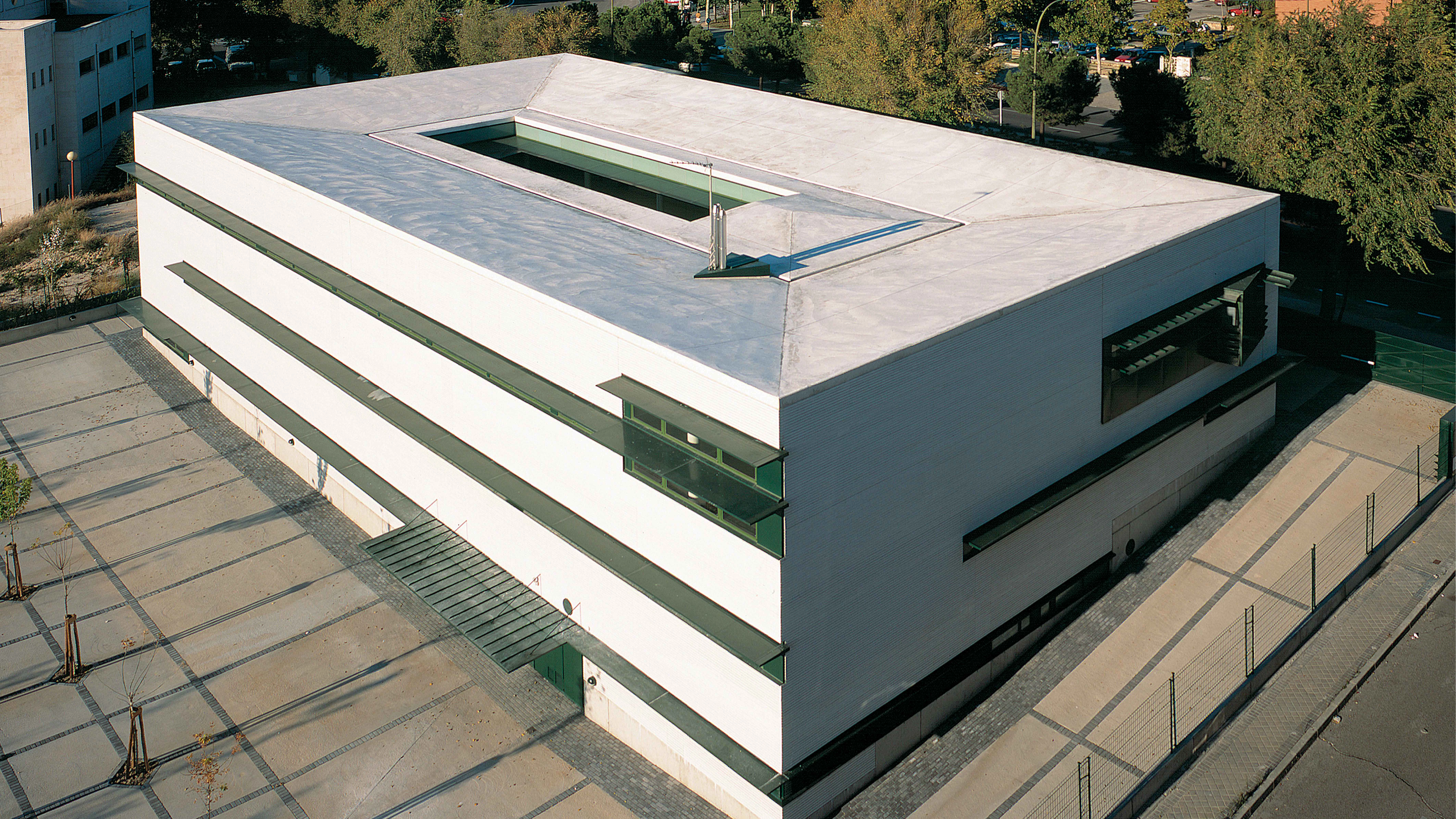
As for the exterior, the project endeavors to present the building as a significant feature of the urban scene, with the main entrance on the street Hermanos García Noblejas clearly marked by a large door and canopy. The categorical volumetry of the center calls for a choice of neutral materials. The exterior shows concrete blocks of a pearl gray tone, aluminum window frames and stainless steel canopies; asphaltic sheets protected by concrete slabs form the inward-sloping roof. The interior claddings are of porcelain clay, wood and plasterboard. All the expressive force of this simple container is concentrated in the treatment of the windows, which are framed with jambs and eaves providing both shade and protection. The greater or lesser need for solar protection determines the variations of a pattern that ranges from ‘maximum’ in the personnel lounges and multi-purpose rooms to ‘minimum’ in the boiler room or in the dressing rooms. The open space around the building is designed to mark the boundaries of the premises, but also serves as a transition between the center and the neighboring park...[+]
Cliente Client
INSALUD
Arquitecto Architects
Andrés Perea
Colaboradores Collaborators
Luis Fructuoso, Alfredo García, Luis González-Mariscal, Eva Olalla (arquitectos architects); Julio Hernanz (aparejador quantity surveyor)
Consultores Consultants
Indagsa (estructura structure); ICIISA: Rafael Úrculo (instalaciones mechanical engineering)
Contratista Contractor
ACS
Fotos Photos
Javier Azurmendi


