House in Bad Tölz
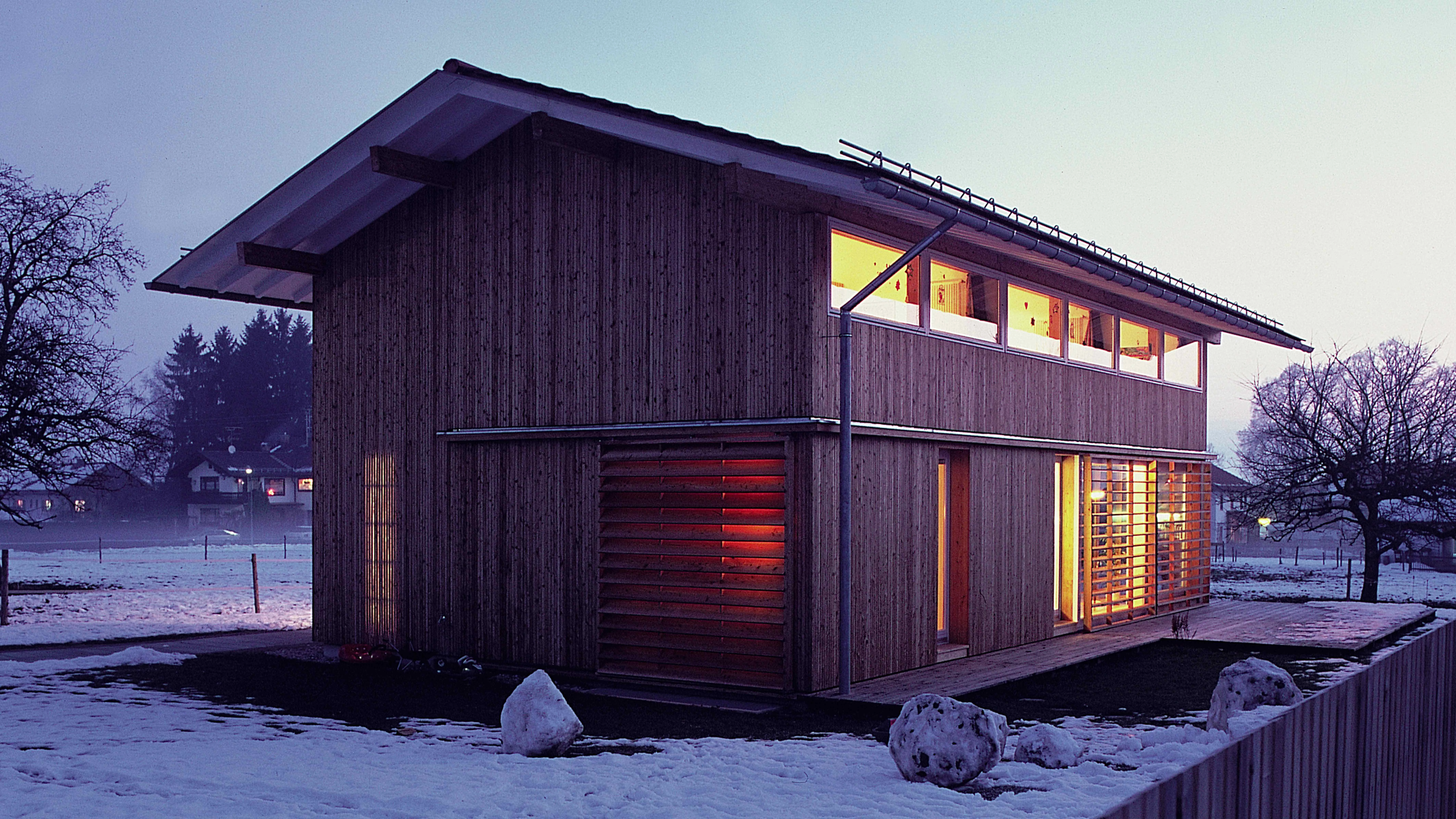
Fink+JocherA house is a house is a house, one is tempted to say – emulating Duchamp – when faced with the sophisticated innocence of this work of Dietrich Fink and Thomas Jocher. Both teach at the Institute of Urban and Regional Planning of the Polytechnic University of Munich, so despite the apparent ingenuity of the house, it is hardly likely that they have altogether ignored what is one of the most unanimously accepted precepts in urbanism: the destructive character of the urban sprawl, the disarticulated spread of the low-density fabric around consolidated nuclei. Here they seem to have deliberately set aside this widely held opinion, and assumed the limitations inherent in architectural practice to concentrate on those aspects of it that do fall under their control. The project in fact tries to combat one particular aspect of such uncontrolled growth, anomy, by adhering to a current that has come down from reflections of the sixties about vernacular architecture, and from the ‘critical regionalism’ vein of postmodernism.
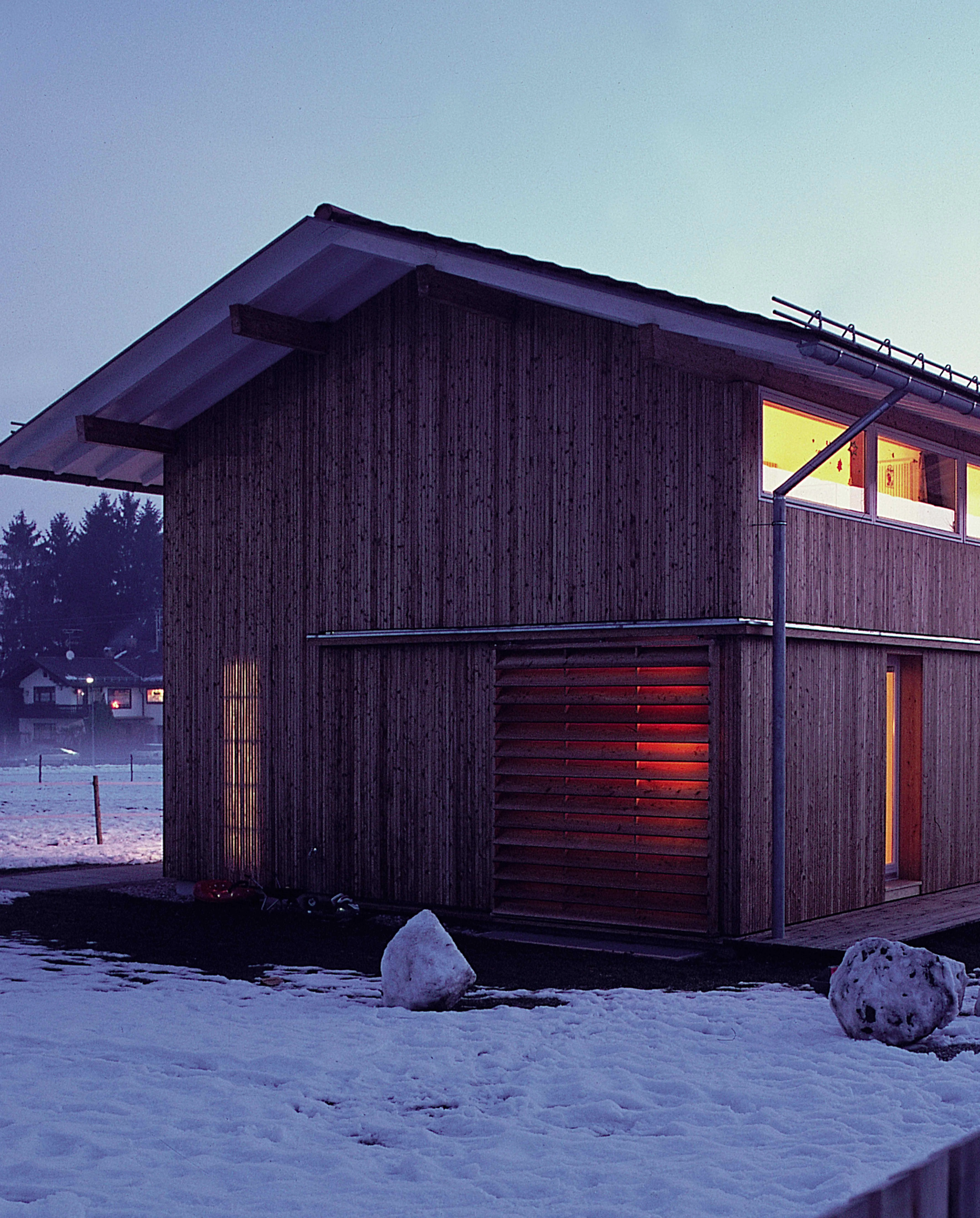
In this case the reference is the traditional Bavarian farmhouse, a long wooden box which brought the functions of a dwelling and a facility for agricultural work together under the same two-pitched roof with large eaves. The project begins with this basic typological evocation, then proceeds to become a meticulous exercise on detail design, masterfully executed by local carpenters. For the structure the architects resorted to a system resembling the balloon frame, modifying it where necessary so that the corner of the large ground-floor living room could be glazed. Passive methods of lighting and heating are important at all scales. The layout, with the main living spaces facing south through abundant glass and the service spaces pushed toward the very opaque north facade, is a simple scheme which is ideal in northern countries. The sliding panels keep out the glare of the sun during summer while making it possible to regulate the degree of privacy of the inhabitants. The underpart of the eaves are painted white in order to maximize the sunlight reflected toward the interior. There are other details like the windows of the upper level, which open outward so as not to restrict the interior space, or the conically sectioned strips of larchwood screening the ground-floor bathroom and filtering sunlight into it, or the use of natural materials which facilitates any future recycling. All this show a desire to address the surroundings...[+]
Cliente Client
Ursula & Alexander Schroth
Arquitectos Architects
Dietrich Fink, Thomas Jocher
Colaboradores Collaborators
Nicole Hemminger, Toni Staudacher (estructura structure)
Fotos Photos
Fink + Jocher


