Prada Building in Aoyama, Tokyo
Herzog & de Meuron- Type Commercial / Office Shop Culture / Leisure
- Material Glass
- Date 2000 - 2003
- City Tokyo
- Country Japan
- Photograph Christian Richters Nacasa & Partners
- Brand Arup
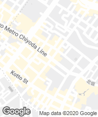
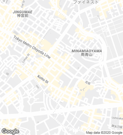
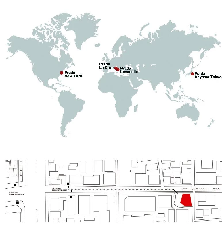
The initial observation of the site revealed two things: on the one hand, the extreme heterogeneity of the area freed from the need to meet any contextual requirements, and on the other, the site was surrounded by a low-rise type of building. No square meter was unoccupied.
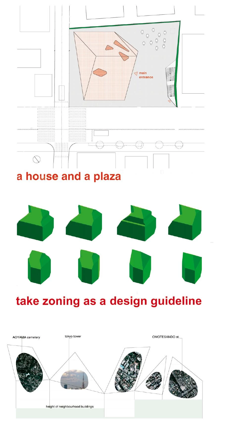
That led to become more visible, which meant somehow higher and, in addition, to create the kind of public space often seen in Europe, which meant not building on part of the land. This open area was later called a ‘plaza’: a place where people can go and spend some time, even without visiting the store. The building could become an attraction due not only to its visibility, but also to the plaza’s potential as a meeting point.
The analysis of the zoning laws discovered a rather complex virtual machinery, which literally shaped the permitted building volume. This volume was moved around the site, and the more it approached the free corner, the more the open space that had been envisioned from the very beginning was defined. The building itself became a kind of hybrid of odd shapes, it became freer, and also more exposed, more visible, while the plaza became more intimate.
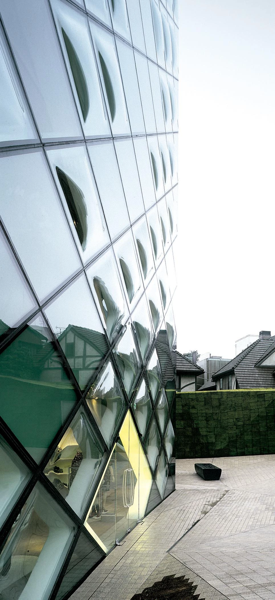
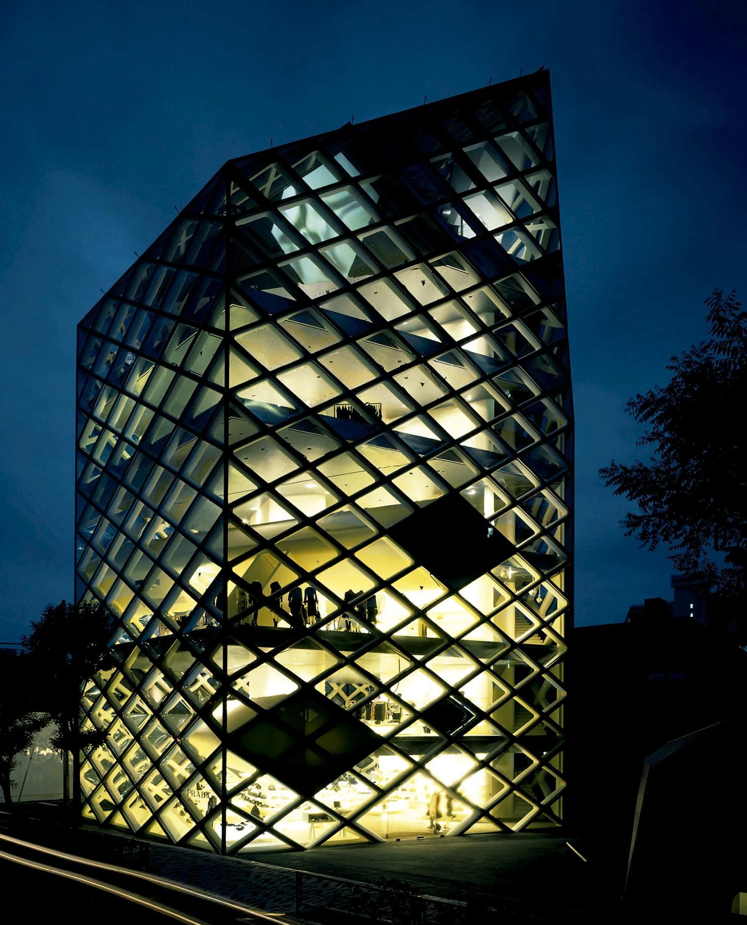
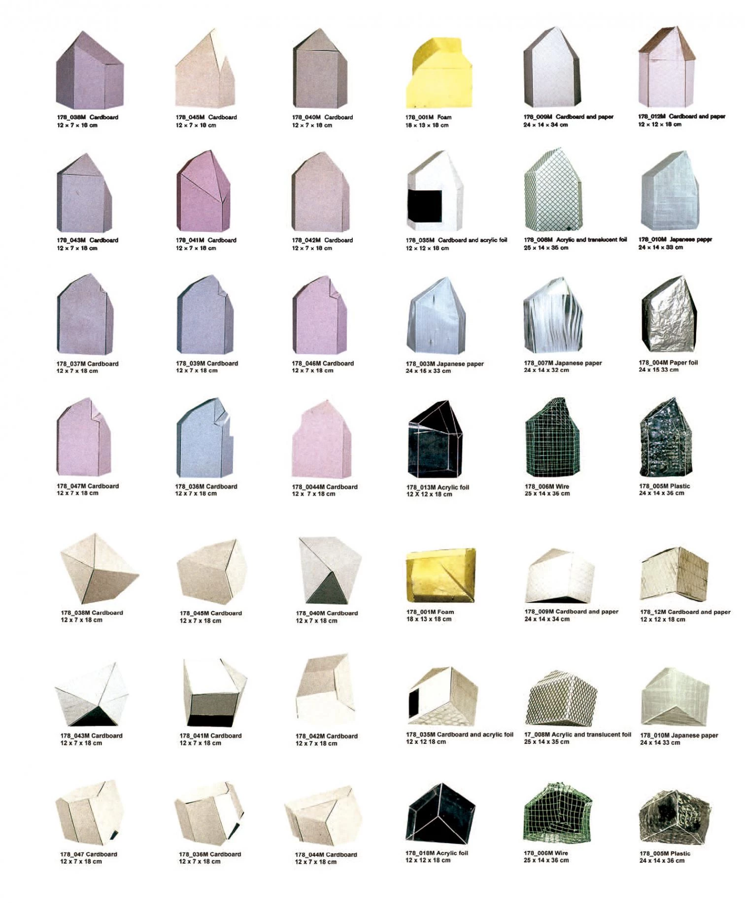
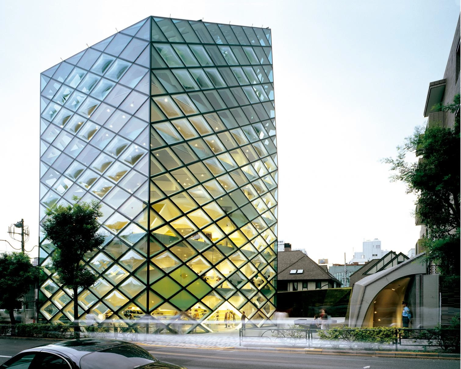
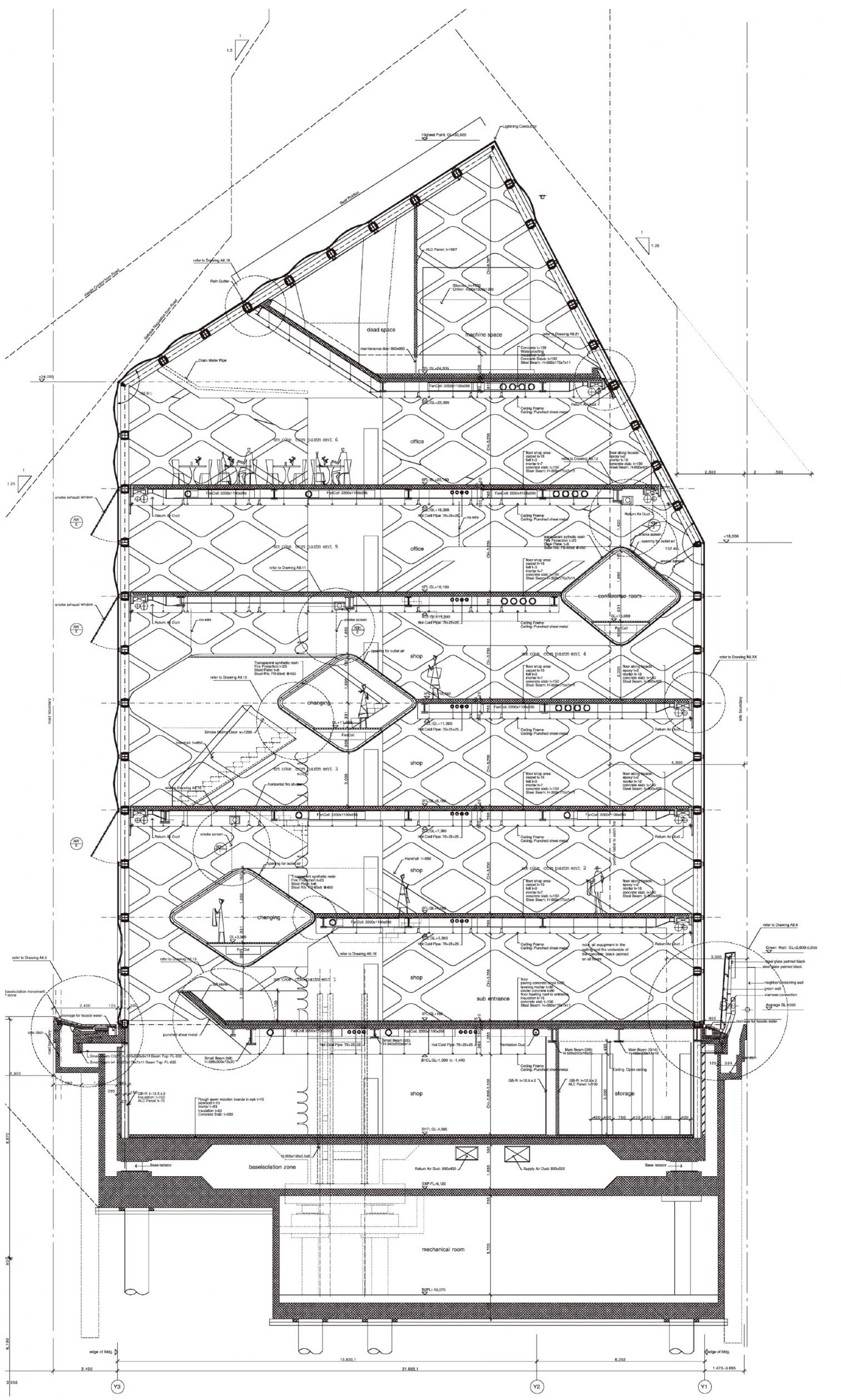
Through this process, it acquired a kind of crystal form. The variety of ways one could interpret the volume left over by the zoning was amazing. The decision to build a narrow, tall building led to an extremely visual, sculptural shape, but also a very simple and immediately recognizable one. Depending on the angle from which it was seen it shifted from being a crystal to being a typical, in fact prototypical, house; it was also a ‘bursa’, which is a typology for a bag, a precious bag. Ultimately, the building was treated like a plant, placing it where the best conditions could be found for it to grow.
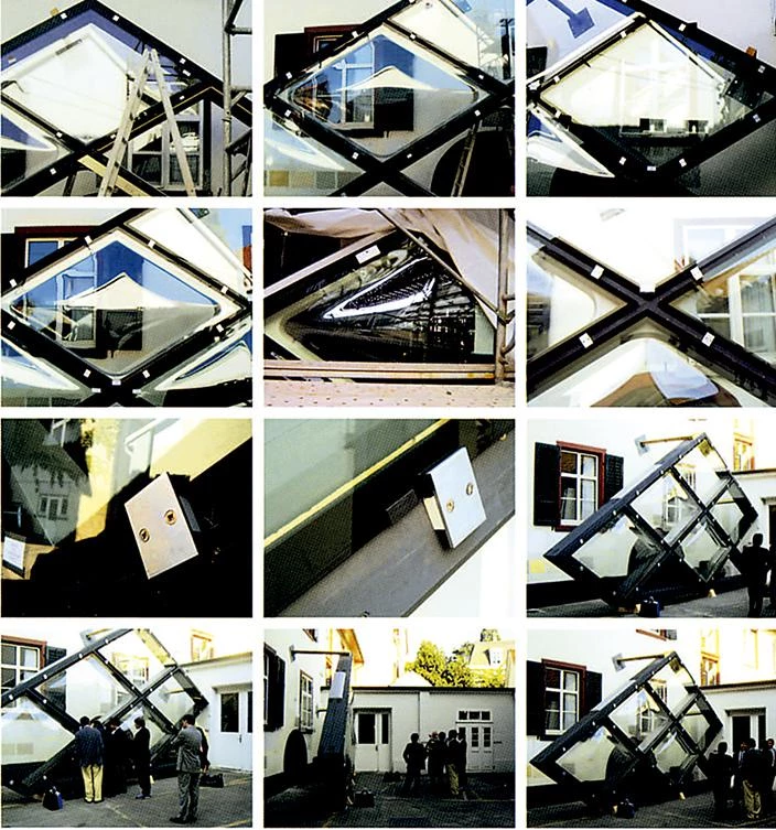
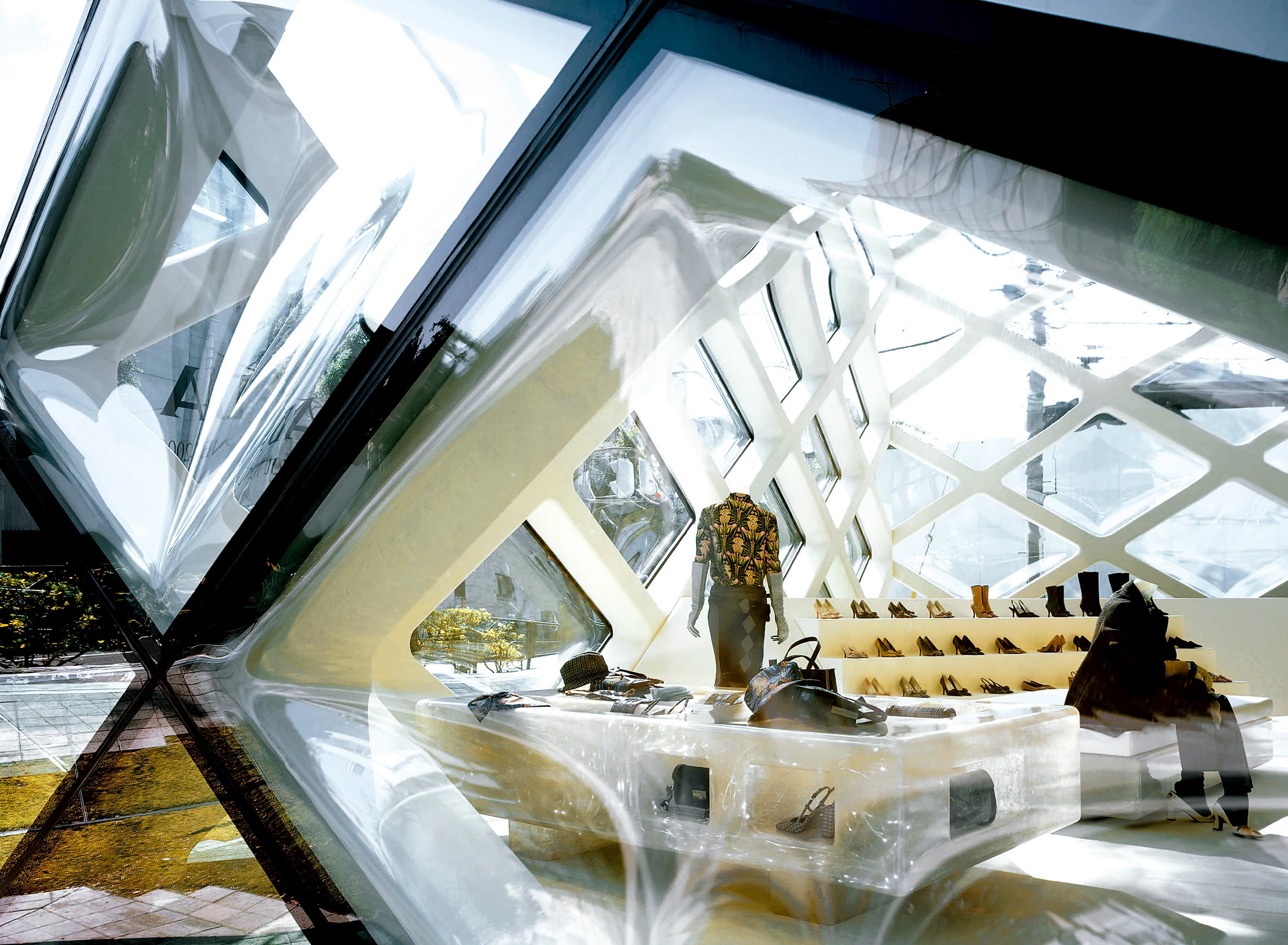
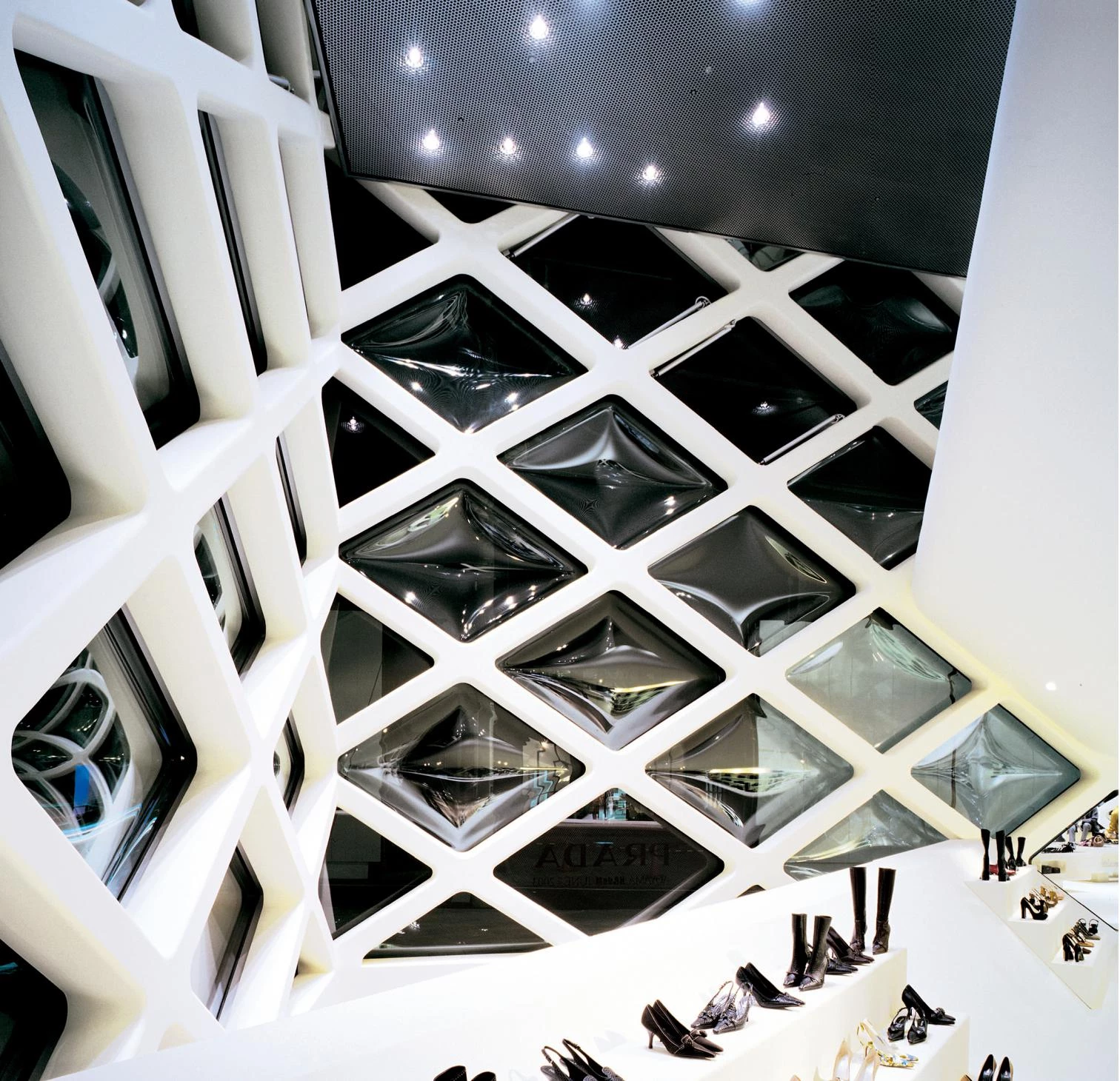
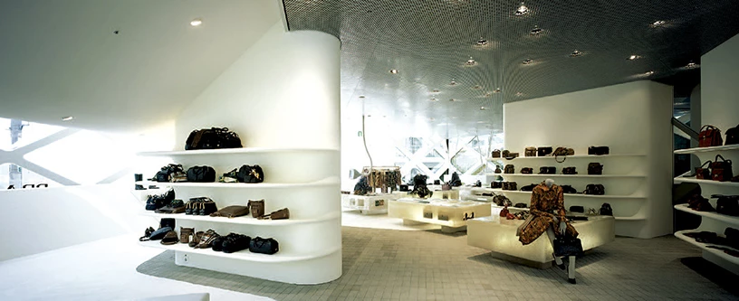
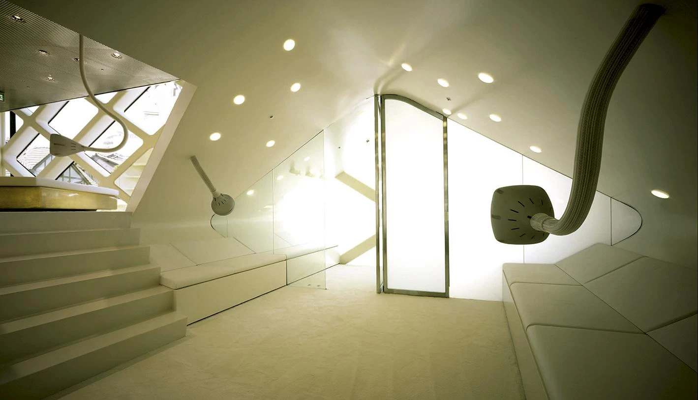
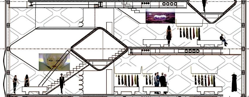
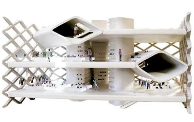
Inside the building, the space is fluid, with connections between each of the floors so that visitors do not really distinguish between floors but perceive the building as one continuous space. All these ambitions resulted in a great technical complexity: in terms of structure, glazing and fire safety regulations, the building ended up being one of the most complex structures in Japan.
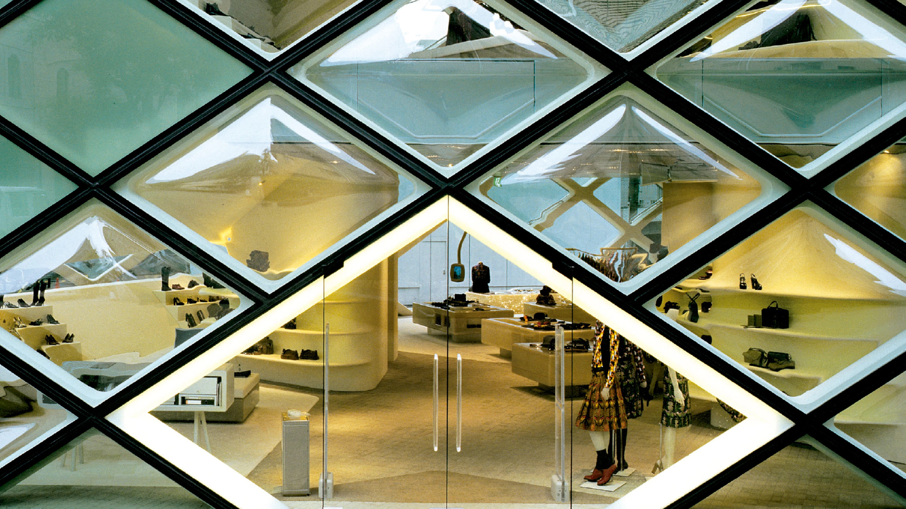
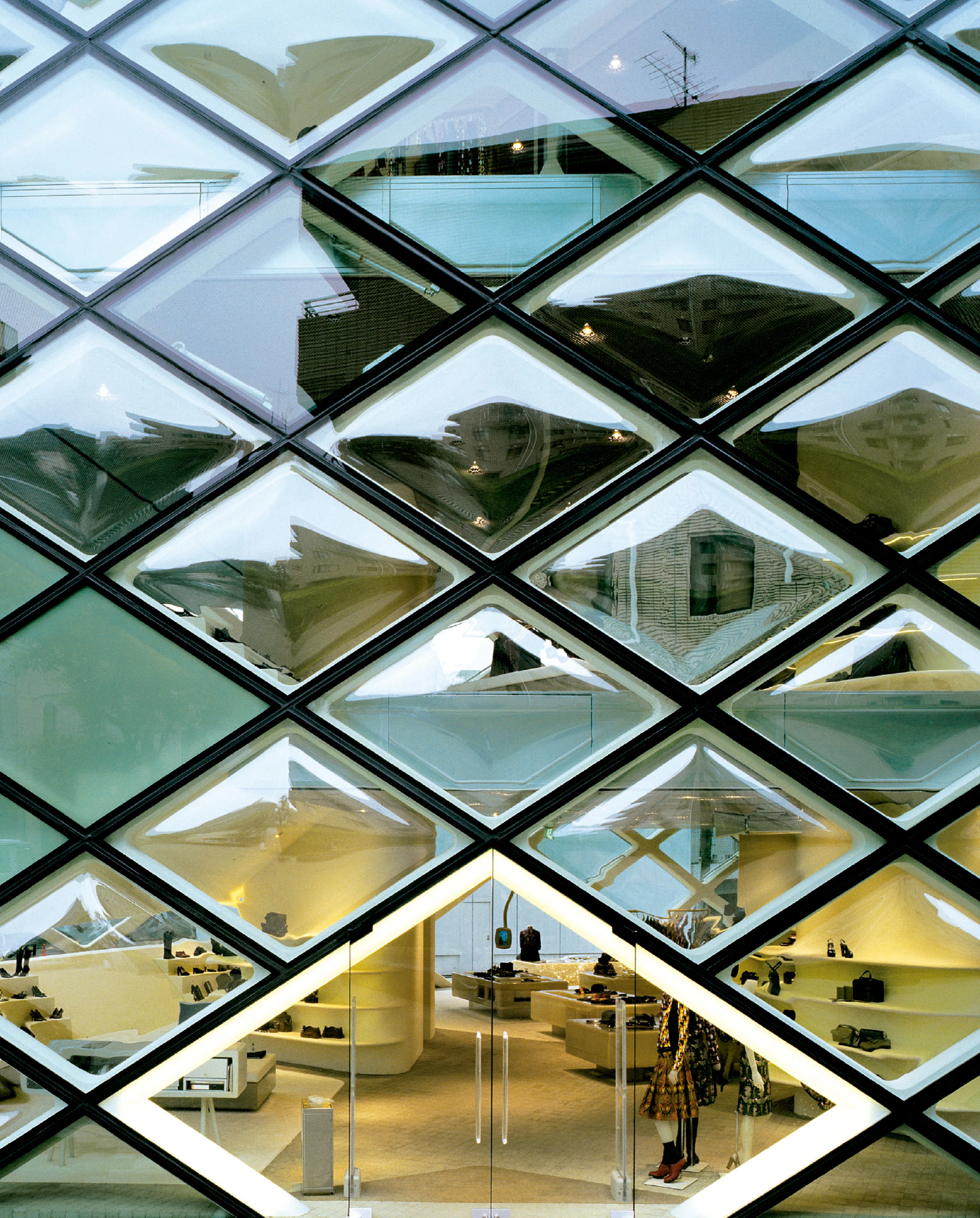
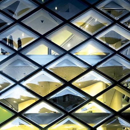
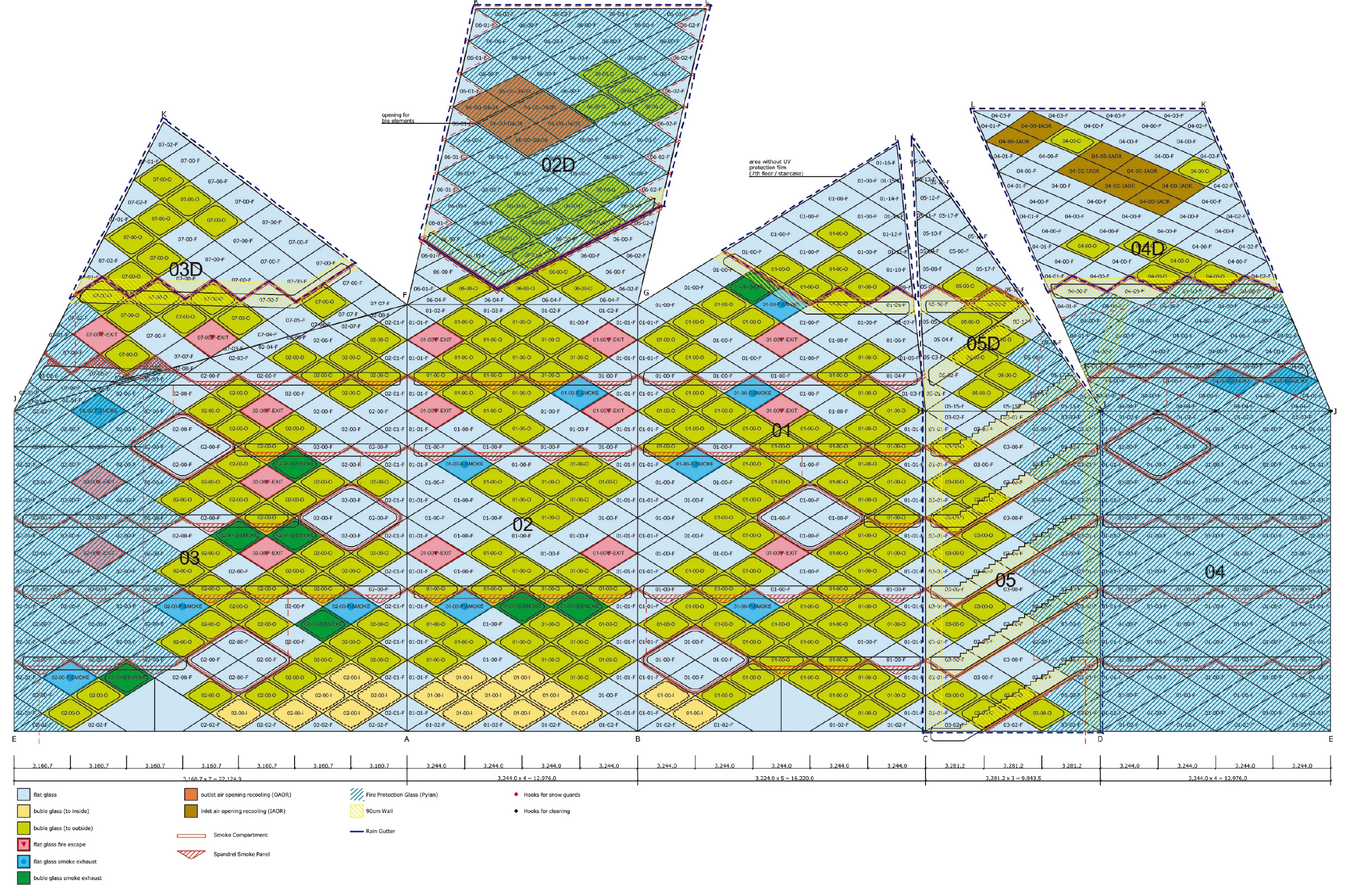
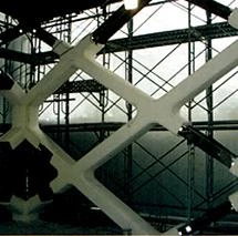
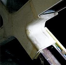
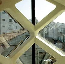
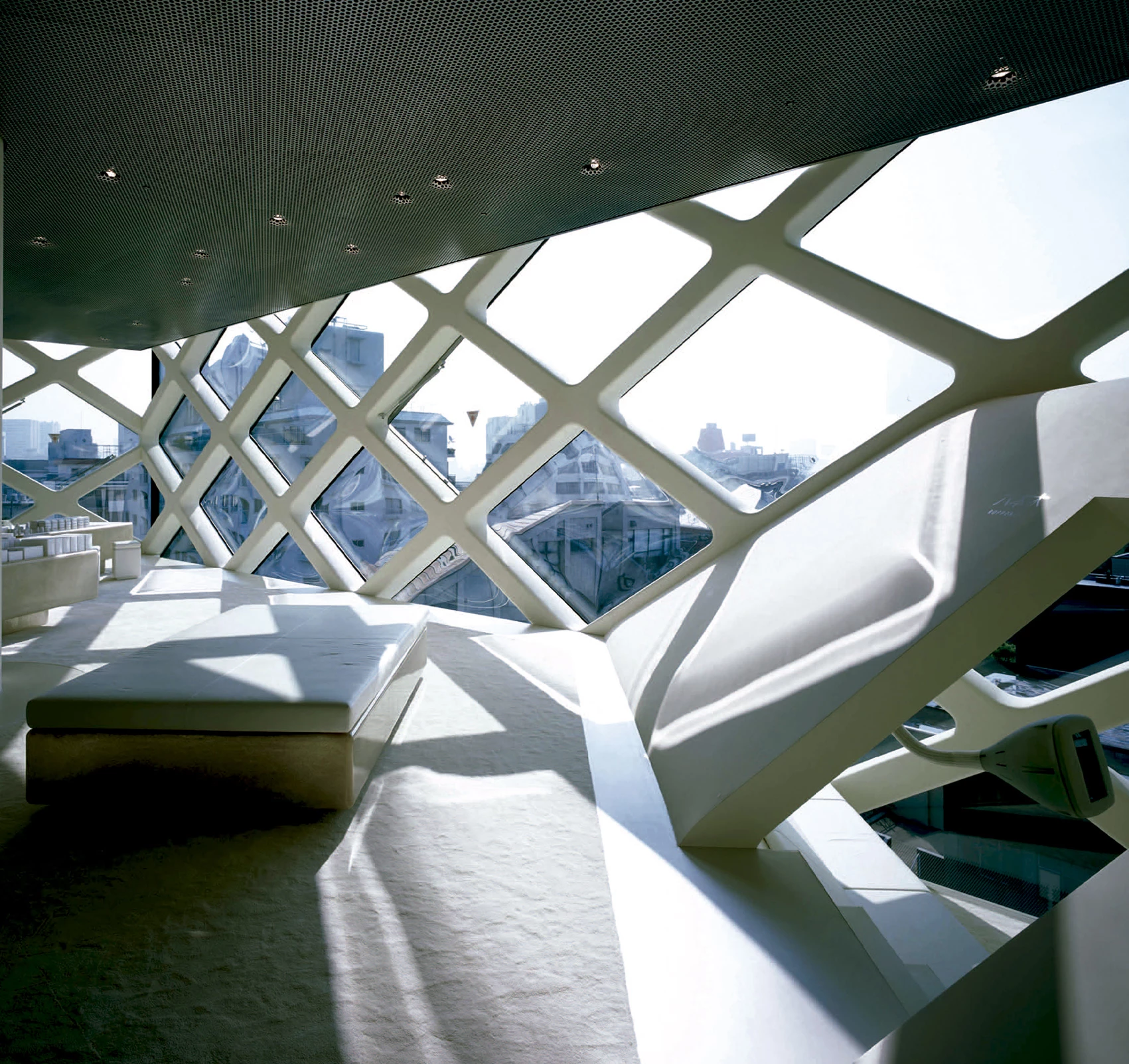
The structure, space and facade form a single unit. The vertical cores, the horizontal tubes, the floor slabs and the facade grilles define the space and also the structure. Every single visible part of the building (except for the glass) is structure, space and facade at the same time.

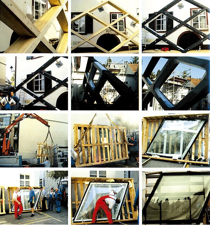
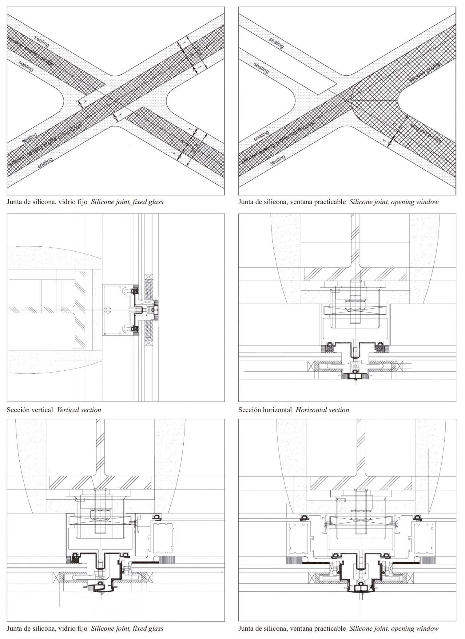
Cliente Client
Prada
Arquitectos Architects
Jacques Herzog, Pierre de Meuron, Stefan Marbach,Wolfgang Hardt, Reto Pedrocchi
Colaboradores Collaborators
L. Andrisani, A. Fries, Y. Himeno, H. Kikuchi, S. Okuda, D. Pokora, G. Schmid, M. Tinner
Consultores Consultants
Takenaka (estructuras, instalaciones, protección contra incendios structural, mechanical engineering, fire safety); WGG Schnetzer Puskas (estructuras structural engineering); Emmer Pfenninger (fachada facade); Arup (iluminación lighting)
Contratista Contractor
Takenaka Corporation
Fotos Photos
Nacása & Partners, Christian Richters

