It is difficult to converse in screams and whispers. The pavilions of the Hannover Expo hawk their symbolic merchandise in ways so diverse that the visual cacophony grinds the messages, reducing them to the friendly magma of recreational leisure. In 1992, the Swiss of Locarno Michele Arnaboldi and Raffaele Cavadini won the initial urbanistic competition by proposing a square citadel with an orthogonal internal grid, the disciplined geometry of which endeavored to subject the pavilions to the contained rigor of a regulated dialogue. But the heterogeneity of the participants’ demands made it necessary to draw up a more ductile project, and this would be carried out to the very end by the architect and town planner Albert Speer (son of Hitler’s architect of the same name who built the classicist German pavilion of the Paris Expo of 1937 and was the Third Reich’s Armaments minister). Speer, with the help of the Munich architect Thomas Herzog and the now deceased Zürich landscape architect Dieter Kienast, supervised the process with efficiency and pragmatism, adding two pavilion zones and several theme gardens to existing facilities of the Hannover Messe.
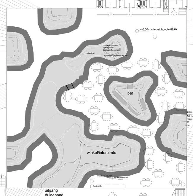
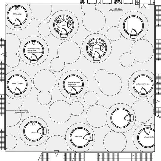
Within the modest and sober development of Hannover’s Expo, which achieves a return on the investments due to its link with the Fair, the pavilion of the Netherlands by MVRDV stands out for its spectacular nature.
The end result is a modest and sensible precinct – less spectacular than Seville 92, but more ambitious than Lisbon 98 – where the huge investments in infrastructure and transport will pay off through their link to permanent fair premises, and where the seemingly inevitable frivolity of pavilions is compensated by abstract gardens of hermetic beauty. Reasonably faithful to its aim of reconciling technology and nature with its emphasis on the economy of material resources and the recyclable character of temporary constructions, this twenty-second universal exposition is the first ever to be held in Germany (the one planned for Berlin in 1896 never pushed through), and its responsible low profile well reflects the insecure pride of a nation traumatized by recent history. The architectural mediocrity of its own pavilion, exclusively concerned as it is about the political correctness of transparent functionality (monumentality and opacity still being associated with Nazi esthetics), and featuring in its gallery of historic personages the likes of Steffi Graf but not Goethe (a name invoked in the past to promote authoritarian causes), illustrates the more deplorable aspect of such identity crisis.
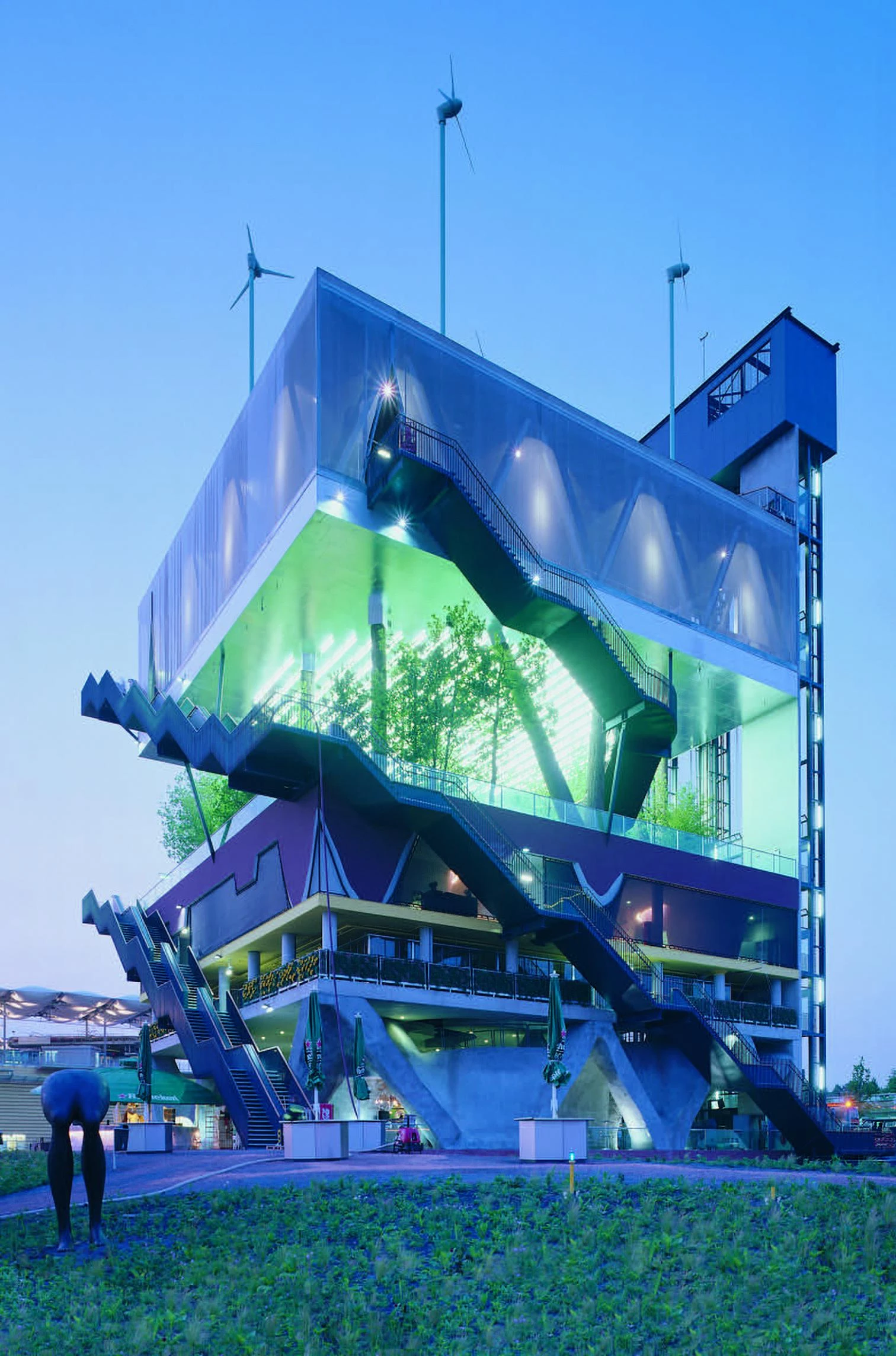
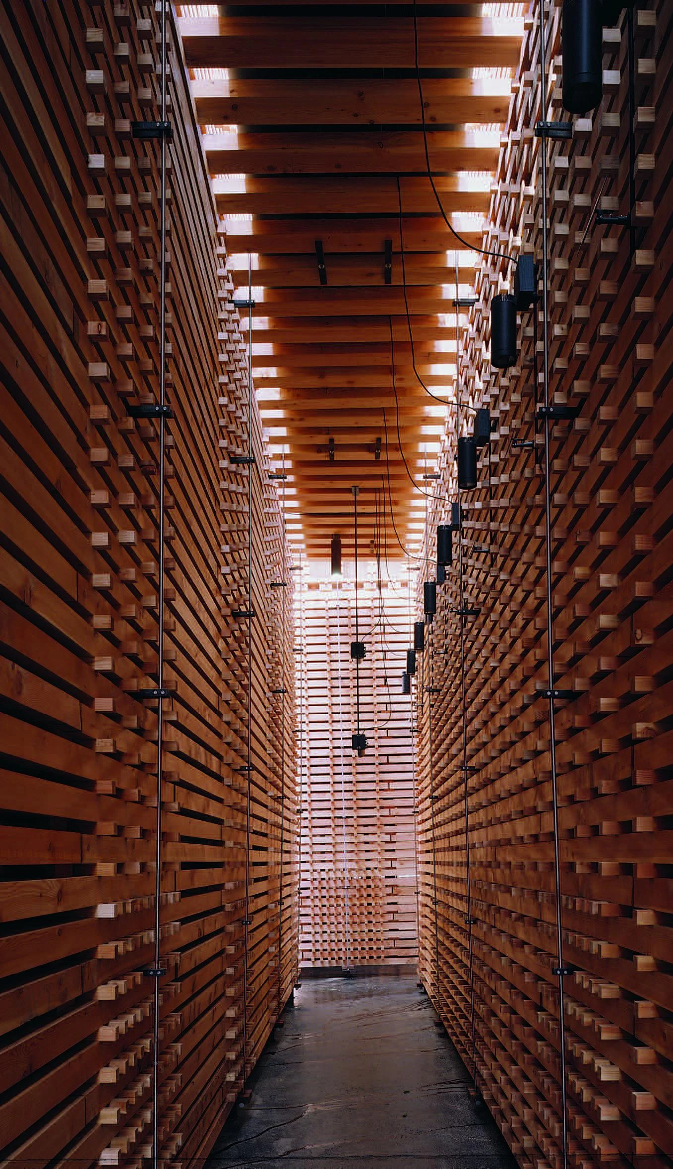
Traversed by the inevitable cable railways and footbridges, articulated by Kienast’s linear parks and a lake featuring Herzog’s elegant wooden parasols, the jungle of pavilions is a mixture of the deplorable and the excellent, but at least two constructions will not go unnoticed, representing, as they do, as much the extremes of the contemporary architectural debate as the two most dialectically opposed attitudes that can possibly have a place in an exhibition of this kind. The Dutch pavilion, designed by the young and popular Rotterdam team MVRDV, piles up with surreal sensibility the five different landscapes of the Netherlands, from dunes to woods, in what is at the same time a practical illustration of its war cry for maximum occupation of land, FARMAX, and a metaphor of the needs of Lebensraum in their very populated territory. And the Swiss pavilion, a work of Peter Zumthor, the veteran master from Chur, stays clear of any expositional exhibitionism by reducing the representation of his country to a labyrinth of unpolished wooden strips that will be reused as building material once the Expo is over, but in the meantime offer fine food and music to visitors venturing into their intimate and cordial penumbra.
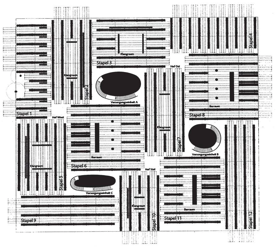
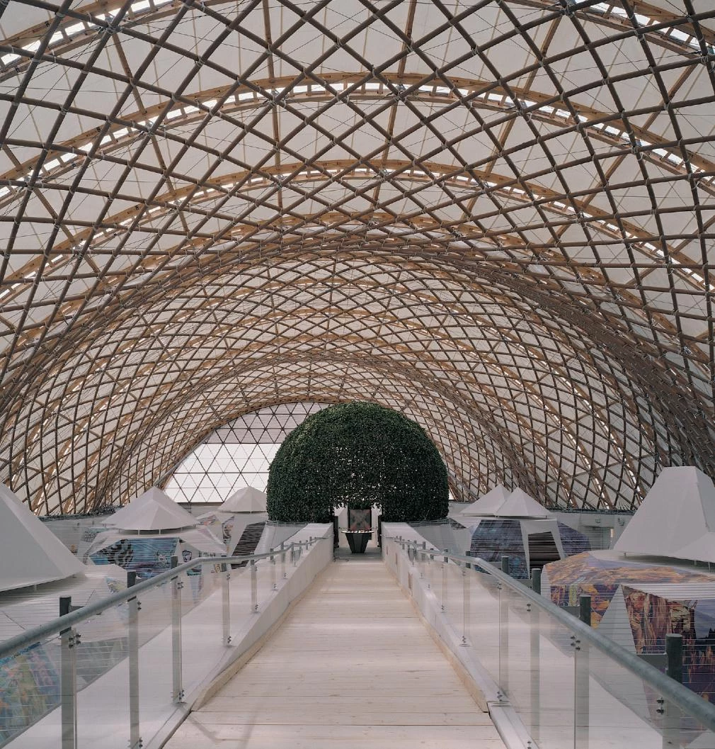
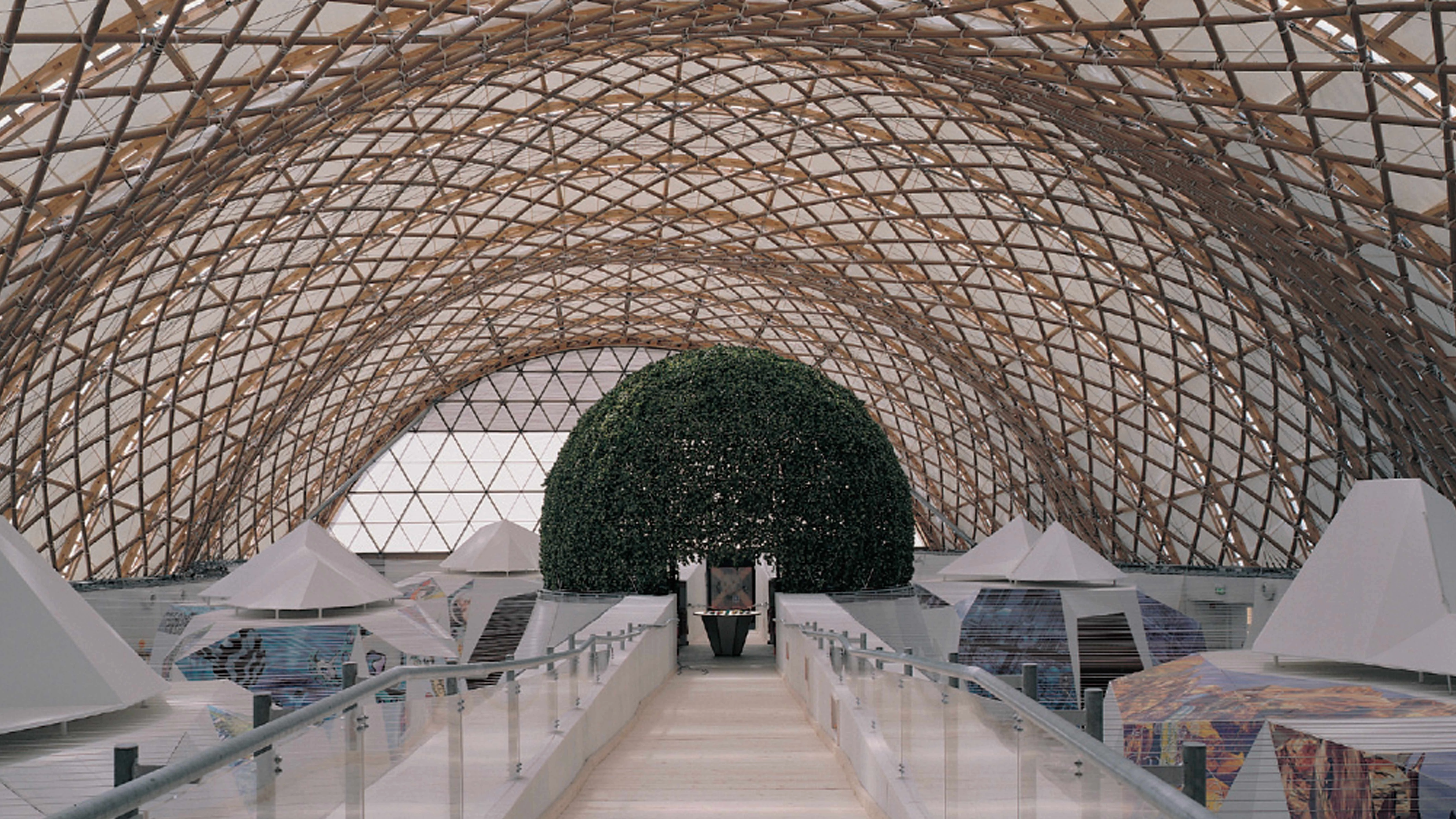
The Swiss pavilion by Peter Zumthor cuts the country’s representation down to a labyrinth of unsanded slats;and Japan adds the ecological touch, a vaulted space built with paper tubes by Shigeru Ban.
The ‘exquisite corpse’ of the Rotterdam youngsters, once again busy building the ideas of their compatriot Rem Koolhaas (from the concrete dunes of the Agadir project to the heterogeneous compacity of the proposal for the Paris TGB) before he himself is able to, is an excellent sample of the provocative and abrasive experimentalism of Holland’s mediatic avant-garde. In its turn, the “Swiss soundbox,” as Zumthor calls it in a description more concerned with the quality of the food, the music and the attention of visitors than about the actual architecture, is an artistic installation and a theatrical performance that puts art and theater aside to offer our senses a refined ritual of hospitality, in a maze of pinewood and larchwood striped with shadows and breezes that admirably represents the finest tactile and emotive qualities of the architecture of German-speaking Switzerland. Between Dutch screams and Swiss whispers, however, it is difficult to imagine a dialogue, and we can hardly expect one to ensue in the motley context of an Expo. Each removed from the arguments of the others, and each circulating autonomously like elementary particles through the planet of ideas and forms, the Hannover pavilions display their national and architectural identities in a succession of soliloquys that augur more fatigue than learning.
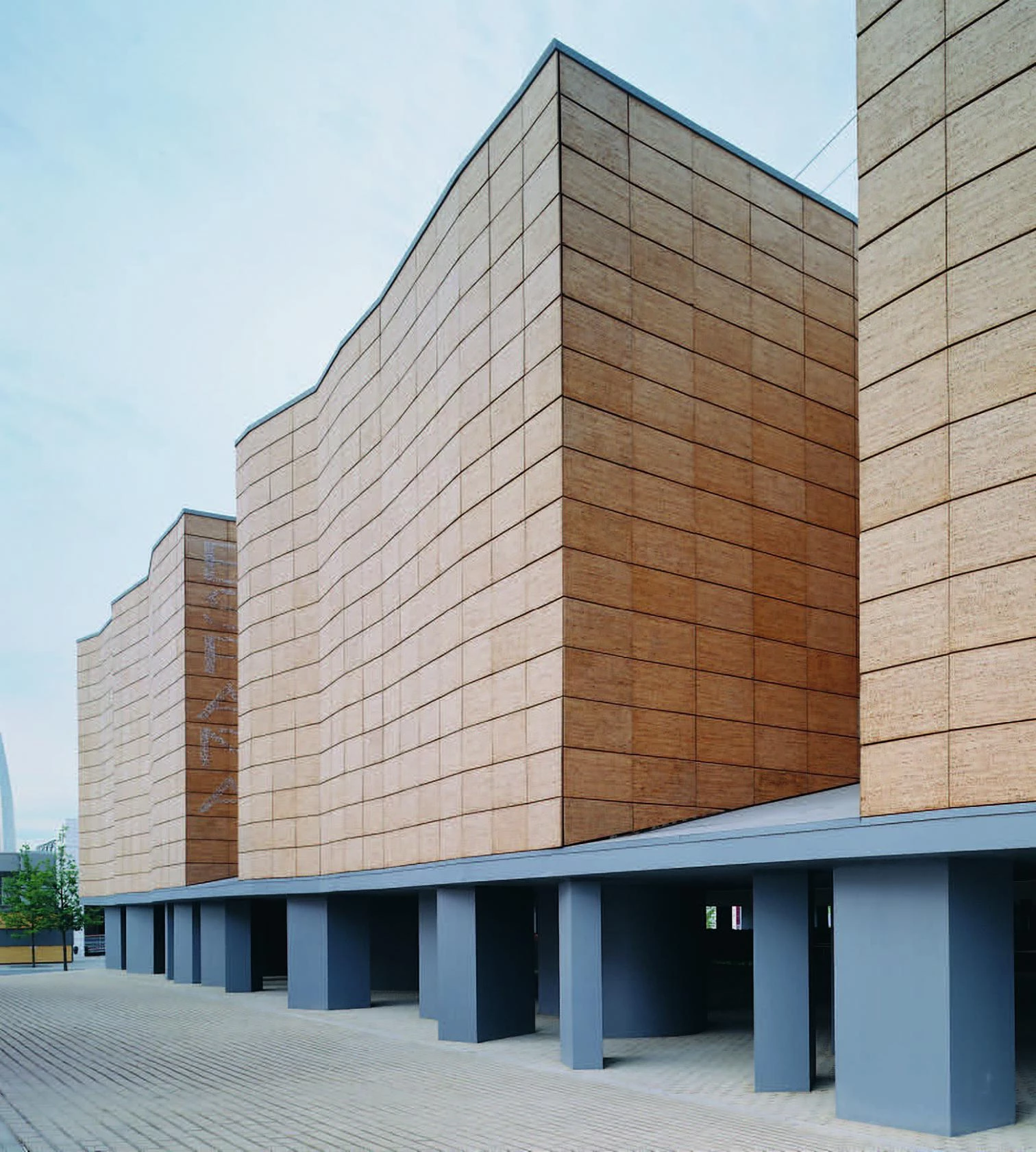
In any case, the ecological emphasis, the recyclable character and the temporary nature of the pavilions have together produced the usual crop of wooden constructions. Switzerland has of course selected this material, but so has Finland with its usual austere geometries or Hungary with its inevitable expressionist forms. Iberia has opted for cork, however, and both Spain’s pavilion by Antonio Cruz & Antonio Ortiz and Portugal’s by Álvaro Siza & Eduardo Souto de Moura employ this warm and lightweight material. But whereas in the Portuguese case this is true only for the external cladding of a large hall topped by an undulating textile sheet, in the building of the Spanish tandem the faceted cork facade that folds to create deep gaps toward the luminous interior courtyard is the most significant element of an exquisite work, at once severe and light, that in its reticent monumentality manifests a tenacious desire for permanence.
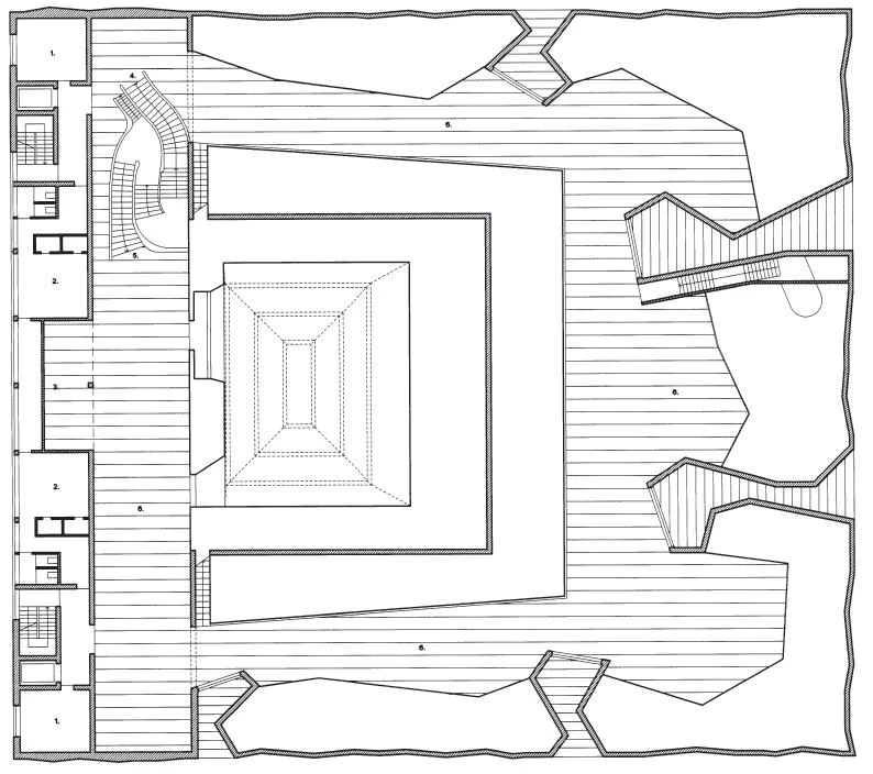
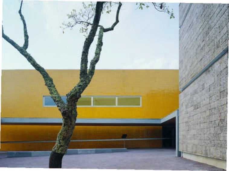
The Iberian Peninsula chose recycling through a vernacular material, cork, that clads the large hall of Siza and Souto de Moura’s building for Portugal, and defines the folded facades of Cruz & Ortiz’s Spanish pavilion.
Japan, finally, has chosen for its pavilion another unexpected building material, paper, and what better architect for this than the young Shigeru Ban, who already boasts several brilliant works where paper features as a structural element, and who on this occasion, with the collaboration of the legendary engineer Frei Otto, has erected a delicate vault made of cardboard tubes that, alas, strict German construction guidelines have made it necessary to reinforce with plastic and metal, thereby frustrating the commendable initial idea of recycling the pavilion to produce school notebooks and toilet paper. Safety comes first in Germany.
