Mixed Complex, Muttenz
Bürgin Nissen Wentzlaff Architekten- Type Housing Hotel Shopping center Commercial / Office Collective
- Material Vidrio mateado Aluminum
- Date 1996 - 1999
- City Muttenz
- Country Switzerland
- Photograph Ruedi Walti
Near the meander of the River Rhine that has protected Basel since time immemorial, and a just little upriver, lies Muttenz, now a district to the east of the Helvetian cosmopolis, having been absorbed by the city in the growing sprawl of houses around it. Not far from the triple frontier - about five kilometers or so from the point where Switzerland, Germany and France meet - the territory of Muttenz is cluttered with the nodes of the road that ties together three countries, the way the great north flowing river once did.
Formal decomposition
The most notable building in this frontier- village turned city-quarter is its fortress church, out of which springs the old Main Street. At the far end of the street, just past the well-conserved village center, over an important thoroughfare and close to the district station, a large tract of land accommodates the shopping center, hotel and housing by the architects, Biirgin, Nissin & Wentzlafif. In an otherwise low-density zone which is characterized by disperse constructions, built up over the past two centuries, the architects, addressing the three parts of the brief, brought together three different volumes in a peculiar complex. The main question in the project lay in the difficult challenge of inserting in an old quarter the 2,500 square meters of a large commercial center. It is a typology that often comes across as a characterless container and which, with its accompanying advertising signs, is associated with the formal decomposition of a place.
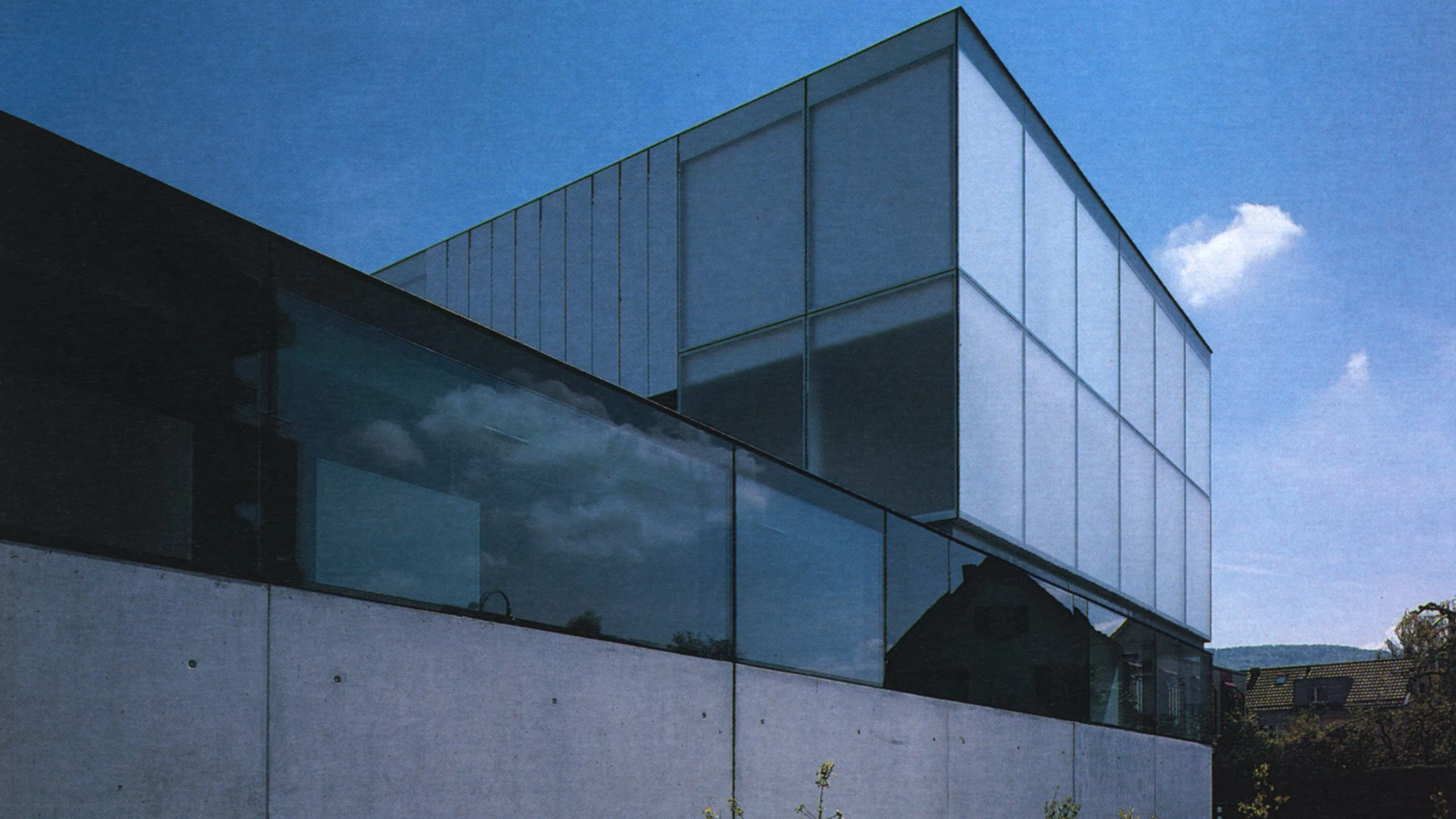
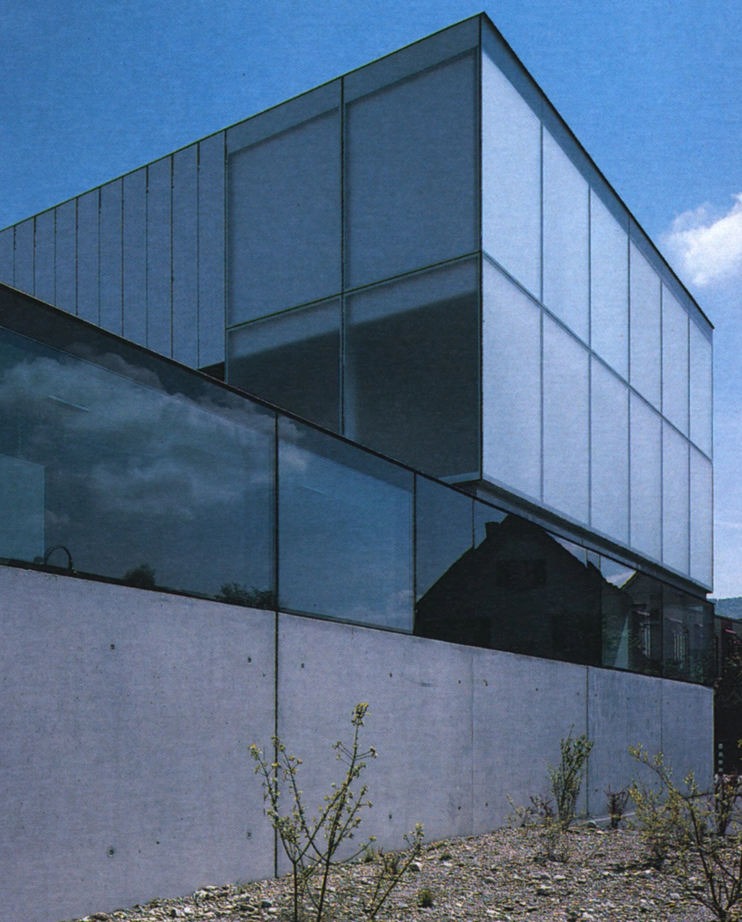
So here the architects thought of using the residence and the hotel to support and mitigate the presence of commerce. The three volumes surround a courtyardsquare, forming a still life of two boxes on the edges of a checkered tablecloth. A dimensional and structural grid organizes the peices and slots them all in to place - cold pieces of modern Swiss architecture, with polished materials and exact lines. Two white pieces on a black base.
Variations on a theme
The large flat commercial center presents itself like a box of dark, sometimes transparent and at other times opaque crystal that extends to the ground levels of the hotel and apartment volumes. These in contrast - rising four and two stories, respectively - are white, featuring panes of matte white glass and aluminum of the same color to form the exterior shutters. The dark plinth fragments into large windows and doors, though the architects have tried not to make the entrances to the commercial center stand out excessively. The facades of the two white volumes above continue its full-height paneling. The shutters over the glass panes are intended to create an ever changing facade, with climate and use forming variations on the same gridded theme. The complex is therfore, designed in such a way that it pays much attention to the surroundings while being confident of its presence. Both the hotel and the commercial center open on to the main street.
The hotel lobby repeats the age-old trick of a grand staircase rising to the rooms. Designed however in a manner more associated with large public offices than with a small, fifty-room hotel establishment, the stairs take up the north facade, ascending through high spaces and spanning in successive heights the open galleries that correspond to the floors of the bedrooms. The dramatic effect can be discerned on the main facade, through the white grid, because the opaque panels give way to transparent ones. On the opposite side, to the south, the rooms look onto the courtyard.
The small block of apartments on the other end has no vertical elements. It presents itself instead, as a row of duplex units that blend with the neighboring buildings and open out onto the pergola of the large esplanade of grass that forms the roof of the commercial center...[+]
Obra
Centro comercial, hotel y viviendas en Muttenz, Suiza.
Cliente
Coop Basel Liestal Ficktal.
Arquitectos
Edi Bürgin, Timothy Nissen y Daniel Wentzlaff.
Colaboradores
P. Oeltges, M. Schlegel, M. Küng, P. Laplace, H-P Lüttin, M. Müller, T. Nissen; Berchtold und Eicher (estructuras); Waldhauser Haustechnik & Haustec (instalaciones).
Contratista
S+B Baumanagement.
Fotos
Ruedi Walti.


