Hürzeler House in Erlenbach
Peter Märkli- Type Housing House
- Material Concrete
- Date 1997
- City Erlenbach
- Country Switzerland
- Photograph Gaston Wicky
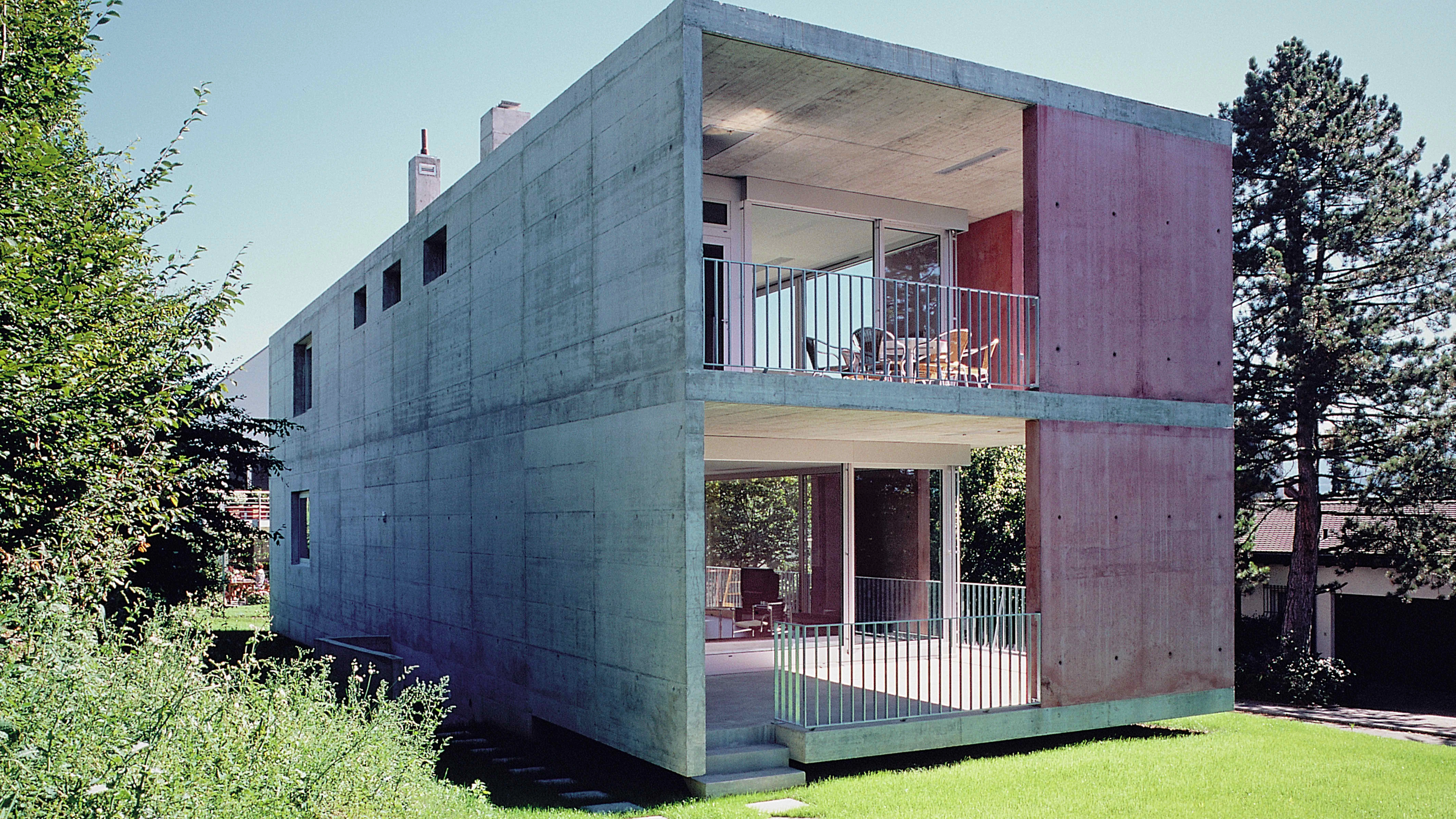
It was in the seventies that buildings of exposed concrete began to replace the white boxes of the classical avant-garde in signature house projects. The later works of Le Corbusier might have had something to do with it. Here Peter Märkli continues this tradition with a lyrical and refined example, an elongated box which establishes a subtle play between interior and exterior through red-dyed concrete panels at certain points of the front facade.
The house is positioned parallel to the slope of a valley in order to give itself an extraordinary view of the lake of Zürich, on a parcel delimited by two streets. The three-story construction is anchored to the ground through a half-basement level that shows the entrances into the house and the garage on the lakeward side but almost becomes a full basement at the rear, as the slope of the site rises.
On the lakeward facade this half-basement is set back with respect to the rest of the building, so that the two main floors above are perceived as a box floating on the lawn. Yet their actual interior spaces, on plan, are also set back, aligned with the half-basement, so that what really work to form the impression of a box are the extended floor slabs and the outer panels. The space between these facade panels and the fully glazed inner skin is a transition from interior to exterior: toward the lake it is an outdoor gallery, and on the northwest end, which affords the finest views, it widens to form a terrace.
The metal railings that close the outer limit where there are no panels are so fine that they do not visually compete with the thick floor slabs and the abstract red surfaces of the panels. The contrast between the inner glass box and the outer concrete volume is therefore emphasized, and the resulting interplay of compactness and openness in turn enhances the ambiguity created by the apparently aleatory checked arrangement of the lakeward facade panels, which almost look like sliding screens.
The layout follows a scheme which is habitual in elongated houses of this kind. A narrow band stretching along the rear facade of the building accommodates the bathrooms, the corridors and a straight, two-flight staircase, while the main living spaces are sequentially arranged in the remaining space. Through a partition that folds and unfolds like an accordion, the large diaphanous living room of the first floor level can be divided into two parts when desired...[+]
Cliente Client
Harry Hürzeler
Arquitecto Architect
Peter Märkli
Colaboradores Collaborators
Gody Kühnis
Consultores Consultants
Walt + Galmarini (ingeniería engineer); Rino Weder (ventanas de aluminio aluminum windows)
Fotos Photos
Gaston Wicky


