Fondaco dei Tedeschi, Venice
OMA - Office for Metropolitan Architecture- Type Refurbishment Commercial / Office
- Date 2009 - 2016
- City Venice
- Country Italy
- Photograph Delfino Sisto Legnani Marco Cappelletti
- Brand Tecnobrevetti Sicurtecno
Fulvio Irace
“I think it is very possible that just as you cannot be critical of oxygen, you cannot be critical of shopping. Shopping for me is another word for modernization.” In 2001, when Rem Koolhaas disseminated his manifesto on shopping as “the founding act of urbanization,” he was thinking of Las Vegas and Singapore, and Dubai could already be discerned in his horizon. But it’s a long way from Las Vegas to Venice and the last ten years have seen Koolhaas fall off the horse, like St. Paul enroute to Damascus. With the reopening of the Fondaco dei Tedeschi as what it was originally, a monumental container of merchandise, the Dutch architect provides an example of good intentions applied to the reuse of the building-fetish that best synthesizes the ambiguous nature of the myth of ‘antimodern’ Venice: the city which, from Palladio to Wright, has been wary of and averse to novelty, jealous as it is of preserving the appearance of an identity based on a desire to remain unchanged in the course of time.
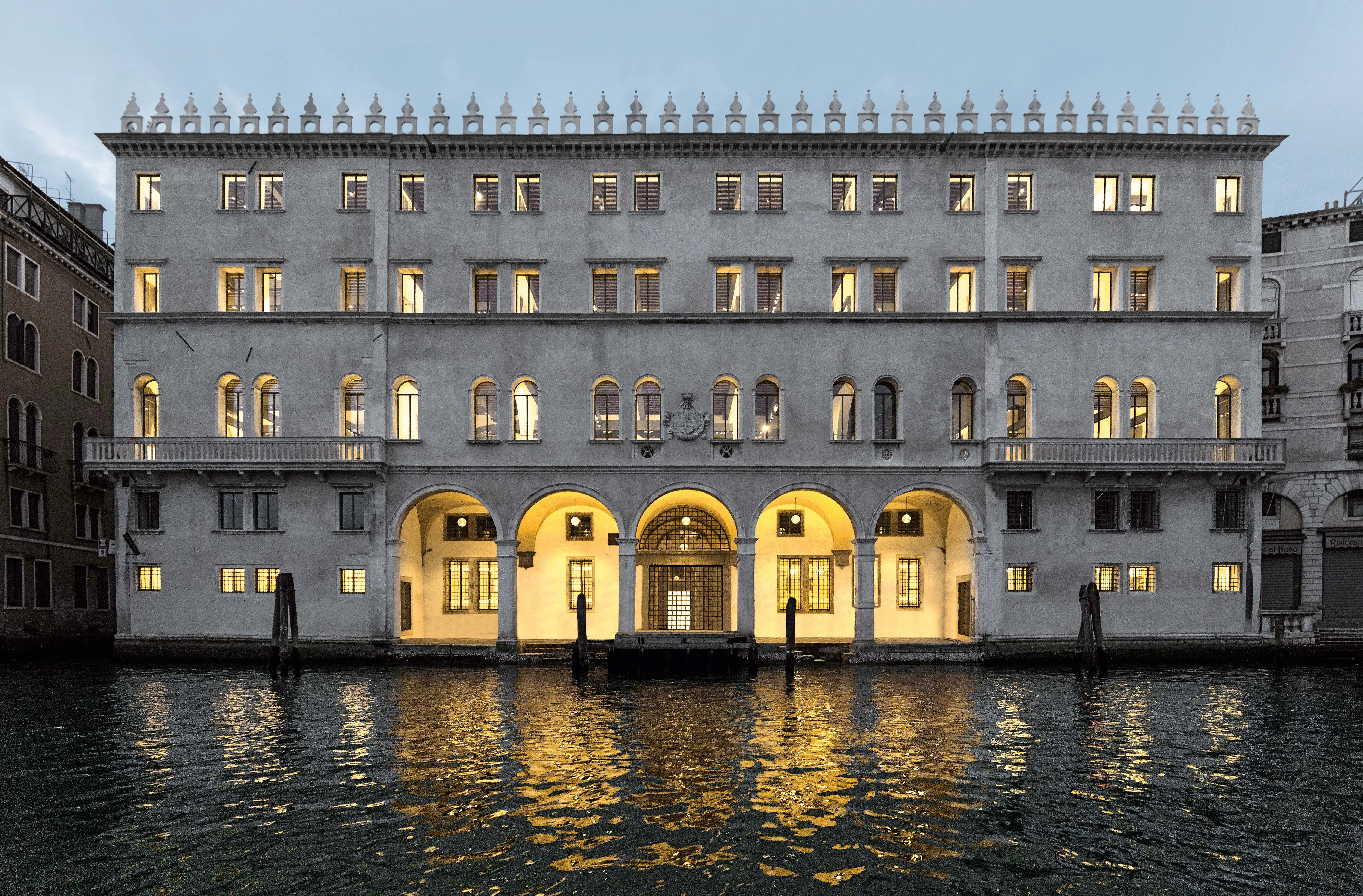
Since the 13th century the Rialto factory has been a major building in the political and institutional history of the Repubblica Serenissima: it was a place for receiving and regulating merchandise in the trade between Northern Europe and the Mediterranean. Through its spaces – it was not so much an isolated building as a small city within the city – flowed both basic and luxury goods, metals used in the Zecca (state mint), and huge incomes garnered by the Repubblica through tariffs. All this required rigorous control of transactions, making the building a mercantile strongbox and also an espionage center, so important that when it burned down in 1505, plans for reconstruction on an unprecedented symbolic and monumental scale were immediately made.
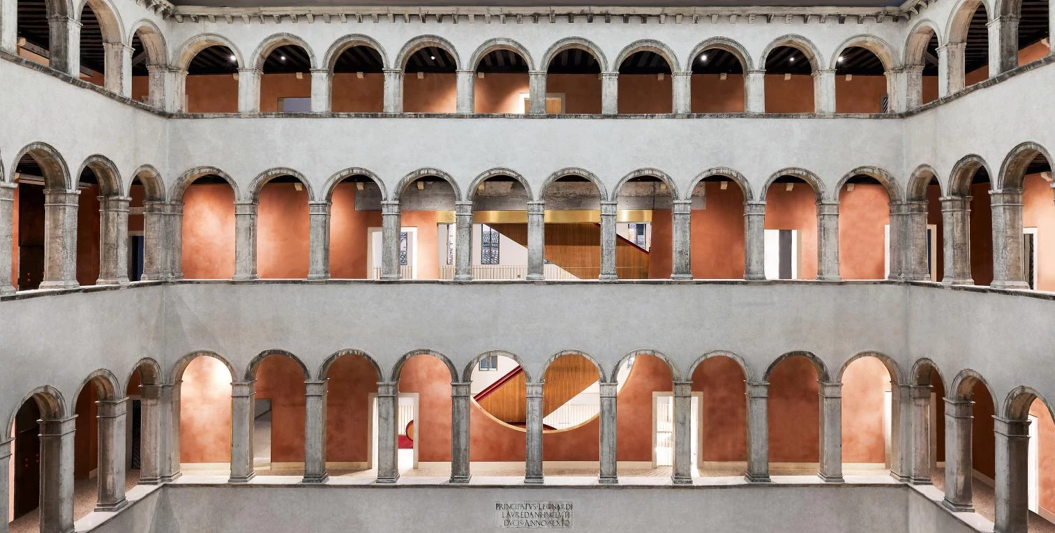
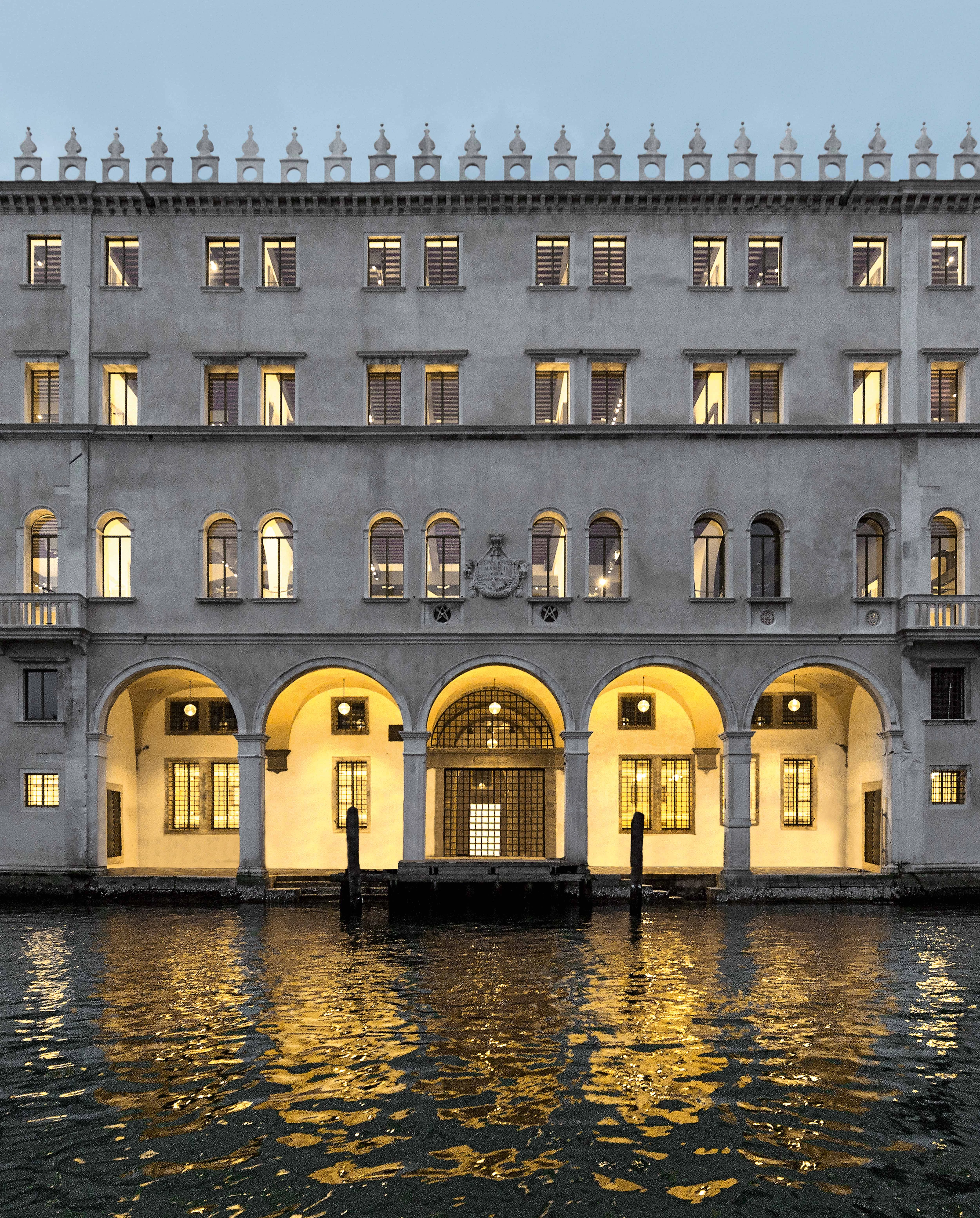
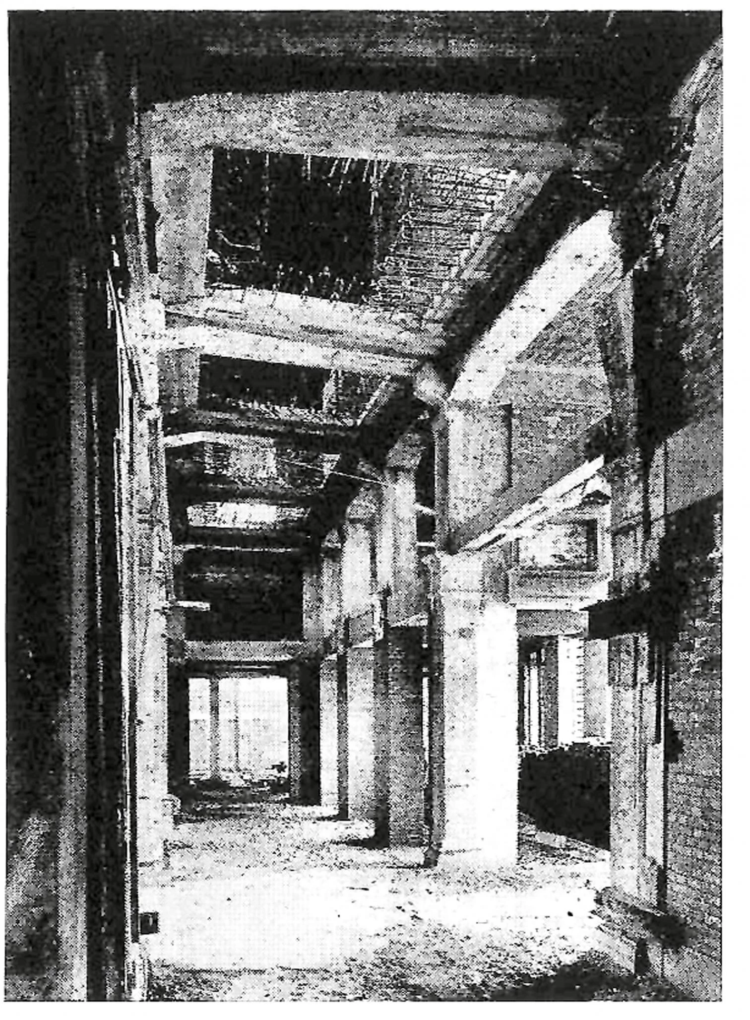
Besides the facade, decorated by Giorgione and Titian, the reconstruction changed the interior, with a four-height courtyard forming a loggia of Renaissance splendor. When the Repubblica ended in 1797, the building lost its commercial function to be absorbed by the administration – French, Austrian, finally Italian – and turned into a post office. Restoration in 1938 involved a cumbersome redistribution of the interiors and the invasive addition of a concrete structure to serve as skeleton or straitjacket holding up the building and adapting it to its new use, as Venice headquarters of Poste italiane SpA.
Mistreated though complete, the building suffered interventions that made it a symbol of ‘hyper-Venetian.’ Rejection of novelty led to fetishism, the idea that the Fondaco should wear the mask of continuity with the Repubblica’s glorious past, demoting history to mere show.
The intervention reinforces the leading role of the Tenaissance atrium and returns the building to its original commercial function, in the past a major Venetian center for distributing merchandise.
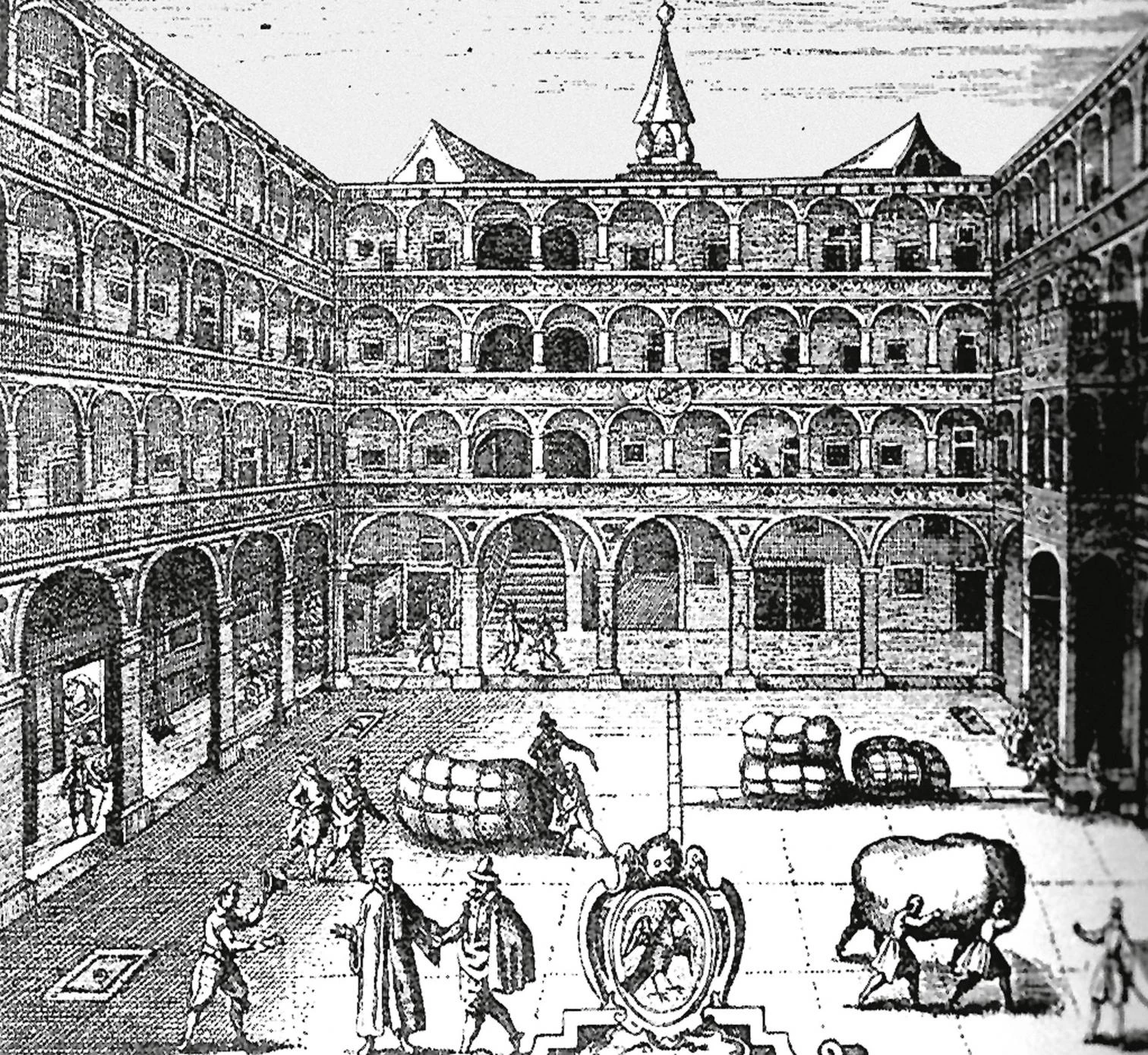
In 2008, no longer a post office, the Fondaco took on a third identity. The building was acquired by the Benetton Group, which initially thought of converting it into a luxury resort, and entrusted the refurbishment project to OMA, the firm captained by Rem Koolhaas. This was the time of the Harvard Design School Guide to Shopping, the bible of anyone interested in knowing about art and big retail business, from Niketown or Disneyworld to the mirages of new malls in the Far East: 800 pages of photographs, statistics, historical data, and barcodes reinforcing the idea of the “marketplace as an arbiter and regulator of life” and a way of seeing shopping not only as a hedonistic and consumerist activity, but also as a vital process for urban societies of the new millennium. Four decades after Delirious New York came another “retrospective manifesto,” this time on the importance of the exchange of goods.
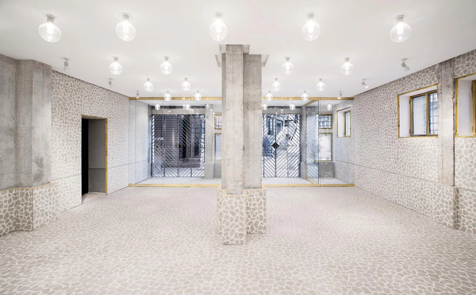
Convincing the Benetton family to change the program of the project was a simple matter for a communicator as skilled as Koolhaas: the building would not be an exclusive hotel, but a new kind of shopping gallery, one in tune with the successful experiment undertaken by the Prada group years before. In the 2010 Venice Architecture Biennale, OMA put together the ‘Cronocaos’ exhibition on preservation, which Koolhaas considers to be an expression of the arrogance of modernity, the obsession with loss, and the loss of identity in designs. Two rooms full of historic images and ‘big data’ – presented in a way following the method typical of the Dutch school – tell a convincing, coherent, and epical story – “From the beginning, OMA and AMO have been obsessed with the past” – upon which to develop a new field of research: “The present has no capacity to take stock of the coexistence of radical change and radical permanence in which our future consists.”
In Ruskin’s Shadow
It was in this context, in the shadow of Ruskin and Viollet-le-Duc, that a first version of the project for repurposing the Fondaco was presented, and the matter became a subject of nationwide civic debate, with all the graveness of an issue which John Ruskin had already addressed, in the mid-19th century, in his influential work The Stones of Venice. The answer of the British critic – restoration is “the worst of all destructions” – was a blunt reaction to restoration understood as falsification, but later, in the early 20th century, Italy saw the emergence of a different current, summed up in the stand of Gustavo Giovannoni: “Better an imperfect restoration than to deprive cities of their identity.” Today the discussion takes on dramatic reality in Venice, where the image of the the tourist city conditions the future from the moment when, in consideration of the image, anything ‘new’ is explicitly ruled out while overlapping interventions of adaptation and transformation are carried out with modern techniques, camouflaged beneath the costumes of an eternal present.
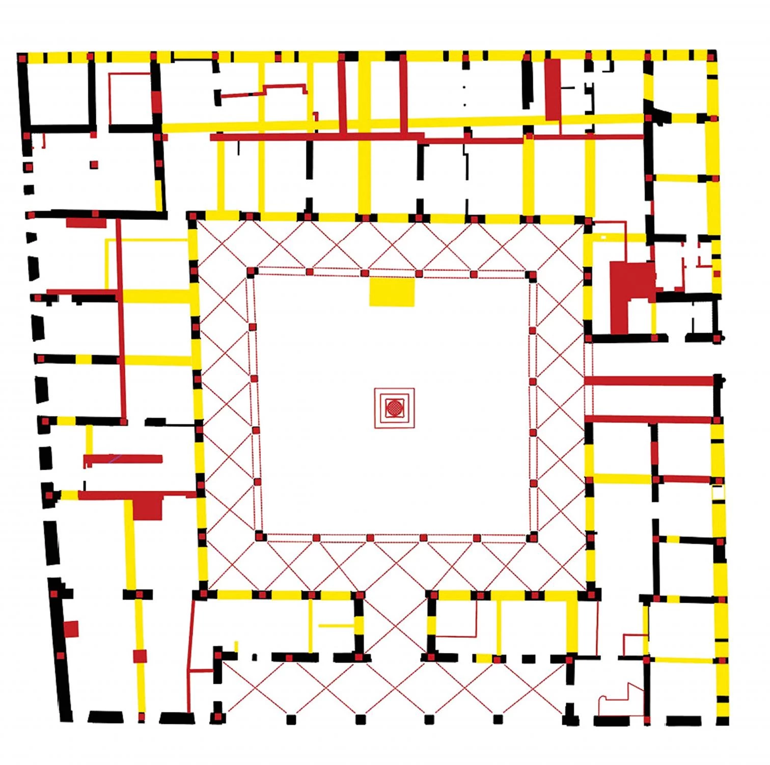
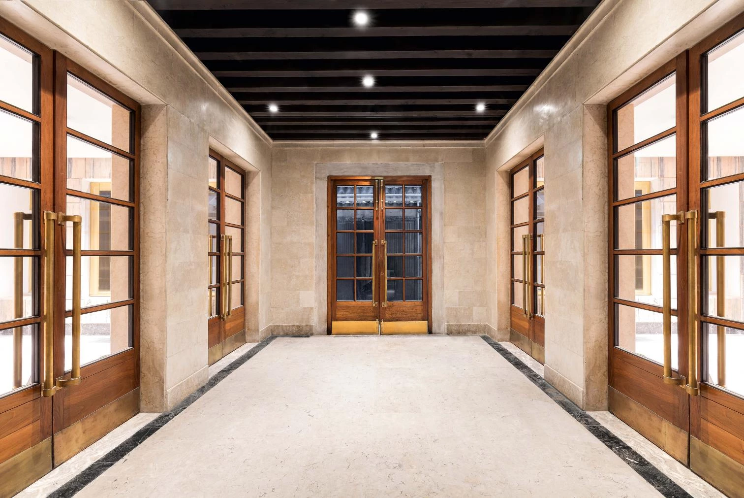
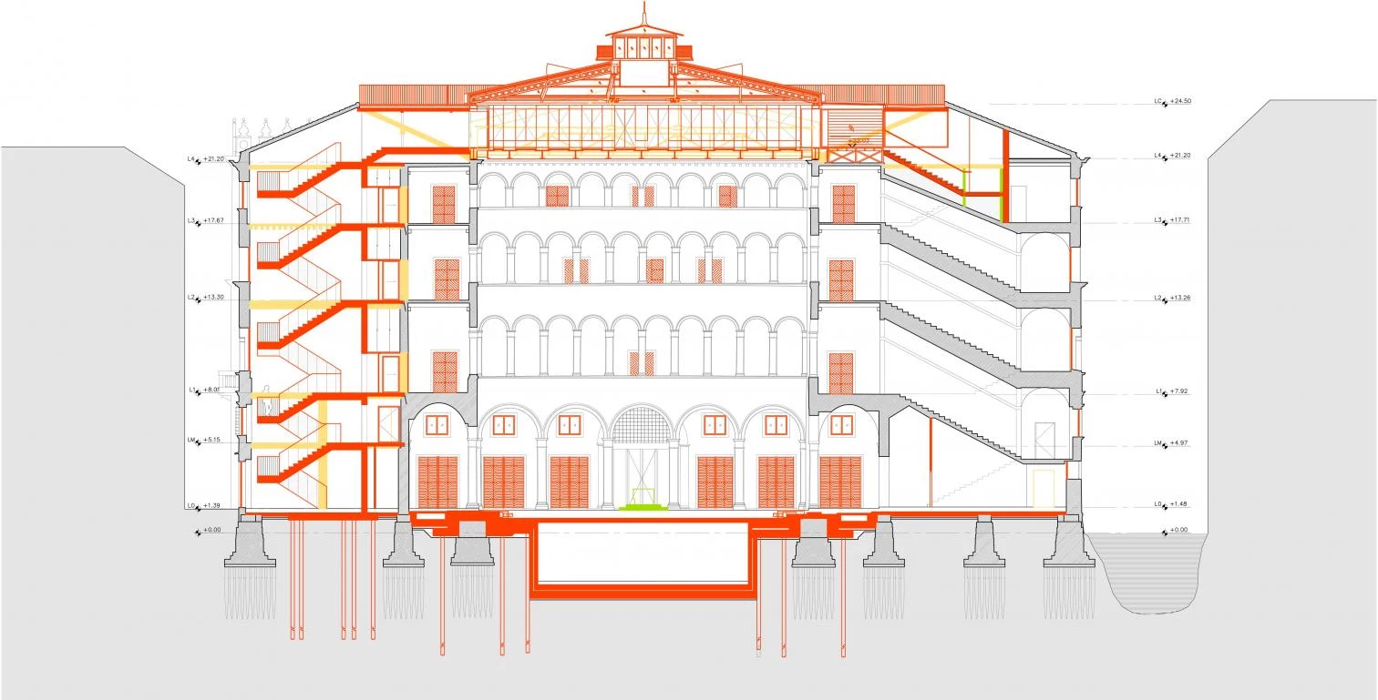
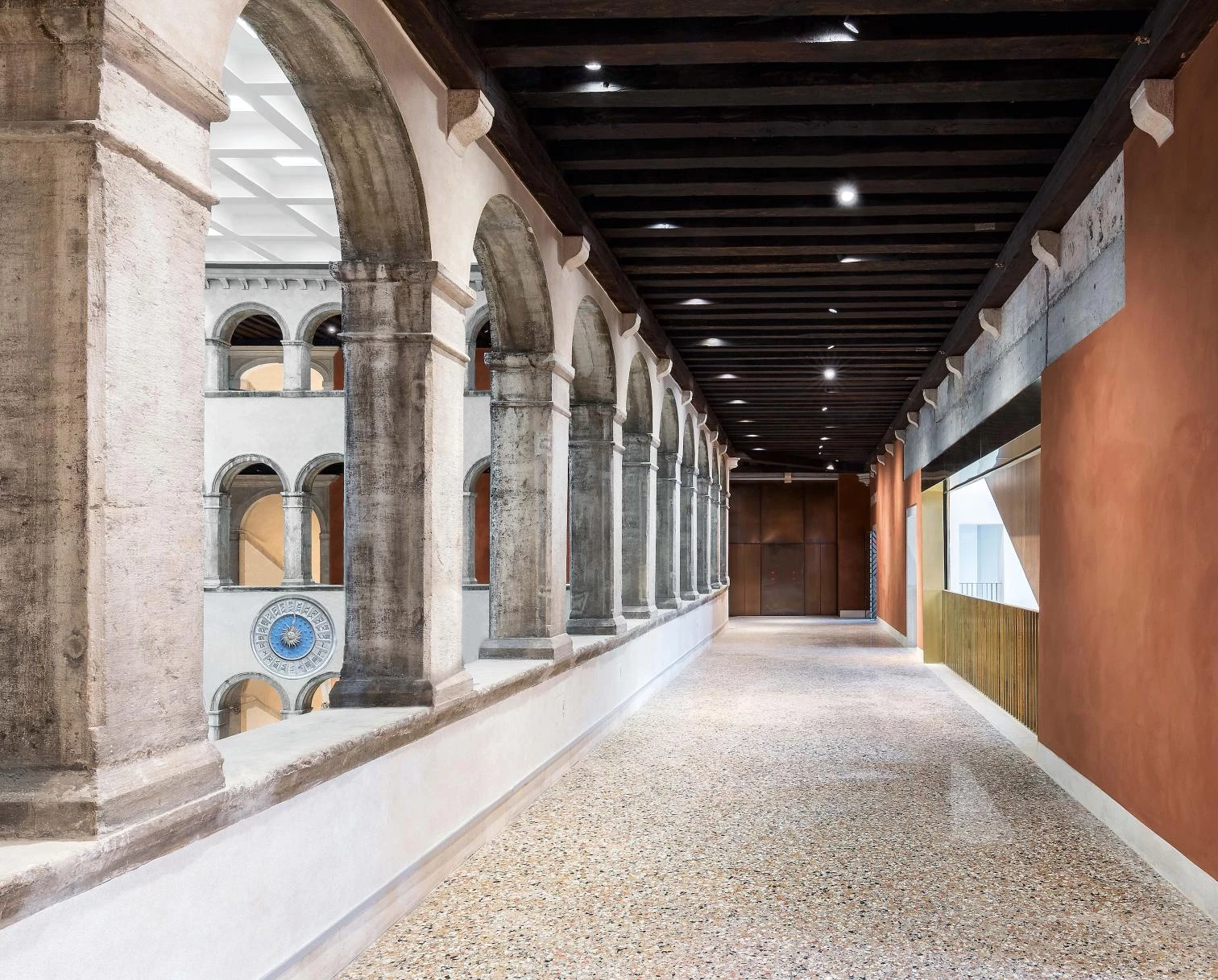
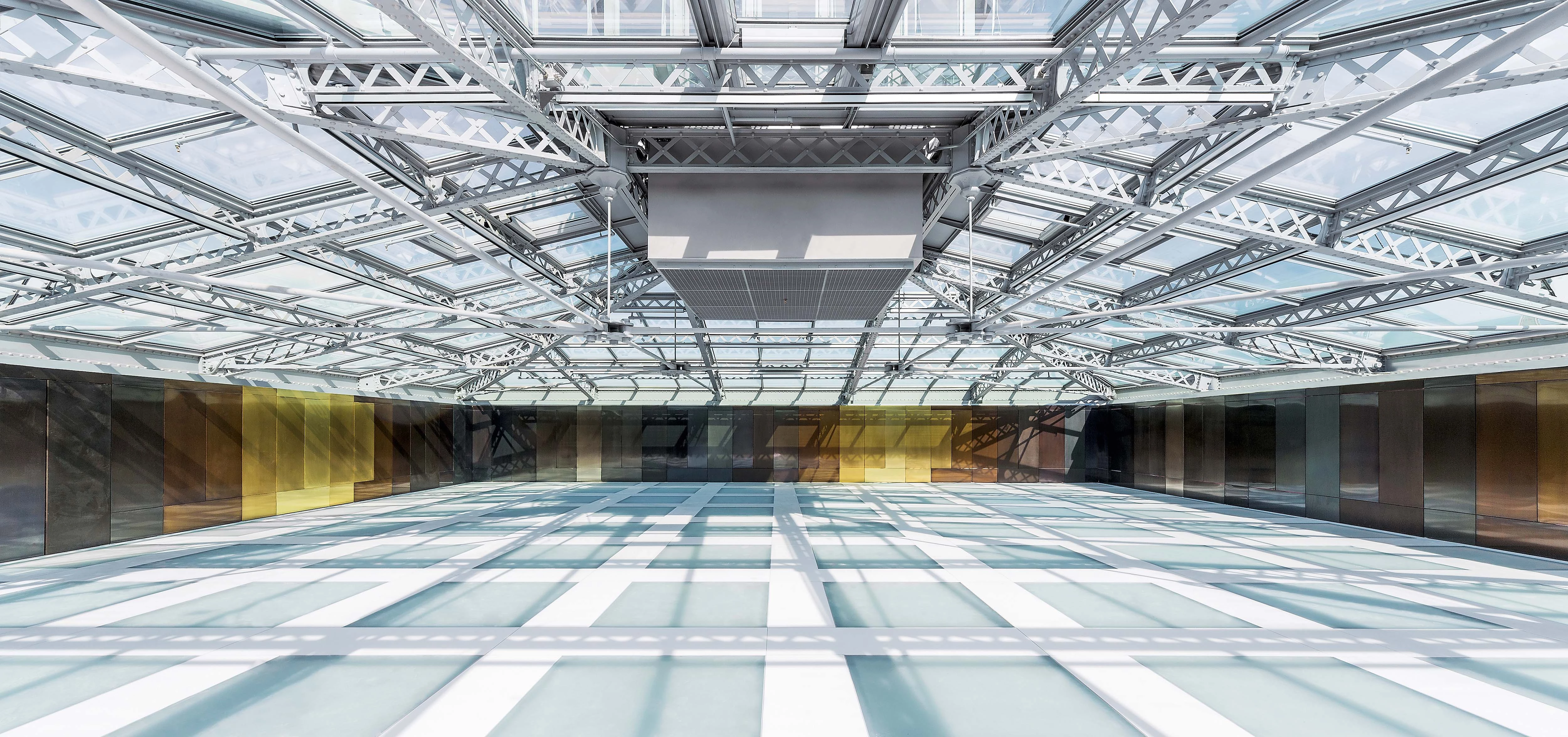
Today’s reborn Fondaco comes across as a large covered square where 15th-century walls coexist with 19th-century brickwork and bulky 20th-century structured concrete structures. Visitors enter it the way an archaeologist does an excavation site, finding themselves surrounded with all the layers of different civilizations exposed didactically, one atop another, one beside another. Notable as exceptions are two complementary features:a skylight replacing and including the 20th-century roof (now a camera segreta used as an events venue); and the red-painted escalators. While the former evokes the classical neutrality of Mies, the latter belongs to the family of ascent-and-descent elements so typical of the language of Koolhaas, evolved directly from those at the Ruhr Museum in Essen (Germany).
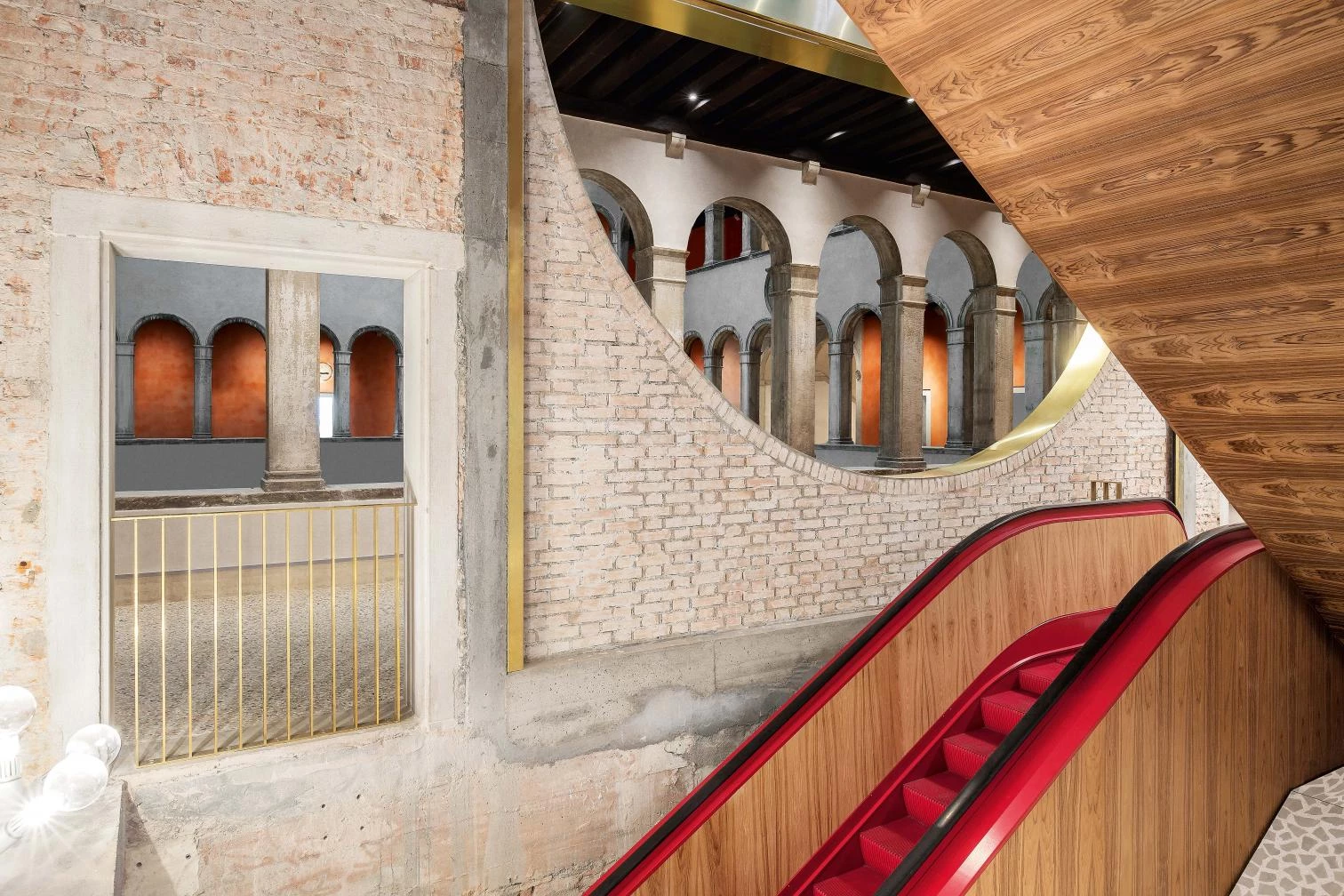
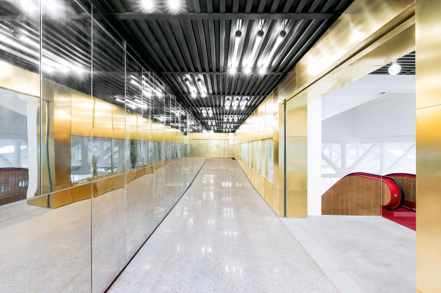
The intervention involved cleaning the finishes in order to expose the traces of the passage of time, and installing the forceful but carefully composed escalators that permit movement from one gallery to another.
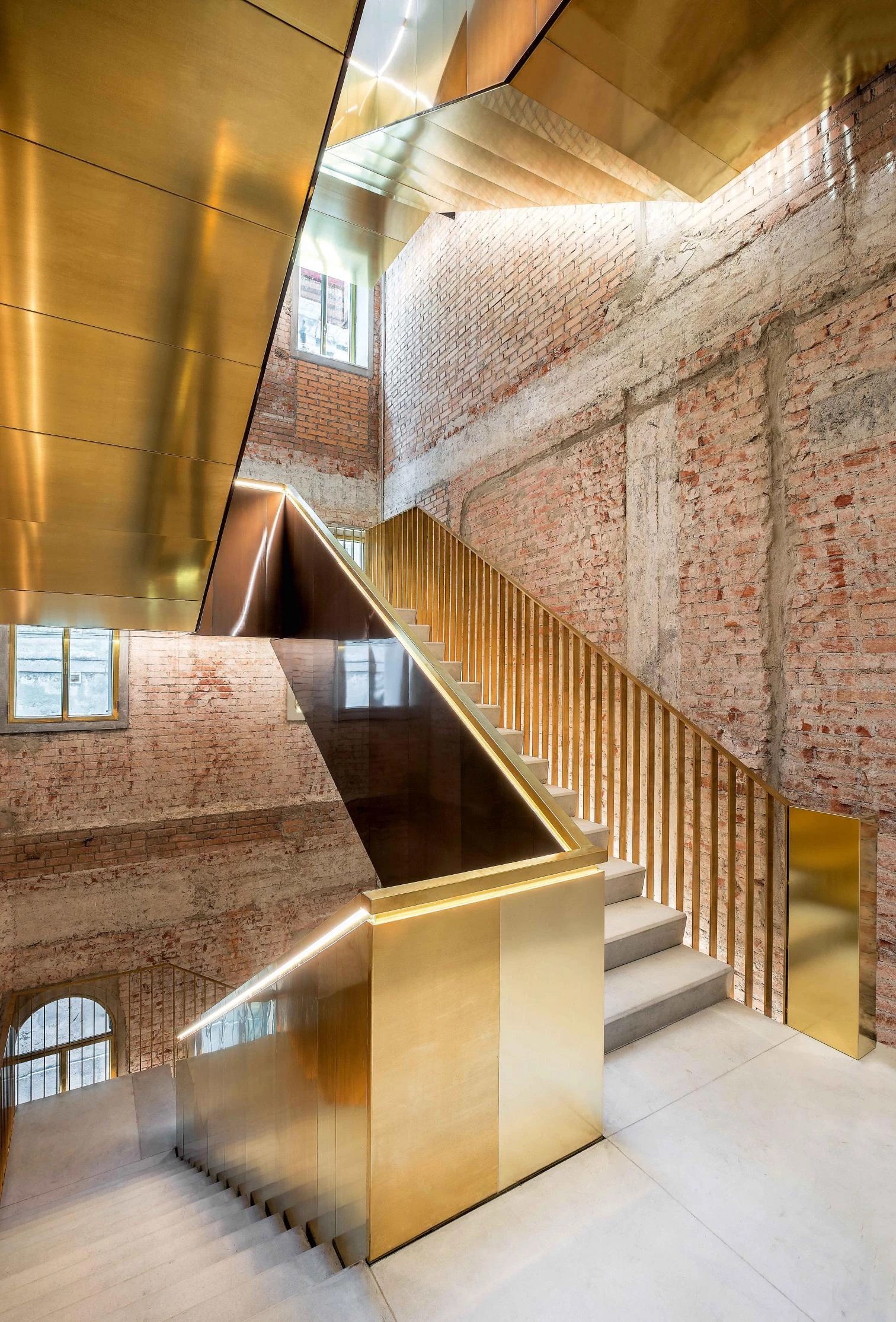
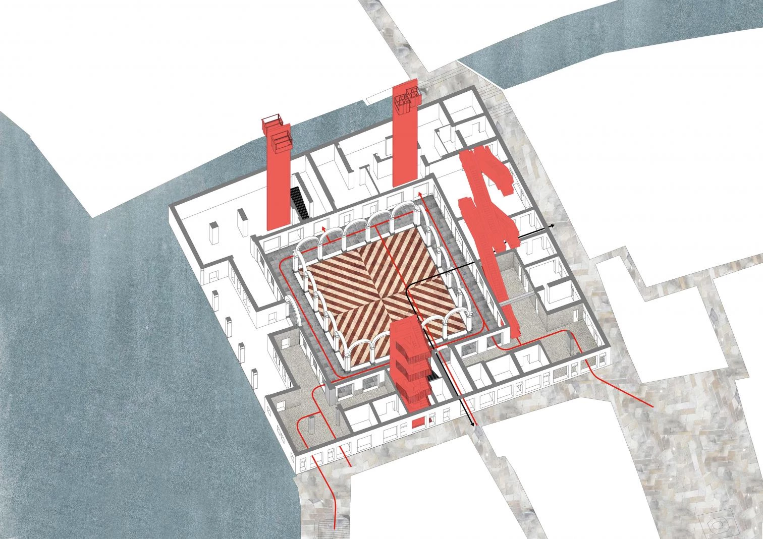
What’s interesting in OMA is its capacity to work as much on the unique element as on the catalogs: with solutions of compared efficiency and at the same time with details that a connoisseur like Morelli considered the only unquestionable proof of an author’s identity. Beyond Scarpa, for whom the detail is God’s receptable, for OMA the detail is part of a family which previously has had excellent results. As in the Netherlands Embassy in Berlin, the promenade architecturale is the spine of the served space, in this case the levels where the stores are distributed along the corridor of the outer galleries, a distribution which at the rear coincides with that of the mall of an airport. The initial design – the final solution is for Koolhaas a negotiated and reduced version – was more daring and impactful: in the large entrance hall (a small covered plaza where the surrounding streets would have converged), a ski lift positioned diagonally like a drawbridge would have reinforced the promenade of the ascent into the building, serving as the starting point of a conveyor belt moving up, piercing the floors. Level zero would have then coherently related with the surprise of arriving at a belvedere under the roof, open to the public, transforming walks through Venice into a slow and constant rise from the atmosphere of the atrium aquarium to the plein air of the roof over the Grand Canal.
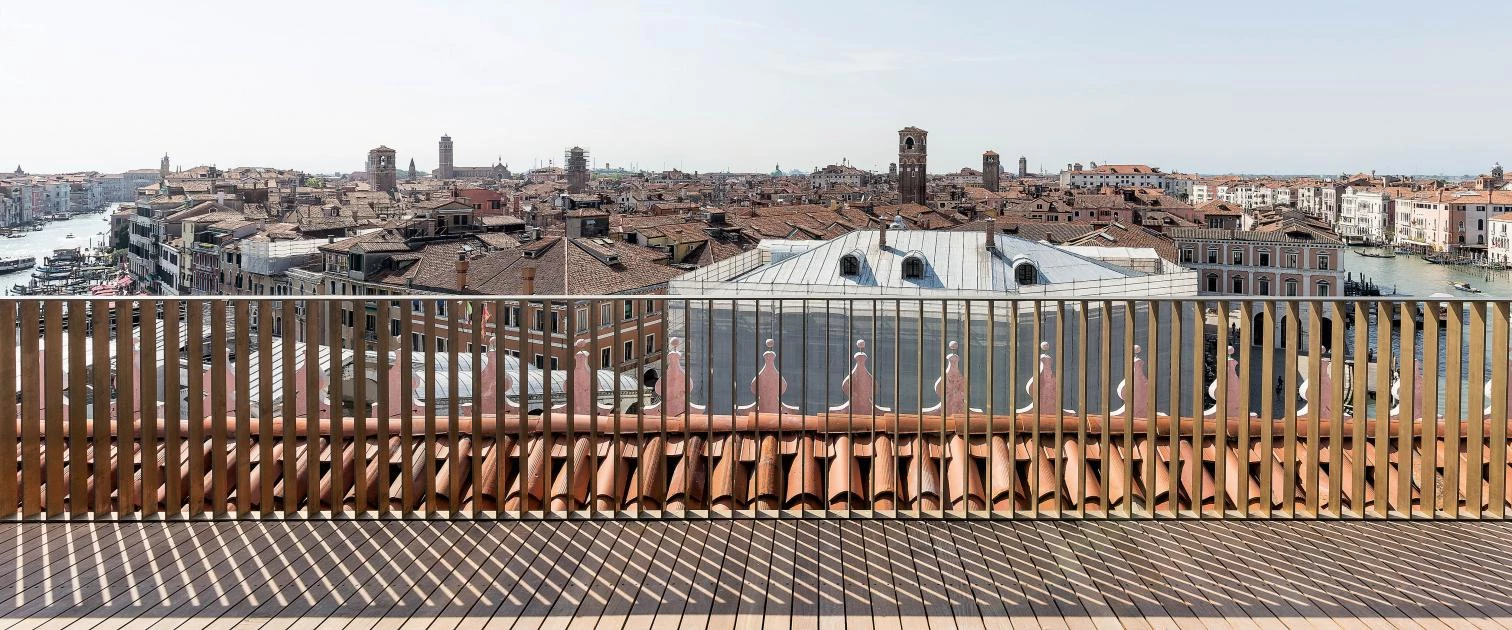
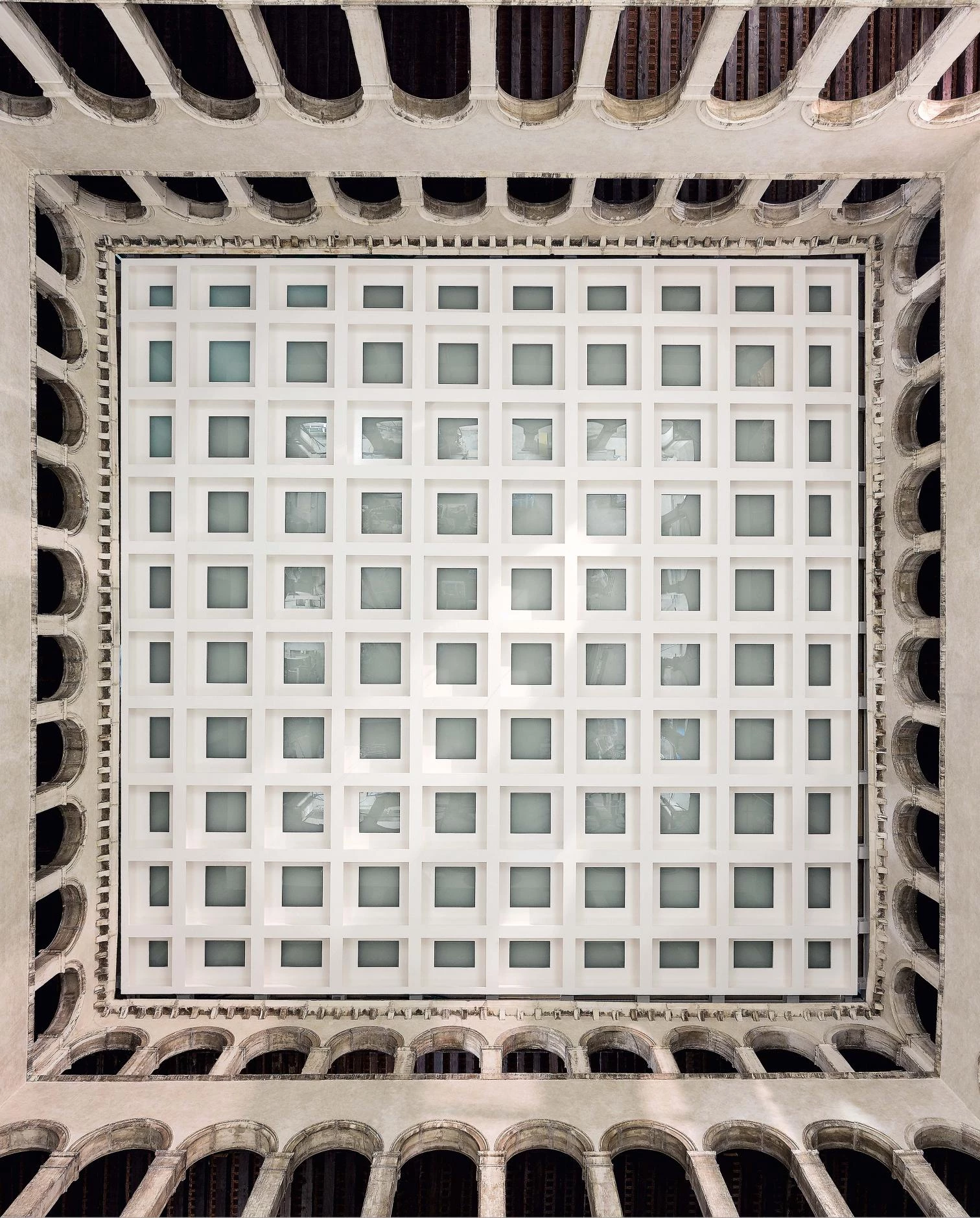
One of the most unique features of the building is the false ceiling that hangs over the inner courtyard, concealing the metal roof of the late 19th century to generate a new space that can be used as an events venue.
Even after substantial modification of the first design, the effect is guaranteed by an intervention of subtraction and addition. A surprising result in the irritating theorist of hypermodennity, who only a few years ago had declared that “preservation is catching us unaware, dominated by the lobby of authenticity, antiquity, and beauty, which of course constitutes a very limited idea of preservation.”
Koolhaas has never given up his pedantic tone of misunderstood prophet, not even when his theories ooze manipulation and oversimplification. Nevertheless it’s necessary to acknowledge – and perhaps he himself ought to publicly do so – that the result he now defends as “a refuge from starchitecture and a way of escaping this label – with the consequent need to take a step back with respect to other projects like the unsustainable proposal to expand the Whitney Museum in New York – had at heart already been expressed right in Venice: in 1964, the ’Carta del restauro’ upheld respect for the authenticity of the work and validated what Camilo Boito had defined as “the modern identification of additions”; that is, the fact that the superpositions and stratifications of the new would be valid to the extent that they were compatible with the nature of the work and clearly identifiable as contemporary evidences recognizable as such. A history lesson.
Cliente Client
Edizione S.r.l.
Arquitecto Architect
OMA / Rem Koolhaas, Ippolito Pestellini Laparelli (socios partners); Francesco Moncada, Silvia Sandor (jefes de proyecto project architects)
Concepto Concept
Ippolito Pestellini Laparelli (asociado associate); Marco De Battista, Andrew Chau, Paul Feeney, Alice Grégoire, Ricardo Guedes, Kenny Kim, Andreas Kofler, Kayoko Ota, Pietro Pagliaro, Miriam Roure Parera, Carlos Pena, Ciprian Rasoiu, Agustín Pérez Torres (equipo team)
Proyecto de ejecución Design Development
Francesco Moncada, Silvia Sandor (arquitectos de proyecto project architects); Giacomo Ardesio, Paul Feeney, Alice Grégoire, Ricardo Guedes, Giulio Margheri, Pietro Pagliaro, Cecilia del Pozo, Ciprian Rasoiu, Jan de Ruyver, Miguel Taborda (equipo team)
Construcción Construction
Silvia Sandor (arquitecta de proyecto project architect); Aleksandar Joksimovic, Leonardos Katsaros, Francesco Moncada, Federico Pompignoli (equipo team)
Colaboradores Collaborators
TA Architettura (patrimonio heritage); Tecnobrevetti (estructura structure); Politecnica Ingegneria e Architettura (instalaciones MEP); Antonio Girello (seguridad safety); Sicurtecno Cost Consultant Dd Phase: GAD (protección contra incendios fire safety); SACAIM (constructor contractor); C+S, DUEBARRADUE (arquitecto ejecutivo executive architects); Viabizzuno (iluminación lighting)
Fotos Photos
Delfino Sisto Legnani / Marco Cappelletti

