Facebook Campus in Menlo Park
By Christopher Hawthorne- Architect Frank Gehry
- Type Commercial / Office Headquarters / office
- Date 2018
- City Cupertino (California)
- Country United States
- Photograph Everett Katigbak Facebook Corporate Communications Jeff Hall Amy Geddes Jeremy Bittermann Christophe Wu Nick Otto Jen Stark
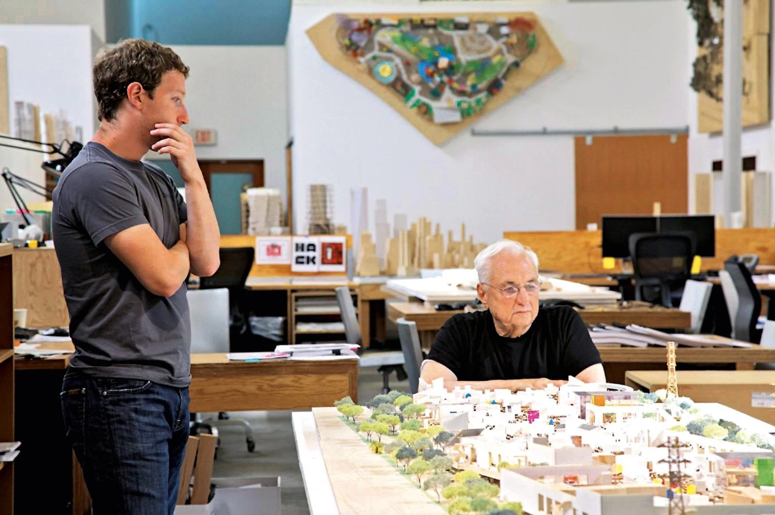
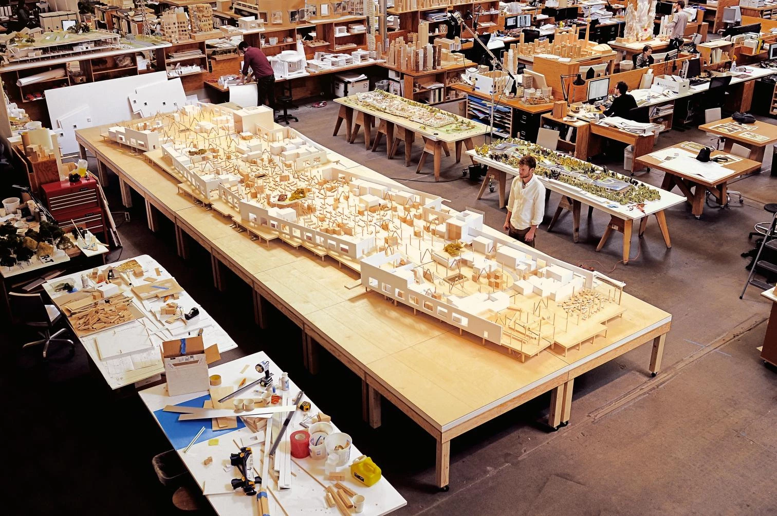
There are a couple of ways to explain how Frank Gehry came to design a very large but surprisingly plain-spoken building for Facebook in Silicon Valley. The first is that the 86-year-old Gehry and Mark Zuckerberg, Facebook’s 31-year-old founder, bonded over a shared appreciation of informal, unpretentious design. The tech magnate whose hooded sweatshirts have become a personal brand found common ground with the architect who won early recognition for making furniture out of cardboard. After visiting Gehry’s warehouse-like offices on Beatrice Street on the Westside of Los Angeles, Zuckerberg told the architect he wanted essentially the same thing, if at a far bigger scale, for Facebook.
The second has less to do with design taste and more with, well, a social network. According to Gehry, his good friend Bobby Shriver – nephew of John F. Kennedy and brother-in-law of Arnold Schwarzenegger – suggested to his friend, Sheryl Sandberg, Facebook’s COO, that the architect and the tech company might make a good match.
It helps to keep both stories in mind in making sense of the new Facebook building. It is an appealing throwback to the unfussy, ad hoc, quickly made experiments of Gehry’s early career. There’s also something absurd about the idea that architecture could turn Facebook, whose market capitalization is in the neighborhood of $225 billion, into a low-key outfit without airs, or even allow it to carry out a plausible impersonation of one. So forget the generation gap between Gehry and Zuckerberg. It is in the gap between the two images of Facebook – between the company as scrappy, accessible digital platform and politically connected Silicon Valley behemoth – that the meaning of the design, both for the company and for its late-career architect, can be found.
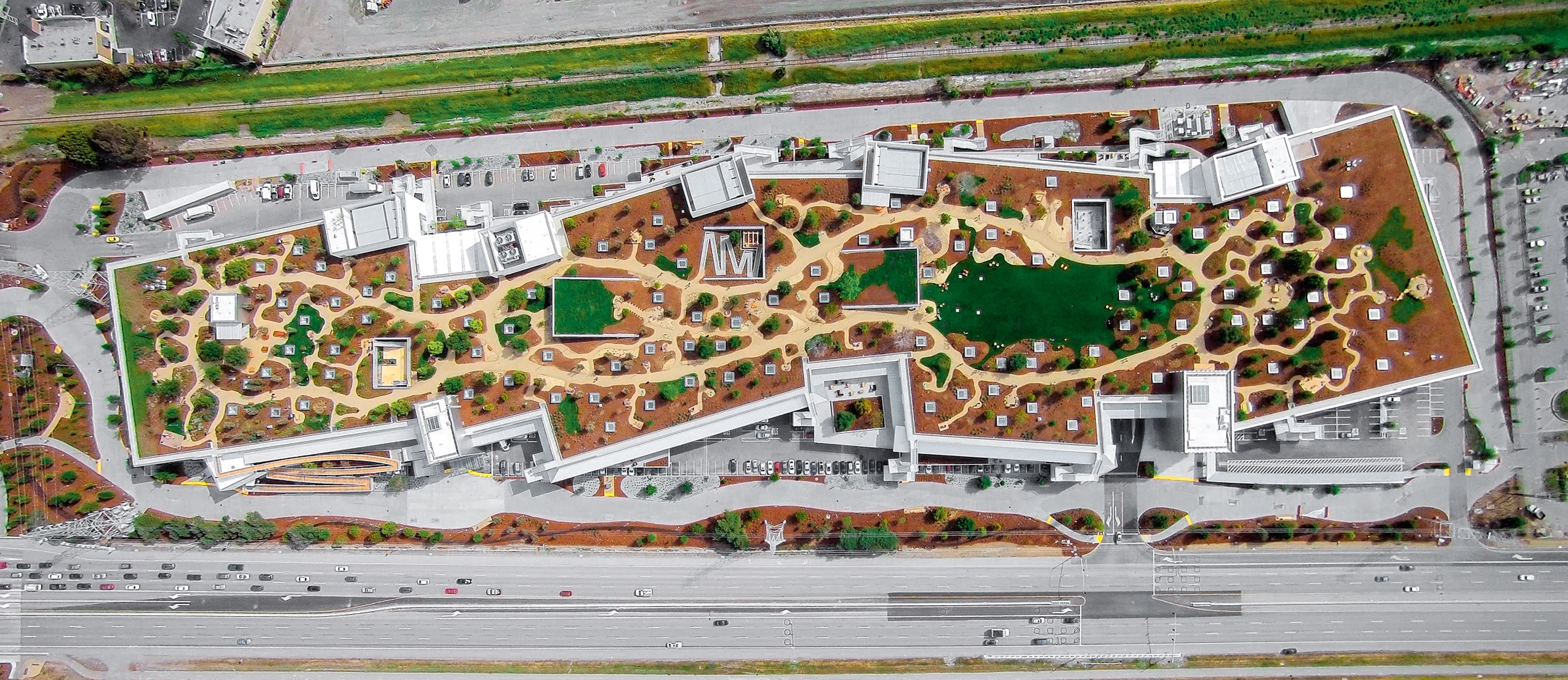
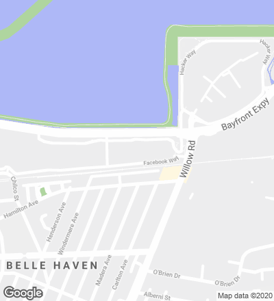
The Gehry building occupies 22 acres across a wide intersection from the company’s existing offices in a nondescript corporate campus once home to Sun Microsystems. (An underground tunnel connects the sites.) Seen from the outside, where it stretches more than 1,500 feet along the Bayfront Expressway, the new office is remarkably restrained, a kind of non-building that is already largely shrouded by trees and will further disappear from view as they grow.
The design is made up of three horizontal layers. Parking is at ground level. Above, raised on dozens of concrete legs, are the offices, filling a long and narrow one-story box. The roof is given over to a garden (by landscape architecture firm CMG) with walking paths, oak trees, and fields of wildflowers.

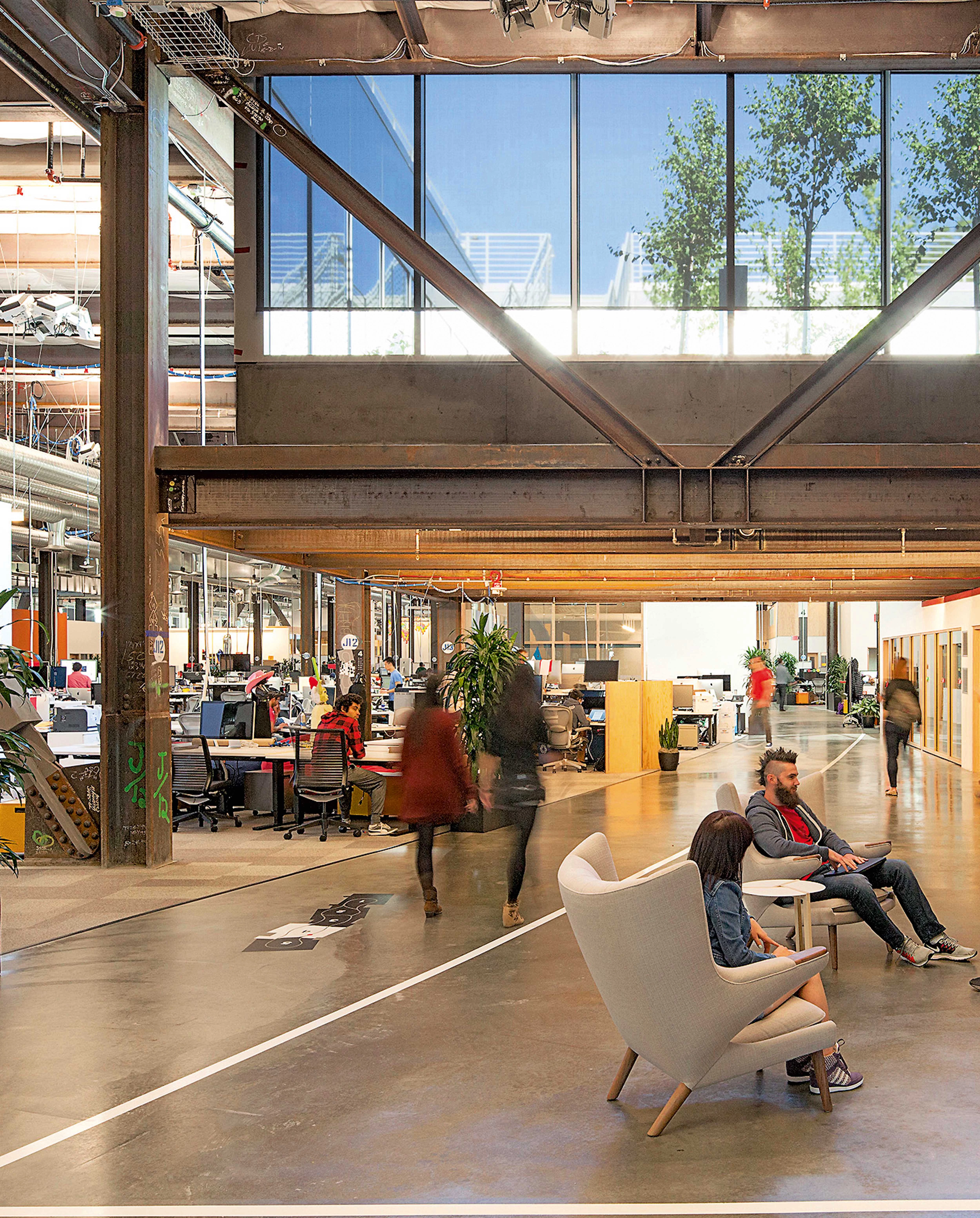
Inside, the building covers 433,000 square feet, enough to fill a midsize office tower. Throughout it is more carefully composed than it lets on, despite simple concrete floors and exposed ductwork. Meandering walkways give it the feel of a crowded, upscale indoor village.


The ceiling is 24 feet high, leaving room for a number of small structures within the larger space holding conference rooms, restaurants, and cafés. (No one at Facebook, including Zuckerberg, has a private office, as I was reminded more than once on my tour.) These miniature buildings are mostly executed in simple materials – white plaster and Douglas fir – with boxy geometry to match. In the way they break up the larger, warehouse-like space and suggest a kind of interior urbanism, they are reminiscent of Gehry’s 2011 design for the New World Symphony in Miami Beach, which also scatters cottage-like buildings beneath a very high ceiling.
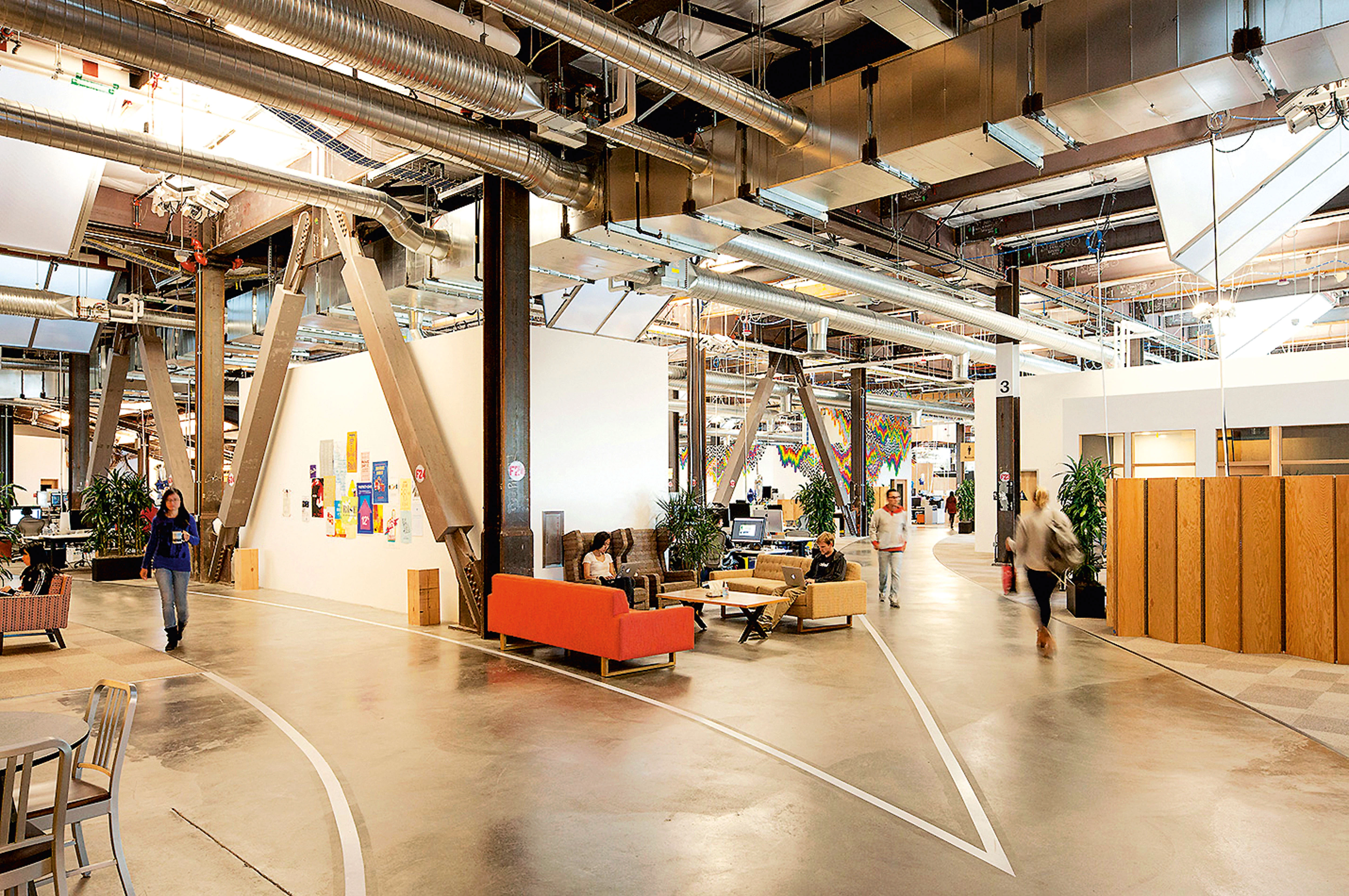
This kind of architectural choreography, with the smaller structures shaping circulation and creating distinct neighborhoods of interior space, is tricky to pull off and deftly handled here. (Gehry’s chief collaborators on the project included two colleagues at his firm Gehry Partners, Craig Webb and Gregory Sobotka; a Gehry team is already at work on designs for two more Facebook buildings immediately west of the new one.) The interior, with room for about 2,800 employees, is quieter than you would guess.
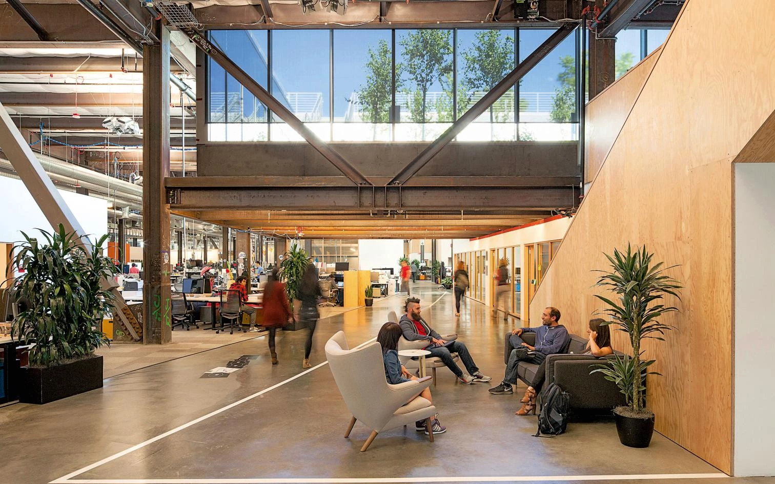
Limited sections of the exterior are clad in stainless-steel panels. Otherwise, the only spot where Gehry has room to execute the kind of dramatic or virtuosic formal gestures for which he has become known is a pair of entry pavilions. A staircase in each one curves and torques toward the ceiling, giving the building the kind of Instagrammable visual charisma it is elsewhere at pains to avoid.
(Not incidentally, in March, as employees began moving into the new building, the company invited a small group of photographers popular on Instagram, which Facebook acquired in 2012 for $1 billion, for a tour; the images they posted, including many of the stairs, gave the public its first glimpse of the interior.)
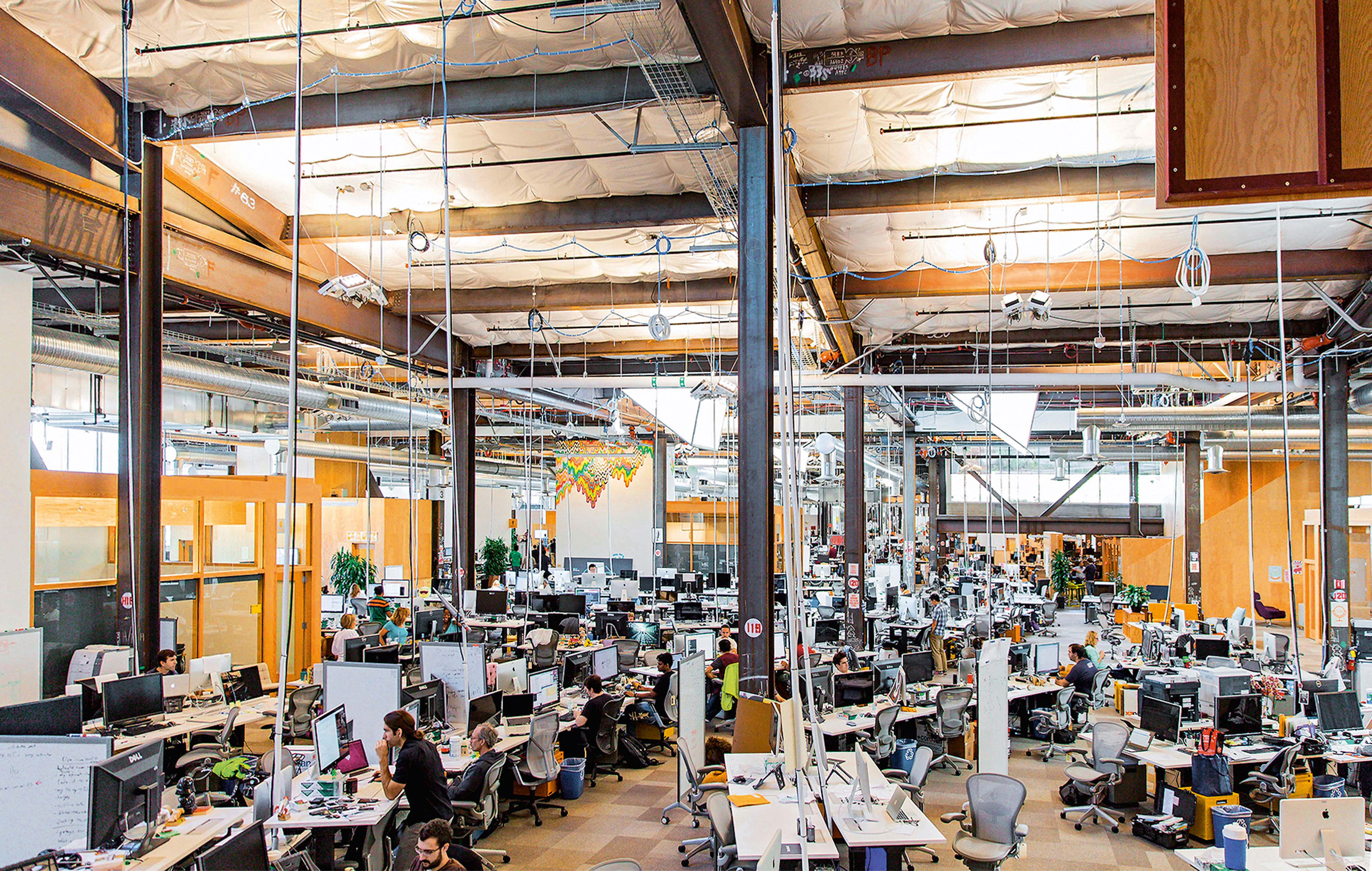
Elsewhere the emphasis is on directness and an unapologetic practicality. (Facebook has not revealed the building’s cost.) When you look across one of the sections of the interior given over to desks, what you see is surprisingly chaotic, a dense view of unpainted steel beams alongside cords and wires running from the ceiling and with the heads of employees half-hidden behind giant monitors. One difference between Facebook’s new offices and Gehry’s is that the Menlo Park building offers multiple views of the world outside, mostly through floor-to-ceiling windows.


Gehry’s aw-shucks persona, the extent to which he likes to both tweak bourgeois taste with surprising combinations of form and material and think of himself as an underdog, misunderstood and still marginalized, has long been at least partly an act. It has been a way for the architect, like a star athlete, to maintain his drive and edge after his 1989 Pritzker had collected dust. The same is true of Zuckerberg, who dropped out of Harvard as a sophomore to work full-time on the company that became Facebook.
Now, of course, both are operating in rarefied air, as the compactness of the Gehry-Shriver-Sandberg-Zuckerberg phone tree makes clear. But something about the chance to collaborate on this building pried open those old feelings. Gehry told me that in spirit the Facebook design is the closest thing in years he’s done to his own house in Santa Monica, which he wrapped in chain link and corrugated metal and which remains the most famous example of his interest in undermining architectural convention.
The aesthetic marriage between Zuckerberg and Gehry succeeded because it allowed both to commit to a comforting fiction. The work Facebook does – the code that underlies its Web pages – is no more slapdash or unrefined than the architectural drawings produced by Gehry Partners, which have to meet building and seismic codes. When executed at this level, lack of polish is very much a kind of polish.
There is also no doubt that Facebook sees architecture – for all the ways in which the Gehry design is genuinely efficient, bordering on anonymous – as a way to distinguish itself from its Silicon Valley rivals. Apple hired Norman Foster to produce a ring-shaped HQ that will be exquisitely, expensively detailed. Google enlisted Thomas Heatherwick and Bjarke Ingels, rising stars, to design a leafy, idyllic-looking campus beneath an undulating glass roof.
For a field that has long taken pride in generic work spaces – garages, dorm rooms, and suburban office parks – this emerging architectural arms race is a major shift. Unlike Apple and Google, Facebook has managed to have it both ways. It has maintained Silicon Valley’s quick-and-dirty aesthetic, its sneaker-wearing and ramen-eating ethos, while also signing up one of the most famous architects in the world.
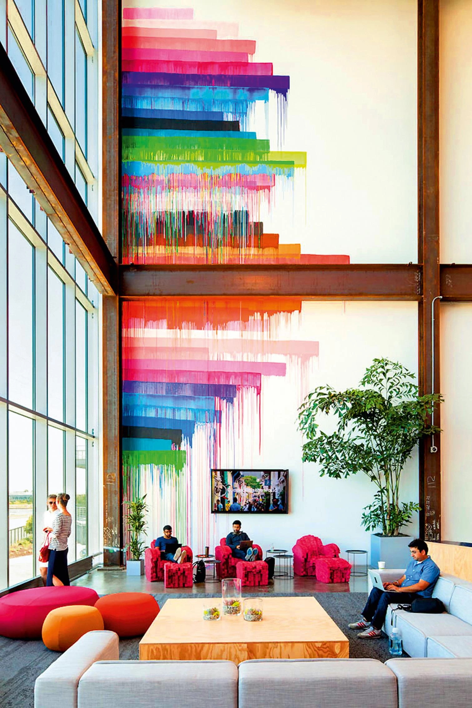
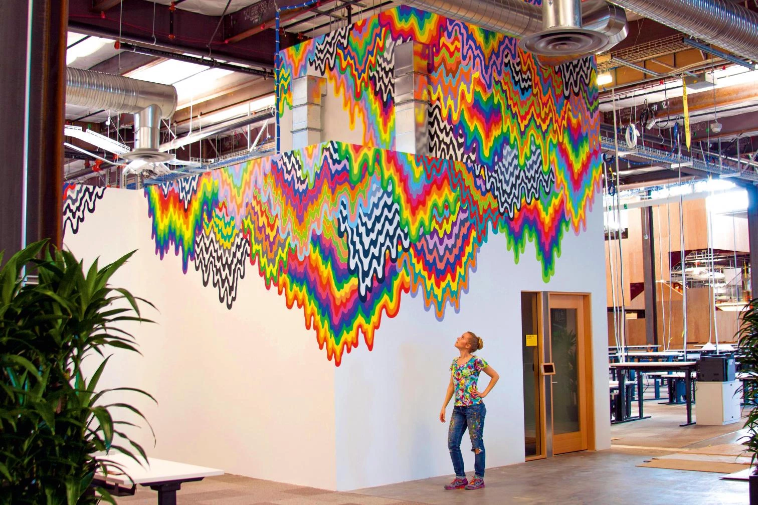
It is now the proud owner of what might be corporate America’s first trophy building in which the trophy is designed to arrive pre-scuffed, with the smudges and nicks carefully built in.
Christopher Hawthorne has since 2004 been the architecture critic of the Los Angeles Times.
Obra Work: Campus de oficinas para Facebook en Menlo Park (California); Facebook West Campus Building in Menlo Park (California).
Arquitectos Architects: Gehry Partners.
Fotos Photos: Everett Katigbak; Facebook Corporate Communications; Jeff Hall; Amy Geddes; Jeremy Bitterman; Christophe Wu; Nick Otto; Jen Stark

