Shopping Center, Lucerne
Diener & Diener Architekten- Type Shopping center
- Material Metal Concrete Copper
- City Lucerna
- Country Switzerland
- Photograph Roland Halbe Gaston Wicky
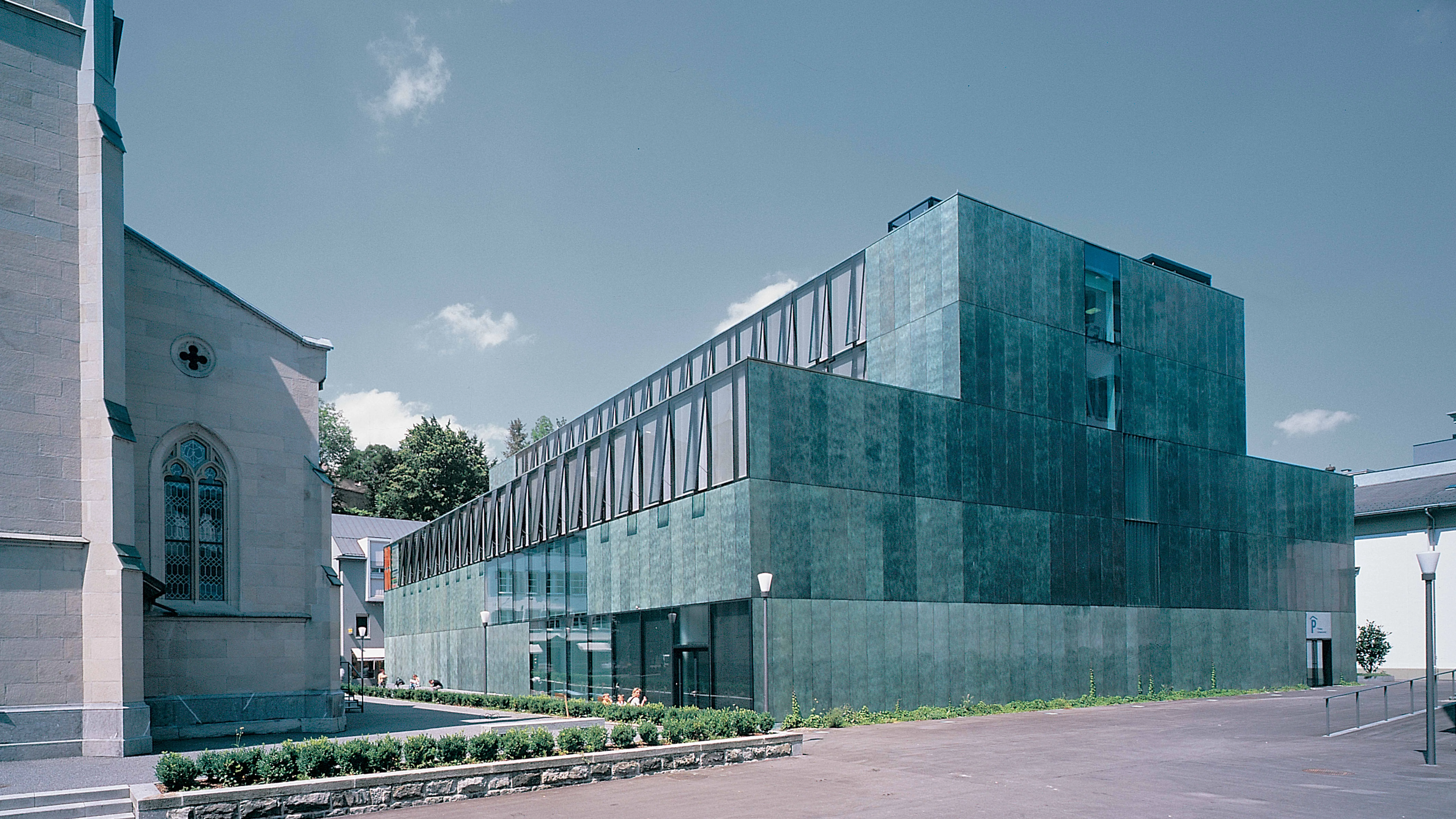
The Schweizerhof hotel is one of the buildings which speaks today about the leisured rhythm with which the city of Lucerne looks onto the Lake of the Four Cantons. The project to substitute the coach house and the kitchen wing for the new headquarters of a well-known chain of department stores aroused a lively public debate due to the fear that its most emblematic interior would disappear with the alterations: the hall designed by Leonhard Zeugheer between 1863 and 1865. The competition brought forward a winning proposal that reconciles the architectural and urban demands with those imposed by the current commercial needs. On the buildable grounds – located in the meeting point between the tiny fabric of the historic center and the largest farmhouse by the lake promenade – the shopping center goes up as a free-standing volume which performs as a profane counterpoint to the neighboring church of Saint Matthew, formed by a central nave and two aisles. Influenced perhaps by its proximity to the church, the new construction adopts a symmetrical and stepped silhouette towards the sides, so becoming part of the public buildings extending throughout the city.
Following the tradition of covered marketplaces, the edifice reproduces the basilical type with a stepped section and setbacks on the east and west facades affecting the last two floors which house the offices. With five floors underground and five more above the street, the largest commercial area concentrates on ground level and on the first floor, which is linked to the next level by a two-story void. A gallery of small shops outlooks this interior courtyard. illuminated by a crown of skylights on the roof.
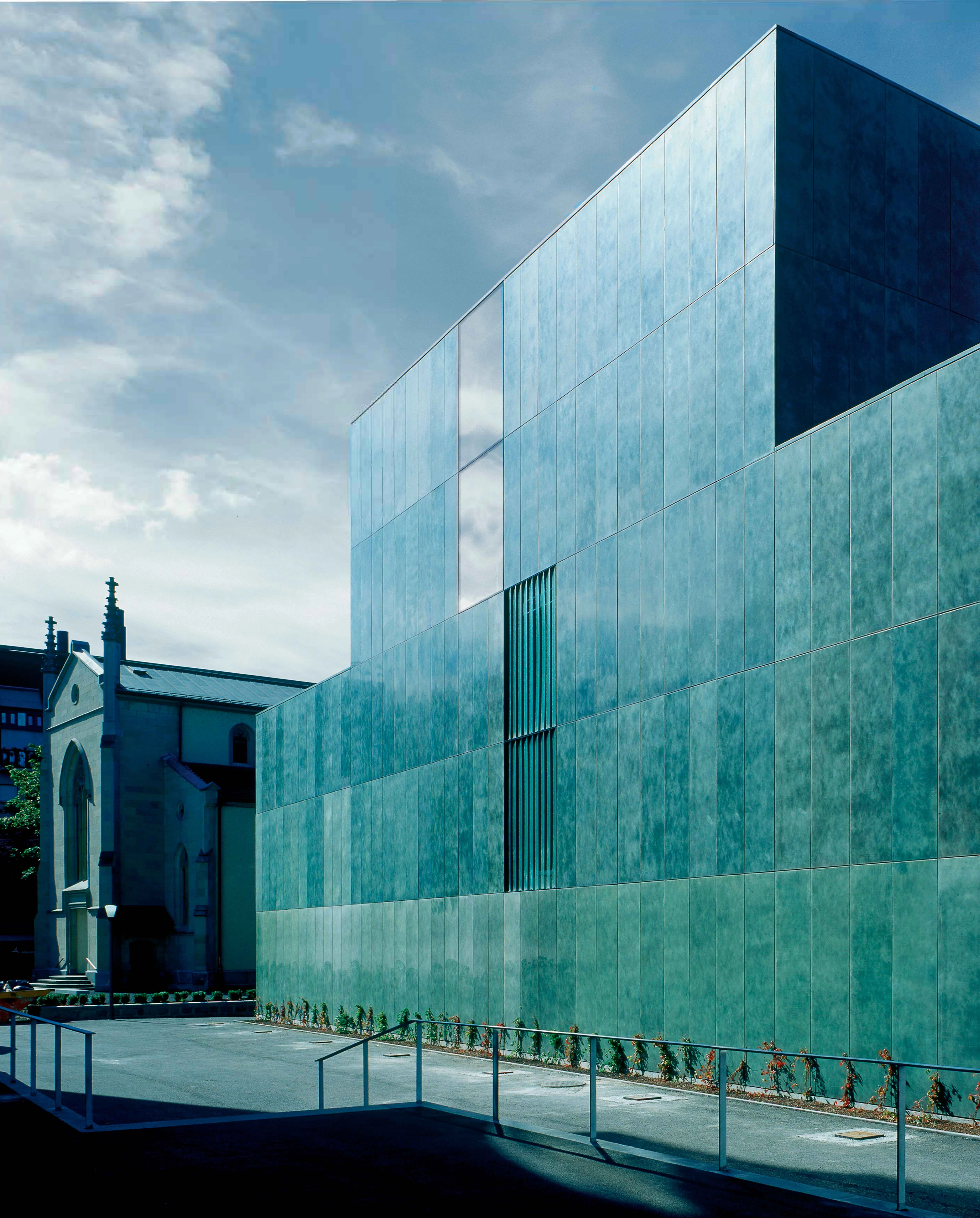
A reinforced concrete structure facilitates the free disposition of the shops, in an interior which looks onto the surroundings through large glazed openings. The hustle of commercial activity is concealed from the street behind a light facade of copper wash panels, whose width determines the basic module of the facade. Despite being haphazardly distributed, the glazed panels are hardly noticeable thanks to a fixation system that is furred onto the metallic panels. The greenish tone acquired by copper in a pre-weathering process helps to blend the building with its urban context: the tree-lined promenade which traces the encounter of the Schweizerhof and the lake...[+]
Cliente Client
Genossenschaft Migros, Hotel Schweizerhof
Arquitectos Architects
Diener & Diener
Consultores Consultants
TGS (dirección de obra site supervision); Stefan Koepfli (paisajismo landscape design)
Fotos Photos
Roland Halbe, Gaston Wicky


