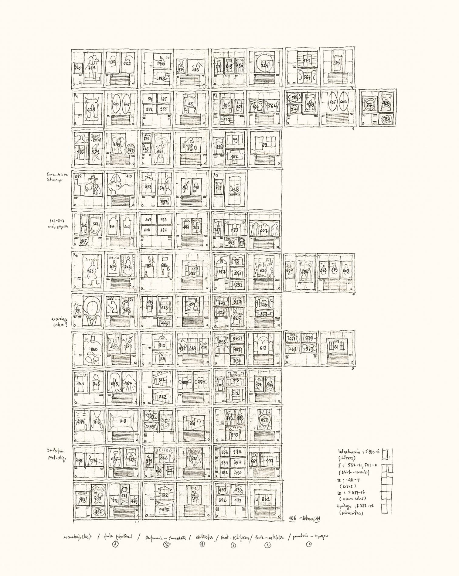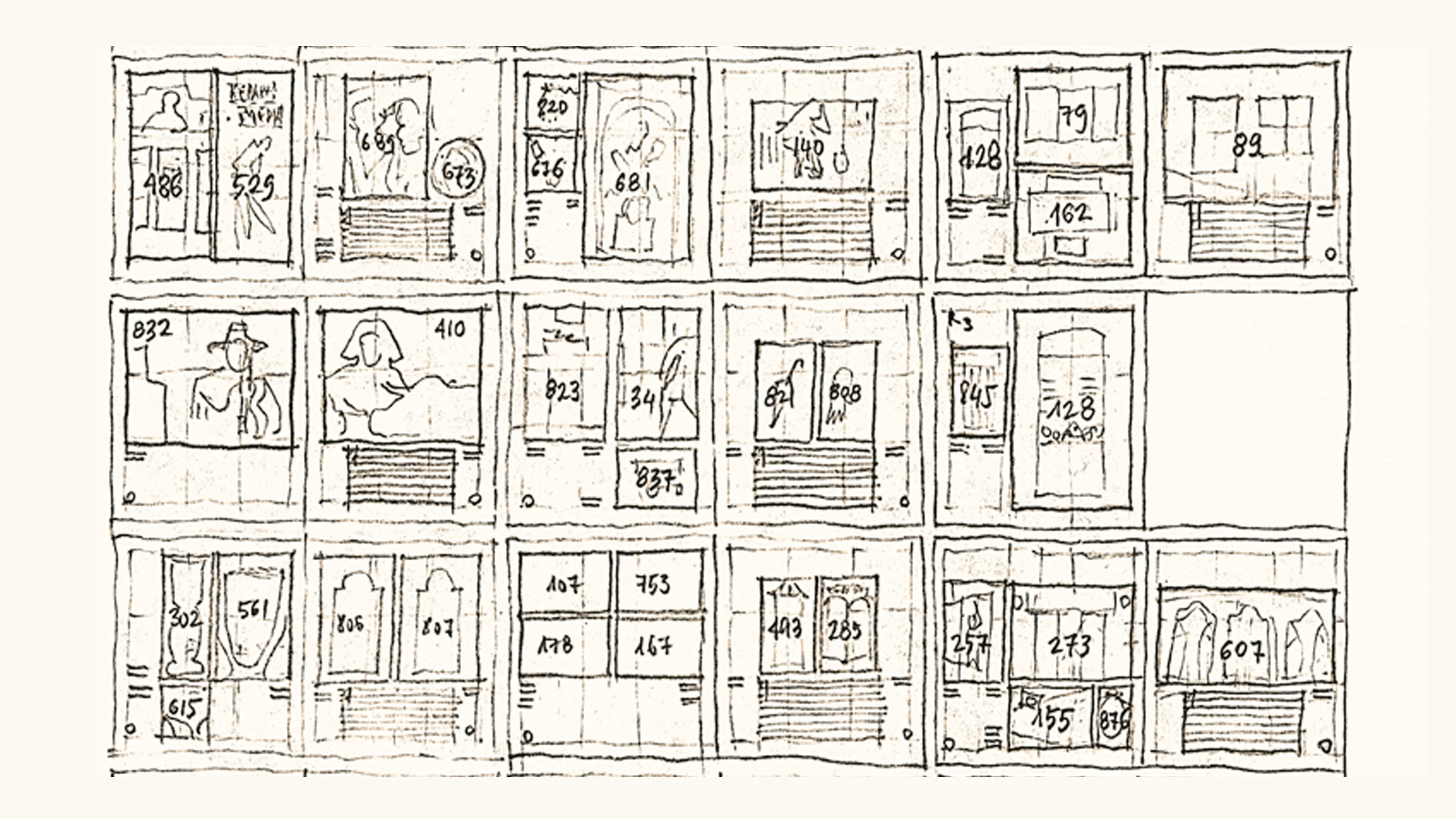
Luis Fernández-Galiano, Sketch of the book La belleza común, 1990
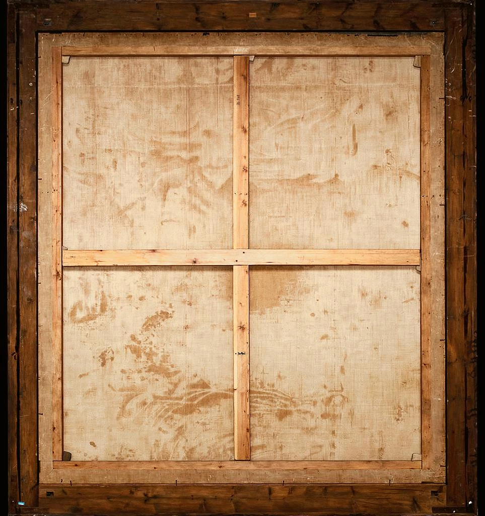
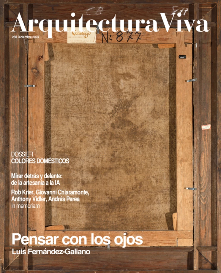
The AV/Arquitectura Viva project celebrates four decades in 2024, and this anniversary has prompted a stocktaking of our career, using as guiding thread my last lecture at the Madrid School of Architecture, where I tried to explain to what extent visual thinking has been important in my teaching and publishing career, two ways of communicating architecture that complement each other. Looking back is also looking behind, because along with the chronological survey of the magazines over these forty years I also try to comment on the making of publications and lectures, describing the graphic tools and geometrical constraints that lead to the final result. If the Prado Museum is these days showing the reverse of paintings to bring visitors intimately closer to their material condition and the traces left on them by time, here we invite readers to visit the backroom of the editing process, in the hope that showing what is hidden behind the scenes will better explain our history and our purpose.
The magazines were launched in the eighties, but if the retrospective gaze had gone back to the biography of the person at their helm, during the previous three decades it would have found signs of the visual fascination summed up in the altered evangelical quote: “In the beginning was the image.” In the fifties they were cartoons and comics, some of which even included a drawing course, where my generation learned the basics of framing or layout; in the sixties, the wire line discipline in the representation of figures or the use of charcoal to shape the volume of plaster casts, plus the different techniques to paint in open air or a studio; and in the seventies, the design exercises presented as comic strips and British coffee table books that taught us the importance of the spread. The eye of the grown-up takes shape in the child, the teenager, and the young adult, and the visual habits created then will be called style by some and seen by others as stubborn routines that corset the imagination with their strict patterns.
Looking at what lies behind magazines or classes gives reasons to confirm that dismissive judgment, because the maniacal obsession with order becomes evident in almost anything, from the geometric layout of the publications to the modular orchestration of the images or the syllabic limitation of titles: this is a voluntary disease that tries to justify itself with the metric discipline of classical poetry or architecture, but that reaches the extreme of having maintained during four decades a plaid mesh of 13 and 4 mm, and whose most frequent modules of 30, 47, 64, 98, and 200 must become familiar to anyone designing one of our pages. I do not know if rigor may in the end become rigor mortis, though perhaps this obsession with keeping a musical rhythm is in tune with the essentially organic rhythm of heartbeats or steps, and the happy submission to the metronome is not seen as the ominous restriction of the straitjacket, but the echo on paper of the life that beats in words or images, in voices or in the eye.

Vik Muniz, Verso (Las meninas), 2018


