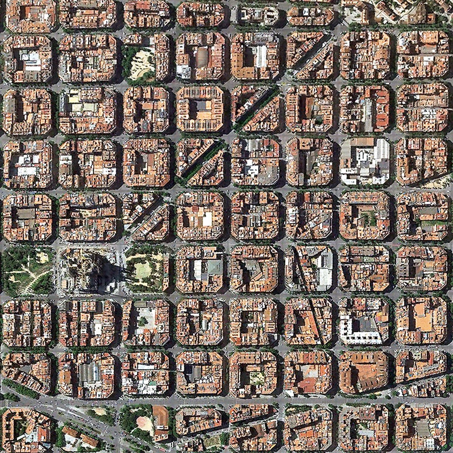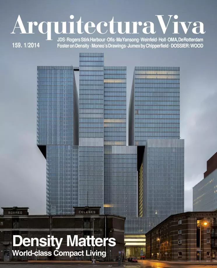
Density matters. Accustomed to publishing in great detail works of unique qualitative value, we often forget how important their quantitative context is. And yet, this aspect often determines whether they succeed or fail. In the residential field density is crucial, and while too much density increases traffic, sanitary and safety problems, the reduced density of new neighborhoods or sprawling expansions causes an economic and ecological damage only comparable to the subsequent impoverishment of social interaction and disappearance of the civic and political nature of urban space. Far from being incompatible with quality of life, density becomes a key element to achieve it, and urban regulations are now complementing the old codes on maximum density, intended to prevent overcrowding, with new minimum densities that aim to stimulate sustainability and sociability.
As architecture editors, we carefully document built objects, submitting them to an interpretive ‘close reading’ that might not be far from the approach of the New Criticism half a century ago. Nevertheless, a global perspective of the built landscape should probably demand a ‘distant reading,’ as Franco Moretti proposed, where statistics, graphics and maps replace details, edges and joints, so that architecture – paraphrasing his comments on literature – does not become ‘a sum of individual cases’ but ‘a collective system.’ Many would argue that, as far as buildings are concerned, this system is the city, and the ‘distant reading’ coincides with that of urbanism: the didactic diagrams of Vishaan Chakrabarti, which here illustrate Norman Foster’s foreword to his book A Country of Cities. A Manifesto for an Urban America, point in that direction.
Arquitectura Viva turned 25 becoming monthly and bilingual, in continuity with a path that has tried to combine intellectual rigor and formal beauty, but changing in tune with a professional and publishing environment undergoing a radical mutation. Now it begins the second year of this new period with two significant changes, which we hope will make it more instrumental: the return of the news section, commenting on the most relevant features published during the month on our website, and enhanced with Focho’s cartoon; and the presentation of the innovation section as a dossier, making it easier to find references and giving a more comprehensive analysis of the subject at hand. In this way – and with an issue in which editorial density meets urban density –, the magazine becomes more compact in contents, more journalistic in approach, and perhaps more capable of offering architects a helpful tool.


