The Barcelona Pavilion is already the longest-lived temporary building of modern architecture. In its first life, it condensed the desires of the artistic avant-garde of the first quarter of the 20th century. During its absence, it became a virtual crystal, capable of reflecting many of the theories of the past century. Between its conception and demolition barely two years passed, but its leg-end grew thanks to the two important exhibitions held at the MoMA (1932/1947). In 1986, coin-ciding with the centenary of the birth of Mies, in an environment dominated by postmodernism and deconstruction, an exact replica was inaugurated, increasing the play of reflections and the scenographies of a building that already in its original version was a ‘representative’ space. Since then, turned into an anachronistic ephemeral building, its purpose has been to represent no longer Germany, but itself, its architect, and the foundation that bears his name, which also or-ganizes temporary interventions.
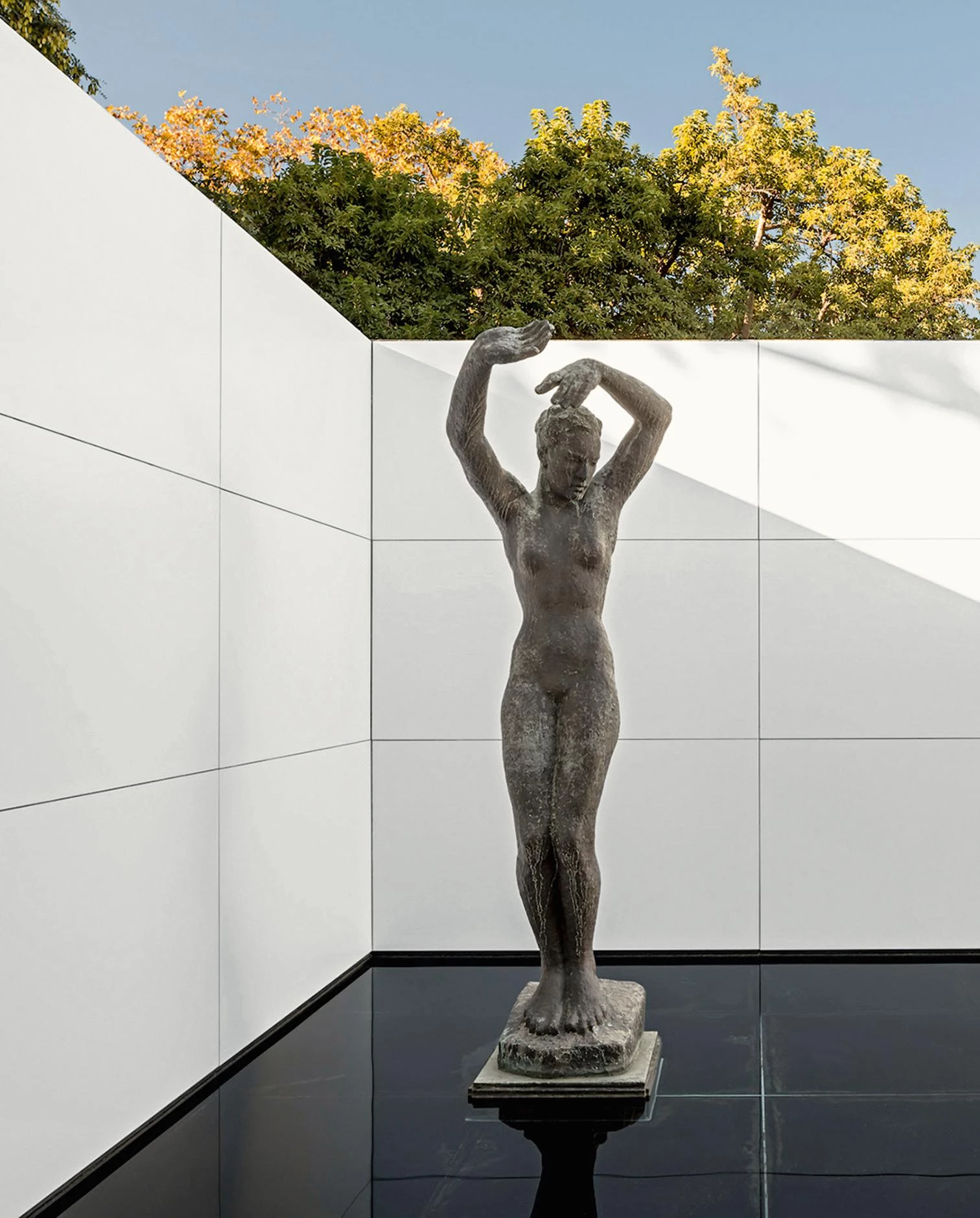
With a temporary intervention, Anna and Eugeni Bach have managed to make Mies van der Rohe’s Barcelona Pavilion lose its materiality.
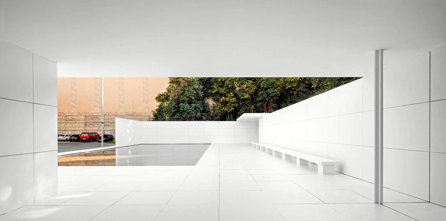
The latest, ‘mies missing materiality,’ was carried out last autumn by the young architects Anna and Eugeni Bach. The proposal involved ‘dressing’ the pavilion’s surfaces in white for eleven days, using vinyl. In this brief period of time, the pavilion was ‘undressed’ in the modern way, clothed entirely in white; a simple gesture evoking multiple interpretations. Perhaps the most obvious remembrance are the white walls of the Weissenhofsiedlung in Stuttgart, for which Mies designed the masterplan, imposing two aesthetic tenets on sixteen modern architects: the finishes had to be as white as possible, and the roofs of the buildings flat. But as Mark Wigley suggests in White Walls, Designer Dresses, far from being real, its nakedness hid a textile strate-gy akin to the world of fashion.
In truth, Mies dressed few buildings in white: the houses in Stuttgart, the Villa Tugendhat, and the exoskeleton of the Farnsworth House. In his work, it is primarily in the horizontal surfaces that clarity is best achieved. Mies’s horizontal diagram begins to take shape with the experi-mental projects of the early 1920s, where the two white planes are clearly defined, creating a horizontal symmetry, thanks to the fact that the observers’ eyes are equidistant between the floor and the ceiling. As Robin Evans points out, the asymmetry of the floor plans is nourished by reflection symmetries in perspective, a type of symmetry from which it will be much more diffi-cult to escape than from the classical symmetry of the vertical plane. Between these two hori-zontal surfaces, Mies van der Rohe establishes two redundant structural elements: the walls, supposedly freed from bearing loads, and the cruciform pillars, too slender and inefficient for bending moments. The internal walls are of darker colors, and their polished finish reflects light and movement, working with the glass to dissolve the exact limits of the floor plan, and enriching the cinematic experience through a labyrinth of reflections.
Therefore, the materiality of Mies is not aimed at hedonistic pleasure; it is not phenomenologi-cal, but it is used to emphasize the spatial concept: it is a diagrammatic materiality. But what hap-pens when, as Anna and Eugeni Bach propose, we alter the material code that makes this hori-zontal diagram readable?
Effects of Whitening
First of all, dressing the walls and the pillars in white reduces the kaleidoscopic multiplication of the space, as the most important material of the pavilion is virtual: its reflections (Josep Quet-glas, Fear of Glass). But by leaving the glass and the two ponds uncovered, this intangible mate-rial is not completely lost. The intervention respects, in addition to the glass, the joints of the floor and walls. The black joints were disguised in the darkness and the narcotic effect of the reflections. The disappearance of the chromatic contrast and the reduction of the reflections make the non-correspondence explicit. Not even the pieces of travertine we step on are the same, as the floor plan would seem to indicate. Mies makes us believe that there is a perfect grid, one which projects an idea of rationality that does not exactly fit with reality.
The second effect of whitening is the recreation of a 1:1 scale model. The pavilion is in itself a true replica which perhaps Mies himself might have rejected, considering how he drew it for publication, showing the plinth overflowing its four corners. Curiously, Mies’s professional inde-pendence began with a huge, full-size white model built in fabric and wood for the Kröller-Müller House. It was initially commissioned to Peter Behrens and subsequently appropriated by his young disciple (1912-1913). Twenty-five years later, together with the designer Lilly Reich, Mies would resume the construction of installations as 1:1 scale models. Of the half dozen installations that they did together, the Glassraum in Stuttgart would be the clearest precedent of ‘mies missing materiality’ in the use of the color white, glass and, above all, reflections.

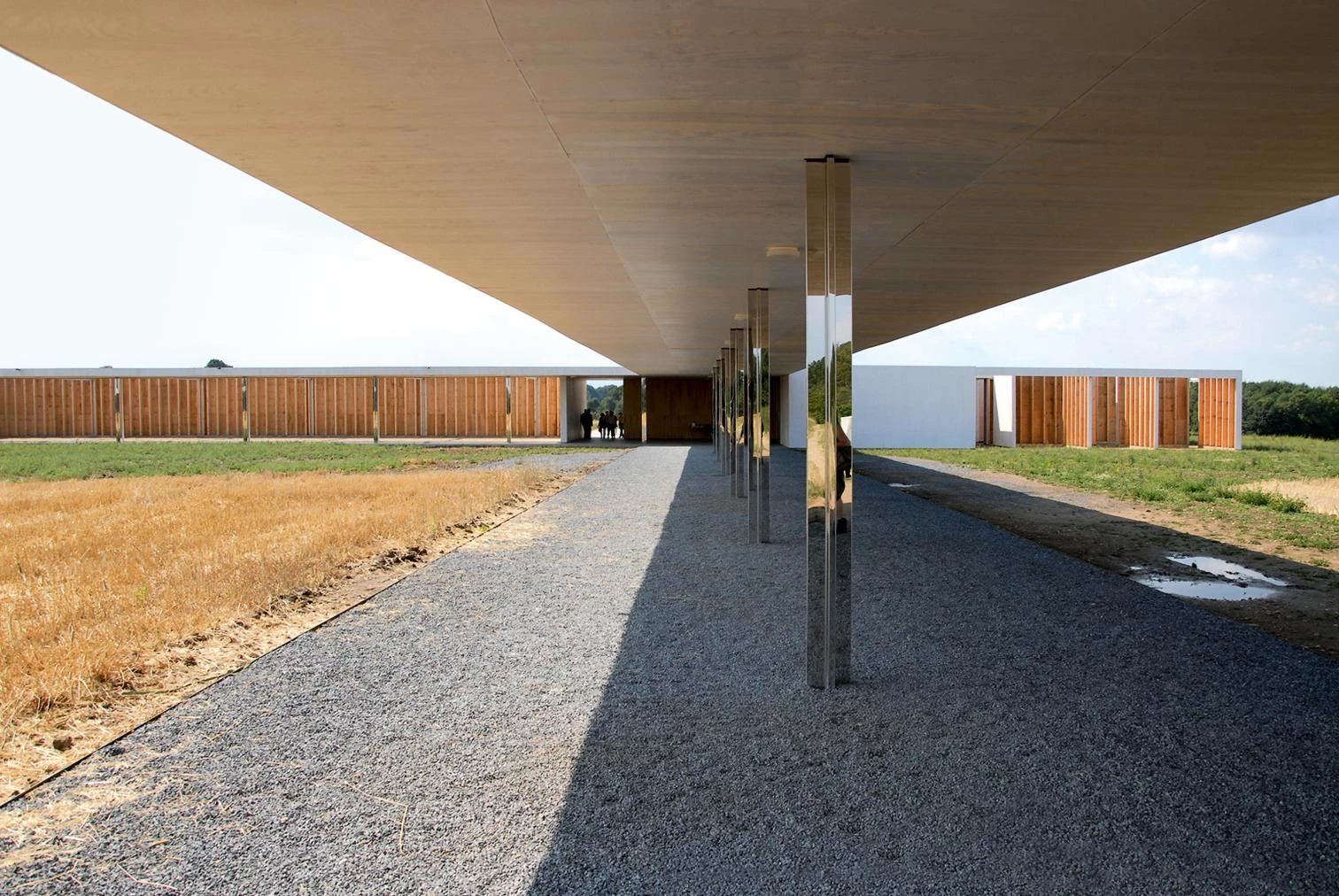
Unlike the exact replica in Barcelona, in 2011 the Belgian firm Robbrecht en Daem reconstructed a 1:1 scale model of the Golf Club Project at Krefeld, a Mies project that had never been built. The installation stood for two years in what would have been its original location. But instead of using brick and glass, following the Mies archives, its materiality was deliberately fictitious and temporary. Robbrecht en Daem re-materialized Mies, replacing the brick walls with plywood panels. With great precision, they reconstructed the windows but omitted the glass, keeping the ghost of the frames without reflections and exposing the wooden frameworks in some of the walls. This shows the structure and the joints, in an exercise in nudity that makes the rigging of the set explicit. Hence, instead of dressing Mies in white, the installation undresses him, showing how he built, and even though the originally intended materials are changed, the es-sence of what Mies’s architecture means to Robbrect en Daem is maintained: constructive hon-esty stripped of the superfluous.
The Barcelona Pavilion was in place for over a year, but it took several exhibitions and the propa-ganda skills of Mies himself, with his retouched photos, for its importance to grow over the half-century of its absence. In the images, the context was erased, and the chromatic richness would be annulled by the fact of being in black and white, emphasizing the symmetry of the horizontal diagram and the reflections of the walls and the water.
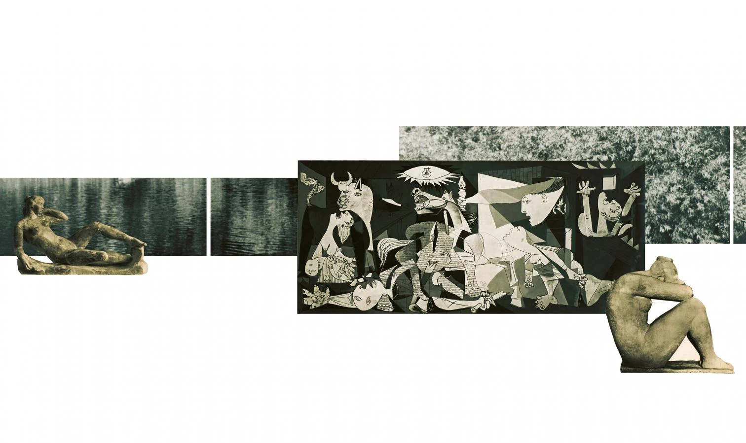
Just eleven days sufficed for Anna and Eugeni Bach to generate a cascade of whitened images of the Pavilion in social networks, which will be projected unlimitedly in time. It is here that the screens multiply. Few could visit the real space, but a look at the photographs of the intervention inevitably brings to mind other unvisitable spaces: the laconic photomontages of Mies, where the floor and ceiling are extremely white, in contrast with a landscape, a picture, or a dark, al-most black, sculpture.
‘Mies missing materiality’ accentuates this contrast between the white and the pools and the black reflections, which can be interpreted as predigital screens and allude to other screens, those that we have in our pockets and on our desks, and which in an infinite scroll we stare at, hypnotized, abstracting our environment, which dematerializes like the dazzling white of Miesian photomontages. If the avant-gardes of the 1920s looked to cinema as a mirror of themselves, new generations consume their time between social networks and online series. The flashes and reflections of the pavilion multiply vertiginously on our screens, evoking the dystopic risks of Black Mirror (Charlie Brooker, 2011-2017). Today’s architecture faces the tension between the heroic position of resistance, with its purity and metaphysical abstraction, and the trivialization of a world transformed into a screen, where the decontextualized image is flashed before so many faces that in the end, its authorship is diluted.
