Reina Sofía Museum Extension, Madrid
Jean Nouvel Alberto Medem b720 Fermín Vázquez Arquitectos- Type Museum Culture / Leisure
- Material Aluminum Metal
- Date 2005
- City Madrid
- Country Spain
- Photograph Duccio Malagamba Roland Halbe Philippe Ruault Joaquín Cortés
- Brand Higini Arau Dragados JG Ingenieros


The project for the extension of the Reina Sofía museum dates back to 1999, year which this proposal was chosen over those of eleven other teams. The program comprised an auditorium, a library, several exhibition halls and auxiliary areas (offices, restaurant, storage areas) that were to take up a triangular plot bordering on Ronda de Atocha west of the old hospital of Sabatini – which houses the museum–, where time ago there were pavilions adjacent to the military hospital.

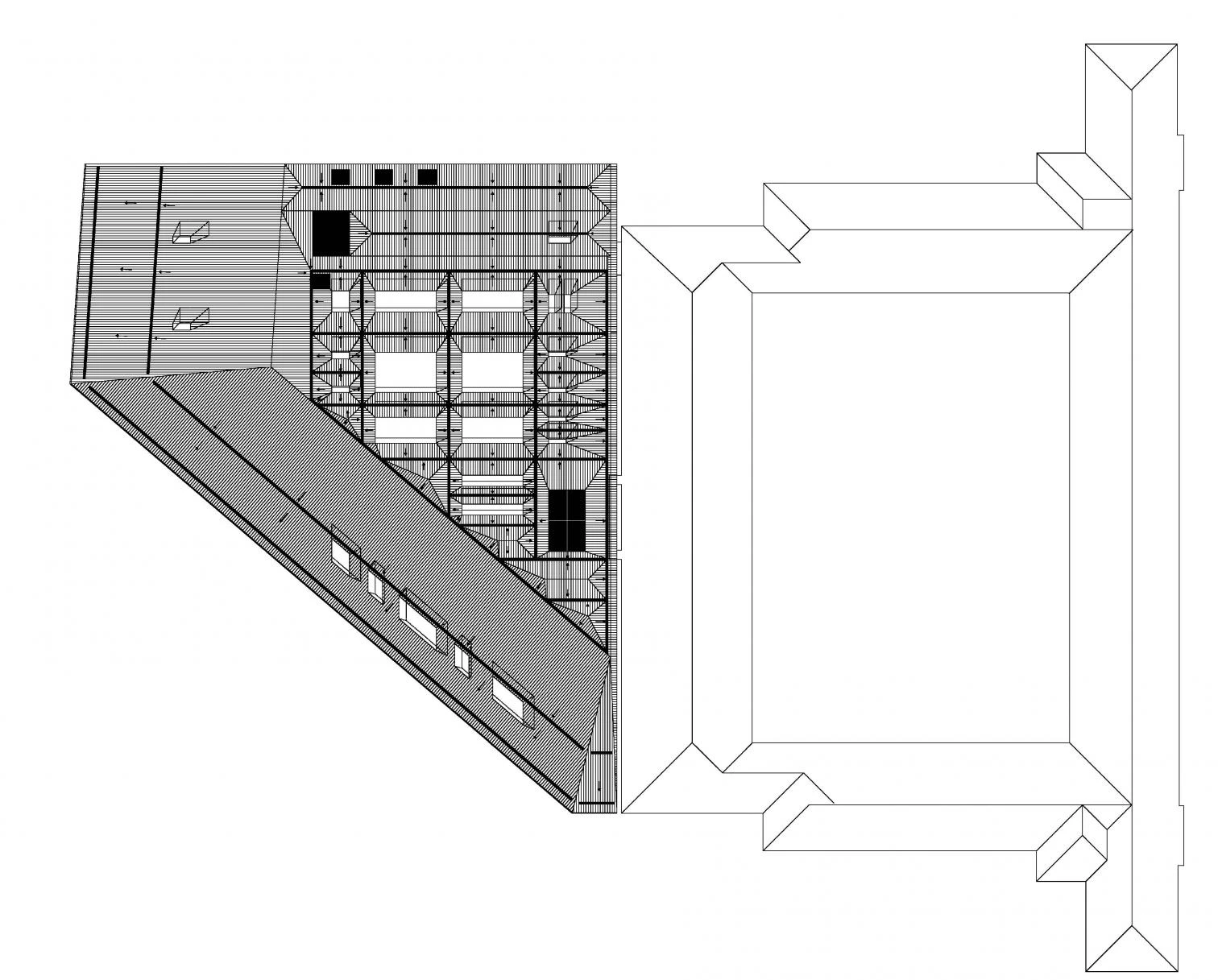
Unlike the compact nature of the Sabatini building, the extension is divided and spread, leaving a public square among its pieces, thus addressing its desire to serve as catalyst for the regeneration of the urban context.
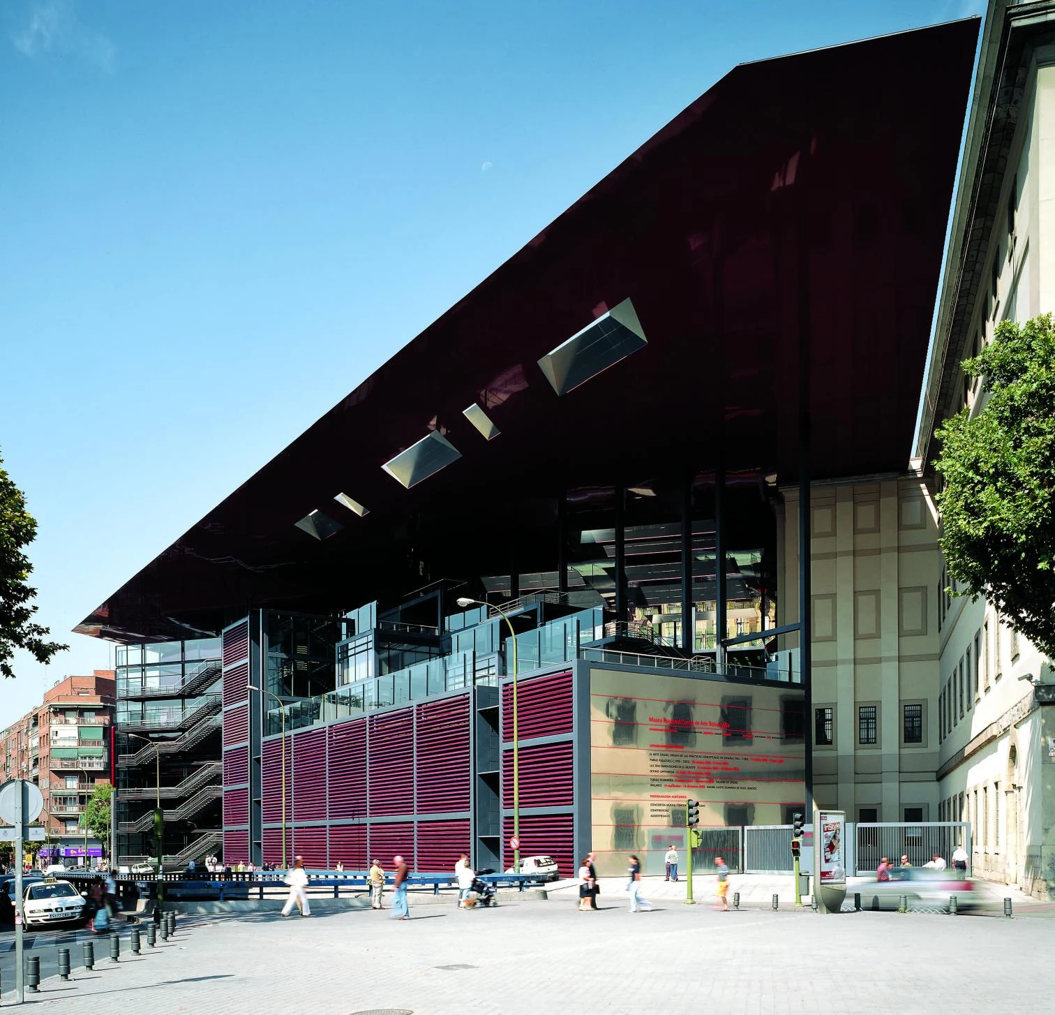
The winning proposal evokes the old Lavapiés quarter raising three volumes around a square open to the pedestrian traffic, bringing them together under a huge roof whose edge is lined up with the hospital’s second cornice.
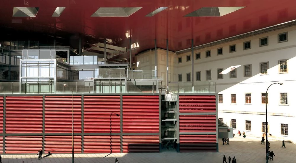
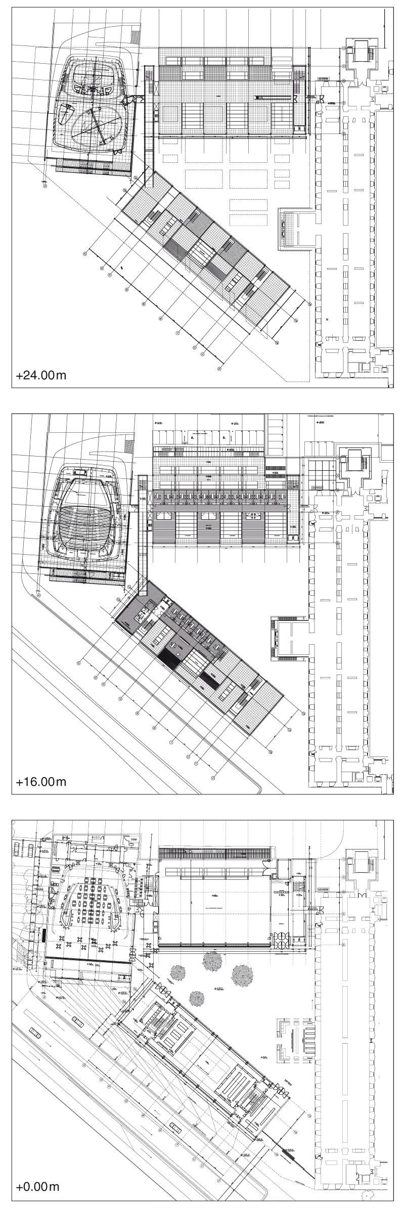
The three volumes are placed around the square: the library to the south, the meeting spaces to the west, and to the north, connected with the old building, the volume devoted to temporary exhibitions.
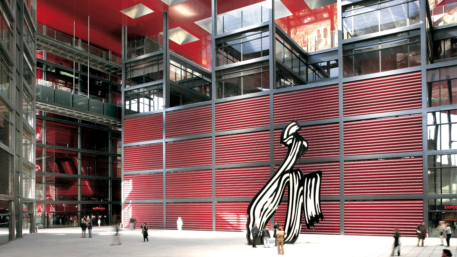
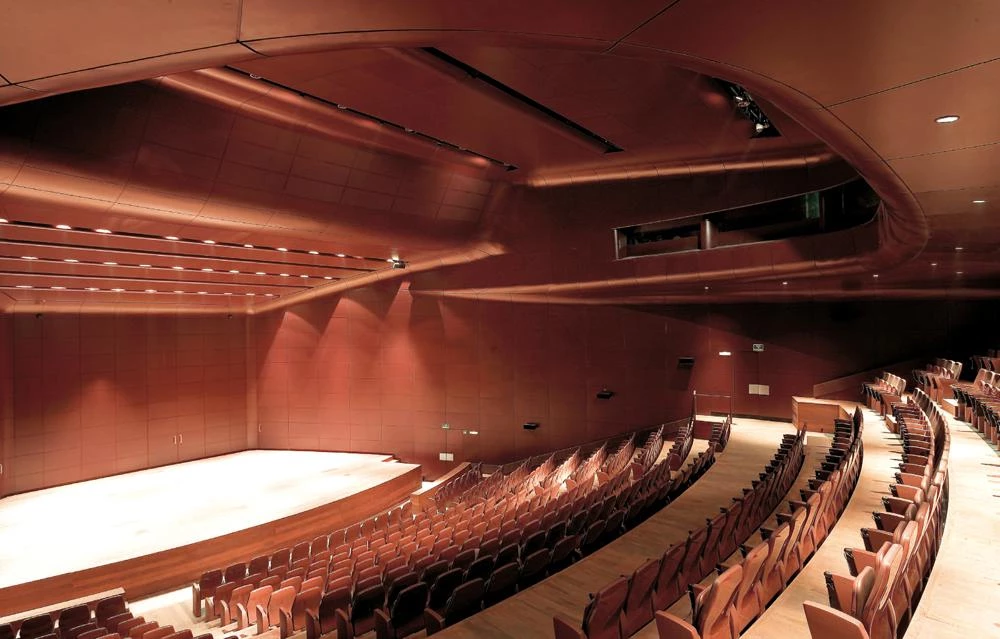
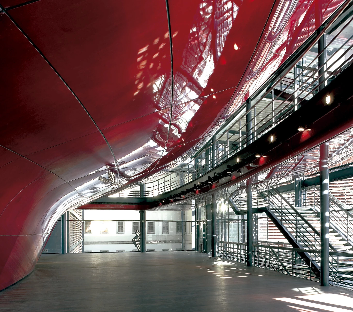
The three pieces correspond to differentiated parts of the program. Connected to the museum by raised footbridges is the exhibitions pavilion, devoted to temporary exhibits – the old one is for the permanent ones – and formed by a sequence of concrete slabs and glass enclosures. At the corner between the streets of Atocha and Argumosa, resting on two concrete ribs and clad in red polyester, goes up the curved volume of the auditorium, next to which are the cafeteria and restaurant; lastly, parallel to the street, is the volume housing the library, a structure of steel frames that accommodates the reading hall, of 16 meters in height and a span of 20 meters, clad in jatoba wood and lit by lamps of thick cut glass.
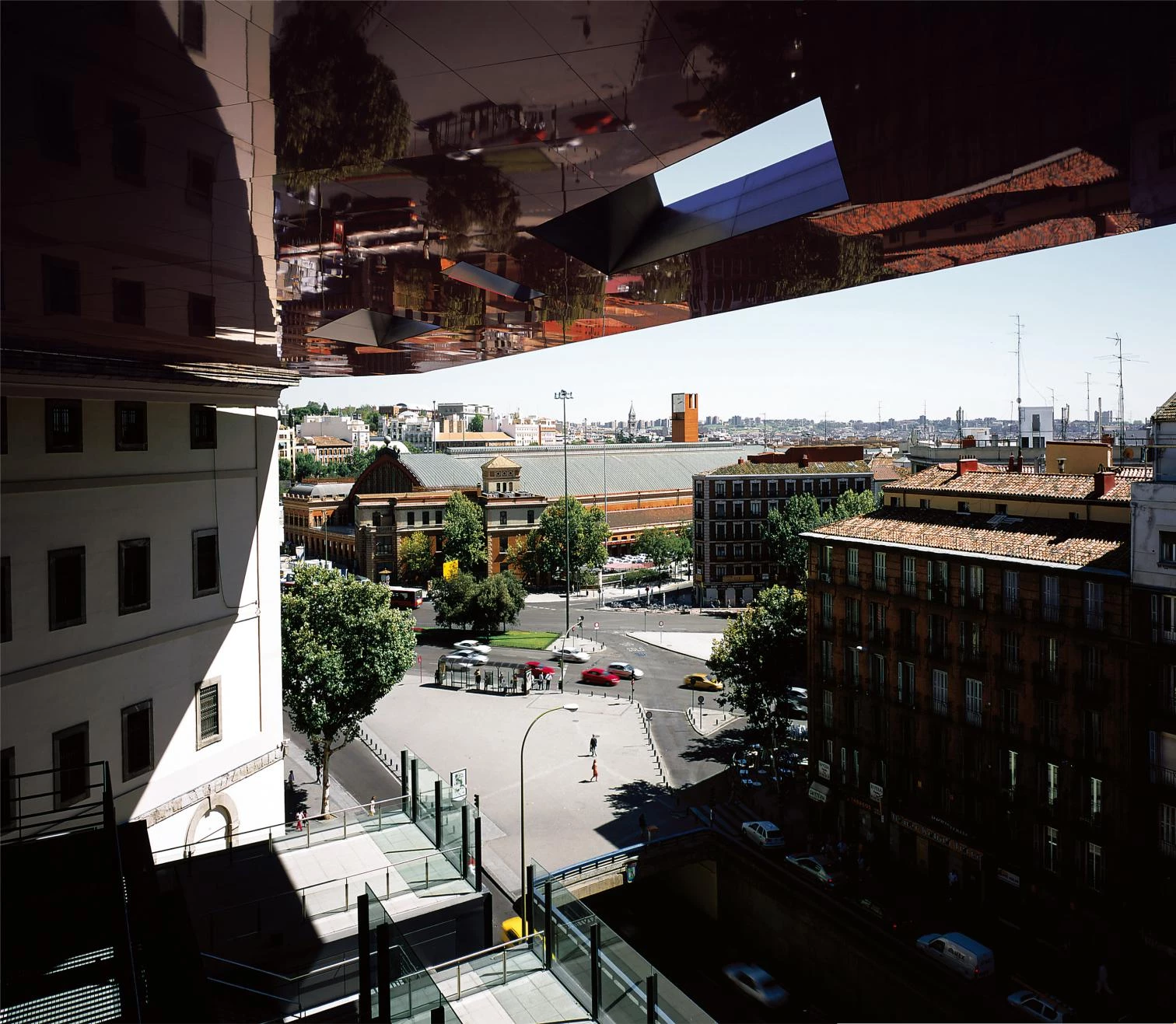
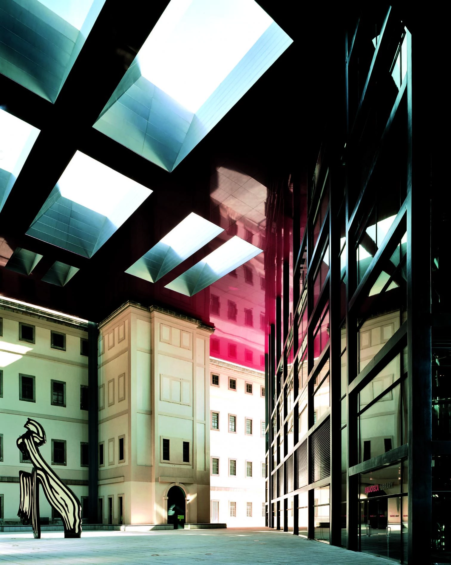
The roof draws the shape of a square over the three buildings: of decreasing section towards the edge – from 340 to 5 centimeters – and of reflecting aluminum towards the interior (towards the exterior it is made of zinc, like the roof of the hospital), its mission is not only to protect the volumes and endow them with an overall unity, but also to bring the city (Atocha station, the car and pedestrian traffic or the nearby facades) into the museum, reflected on its surfaces.
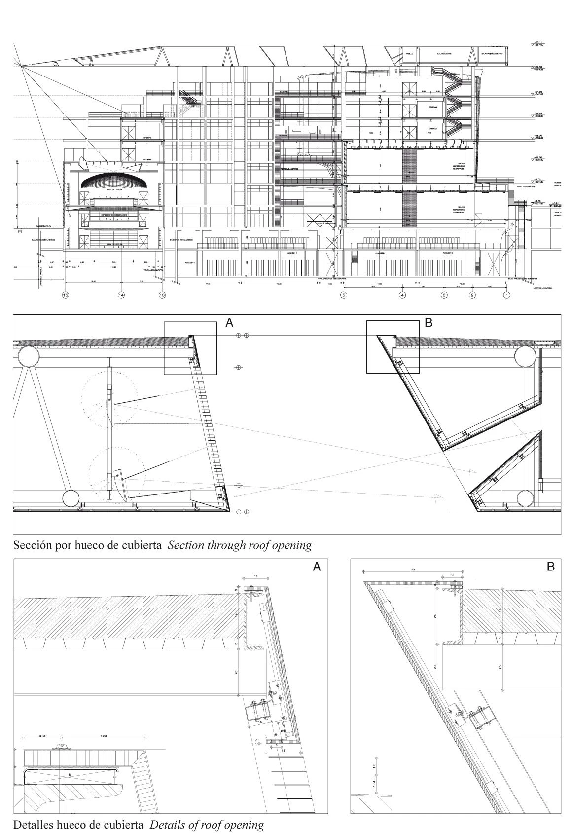
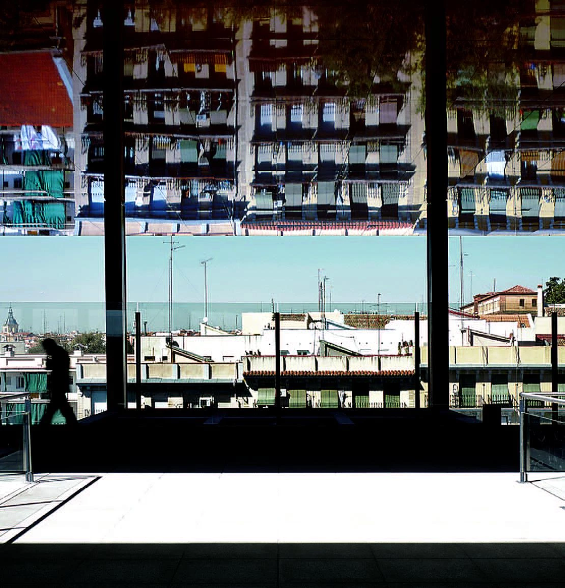
The polygonal openings that cross it are clad in matt steel, to prevent the views of the sky from overshadowing or blurring the images reflected on the roof’s underside. Following this same aim of taking the city to the interior, the library buries its volume below street level, maintaining a lower height than that of the exhibitions building, that is thereby able to afford impressive views from the upper terraces. Mechanized steel slats, perforated or solid, protect the most exposed facades. The granite square, a surface ‘sheltered’ from the street activity, is presided by a Lichtenstein piece, artist with which the new halls were inaugurated.
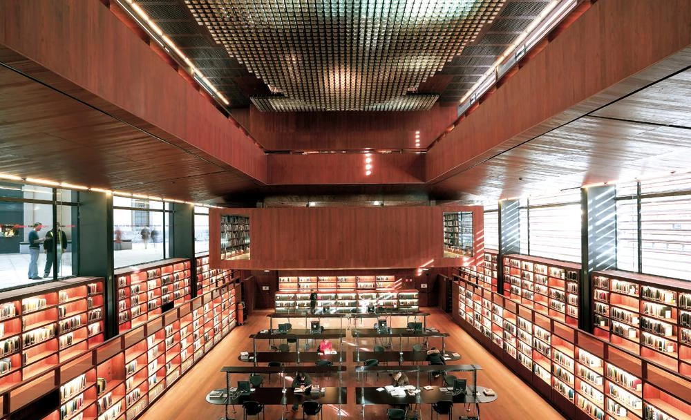
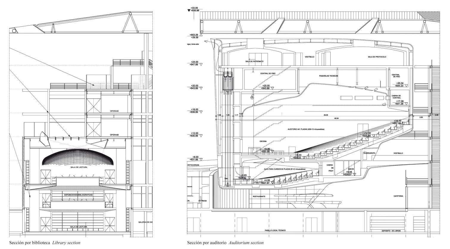
The materials and building techniques used are not habitual in Castilian tradition: the bold roofof zinc and aluminum,the glass dice made ex profeso on the roof of the library, or the red GRP that clads the auditorium.
Cliente Client
Ministerio de Cultura
Arquitectos Architects
Jean Nouvel, Alberto Medem, b720
Colaboradores Collaborators
M.Velasco, A. Miranda, R. Cañizares,C.Campo, B. Belloso, H. Esteban, J. Piedra, C.C. Nogueira, R. Pleite, G.L. Farrarini,A. Magalhaes, A. Lamiable, E. Siles,F. Garrido, J.Chicharro, J.Galiana; D. Muñoz, J. de la Dehesa, (arquitectos museo, museum architects); R. Guijarro, M. A García, P. Parrilla (aparejadores quantity surveyors)
Consultores Consultants
Esteyco (estructuras structures);JG (instalaciones mechanical engineering); Higini Arau (acústica acoustics).
Contratista Contractor
UTE Dragados/ACS
Fotos Photos
Duccio Malagamba, Roland Halbe, Philippe Ruault; Joaquín Cortés

