Iñaqui Carnicero and Carlos Quintáns in Dialogue
Spanish Version

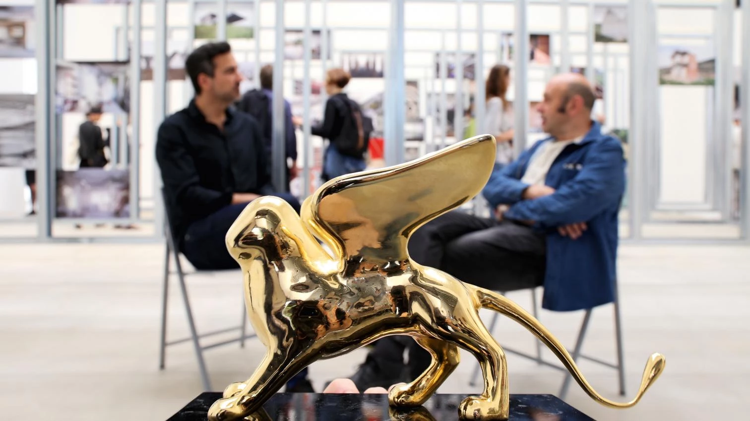
The Spanish Pavilion, curated by Iñaqui Carnicero (Madrid, 1973) and Carlos Quintáns (Muxía, 1962), has won the Golden Lion for Best National Pavilion at the 15th International Architecture Exhibition of La Biennale di Venezia. Its title, ‘Unfinished,’ and its central theme, architecture after the crisis, seemed to announce another critical, if not masochistic, analysis of Spanish architecture today, but fortunantely it hasn’t been so. On a shoestring budget Carnicero and Quintáns have managed to highlight the general theme of the Biennale directed by the latest Pritzker Prize laureate, Alejandro Aravena –with his emphasis on modest projects, his defense of the social role of architects, and an inevitable focus on Latin America –, but most importantly, they have managed to spread a positive message about Spain, and make it get through: the idea that beyond the critique of excess, architects have adapted to the at first glance unrewarding context of small refurbishments, adaptations, or grafts, without giving up the quality that once seemed to be exclusive to large public buildings.
Optimism has thus made its way into the Spanish exhibition, a sober, attractive installation featuring fifty works carried out with a tight budget and an evolutionary purpose, grouped into nine categories that take stock of the recent architectural scene in our country. With the pavilion as backdrop, and still showing undisguised joy after winning the golden statuette, Carnicero and Quintáns talk about the purpose of their exhibition, and about the challenges they had to face to convey an at once critical and hopeful message without falling back on the clichés associated with the crisis.
Carlos Quintáns: The truth is that coming to Venice is a beautiful adventure. Of the three biennials Spain takes part in (the Spanish one, the Iberian-American one, and the Venice Biennale), I think this one is the most intense and stimulating because it allows conveying a message beyond local frontiers. In this cycle we were fortunate to have a general coordinator for the three biennials, one who has made the effort of arranging the contents, trying to find the way of offering an original and complementary message in each one of them.
Iñaqui Carnicero: Pachi Mangado has managed to construct a fitting argument for three very different biennials, and we must also mention the Biennale’s overall director, Alejandro Aravena, who has chosen to share rather than display his own work, and invited us all to do the same. Thanks to this we have been able to hear about the problems afflicting each country over the past years, learning a lot in the process. The collective has prevailed over the individual.
CQ: The primary focus was to show a collective project, to transform all those sad years into a ray of optimism. This, I think, is what has drawn more attention in our installation: how it shows the potential of so many Spanish architects, of so many works. We wanted the world to discover buildings that we know well, all works of high quality, which in Spain we take for granted. The Venice Biennale had to be a showcase of our efforts.
This showcase is a simple structure of galvanized steel frames that take up the space provided by the powerful architecture of the existing pavilion, creating a grid where photographs and plans are placed (one photograph and one axonometric drawing per work). The result is a sort of chaotic cartography that bombards visitors, but also captures their attention.
IC: Many people didn’t understand it at first. They thought we were criticizing the situation, when it was quite the opposite. The selection of photographs, aside from documenting a harsh reality, is filled with optimisim and highly suggestive visions. The images call for action, they are innovative proposals that have managed to discover revealing actions in these architectures.
CQ: At first we feared that handling so many works and projects could produce a complete cacophony with no sense of unity. The challenge was to convey a sense of unity.
IC: Yes, indeed, this was the most complicated thing. I remember that the first thing we did was to visit the pavilion in order to establish a dialogue with the existing, and also a balance between the amount of architecture we had to produce and what was already there. What people understand after visiting the pavilion is that it is a very good building, a space that works as it is supposed to, and also, that the exhibition is carried out with very few means.
CQ: It was surprising to hear someone comment that this exhibition had managed to give the building, or the perception of the building, a dignity that in other exhibitions had remained hidden. In our view it was the best possible container for the exhibition.
IC: It is fantastic because it is so versatile. When we decided that we didn’t want a static exhibition, we brought in the idea of movement in some components, and added the small motor that lifts the structure of the photographs. The exhibitions hall is transformed into an impromptu assembly room for debates, talks, or roundtables, encouraging the exchange of ideas that this biennial promotes.
CQ: The height of the central space is extraordinary. We were lucky to find it completely bare and have the opportunity to discover its possibilities.
IC: This links up with a subject that comes up often of late: the danger of falling on a povera aesthetic, an aesthetic of ruin, on something more banal. At the beginning we wanted to bare the walls to expose the brick, but now, months later, we feel it would have been a mistake, don’t you think?
CQ: That would have been a mistake, and also a fiction: jeans are best worn out by use, not by trying to make them look used.
Powerful and intuitive thanks to its synthetic, direct character, the exhibition of photographs and drawings might seem succinct, but in fact the information physically presented in the artistic installation is only the tip of the iceberg, and there is a huge amount of data and works gathered after an open selection process that can be explored on the pavilion’s website, so there are several reading levels.
IC: We wanted the message read at different speeds: some want a clear message from the beginning, graspable in less than thirty seconds, but others prefer to delve into the works and learn from them. I am quite pleased with the three levels of perception, which begin at the pavilion and end on the website.
CQ: There was a lot of information, true, and we had to be very generous with that information. That is why we have to analyze how the website has worked over these days, to understand how the exhibition has worked.
IC: There are controversial and tough subjects, perhaps without a clear answer. While visiting the pavilion Rafael Moneo pondered on an issue that had been very important for us from the beginning: finding a format in which all the works are displayed at the same level. We chose a photograph and an axonometric drawing. He wondered to what extent this information could be enough to understand a project, and we on the other hand had no doubt that overall unity was more important than hierarchy.
CQ: Exactly, feeling that there was a shared course of action.
IC: We didn’t want to show a specific architect or school, but rather to convey a message: a positive message, open to our present time and to the complex future that lies ahead.


