Foam Rubber Avant-Garde
Koolhaas has presented in Berlin his latest works with a street market-exhibition and fanzine-book whose playful disorder reflect the restless spirit of the moment.
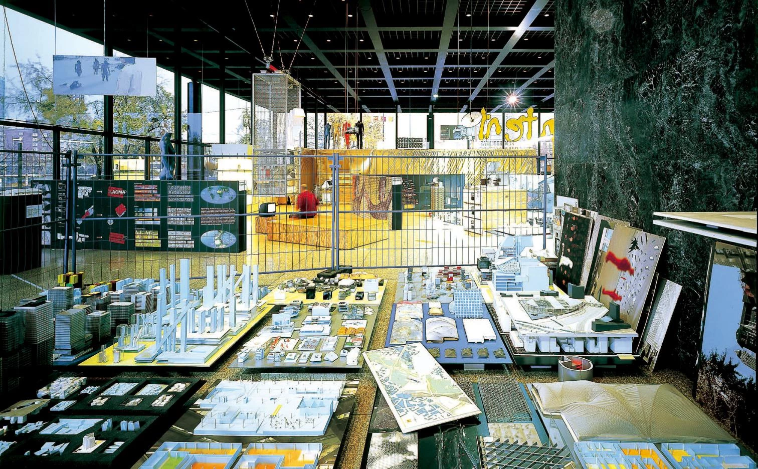
With the exhibition and book Content, Rem Dutch architect sums up the past seven years of his career with a show in Berlin’s Neue Nationalgalerie that scatters 300 objects and models in the interior of Mies van der Rohe’s monumental temple, and a fanzine-sized book whose 544 pages mix projects and politics in a toxic and hypnotic cocktail. Evoking the casual mess of a street market and the confusing agglomeration of a school warehouse, the exhibition presents some fifty projects through a wealth of documents and work materials. These are interweaved with categorical geopolitical and socioeconomic diagnoses formulated through vertig-inous typographies and illustrated with a profusion of diagrams, maps, statistics, and press clippings. The book, in turn, which is not exactly a catalog of the exhibition but a motley accumulation of images and texts on design and trends in a globalized world uses Koolhaas projects to traverse the planet from San Francisco to Tokyo, following an eastward route that endeavors to reflect the architect’s intellectual movement from a disappointing America to a resistant Europe and an Asia on the rise.
The book released for the AMO/OMA exhibition is a volume of fresh and provocative appearance.

Designed by the Canadian Bruce Mau, the previous stocktaking of Koolhaas and his Office for Metropolitan Architecture was the titanic volume ti-tled S,M,L,XL, which became a cult book among young people soon after it came out in 1995. The current synthesis of the work of Koolhaas and OMA uses as guiding thread no longer the size of build-ing, but their geographic location. The shift from scale to context perfectly expresses the Dutch architect’s insomniac anxiety to situate his work in the world’s agenda. Making abundant use of material generated by AMO (a parallel office concentrating on research, publication, and image) and entrusting editorial design to &&& (a graphic design team with an alternative and amateur flavor), the final Content turns out to be a digest of what has of late gone through the hands and effervescent head of Rem Koolhaas: projects indeed, ranging from the library of Seattle and the just opened student center in the IIT of Chicago to the CCTV headquarters in Beijing or the hyperbuildings for Bangkok and Seoul, passing through the Casa da Música in Porto, the Dutch embassy in Berlin, or the renova-tion of the Hermitage in St. Petersburg; but also his texts on ‘junkspace’, today’s Las Vegas, the impor-tance of commerce and fashion, approaches to heritage, European identity, or Asian challenges.
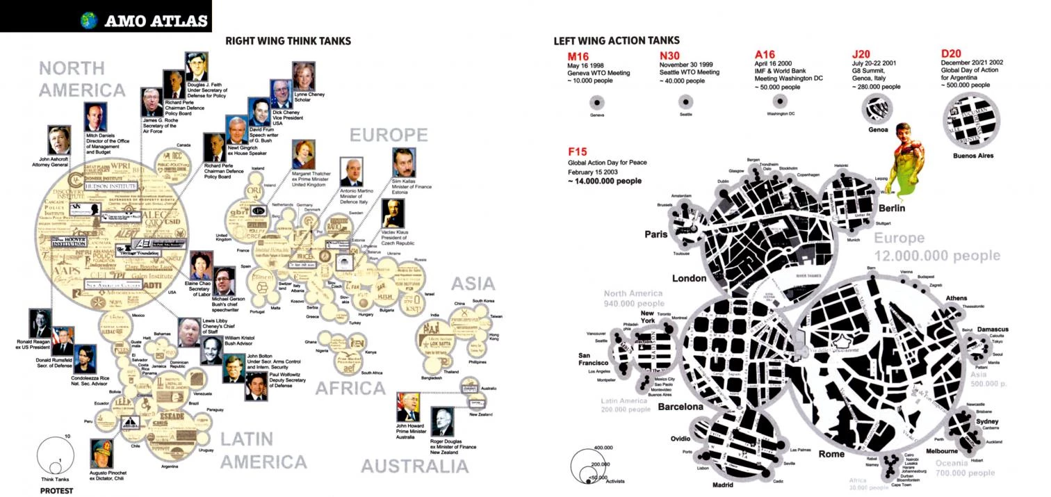
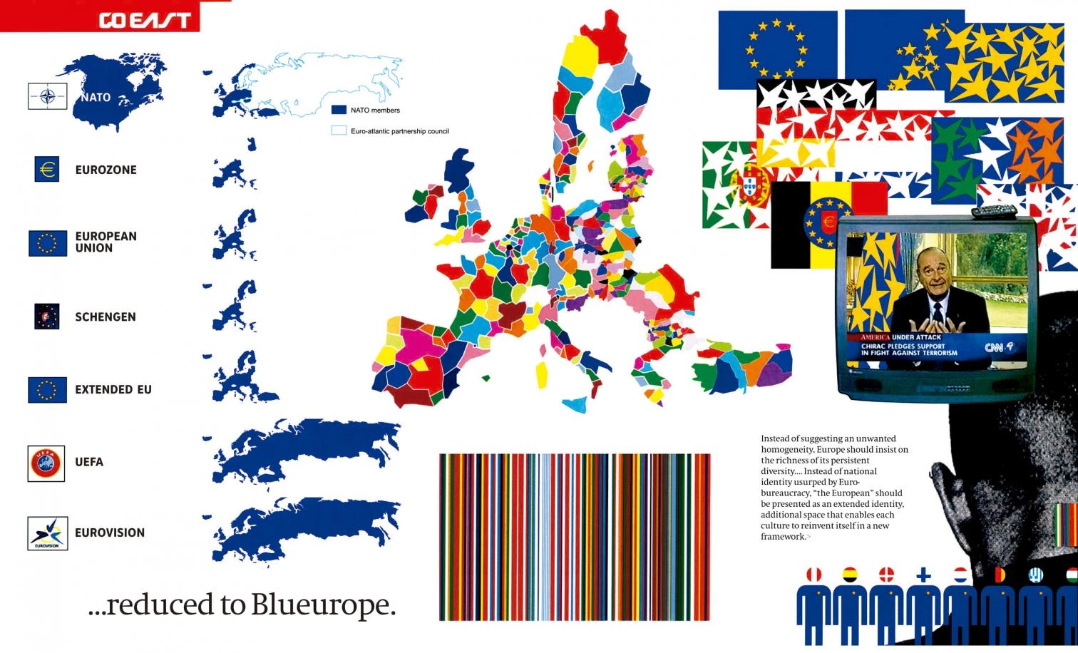
The peculiar graphics of Content interpret with the same flair recent world history, the struggle between right wing think tanks and left wing action tanks or the evolution and perspectives of the European unity process.
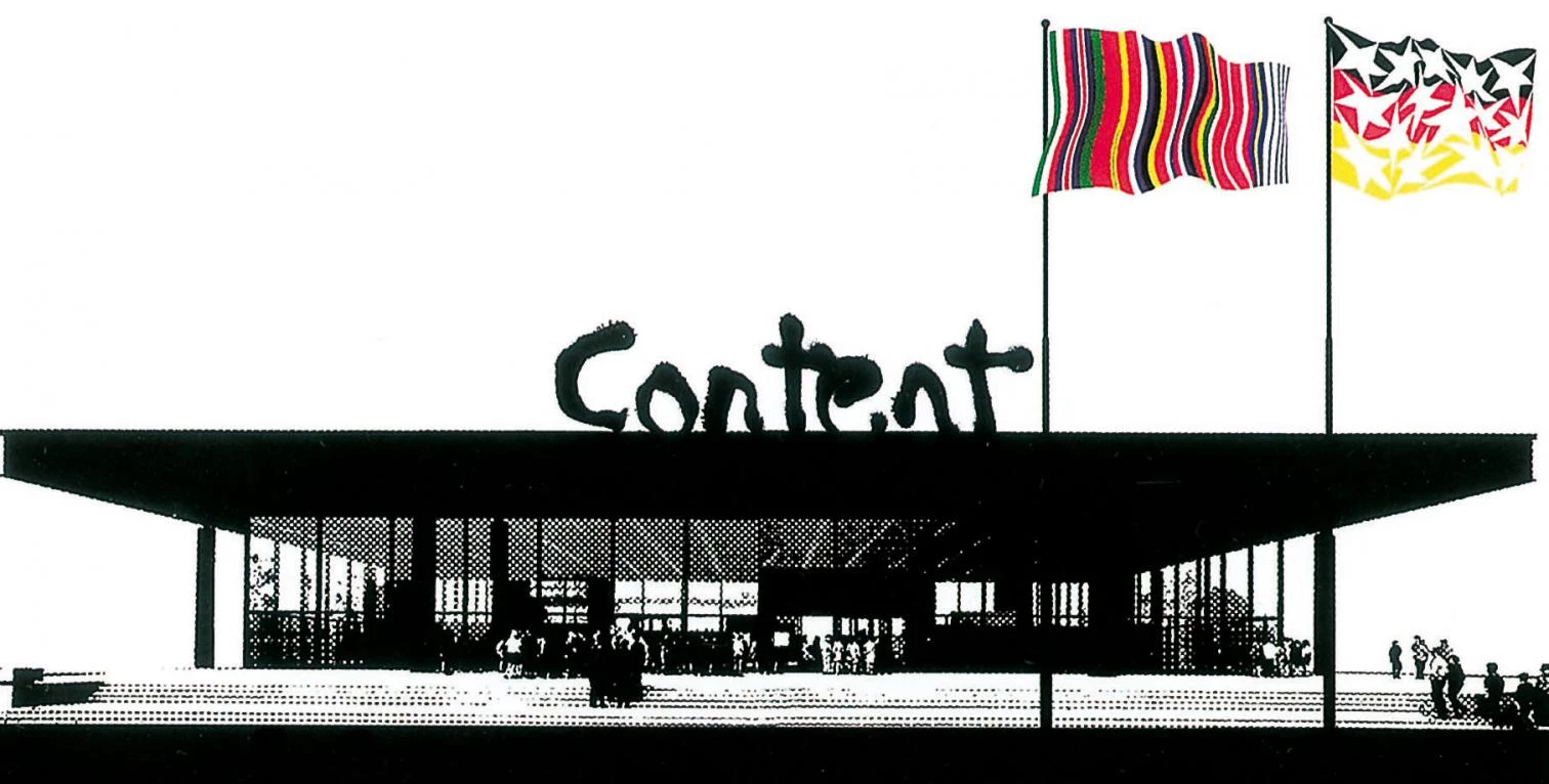
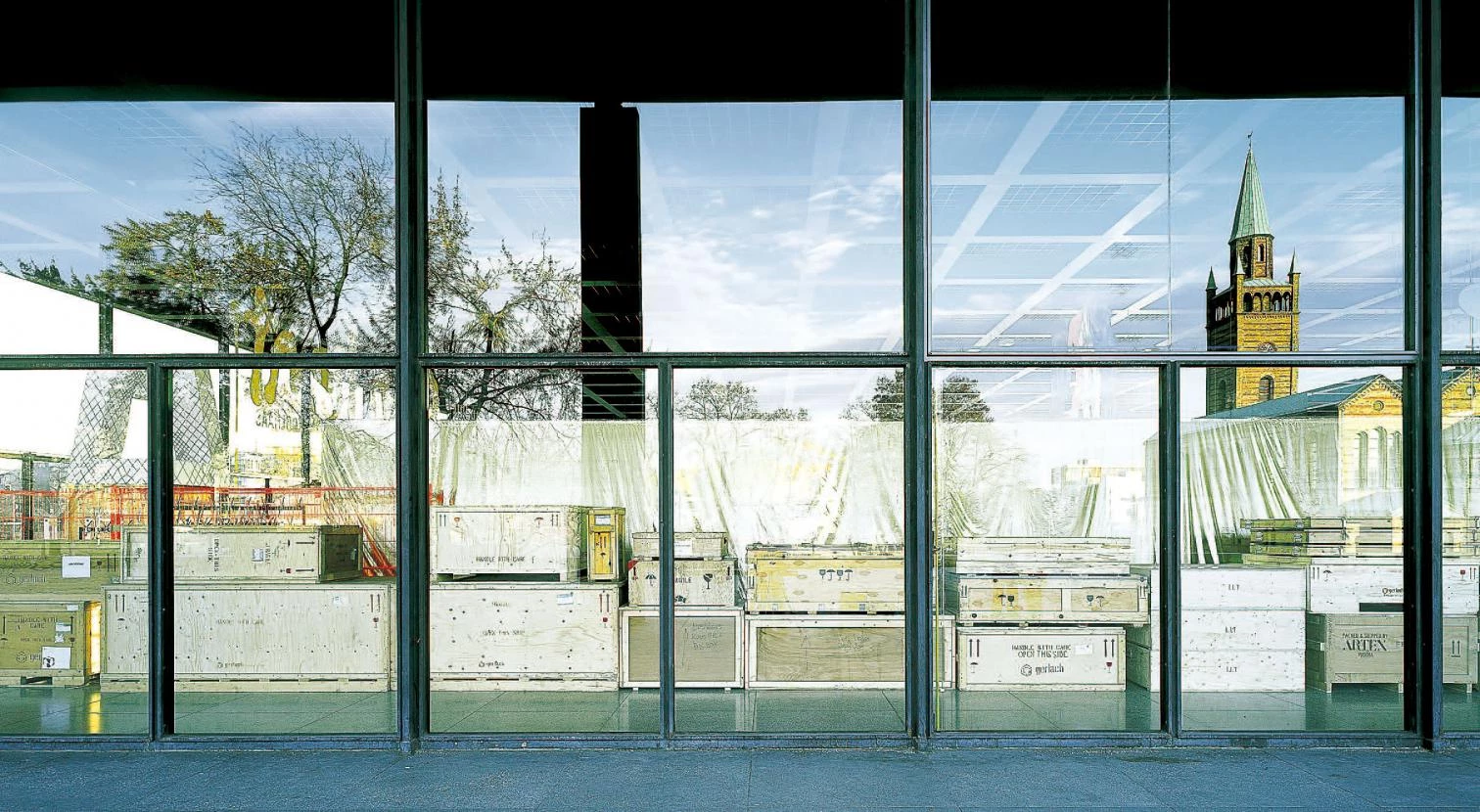
In both the exhibition and the book, Koolhaas stimulates us with excess, racket, and shrillness. Seeing Mies’s inscrutable building colonized by a bazaar of blue polystyrene models with magnetic anti-theft markers, construction site fences, drawing boards carelessly propped against the marble walls, a stall selling T-shirts with the logos of the projects, and boxes piled up beside one of the large window panes makes us think of the barbarian invasions. But it also speaks of the disheveled vitality of the everyday, a fertile disorder that may disconcert us but also bring unexpected rewards. To pursue these pearls in the book needs first to cross the threshold of its cover, where Koolhaas subjects us to a shock treatment of an air brushed title, Disney stars, trivially provocative labels (perverted architecture, homicidal engineering, paranoid technology), and the racy humor of a collage worthy of a brainless teenager on a diet of chats and photoshop. However, behind this offensive, grotesque presentation is a rushed sequence of flashingly seductive images and ideas that puts architecture in the ever-changing pulse of a turbulent planet.

Always moving out of bounds, the Dutch agitator sums up his formal innovations in fifteen irri-tating, brilliant patents, and places his architecture in the framework of the information economy and media totalitarianism. If in the process he flirts with the famous in fashion, succumbs to the megalomania of design, and takes pleasure in proclaiming a revolution every three months, something he himself lucidly detected in Wired magazine, these are venial sins deserving forgiveness. Harder to accept is the uneven quality of the information, accumulated with the bulimia of the web, and the puerile populism of the graphic layout, that goes from bright to vulgar without batting an eyelash.

But even in informational gluttony and childish packaging Koolhaas is in tune with the times. If pub-lic space is a circus, as Peter Sloterdijk thinks, then no one can denounce the residues of Francoland better than the clown Leo Bassi. After all, James Carville reviews the US primaries dressed in a rugby T-shirt in CNN’s war room, decorated like a teenager’s bedroom. And when newspapers publish obituaries of gorillas, there is nothing strange in exhibition galleries featuring corpses of executed Chinese people skinned by Gunther von Hagens as pedagogical anatomy and middle-class frisson. Koolhaas is hip, and his caricaturesque politicization of architecture is a rhetorical resource that uses foam rubber to recall the divorce between money and intelligence that Hollywood coined as the conflict between suits and ponytails.
Spain’s most political architect is Oriol Bohigas, who in Avui effusively thanks the extravagant nationalist leader Carod Rovira. Whether it is out of a desire to tame the beasts with music or to declare himself neutral between lions and Christians, it is difficult to say. Perhaps politicians, as in Mexico’s PAN, ought to pass a test before being issued a license. Meanwhile, Newsweek applauds how well Spain is doing and presents Barcelona as example. The producer Ibáñez Serrador claims that the TV audience is exactly 14 years old; the audiences of architecture and politics may not be much older.

