Inconspicuous Mastery
The Bank of Spain has completed its headquarters in Madrid’s Cibeles with a corner designed by Moneo that uses the language of the existing building.
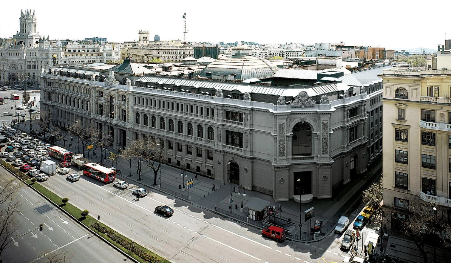
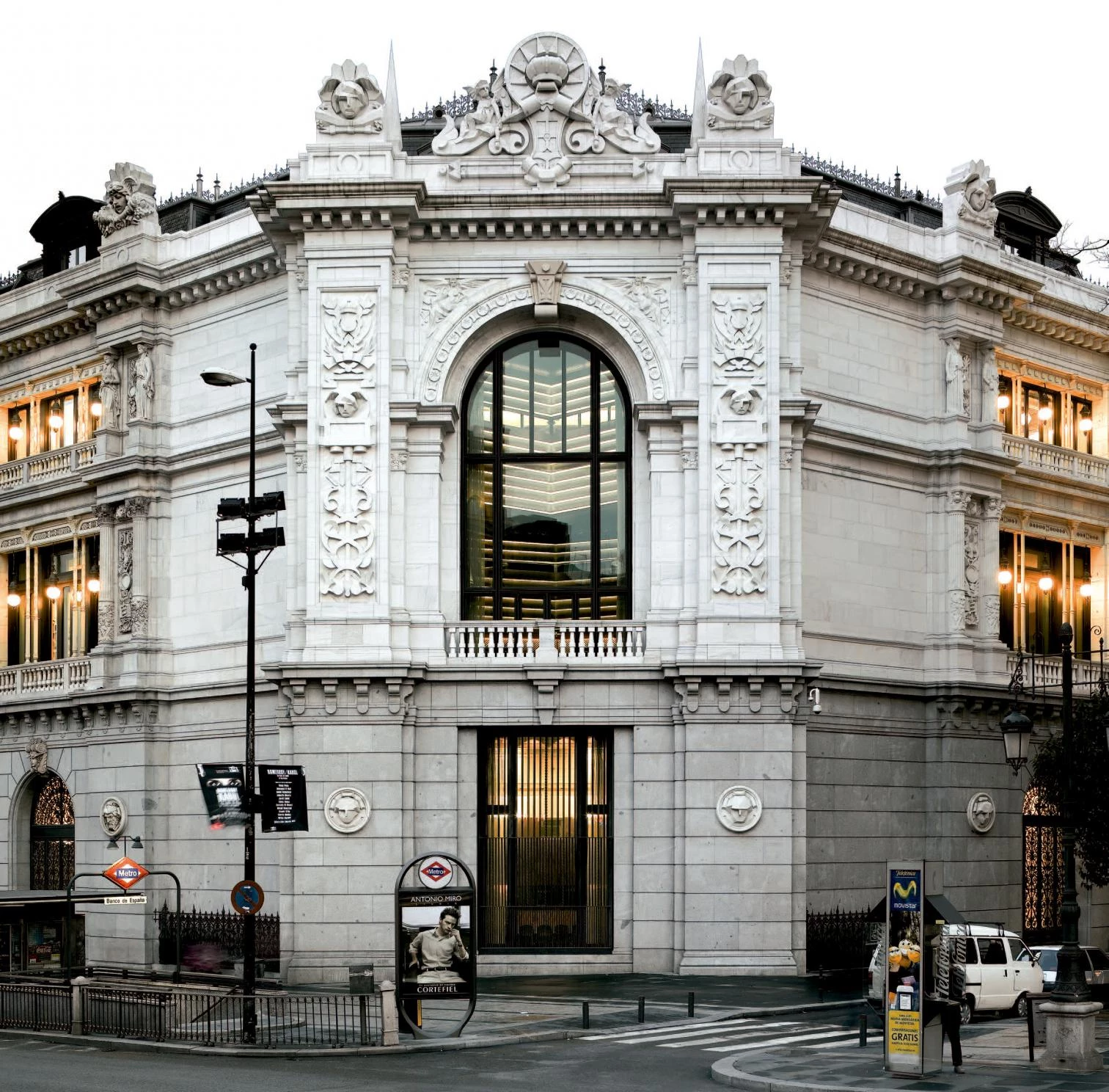
It is harder to go unnoticed than to attract attention. And at the Plaza de Cibeles, at the symbolic heart of the Spanish capital, little less than impossible. Yet few of Madrid’s people will notice Rafael Moneo’s recent enlargement of the Bank of Spain headquarters, however prominently its new corner on Alcalá wraps up the perspective of the Gran Vía. So faithfully does the addition take up the lines of the preexisting construction, that the distracted gaze will simply assume it was always there. Only those residents with particularly good memo-ries will remember José de Lorite’s building for Banca Calamarte, long covered as it was with canvases and torn down in 2002 to give way to what now concerns us, the recently finished facades of which—as in the first enlargement, drawn up by José Yarnoz in 1927—reproduce those of the original construction, an eclectic work of the architects Eduardo de Adaro and Severiano Sáinz de la Lastra that opened in 1891. And if now it takes a lot of attention to detect the sutures in the masonry, in a few years only historians will know that the categorical elevation on Alcalá is actually two elevations separated by more than a century.
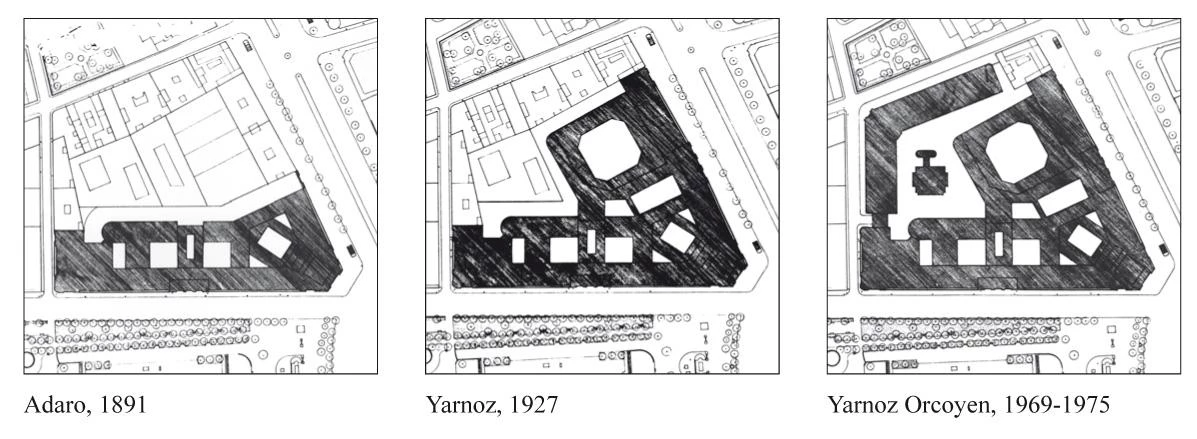
The original Bank of Spain was built in 1891 on the Paseo del Prado, was extended in 1927 along Alcalá street, and the block was wrapped up (except for the corner now completed by Moneo) between 1969 and 1975.
Naturally, the essential lesson of this small work of Moneo is that one need not use the language of our time to expand a historic building, as claimed by heroic modernity, which established this principle beyond doubt. To question this dogma of the 20th-century avantgardes is to scandalize the defenders of modern orthodoxy, who will probably raise their fists in several directions. For a start, they will point out that the project came about through a competition held back in 1978, and that it therefore goes by the postmodern revisions then in vogue – subsequently discredited – instead of addressing con-temporary concerns. They will also draw attention to the fact that as much the unmistakable interior sections as the geometrizing of the decorative de-tails of the facade are evidence of the architect’s simultaneous sliding toward his own formal language and ironic distancing from classicist codes. Finally, they will stress that the extension rises on so small a piece of the city block taken up by the Bank of Spain that it cannot possibly aspire to offer a modern counterpoint, and it can do no more than complete the preexisting through mimesis.
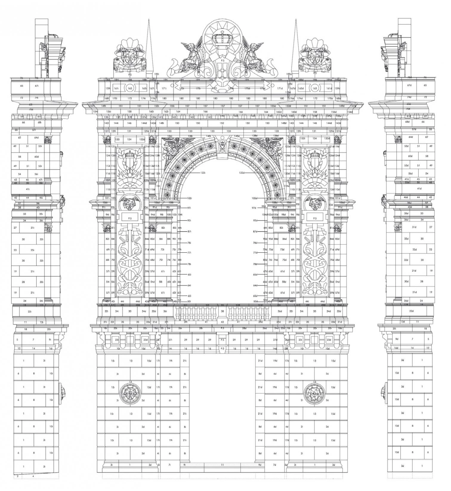
But none of this is entirely true. The competition is indeed remote in time. Suffice it to remember that the central bank has seen four governors since. But the matter came to a dead end when the City Council denied the institution permission to tear down Lorite’s work, a mixed-use building containing offices and apartments that was completed in 1924 and vacated in 1974, after its acquisition by the Bank of Spain. Construction of the corner was delayed for over a quarter-century, but has now finally been carried out in accordance with a definitive project that, while significantly improving the initial proposal, reaffirms the starting hypotheses, which revolve around completing the block with the same language. In the second place, the sections reveal some dissonances that are modern, but these are clearly less important than the symmetrical classicism of the floor plans, and the convincing decomposition of ornamental elements into planes –except for the new caryatids, entrusted without too much luck to the sculptor Francisco López Quintanilla – is closer to Art Déco than to the irony of Venturi, whose playful extension of London’s National Gallery in 1986-1991 will be in the mind of many, even as it places itself in a territory that is methodologically much removed from this severe project. Finally, the dimensions of the operation invite but do not necessarily demand contextual discreetness, as several of the 1978 competitors eloquently expressed through a whole gamut of proposals that ranged from the rough modern militancy of Corrales & Molezún or Eleuterio Población to the postmodern provocations of MBM, passing through the schematic historicism of Javier Yarnoz, son of the author of the first extension and himself the architect of the less fortunate second extension carried out in the period 1969-1975 on the streets Madrazo and Marqués de Cubas.
Though a small work, both the importance of the institution and the quality of the original building – where the historian Pedro Navascués has with a critic’s sharpness detected the coexistence of the establishment’s two characters: on one hand its industrial nature, reflected in the sober granite plinth, on the other hand its representative role, shown by the solemn arches and ‘Venetian’ columns of the main floor, rendered in limestone; a dichotomy that is repeated in the sequence of interior spaces, the more laconic ones along the axis of the corner facing Cibeles, the more palatial ones behind the monumental entrance on the Paseo del Prado –make Moneo’s enlargement a uniquely prominent project, one we cannot help comparing to his other interventions along the Prado-Castellana axis, in all of which he has had to confront patrimonial dilemmas, from the exemplary deference to a pre-existing mansion in the Bankinter case to the less successful struggle with Villanueva’s work in the Prado Museum extension (perhaps more censurable than the stubbornly controversial brick cube in the Jerónimos church cloister), not to mention the intelligent use of the Palacio de Villa-hermosa facades for the Thyssen Museum and the joining of the hypostyle rhetoric of Atocha Station with the marquee of Alberto del Palacio.
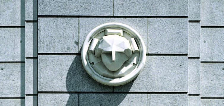
The corner designed by Rafael Moneo resorts to the classicist language of the original eclectic work, though nuanced by the geometrical treatment of ornamental elements, which are carved out with planes of Art Déco flavor.
In perspective, it may be that the most silent works are what end up capping greater critical attention, and that the two banks designed in the seventies – Bankinter and Banco de España – will be judged as being more significant for the history of architecture than the two museums or the station nearby, the mass use of which give them greater public visibility. The long due closing of the Banco de España block has been described in El País under the title ‘The Caruana Corner,’ and indeed one is tempted to think that the parallel history of the institution and the building has a worthy crowning in its culminating under Jaime Caruana, a governor – one trained in that same public high school of Teruel that with teachers like José Antonio Labordeta produced graduates like Juan Alberto Belloch, Federico Jiménez Losantos or Manuel Pizarro – who is as excellent as he is discreet, with an international career in the economic field comparable only to Rodrigo Rato’s, and who in the Spanish arena has managed – unlike Greenspan or Collina –to act without protagonism, like good arbiters, as befits the regulatory function of the entity he heads. In the city and in life itself we are constantly coming across works and persons that go unnoticed, not so much because of their low profiles but because of their cautious subordination to an urban or institutional context. It is an attitude that calls for vital elegance and professional mastery: no one said it would be easy to fly under the radar.


