Estética Stealth
Jacob will never forget the day Rem Koolhaas introduced him to the pleasures of meat. The son of the director of the Seattle Public Library had decided to give up his vegetarian diet and the architect treated him to dinner at Wild Ginger, ordering all the meat on the menu for the young man to start getting familiar with. So goes the story told by his mother to John Marshall in the Seattle Post-Intelligencer, where she expresses as much enthusiasm for the Dutchman’s paternal gesture – “Rem acted like a father figure to my son” – as for the building for which she has been both client and driving force. But Deborah Jacobs is not alone in expressing torrential admiration for the latest work of the controversial architect from Rotterdam. In Time, Ricard Lacayo writes: “If Picasso painted a library, this is what it would look like”, and in The New York Times Herbert Muschamp begins his column with the statement that “in more than 30 years of writing about architecture, this is the most exciting new building it has been my honor to review”.

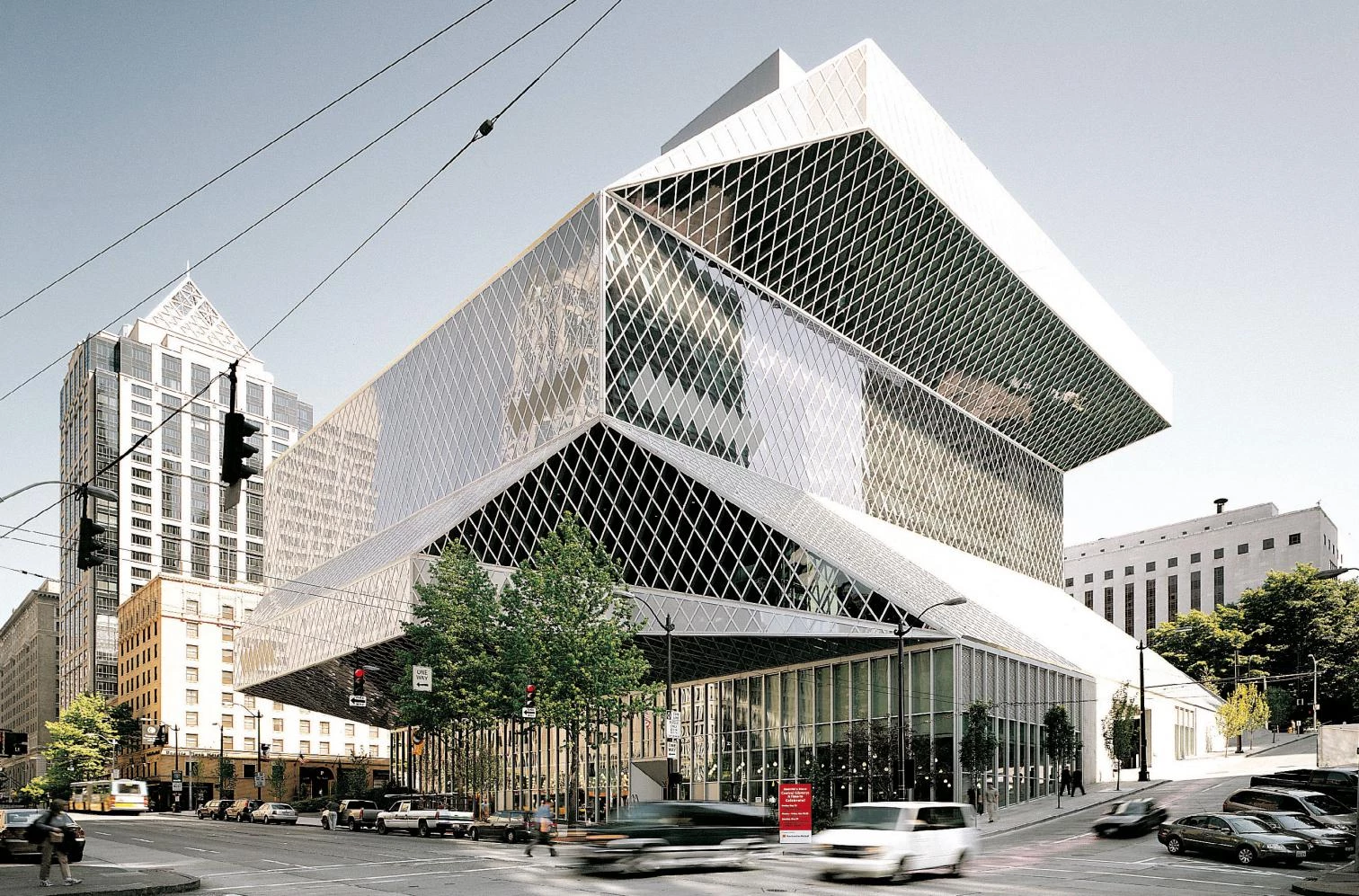
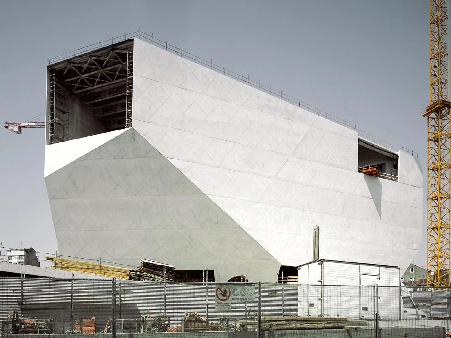
The characteristic folded shapes of the mythical fighter plane F-117 Stealth have had an influence on the concrete volumes of the Casa da Música in Porto and on the glazed surfaces of the Seattle Public Library.
Indeed the library’s opening is a milestone in the career of Koolhaas, who up to now had been unlucky in his American projects. In the past five years he has suffered the cancellation of four major commissions: the headquarters of Universal Studios in Los Angeles, a Manhattan hotel designed in collaboration with Herzog & de Meuron, and two important art museum projects, the new LACMA building in L.A. and the enlargement of New York’s Whitney (both entrusted in the end to Renzo Piano). He has seen his Guggenheim Las Vegas close down and change use after only fifteen months. And he has experienced the bittersweet reception of critics, as much for the extravagant Prada store in New York City – he has finished another one in Beverly Hills this July – as for his abrasive student center in the mythical campus built by Mies van der Rohe for the Illinois Institute of Technology (IIT) in Chicago. But five years ago, Rem Koolhaas drew up two extraordinary buildings characterized by violently faceted geometries – the Seattle Public Library and the Casa da Música of Porto – which are now reaching almost simultaneous completion, just months after the opening of the unique Embassy of the Netherlands in Berlin, and these three buildings have put the Dutch architect back on an Olympus of unanimous recognition.
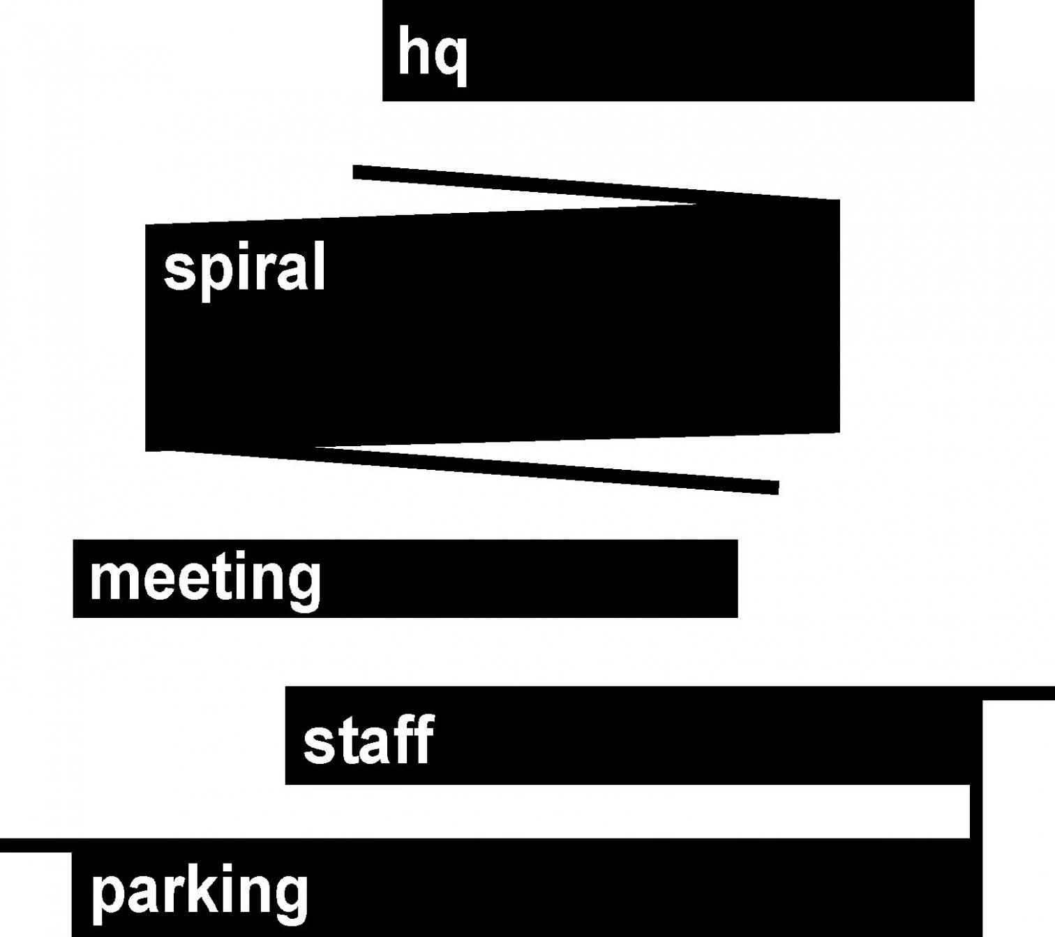
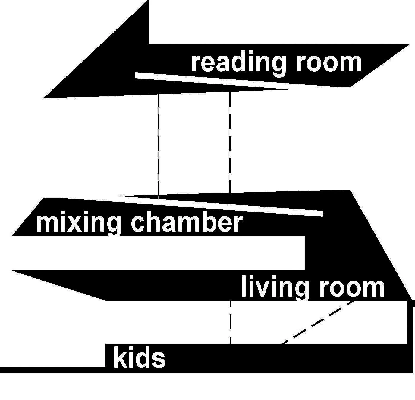
The library is designed as an apparently random stacking of volumes, creating a series of platforms that leave between them dramatic spaces, enclosed by sloping glass surfaces and enhanced by textiles.
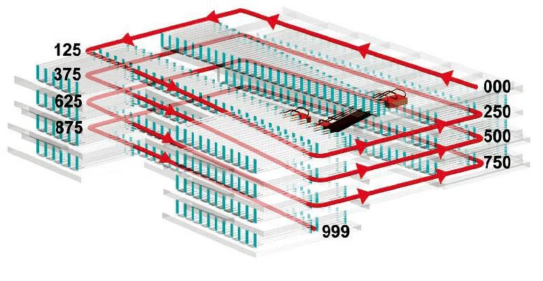
In Seattle – a city many associate only with the technological futurism of Boeing and Microsoft, but which has also incubated commercial revolutions like Amazon and Starbucks – Koolhaas has built the central piece of an ambitious library renovation operation for which US$196 million of public funds was set aside in 1998, US$165 million of which was invested in this particular project. Unexpectedly selected over Steven Holl, a native of the city, after a quick visit of the library’s patrons to his European works, the Dutch architect has carried out the project with the help of a local engineering firm and placed it under the responsibility of a Seattle-born member of his staff, Joshua Ramus. The library’s 35,000 square meters (not counting the 7,000 of underground parking) are organized on five superposed and shifted ‘platforms’ interspersed with zones assigned for children, access, consultations, and reading. The whole thing is closed off with a glass and steel facade that folds up, with origami-like weightlessness, to adapt to the piling of platforms, which is arbitrary only in appearance. The largest platform serves as support to a publicly accessible collection of books shelved along two large concrete ramps that make for functional and spatial continuity on four levels, something the architect already tried to do in his 1993 project for two libraries in Jussieu. Here the visual richness of the interiors, marked by vertiginous perspectives, luminous dramatic views and diagonal foreshortenings, and accentuated by clear-cut finishes, the red and yellow flashes of the stairs and corridors, and the plant patterns of the Petra Blaisse carpeting is comparable to the iconic boldness of the exterior, whose ambiguous and reflecting crystallography, like a vertical and random greenhouse, superposes the changing variation of viewpoints on a single memorable image.
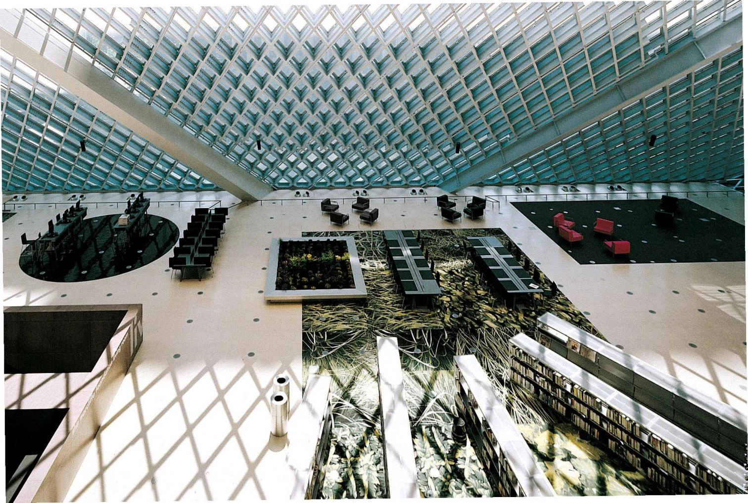
The free access book deposit is laid out on two large concrete ramps – marked by bright colors and bold signage – that ensure functional and spatial continuity between each of the four levels which compose it.
Maybe it is true that this geometric decomposition has the fragmented air of analytical cubism, and the landscapes of Horta de Ebro may indeed have been present in the retina of the critic who likened him to Picasso. The most skeptical will for their part see only a sculptural volume of sharp-edged abstraction that refers to the most ornamental Art Déco, the tiresome triviality of the so-called Czech cubism, or the shimmering decoration of casinos and nightclubs of the fifties. Nevertheless the project also takes inspiration from the luminous expressionism of the Alpine architecture of Bruno Taut and the early Bauhaus, reconciles Venturi and Eisenman in combining an indifferent mesh of structural lozenges that almost look like textiles with a multi-faceted composition that evokes the Max Reinhardt House of the American, and makes the formal lessons of Herzog & de Meuron’s Prada in Tokyo converge with what Koolhaas himself has called the “Stealth aesthetic”, in tribute to the F-117, the famous invisible fighter plane first used in the nineties, whose uniquely folded shapes fascinated architects who saw in them a simultaneous manifestation of artistic deconstruction and the philosophical pli: Derrida and Deleuze reunited in a fatal and lethal weapon, a seductive and ominous war object that summarized French theory.

Such aesthetic of folded geometries is present in another Koolhaas building, designed at about the same time, that too approaches completion these days. This is the Casa da Música of Porto, a large auditorium that was conceived on the occasion of the Portuguese city’s turn as European culture capital in 2001, and that – besides the shift from glass to concrete – differs from the American library in that the elements of the program are excavated in the volume, as against the volume resulting from the wrapping of a group of superposed elements. In the end the true value of the Seattle project may be not so much the brilliant stylistic statement as the intelligent orchestration of uses in well-defined platforms that prevent the communal zones from getting encroached upon by storage, a gangrene all too habitual in building rhetorically called indistinct or flexible. This as well as the creation of terraces, suspended like flying carpets, that make one’s use of or visit to the building a breathtaking experience. Koolhaas has written that his angular constructions wish to mark “Seattle’s new modernity,” just like the shaken and electrical waves of Frank Gehry’s Experience Music Project – financed by the same Paul Allen who created Microsoft with Bill Gates and who weeks ago successfully sent a cartoon-like craft into space, initiating the age of privately promoted aeronautics. But such reference to new modernity has little meaning at a time when the Dutch architect has just proposed a colossal project of neo-Aztec airs for a bookstore in Beijing that would triplicate the volume of the American library. Koolhaas can be as omnivorous in matters of style as in matters of cuisine, and only an uncontrollable penchant for the dangers of the trapeze strings together his carnivorous or cannibal architecture.
[+][+]

