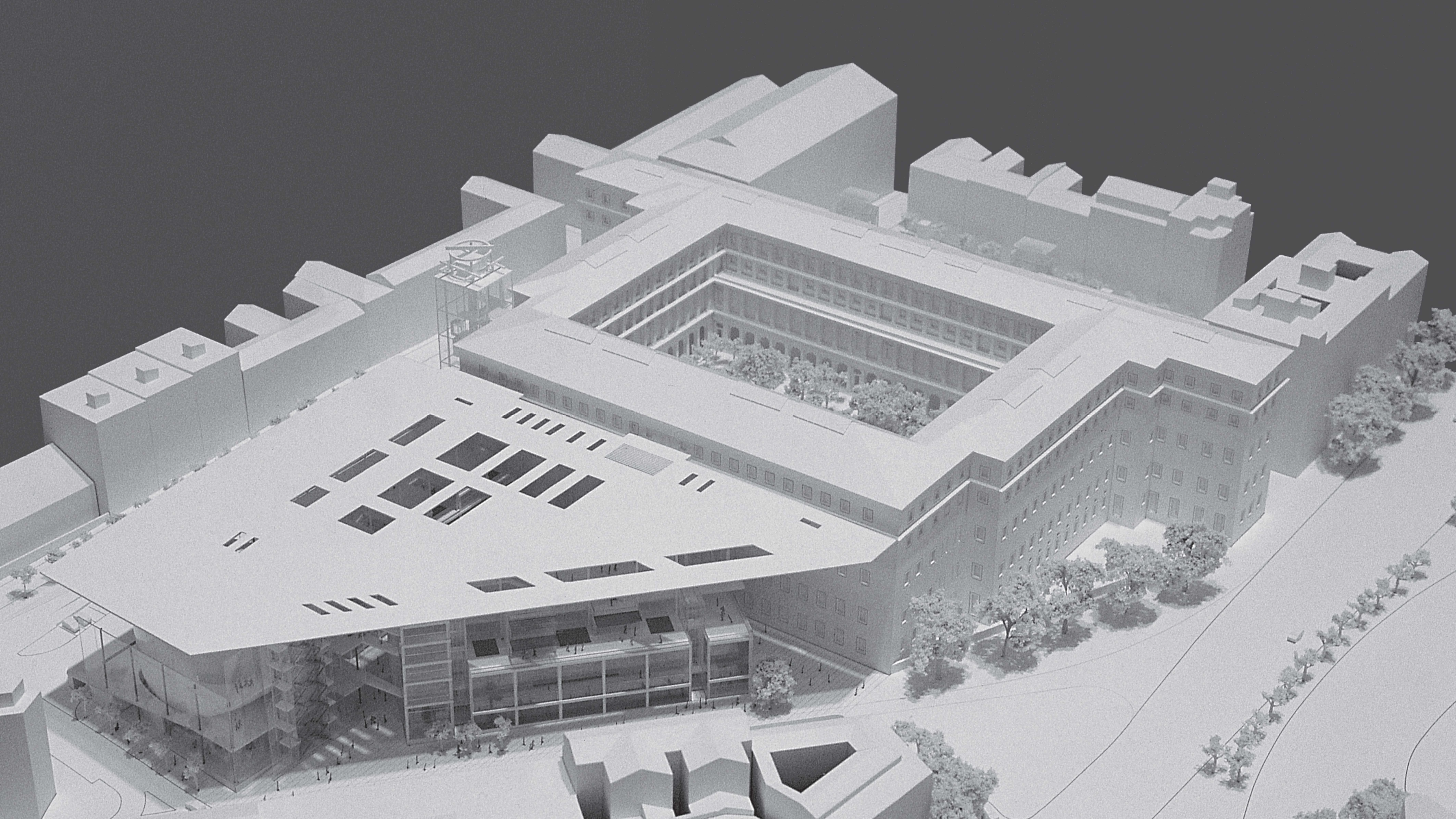
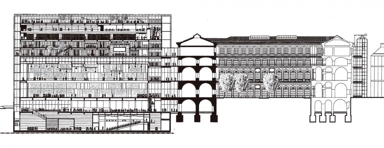
Jean Nouvel proposes to enlarge the Reina Sofía with a copper wing. Beneath a perforated light- weight plane, sharp and cold like a knife, the French architect envisions three volumes defining the triangular perimeter of the site, the space in the middle forming a square covered by the metal canopy. This at once tree-planted and petrous courtyard, which will conserve remains of the buildings to be torn down as well as part of the existing vegetation, is to be the friendly core of the extension to Sabatini’s old hospital. It is through this covered court that one will enter the new temporary exhibitions building, which in turn will connect with the main museum and its loading facilities. From the court, the visitor could also proceed to the transparent prism that is to house the library, or to the ovoid volume of the auditorium, although both will have independent accesses from the street so as to be functionable outside exhibition hours. The three new blocks of steel, granite and glass, built with a laconic palette of black, gray and reflections, are crowned with a reddish, reflecting baldachin that seems to float over them, and which stretches from the hospital’s lower cornice all the way to the edge of the projection over the sidewalk.
With urban sensibility and monumental deference, Jean Nouvel’s winning project arranges three volumes around a covered patio which will allow access to the library, auditorium and temporary exhibition galleries.
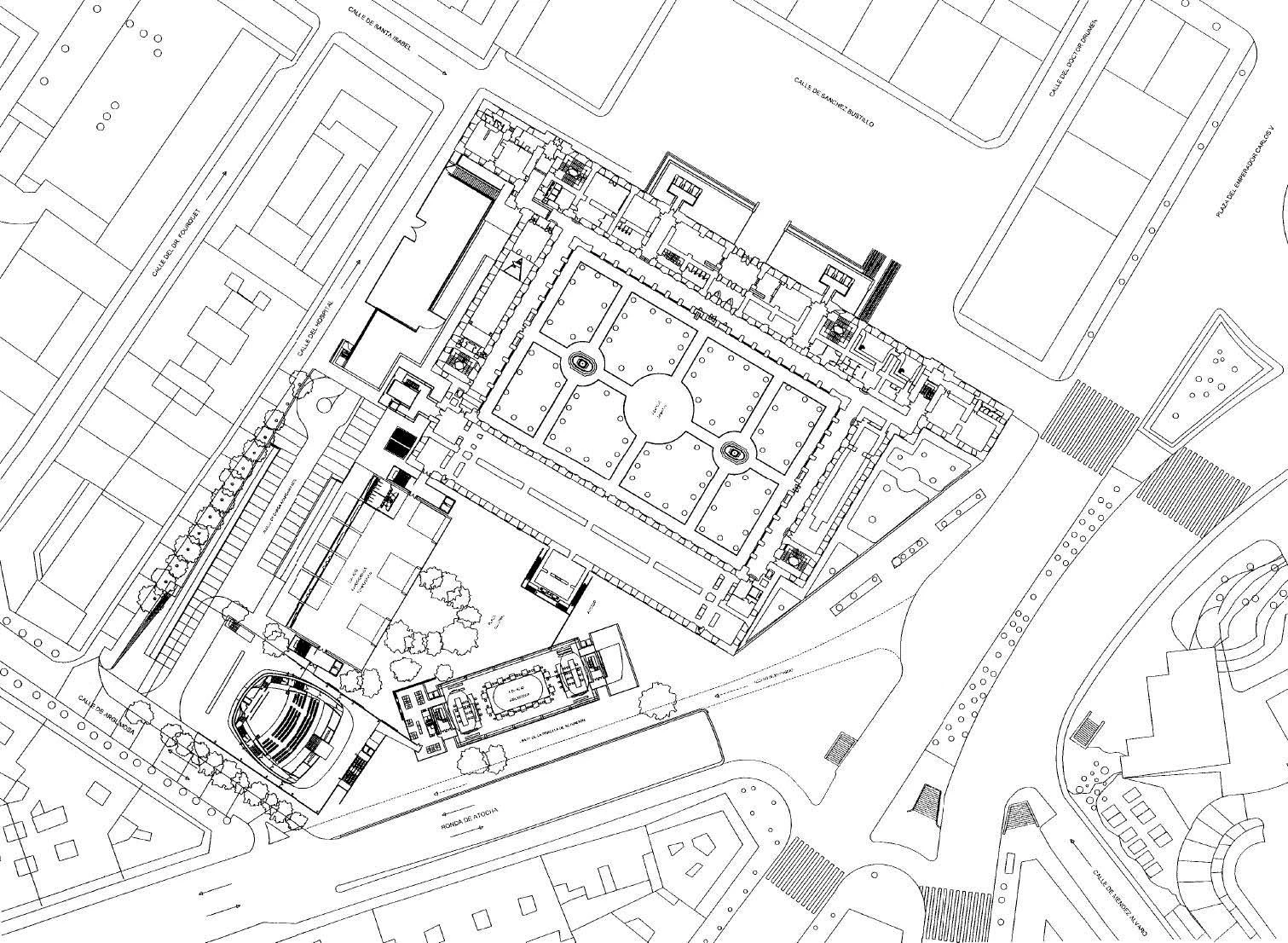
Intelligently using ideas of previous projects of his, from the futuristic careening of the Tours convention center to the immaterial canopy of the recently finished Lucerne cultural center, Nouvel tackles the difficult site with sensibility to the urban fabric and deference to the monument involved. By fragmenting the program into three constructions and placing them right over the marks of demolished ones, the architect gracefully allows himself to be guided by geometric logic and the dimensional grain of the city, silently inserting an architecture of great technical elegance and extraordinary scenographic refinement. And by topping it all with a copper wing that serves to prolong Sabatini’s roof, he courteously subordinates himself to the historic building, whose solid masonry will stand out in contrast to the translucent lightness of the extension’s volumes and the suspended sharpness of its lid, and whose original facade will be retrieved, through the symbolic sectioning with the blade of the canopy, of the awkward floor level that was added to the hospital a century ago.
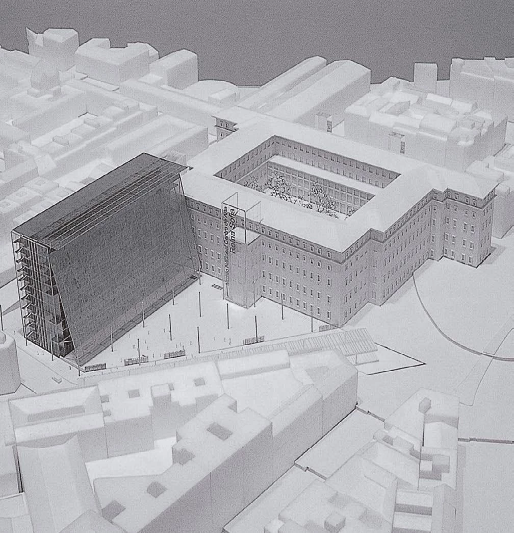
Dominique Perrault
Awarded second place, Dominique Perrault opts for a tall prism in order to free a public plaza, while the third place architect, Juan Navarro Baldeweg, proposes a compact volume with an intricate geometry.
In the final round of the competition, Nouvel’s courtyard was set against two other projects that represented alternative ways of tackling the extension: the high-rise block and the compact construction. Dominique Perrault, who won second prize, proposed a large prism – something like a Pompidou without the tubes – that would rise considerably above the roofs of the current museum and cede the greater part of the lot to the city in the form of a triangular public square. Crowned by a panoramic restaurant, the block was decked with an inclined mesh of golden metal that shielded the entire facade, serving at once as protection from solar rays and as a welcoming gesture to visitors. Juan Navarro Baldeweg, who got the third prize, opted instead for a very compact building with an intricate geometry, attaching one end of it to Sabatini’s hospital in such a way that a wedge-shaped gap in between would act as an urban threshold. Resting on a large structural tripod, the faceted volume would be lit inside by overhead skylights that lined a large part of the roof’s surface.
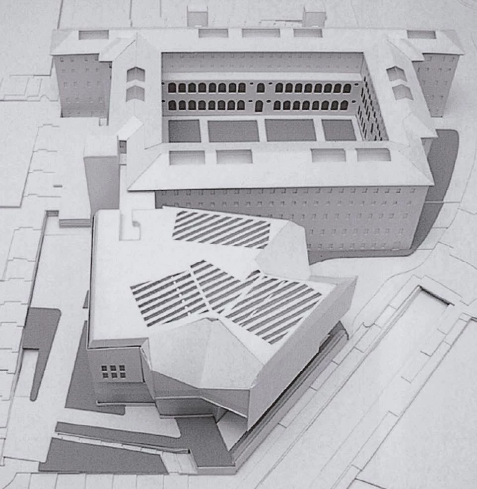

Juan Navarro Baldeweg
The other nine proposals covered a wide range of solutions, though many of them could be understood as variants of the winning entries. Significantly, the three projects which received special mentions explore the same alternatives as the three top finalists: the courtyard, the block and the compact construction. Like the winner, Antonio Cruz and Antonio Ortiz proposed a patio around which to distribute the center’s activities, and in which to conserve some of the splendid trees existing on the site. Emphasizing the contrast with the solemn regularity of the hospital, however, theirs was delimited not by various buildings, but by a surreal ribbon twisted around a kidney-shaped void, which rose on one end to present a publicity front to the Atocha traffic junction. Like the second prize, Luis Moreno Mansilla and Emilio Tuñón drew up a high-rise block, continuing a certain Madrid tradition of compact prisms along the Castellana. But in this case the slender block rose on a podium containing an auditorium and exhibition halls, and the generous breadth of its facade was turned into a billboard latticework. Like the third prize, finally, Guillermo Vázquez Consuegra conceived a sculptural compact piece, but the significant feature of his was a large plaza covered by the projecting volume of the exhibitions area, which one reached via a wedge-shaped stepped ramp and connected to the central courtyard of Sabatini’s building through a passageway carved into it.
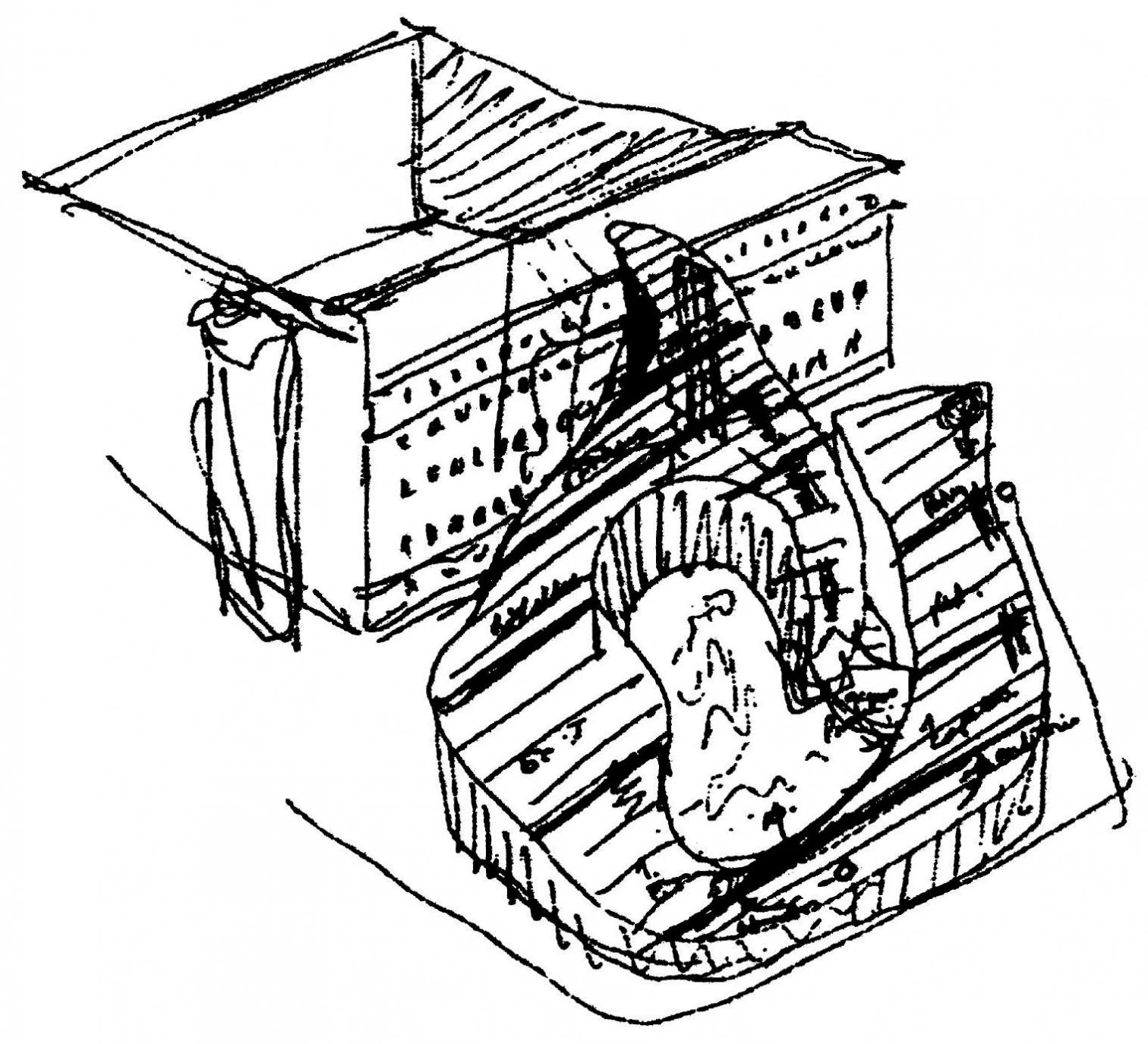
Antonio Cruz y Antonio Ortiz
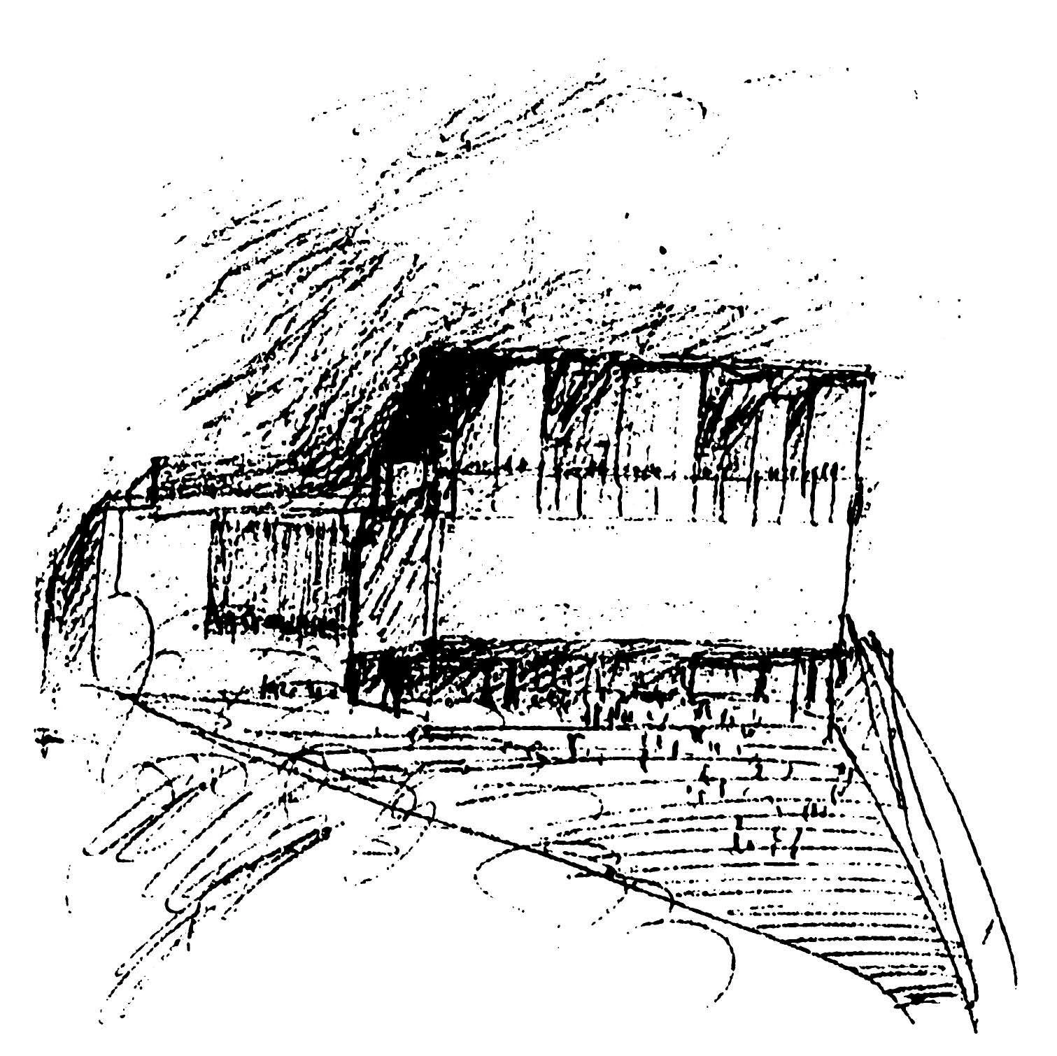
Guillermo Vázquez Consuegra
As the three projects that obtained prizes, those mentioned by the jury (Cruz & Ortiz, Moreno Mansilla & Tuñón, and Vázquez Consuegra) each use the closed patio, the tall prism or the compact volume.
As for the rest, Manuel de las Casas designed a colossal, over-sixty-meter-sided cube that makes a paroxysm of the quest for compactness, hardly alleviated by its translucent crown. David Chipperfield proposed a series of disconcertingly positioned patios that explored an inappropriate compositional continuity with Sabatini’s hospital. Tadao Ando drew up some austere prismatic pieces that colonized the parcel with a trivial schematism and linked up with the existing building in a manner detrimental to its current use. Santiago Calatrava’s solution proved less cultural than commercial and real estate oriented, with a version of his Toronto shopping gallery separating the hospital from a formidable volume that took up the entire lot. Enric Miralles and Benedetta Tagliabue conceived a spectacular, sculptural tower with a cruciform floor plan, playfully erected on a traversible landscape of warped roofs over large underground rooms. And Zaha Hadid transported the sinuous bands of her art center project for Rome to this Madrid spot, coming up with a spatial skein that resembled a tangle of flaccid highways.
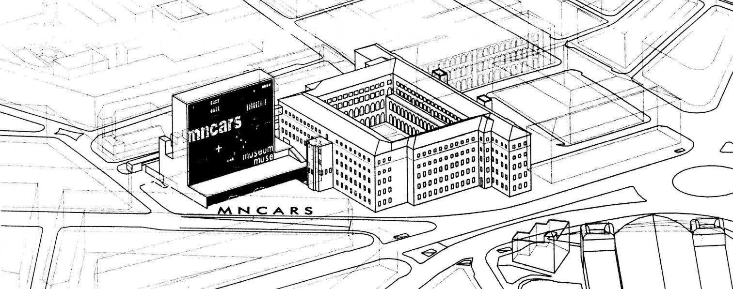
Luis Moreno Mansilla y Emilio Tuñón
With a few exceptions the 12 contestants – who quite adequately represent the elite of Spanish and world architecture – have put in their very best here, and Jean Nouvel’s victory has the additional merit of quality opponents and a coveted commission. But though it was a close race, the result is on-target. Intelligent insertion on the site and a careful interpretation of the needs of the program (which in no small degree must be attributed to the project head, the Paris-based Spanish architect Alberto Medem) render the French team fully deserving of its triumph. Pragmatic yet lyrical, the extension project is a plausible proposal that should be completed without significant complications. If the sailing is smooth, in the fall of 2003 Madrid will open a courtyard of striped copper shadows under the sheltering sky of an intangible blade.

