The Sainsbury Wing redesign

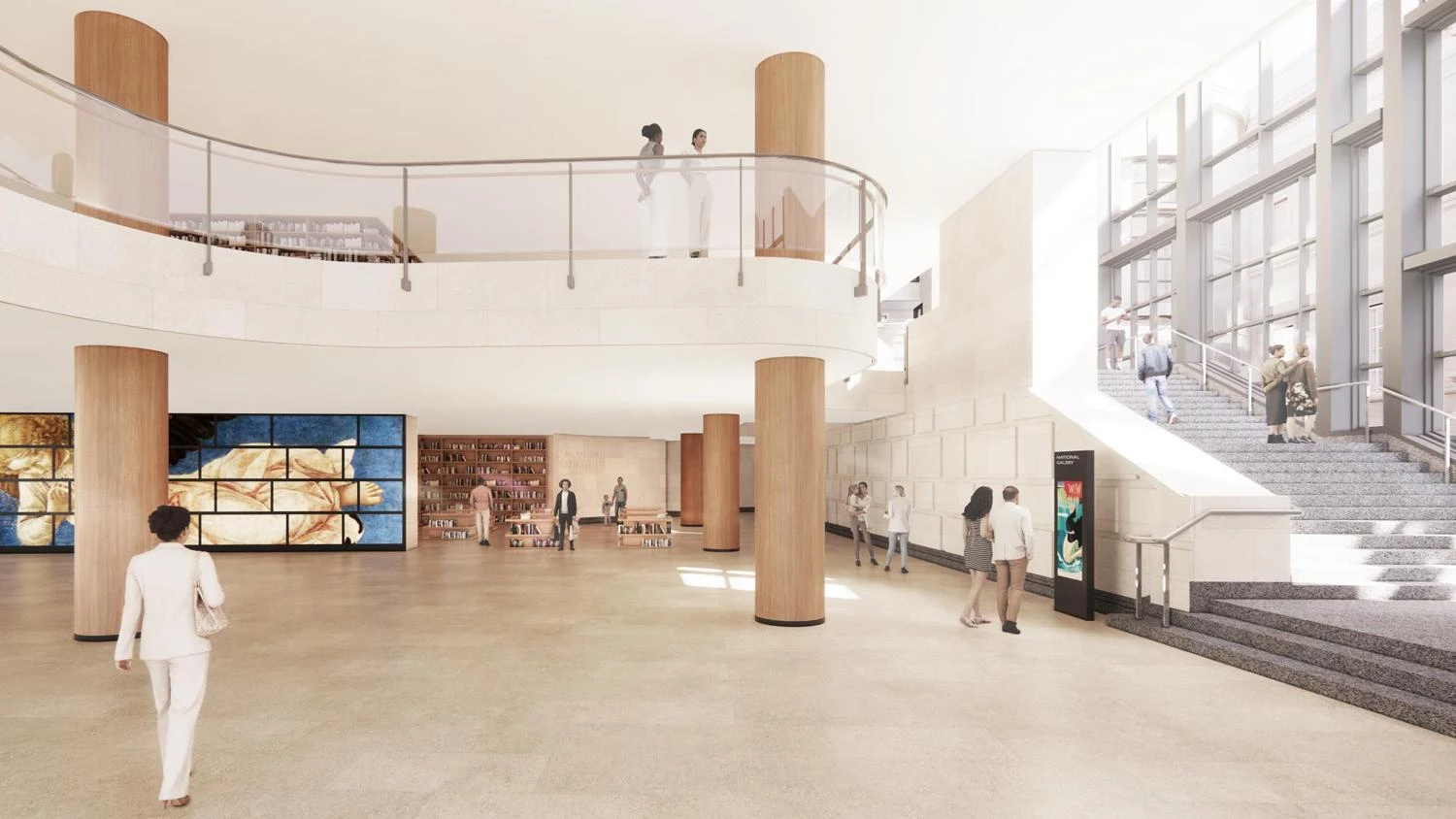
‘An over-smooth facelift on the visage of an old friend’: the curving glass balustrades, white walls and oak-clad pillars that won Annabelle Selldorf the Sainsbury Wing redesign. Image: Selldorf Architects
Born in controversy, the National Gallery wing was a lesson in throwing away the architects’ rulebook. Now plans to remodel it threaten its quirky splendour.
The Sainsbury Wing of the National Gallery in London, tucked into a corner of Trafalgar Square, which opened in 1991, is a building like no other. The galleries on its upper level, containing works by Leonardo da Vinci, Botticelli, Piero della Francesca and other masters of the Italian renaissance, achieve a widely admired combination of serenity, substance and character – “practically perfect”, says the gallery’s director Gabriele Finaldi. Its exterior wears multiple guises: classical stonework, modernist steel and glass, utilitarian brickwork. Its interior runs a gamut of different spaces.
Designed by the Philadelphia-based partnership of Robert Venturi and Denise Scott Brown, it delights in playing architectural styles off each other. It celebrates what Venturi called, in the title of a famous book of his, Complexity and Contradiction in Architecture. It also has some bum notes, in part because Venturi and Scott Brown had some rows with the gallery and the project’s donors, and it wasn’t realised quite as they proposed.
Now Finaldi wants to remodel the Sainsbury Wing. The original design can’t cope with the six million visitors who now visit the gallery every year. The revised wing is also part of more extensive improvements to the gallery, including a new research centre, timed to coincide with its 200th anniversary in 2024.
A design competition has been held, won by the New York-based Annabelle Selldorf, widely respected in the art world for her designs for private galleries such as Hauser & Wirth and for prestigious institutions such as the Frick Collection...
The Guardian. The Sainsbury Wing redesign: spare us the art-world good taste


