•Austral Chart
•Artificial Gas
•Cinema Constructions
•More Towers and More Walls
•Gravity and Grace
•Two Stadiums, Two Battlefields
•The City is a Tree
•It’s the Economy, Ecologists!
•Spanish Landscapes
•Inconspicuous Mastery
•Motor Works
•The Oil of Icons
•Fog in the Desert
•Advent Homily
•Overseas in October
•Totem and Catastrophe
•Asian Luxury
•Piano ‘lontano’
•Philip Johnson, Master of Infidelity
•Sudden Beauty
•What is bothering me?
•The Architect’s Dream
•The Airport and the Village
•Scottish Inquiries
•Venice: Lions and Chimeras
•The Enemy´s House
•Stealth Aesthetic
•The Construction of the Disaster
•Jørn Utzon, Pritzker Prize 2003
•Asia on one hand, Europe on the other
•Construction Games
•Babel vs. Babylon
•Glass Shells
•Dead Seas
•Navarro Carves the Auditorium of Vitoria in Silver
•Francisco Mangado, on the Outskirts of Ávila
•Eccentric Albion
January 2007
The Celtic Tiger
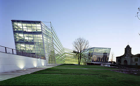
The spectacular Irish prosperity fuels a real estate growth that is quickly suburbanizing the country, but it also triggers an architectural boom that reflects the lights and the shadows of cultural modernization and economic success. Prominent architects and projects inside and outside the island confirm this. (Photograph: Hisao Suzuki)
Luis Fernández-Galiano
The Celtic Tiger
Ireland rides on the back of a tiger. The sleepy dragon of the Emerald Isle has become a feline as ferocious and flexible as its fellow kind from the Pacific, and the fairy-land of Yeats has turned into an Atlantic athlete that displays its financial muscle assuring that it feels closer to Boston than to Berlin. But this Celtic tiger – as it was called by Morgan Stanley a decade ago – has a heart of shadow; the Irish economic miracle is weaved around a silent and resonant cavity of waste towns and daily endurance. Material progress and cultural modernization have produced destitute margins and faded identities, redundant people and indifferent lives, in an exacerbation of the individualism and the anomy that reflects us all on its concave mirror. Ireland and Spain are two success stories of the European Union, but Ireland is an accelerated Spain, with fewer taxes and less infrastructures, a faster growth and more immigration; its present is perhaps our future, and this hypothetical circumstance prompts an admiring and warning gaze.
At the last Venice Architecture Biennial, that which takes pride on being the most globalized economy of the planet explored the territorial scenarios for the coming years, after having experienced a spectacular process of urban growth during the last decade. The driving forces behind Irish development are high-technology manufacture and a sophisticated service sector – the country is one of the leading software exporters –, backed by a broad education, the English language and a reduced business tax that have favored the establishment of multinational companies and boosted productivity, which has grown four times as fast as the average of the Union. But the economic impulse is also due to the real estate boom that colonizes the landscapes of the island with a unanimous extension of single-family homes, a colossal dispersion of dwellings that makes the trips to work endless, organizes life around the car – in the absence of efficient collective transport – and increases the country's energy dependence: a series of dysfunctions that the curators of the Venetian exhibition proposed to remedy with a transition from the ‘SubUrban' to the ‘SuperRural', a fortunate motto which replaces the degeneration of the city with the regeneration of nature.
While Ireland reinvents its urban future, its current architecture shows signs of the present fracture and of the growing physical and emotional gap between those who have been able to get on the fast track of globalization and those forgotten in an abandoned station where no trains stop. The work of two couples, who are also associates, can serve as a guide in this excursion of extremes: that of the Irish Róisín Heneghan and the New Yorker of Chinese origin Shi-Fu Peng, both graduated in the late eighties and trained at the Princeton studio of Michael Graves, illustrates the most cosmopolitan dimension of contemporary Ireland; for its part, the latest project of Sheila O’Donnell and John Tuomey, whom after graduating in Dublin in 1976 completed their training at the London office of James Stirling, offers a pedagogical account of the social margins of an incandescent country.
Heneghan Peng have just finished a civic center of diagonal glass and swift edges that goes up in the almost rural Kildare County with the confident presence of a metropolitan visitor, but this new work does not distract them from their main undertaking: the Grand Egyptian Museum in Cairo, a colossal structure close to the pyramids – raised in part with Japanese soft credits – that they won in competition three years ago, and are now carrying out as leaders of a team with engineers in London – the group of Cecil Balmond at Ove Arup – and landscape designers in Rotterdam – the West 8 of Adrian Geuze. From their large and luminous Dublin office, the couple builds exquisite laser-cut models, designs meticulous details and practices American organization methods with their European collaborators in this African project financed by Asians.
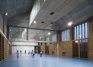
Far from the city center, O’Donnell and Tuomey arrive at their studio by bicycle and proudly show the recently released monograph on their oeuvre, with the Glucksman Gallery of Cork on cover, a small work selected in one of the last editions of the Stirling Prize. The book does not include their most recent completion, the Cherry Orchard School, whose bucolic name conceals the dramatic reality of a neighborhood devastated by delinquency and drugs, inhabited by defeated adults and children that wander about the streets, abandoned by broken families and an indifferent society. Started by a visionary priest, the school wants to be a foster home for these children, training them in domestic skills that were not taught to them at home – from hygiene to cooking –, but even this generous undertaking has cautionary chronological and material limits: it only accepts very young kids, because those over ten are considered hopeless; and the school, in any case, has been built to resist vandalism, with solid walls and concrete vaults without roof tiles or sheets that could be pulled off. Only one budgetary exception were the architects able to extract from the education authorities: the walls that separate the school from the surrounding urban jungle would not be made of concrete blocks, as those of the nearby prison, but of brick, to prevent the children from associating both institutions.
Dublin is a literary city, and visitors following the steps of Leopold Bloom or Stephan Dedalus – as those who go to St Patrick’s cathedral in search of Jonathan Swift, or to Trinity College in tribute to Oscar Wilde and Samuel Beckett – are unlikely to get lost in these menacing and desolate quarters. However, the city of Joyce is also that of Bacon, and the reconstruction of the painter’s London studio in the interior of High Lane Gallery – the city museum of contemporary art – offers a visual metaphor of the shreds of darkness that stripe the splendor of the Celtic tiger: in the half-light, surrounded by the sad flesh of some canvasses and the promises of solar happiness of his dictionaries, grammars and textbooks of Spanish, Italian and Greek, the abyssal and abject chaos of the studio offers itself to the gaze behind a glass of urn and sepulcher. Francis Bacon, who died in Madrid in our annus mirabilis of 1992, was incinerated without witnesses in the cemetery of La Almudena, but his true remains lie in the desperate confusion of this den of papers and paint. The Ireland of the diaspora, that was once ember, returns as dust to the fertile womb of the mythical nation, asleep yesterday and today sleepless rider of an animal of ashes and gold.
November 2006
Austral Chart
Chile is having a heyday economically and politically and part of this is the extraordinary quality of its latest architecture, currently the most interesting in Latin America. The Biennial recently held in Santiago displayed the country’s most outstanding projects and, with a numerous Spanish contingent participating, debated on the state of architecture in the world. (Photograph: Cristóbal Palma)
Luis Fernández-Galiano
Austral Chart
Chile is having days of wine and roses. Neither the regular Mapuche protests nor the cases of corruption that have tainted the Concertación government, nor the judicial vicissitudes of a dictator lost in his own labyrinth of solitude have managed to alter the overwhelming self-esteem reflected in the Bicentennial Poll, conducted in preparation for the 2010 celebration and recently disseminated by El Mercurio. Three out of every four Chileans consider their homeland “the best country in Latin America to live in,” according to the poll published by the Santiago daily. Spain too, incidentally, stands out in the survey results as the most admired, ahead of the United States, a perception that accompanies the substantial Spanish presence in key sectors of Chile’s economy: Endesa controls 50% of electricity generation, Movistar supplies 47% of mobile phones, Santander and BBVA jointly cover 30% of banking, Agbar has 35% of its sector’s clients through Aguas Andinas, and firms like Sacyr, Cintra, OHL and ACS are leaders as builders of infrastructures ranging from airports to motorways; figures which elsewhere in Latin America would arouse more resentment than appreciation.
In this case, the admiration is to a large extent mutual, and the diagnosis published in El País in April by Alain Touraine, “Chile as a Model,” is shared by most of the political and corporate leaders in Spain, where both Michelle Bachelet and her mentor Ricardo Lagos are praised for their determination to make economic growth and social justice compatible, as well as for their lucid ability to combine remembrance of the victims of the dictatorship with the quest for consensus and national reconciliation. This latter objective is symbolically materialized in the Palacio de la Moneda , the grand classicist Baroque building whose construction by Joaquín Toesca in the 17th century is portrayed in Jorge Edwards' novel El sueño de la historia, and the bombing of which on 11 September 1973 became the tragic emblem of General Augusto Pinochet's coup d'etat against Salvador Allende's government. It is the presidential residence that Lagos decided to clear of demons through a large cultural center buried at its feet, underneath the ceremonial palace square: a colossal volume lit naturally from above and flanked by ramps, designed by architect Cristián Undurraga, which represented the country in the last Biennale di Venezia and which itself was the venue for the exhibition and conferences of Chile 's own Bienal de Arquitectura.
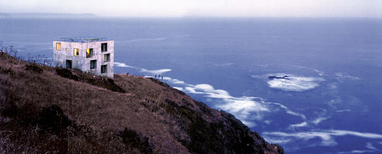
The selection of projects for the exhibition makes a plausible portrait of the here and now of Chilean society, whose economic boom is thanks to private initiative taking the lead, leaving little room for state participation, so unlike the way things work in many European countries, where architecture that stands out in any way is mostly commissioned by public clients. Projects of this nature are rare in Chile. Works as formidable as the Elemental social housing development in Iquique, spearheaded by Alejandro Aravena, or as polished as the public services building in Concepción, designed by Smiljan Radic, are exceptions to the rule. The bulk of the exhibition shows houses built for affluent clients – among these the extraordinary Casa Poli, a neo-plastic prism designed by the young team of Mauricio Pezo and Sofía von Ellrichshausen on a vertiginous cliff over the Pacific – besides private universities like Mathias Klotz’s Diego Portales or José Cruz’s Adolfo Ibáñez, corporate headquarters, the inevitable winery, and the no less inevitable exotic hotel, in this case Germán del Sol’s very appropriately named Remota.
With a rich Spanish representation, culminating with Rafael Moneo's stellar appearance on closing day, the series of lectures and debates organized by the Bienal revealed both how proud Chileans are of their own achievements and how cosmopolitan they are in their curiosity about what goes up abroad, making for a professional panorama whose intellectual and aesthetic proximity to Europe or the United States contrasts with its geographic distance from both. Neruda's mythical Chile continues to exist in the country's vast territory and in the moving devotion of those who pilgrim to his house in Isla Negra – where he is buried in the garden, facing the ocean and close to his devotional figureheads – like one visiting a national and poetic sanctuary. But the topographic and dilapidated beauty of Valparaíso is now undergoing refurbishment with the money of Chile 's new prosperity, the profits from its mines are being complemented by the vegetal splendor of exportable crops, and the warm valleys at the foot of the mountain range are filled with vineyards of impeccable geometry. There, the rows of vines are finished off with rosebushes to facilitate early detection of plagues, and perhaps this unexpected meeting of wine and roses is a good metaphor for the aromatic and euphoric moment that the austral country is enjoying. Collige , Chile , rosas.
October 2006
Artificial Gas
The Gas Natural building in Barcelona is not just a company headquarters. Conceived by the late Enric Miralles, its suspended, shaken volumes express the changing confusion of the times. Rising in the silhouette of the Catalan capital like a citizens’ landmark, it is an emblem of the artistic avant-garde and a sign of economic power. (Photograph: Iñigo Bujedo)
Luis Fernández-Galiano
Artificial Gas
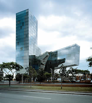
Rather dead than plain: the headquarters of Gas Natural is a provocatively affected work, what with its random interlockings, implausible projections, and decomposed volumes. Everything about it is forced and excessive, with that mood of irresponsibility that characterizes a cartoon and the playful origami that comes to a peak in an inane corbel molded with folds of glass. The sculptural lyricism of Enric Miralles, who in other posthumous works like the Scottish Parliament or the Santa Caterina market has produced amazing fruits, becomes sadly arbitrary here, while the calligraphic violence of his drawings seems to be domesticated by the conventional vulgarity of a curtain wall that is barely nuanced by variable fragmentation and random coloring. The building turns out to be an accidental headquarters because its true function is to be an urban landmark, raising its teetering forms over the broad landscape of the Barceloneta quarter, while expressing the transition from the old gas plant's material and structural clarity to the immaterial and mediatic argument of our own postindustrial times.
The prematurely deceased Catalan architect left a handful of remarkable works – which are all the more brilliant when most topographical – because his bright choreographies required making dance steps on a territory shaken by the forces of context, and this is perhaps why many judge the dreamlike orography of the Igualada cemetery, where he is buried, as the project where his language of gestures comes forth most eloquently and movingly. In the Barceloneta, however, the effort to bring together adjoining urban tensions in a sculptural piece that crystallizes fluxes with its quiet movement is contradicted first by its vertical formation, which does not manage to connect with the lower volumes in a coherent whole but rather makes the cantilevers mere athletic anecdotes, and second by its vitreous lightness, which abstracts the building from the solidness of ground without which the gymnastic gravitas of Miralles's finest moments cannot easily come true. Enric may have had his head in the clouds, but his architecture was great as long as he had his feet firm on the ground.
It is probable that in the same way that Barça is more than a soccer club, Gas Natural is more than an energy company. After all, it is one of the Caixa's industrial jewels, formed by the merger of Catalana de Gas and Gas Madrid , and surely this symbolic circumstance had something to do with the decision to build a unique headquarters, one where corporate needs are subordinated to artistic expression and its role as urban landmark. But we have to resist the temptation to associate Miralles's dynamic, unstable aesthetic to a Catalanism that would quickly have moved from the seny to the rauxa, as so many recent episodes of the once-upon-a-time ‘oasis' suggests, from the ill-fated Gas Natural takeover bid on Endesa to the most absurd vicissitudes of Maragall's tripartite government, from the stunned trip to meet with ETA in France to the soul-searching drafting of the Statute, and through the climate of political intimidation and street violence that has prevailed of late, presenting a distorted image of Catalonia. The disconcerting volumes of Gas Natural should not be the emblem of these troubled times, because the touch of surreal madness that characterizes this land must end up being absorbed by its civil culture of pacts and good sense. Of course the strident polarization of Madrid's politicians and journalists does not help to alleviate the stormy atmosphere of a Catalan scenario that has slid from its famous calm to the urban guerrilla of okupas that forces to cancel a summit meeting of European ministers or the torch parades that are more evocative of the totalitarian aesthetics of the 1930s than they are of the country's Gothic roots. But Catalonia (and the Caixa that proudly displays its economic muscle with the Gas Natural building) has more to win with a ‘soft power' in the Joseph Nye manner, woven with seduction, emulation, and example, than with abrasive confrontations reminiscent of the long gone social panorama of a bomb-ridden Barcelona once known as rosa de fuego.
Exactly a year ago, during the fishermen's blockade of the main Mediterranean ports, the front page of El País showed a picture of Barcelona as seen from the sea. By doing this it inadvertently threw light on the new landmarks of the city's profile, which turned out to be the corporate headquarters of two companies controlled by the Caixa, a savings bank that thereby affirms its central position in Catalonia 's social landscape. Both the Agbar shell and the Gas Natural sculptural tower rise over the low profile of the common city as assertive banners: emblems of economic power that do not even turn out to be too costly on the balance sheets of their owners. As the management of one of the Ibex companies disdainfully told the architect of its colossal Madrid headquarters: “In the end, the cost of the building is one billing day.”
The opening of the headquarters of a strategic energy firm ought to serve as pretext to think about the policy of national champions (Spain's or Catalonia's?), to discuss in detail the recent entry of construction companies in the sector of utilities (who knows if it is to prepare for the bursting of the real estate bubble by linking up with more stable enterprises, or to prevent foreign firms from coming into the picture), and to warn the public about the risks behind our growing dependence on imported energy (aggravated by the absence of a common European policy and inscribed within the menacing context of climate change). But our tribal conflicts prevent us from separating the urgent from the truly important, and a building that ought to be a model of energy saving and an example of civic responsibility, with the austere laconism that should be the mark of a company that must guarantee supply without being abusive in its prices, ends up being discussed as the failed artistic icon of an electoral and gaseous Catalonia. Mea culpa.
October 2006
Cinema Constructions
Frank Gehry and Norman Foster are the stars of recent documentaries that portray the architectural profession from opposite angles. Sydney Pollack presents the Californian as an inimitable artistic genius, while Mirjam von Arx describes the Brit’s skyscraper in London’s City as a collective work. (Photograph: Nigel Young/ Thomas Mayer)
Luis Fernández-Galiano
Cinema Constructions
Architecture loves cinema, but rarely is this love reciprocated. Though the moving eye of the camera has often fed on contemporary buildings, cinema has seldom sought to unravel the mechanisms of the creation of spaces, preferring as it does to stick to the use of architecture as a setting and the occasional stardom of cartoonish architects. Three years ago, Nathaniel Kahn's film about the legendary Louis Kahn, titled My Architect: A Son's Journey, was a moving account of an illegitimate offspring's voyage to his biographical origins and to the very heart of architecture, a self-contemplating, bitter and perplexing portrayal of the father he hardly got to know and the master whose footprints he looked for in impassible buildings. It was also tangible proof of the poetry and emotion with which cinema can begin to pay its debt to the world of construction. This last season, Sydney Pollack's documentary about Frank Gehry and Mirjam von Arx's about Norman Foster's London ‘gherkin', premiered almost simultaneously, offer openly opposed views of the social, artistic, and urban role of architecture, and of the processes of professional collaboration, economic negotiation, and political strife that surround it.
In Sketches of Frank Gehry the Hollywood director delineates his architect friend with the hyperbolic strokes of the genius, and as much in relaxed conversations as in numerous interviews with corporate clients and artist colleagues, the veteran master of Los Angeles comes across as a smart playful child who creates beauty with distracted spontaneity, however much his alleged need to suffer because “it is wrong when too easy.” But the film director refutes Gehry's words by filming him in the act of drawing his lyrical tangles of lines with astonishing ease, or building small models with cardboard and tape, pensive at times but jubilant for the most part. Then the architect expresses his admiration for painters and claims he has never managed to achieve “painterly surfaces,” a gesture of modesty that Pollack counters with a fascinating succession of iridescent and undulating facades. In the end, the model is good “when stupid looking.” “What is the material?” “I do not know yet.” In any case, “buildings take so long that by the time they're finished I don't like them.”
From Disney's Michael Eisner to Vitra's Rolf Fehlbaum to the Guggenheim's Thomas Krens or Dennis Hopper who lives in a house designed by Gehry, all his clients come together in a polyphonic litany of admiration. The artists, from Ed Ruscha or Chuck Arnoldi to the ubiquitous Julian Schnabel, join the chorus of praises, and the few architects interviewed, from an already very weakened Philip Johnson to the critics Charles Jencks and Herbert Muschamp, voice opinions of applause or enthusiasm. Only the historian Hal Foster puts a note of censure, but it is so confusedly expressed that it only serves to legitimize the complacent tone of the overall portrait. In this ocean of flattery, the most picturesque figure is Milton Wexler, Gehry's psychoanalyst of the past 35 years, who denies responsibility for the architect's creative transformation (it was after beginning therapy that Gehry gave up the conventional architecture he had been building) and explains how he discourages many an architect who comes to him in search of a miraculous recipe after hearing of his method.
With an approach almost diametrically opposed to the Californian exaltation of individual inspiration, Building the Gherkin presents the building of the London skyscraper as a collective endeavor, and with admirable plausibility the young Swiss director Mirjam von Arx manages to convey both the complexity of the political and media scenes that surround architecture and the diversity of its technical and corporate protagonists. Combining the emotive spectacle of high-rise construction with a narration of the labyrinthine ups and downs of planning and the inevitable conflicts and crises unfolding in the course of development, the documentary is at once an epic and a comedy of manners. As such, it is as pedagogical in its account of the execution and decision-making processes as it is perceptive in its portrayal of the people involved. This is a long cast of managers, bureaucrats, designers, and building contractors: from Norman Foster himself, who argues with frozen laconic accuracy, to the almost sinister municipal urban planning chief, Peter Wynne Rees, passing through the representatives of the client, the insurance firm Swiss Re, who are led by a formidable, intimidating, warm-blooded Sara Fox. All are portrayed with empathy and humor in the documentary, where their indecisions, phobias, and disagreements together make up a vital and vibrant soap opera.
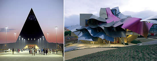
The skyscraper rises on the site of the Baltic Exchange, a building blown up by the IRA. Construction had begun when the attacks of September 11 happened, so the film addresses the impact of terrorism on both the safety of high-rise buildings and the balance sheet of the insurance company behind the tower. These dark shadows are balanced with episodes of high comedy, such as those documenting the decision to assign the interior decoration to another firm, to Foster's huge dismay. The result of four years of work, the documentary about the first skyscraper to go up in the City in twenty-five years – which started out as a controversial project and ended up becoming a symbol of London, appearing in movies like Basic Instinct II and Woody Allen's Match Point – is above all a detailed description of how architecture gets entangled with life itself, and a lucid and critical tribute to the men and women who make possible the miracle of turning sketched dreams into real space. In this implausible territory, Foster and Gehry are not far apart. The recently completed pyramid of the Brit in Kazakhstan seems as oneiric as the dizzying, ethylic forms of the Californian in Álava's Rioja region. In the end all we have are shadows, cinema constructions, dreams of reason or incubi of reason in slumber.
September 2006
More Towers and More Walls
The continuous increase of the oil price – triggered by the multiplication of demand rather than by occasional supply crises – opens a historic period of energy shortage that shall stimulate saving and the use of alternative sources, inviting new reflections in the fields of sustainable architecture and urbanism. (Photograph: Chad Ehlers/Alamy)
(Photograph: Calatrava´s Studio)
Luis Fernández-Galiano
More Towers and More Walls
The 20th century ended in Berlin , but the 21st began in New York . The cold war between ideologies came to a close with the coming down of the wall, and the hot war between civilizations broke out with the collapsing of the two towers. Five years after 9-11, the prediction concerning the death of the skyscraper has proven as erroneous as the previous one about the disappearance of the walls that divide the planet. Technical and symbolic globalization continues to raise high-rises that send out an overbearing and optimistic message, while at ground level the world crackles with innumerable boundary fences and computer fire walls that try to block the passage of persons and ideas. (Photograph: AP/Radial Press)
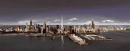
For Chicago , the cradle of skyscrapers, Santiago Calatrava is designing what will be the tallest in the United States , while the federal administration seals the Mexican border with wire fences, pits, and heat sensors. In Shanghai , where cranes and towers abound like nowhere, the completion of the World Financial Center by the American firm Kohn Pedersen Fox will give the city the height record heretofore held by Kuala Lumpur and Taipei , while the Chinese government censors Google and Yahoo and blocks access to the Wikipedia with cybernetic barriers. And in Dubai , in the troubled Middle East that gave birth to the world's first cities, the Chicago office of Skidmore, Owings & Merrill plans to beat Shanghai with an even taller skyscraper, shifting the planet's ceiling to the Persian Gulf , without such an achievement of the global economy preventing boundary walls between rich and poor from going up in the region, whether between Saudi Arabia and Yemen or between Israel and Palestine . Not even in Spain's periphery is the proliferation of towers in the big cities and tourist havens – from Nouvel's polychromatic shell in Barcelona to the four skyscrapers rising on Madrid's Paseo de la Castellana , passing through the many building developments going on along the Mediterranean coast and the Canarian archipelago – incompatible with the closing up of southern frontiers through radars in the Strait of Gibraltar, fences around Ceuta and Melilla, and patrol boats in the Atlantic Ocean, all under siege by the misery of Africa.
Berlin was not the last wall, nor did the attacks against the World Trade Center Twin Towers bring about the end of skyscrapers. In the wake of 9-11, it seemed that skyscrapers were giants with feet of mud, but maybe their vulnerability was not so much technical as social, and the safety of these emblems of political and economic power is more threatened by the multiplication of barriers that fracture the territory, segregate populations, and nourish resentment than by the risks associated with their structural daring and complexity. The suicide cells of September 11 were under the command of Mohamed Atta, who had gone to the Arab world's oldest architecture school, in Cairo (as had Hassan Fathy, Egypt's leading architect, an advocate of neo-vernacular construction at the service of the poor, against western modernity), and gone on to earn a degree in urban planning from Hamburg's TUHH – a young polytechnic university whose dean of urban planning, Dittmar Machule, a defender of traditional schemes, had taken part in refurbishing the ancient Syrian city of Aleppo – with a thesis on the conflict between Islamic town planning and modernity. This makes one wonder if the objective of the terrorist attack may have been not only political, but also architectural. A similar conclusion can be extracted from Eyal Weizman's analysis of the politician Ariel Sharon as an architect, when the writer explores the geometry of the occupation of the West Bank from the viewpoint of the intersection of power, security, and urbanism, showing to what extent military strategy, the geopolitics of protection, and the architecture of territories are inseparable.
Five years after 9-11, the catastrophic clash of the skyscraper and the airplane has rendered high-rise construction more costly, and commercial aviation more troublesome. But the expansive wave of the event has done more harm on the ground than on the sky, and the chain of Islamist bombs that has opened cracks of panic from Madrid to Bali has shaken the architecture of globalization less than the discredit that a bellicose empire has brought upon itself. This empire has proven itself as impotent in guaranteeing security and establishing democracy in Muslim countries as it has shown itself incapable of filling the tragic void of Ground Zero – bogged down as it is in a marasmus that is more real estate-related than civic – with an architectural sign of confidence and hope. On the other side of the Atlantic, London was able to replace the Baltic Exchange, a building destroyed by the IRA, with a light and luminous tower, designed and built by Norman Foster for the insurance firm Swiss Re, that soars above the skyline of the City like a peaceful projectile: if the West wants to propose an icon of encounter and healing for the trauma of horror, this at once swift and blunt skyscraper would be a good candidate indeed.
Meanwhile we will continue to look upon the devastation of Lebanon as a titanic but poor imitation of the deconstructions of Gordon Matta-Clark, the civil war of Iraq as a conflict existing only on screens impassively broadcasting the umpteenth explosion, and Iran's threatening determination to create an Islamic atomic bomb as a mere diplomatic game, all in the course of this uncanny August that has seen Spaniards sequestered by the cruel summer of 1936, Germans from Günter Grass to Arno Breker sequestered by their ominous past, and Cubans sequestered by a Fidel Castro who pathetically sequesters himself, clutching a newspaper as proof of life. But maybe T.S. Eliot was right, and the world ends not with a bang but a whimper: not with an explosion, but with a moan.
July 2006
Gravity and Grace
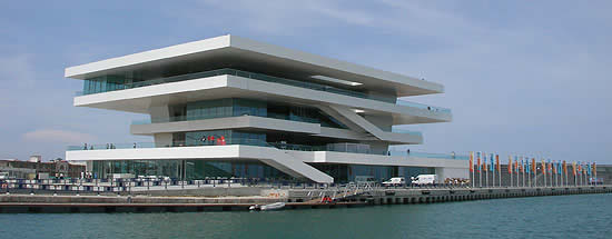
Early in June, Valencia had a bout of agony and ecstasy. The final regatta prior to the America’s Cup of 2007, which served to open the emblematic building of the marina, the tragic underground railway accident, its casualty list the worst ever in Spain, and the Pope’s appearance on the occasion of the World Family Encounter, together turned the Mediterranean city into a capital of spectacle, grief and piety. (Photograph: David Chipperfield Architects)
Luis Fernández-Galiano
Gravity and Grace
Valencia lived a summer of ups and downs: from the winds on the sails to the victims in the trains, and from there to the visit from the Vatican . In a matter of days it moved from the euphoria of nautical triumphs to the sense of total defeat caused by the railway ordeal, to then seek volatile consolation in the pastoral voice of a philosophical pope. In the first weekend of July, twelve boats from five continents took part in the world's oldest competition, for which Valencia had won the bid to be a venue against nearly a hundred other candidate cities. The final regatta prior to the America 's Cup of 2007 served as occasion for the opening of the Foredeck, a lookout-building designed and built in just eleven months by David Chipperfield and b720/ Fermín Vázquez as center and symbol of the event. The following Monday, the underground station Jesús was the scene of the worst accident ever to happen in a Spanish metropolitan railway. Its over forty deaths switched the city's mood into one of mourning, and not even the mass fervor of the pope's visit the following weekend managed to dissipate the grief of so many desolate families.
From 1934 to her death in 1943, the French mystic writer Simone Weil wrote a diary that was published posthumously, in fragments, under the title Gravity and Grace: two words that expressed the opposition of the heaviness of the world and the lightness of the spirit, but which also perfectly sum up the contrast between the solemnity of death that strikes as collective tragedy and the frivolity of the media event, be it sport-related or religious, that congregates masses around a spectacle or a message. Valencia shifted its attention from the immaterial hustle and bustle of breezes and boats viewed from a lookout, to the somber drama of human catastrophe in an underground labyrinth, closing the circle with the ephemeral architectures and winged words of a pious crowd that chose the aerial forms of Santiago Calatrava for backdrop. Gravity and grace are terms that express the changing mood of the city as much as they suit the contradictory nature of the America 's Cup building whose launching party started this week of passions.
To design and build the Foredeck, also called Veles e Vents as a tribute to a poem by Ausiàs March, Chipperfield and b720 won over competitors like Jean Nouvel, Von Gerkan & Marg, Carlos Ferrater, or Alejandro Zaera. The building is formed by four large platforms that rise with sculptural confidence at the end of the dock, extended along the new canal with a parking lot for 800 vehicles and a garden walk that links this landmark to the seafront and the Malvarrosa beach. “The beach of Sorolla and Blasco Ibáñez,” says Mayor Rita Barberá as we lunch in Las Arenas, a big new hotel built in classicist style that is a counterpoint of opulence to the pure geometries of the Foredeck. Here, the gravitas of Chipperfield's work dissolves in the Mediterranean light of the huge cantilevers, clad in a white-enameled steel that makes them look weightless – an impression reinforced by the transparency of the building's main volume and the almost imperceptible glass parapet of its perimeter.
The spacious shaded terraces – the two lower levels for public use, the two upper ones reserved for guests of the organization – are of course the essence of the project. It is there that the main activities of the building happen: receiving visitors and watching regattas by day, parties of sponsors and gatherings of crews by night. Each of the twelve teams participating in the event has its own base in the port – provisional structures several floors high containing workshops, gyms, dining rooms, offices, shops, and reception areas for guests and the press, outstanding among which is the one Renzo Piano built for Luna Rossa, the Italian ship sponsored by the firm Prada, with its intelligent cladding of recycled sails and a large boutique on the top floor that one gets to by escalator. But only the Foredeck brings everyone together on neutral ground, and it does so with an ease and elegance that makes it hard to imagine any other project on the spot. The deadlines for design and execution were so tight (due to the delays caused by the change of government in Madrid and the attendant political contest for the control of the event) that the work has small imperfections in the details and finishes that mortify Chipperfield. Responding to the congratulations of Public Works Minister Magdalena Álvarez – dressed in sailor outfit to watch the regatta from the sea – the British architect is more keen on stressing what is still lacking than on patting himself on the back for what has already been done.
This attitude is typical of an architect who is stubborn and demanding when it comes to the material quality of his buildings, and who is obsessively self-critical about his work in general. Nevertheless, Valencia's Foredeck is proof, precisely, of the force of architectural ideas, the resilience of concept against haste or misunderstandings, because the initial proposal of the slabs in levitation, with terraces in shade and luminous edges that define an abstract geometric sculpture, so persuasively reconciles the functional needs of the lookout with the sculptural needs of the landmark that no small defect or error can damage the result. The building's lightness is perhaps – as Weil would have had it – that of ideas in strife with matter, but it may also be that which suits a fleeting world, incompatible with the gravity of timeless certainties, a liquid circumstance that upsets Joseph Ratzinger as much as it did his fellow-German Karl Marx, who a century and a half ago described the experience of modernity in The Communist Manifesto: “all that is solid melts into air.” In this Valencian summer of gravity and grace, the weightless ‘sails and winds' building reflects the enterprising mood and hopeful dynamism of the town better than the rhetoric colossalism of the City of the Arts and Sciences, the place where St. Peter's successor delivered his message of consolation. The Fisherman's next visit, by boat, and his next homily, from the sea.
June 2006
Two Stadiums, Two Battlefields
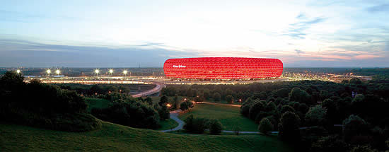
The planet’s biggest event opened yesterday in a lightweight Bavarian stadium, to culminate within a month in the same the place that saw Hitler watch Jesse Owens win a gold medal in 1936. The contrast between the Allianz Arena of Munich and the Olympic Stadium of Berlin illustrates the dilemmas that afflict a country forced to confront contemporary realities with ghosts of the past, but also the tensions that weigh upon a world at once united by spectacle and fragmented by memory. (Photograph: Duccio Malagamba)
Luis Fernández-Galiano
Two Stadiums, Two Battlefields
In Munich , spectacle without memory; in Berlin , memory without spectacle. The two main venues of the World Cup of Germany, where the championship opens and closes, are architectures so opposed one would think them deliberately orchestrated to reveal the two faces of the host country. While the Allianz Arena is light, colorful, and suburban, posed on the landscape like a festive airship, the Olympic Stadium is heavy, grayish and urban, its monumental porticoes rising over a solemn esplanade. Whereas the Munich facility is a new building, clad with the innovative technology of inflatable pillows of ETFE (ethyltetrafluoretylene) that change color with lighting like a discotheque dance floor, the Berlin work is the remodeling of a historic stadium, one that adds a canopy over the grandstands but otherwise maintains the archaic gravitas of limestone and the axial severity of elemental geometries. And if Herzog & de Meuron's stadium is shaped like a pot with three steep stands and a roof that nearly closes on the boiling crowd, the one designed by Otto March almost a century ago (completed in the 30s by his sons Walter and Werner and now adapted by Volkwin Marg of the firm Von Gerkan & Marg) shows the gentle slope and the distance between audience and field that characterize track-and-field facilities, an inconvenience for soccer along with the tiers being interrupted by the Marathon gate and visibility in the upper stand being much diminished by the tree-like supports of the canopy's unclosed ring.
This architectural Jano is of course a portrait of Germany (although the two faces may represent the reverse of what they initially seem to), and at the same time offers a built oxymoron that symbolizes the schizophrenic contemporary tension between globalization and identity, spectacle and memory. At first glance, the cushioned, polychromatic globe in Munich is a futuristic, hyper-technological construction that ought to incarnate the optimistic spirit of Angela Merkel's new Germany . However, the impeccable geometrical logic, the exact functional definition and the lightweight insertion in nature make this colorful, pneumatic stadium a masterwork of canonic modernity, and its spectral immateriality the best vaccine against the ghostly viruses of an ominous past. One cannot help thinking that its classicism à rebours is a deliberate distancing from the random aesthetics of masts and canvases that Günter Behnisch and Frei Otto used to build Munich's Olympic Stadium in 1972, but that particular technical and social choreography sought to exorcize the grave, Wagnerian severity of the Nazi mass rallies with the same tools of lightness and transparency as the Allianz Arena.
The stone peristyle of Berlin , for its part, barely altered by the new canopy, would seem to express the classicist sensibility of old Germany . But its subjection to the rhetorical monumentality of Hitler's architecture, sacrificing functionality to the ceremonial axis that fractures the grandstands and the roof, makes its historicist traditionalism an anti-classical statement, one which otherwise refrains from questioning the theatrical urbanism of the Nazi period. This is perhaps the most contemporary attitude in a country that has replaced the embarrassment of guilt with a distracted acceptance, and which after the fall of the Berlin wall has occupied old Nazi buildings – from the headquarters of the Luftwaffe, now turned into the Finance Ministry, or the old Reichsbank, now housing Foreign Affairs – without the scruples or feelings of reticence that formerly plagued Germans when faced with the phantoms of their past. Only by considering this can we understand the naturalness with which they have remodeled the venue of the 1936 Olympics, the very place where Leni Riefenstahl filmed Olympia – the propaganda documentary that best presented Nazi ideals and aesthetics – and where Albert Speer put up the same cathedrals of light that had graced the Nuremberg party congress of 1934.
The dramatic dilemmas of Germany are also in a way those of Europe , and indeed of all nations afflicted by the antithetical impulses of amnesic adaptation to global homogeneity on one hand, and memory-driven defense of historic uniqueness on the other. In Munich , a Basel-based partnership known for its artistic and experimental profile – which previously gave the Bavarian capital the Goetz Museum and the Fünf Höfe arcade – has created an icon for the city's two football clubs (Bayern and TSV 1860), as well as for the national team. This icon lights up like a cushioned beacon, rising in the landscape of highways like a magical abstract landmark that arouses emotional identities and aesthetic emotions in a single stroke. In Berlin, a Hamburg firm with a more technological, corporate profile – which already had stadiums in other German cities in its track record – has remodeled a Nazi emblem without altering its urban presence, limiting its intervention to covering the tiers and introducing elements of a modern sport venue, from comfortable seats to press rooms and VIP boxes, homogenizing its program amenities while limiting symbolic regeneration to informative signs in perimetral porticoes and an interpretation center in the Langemarckhalle, a building shaped like an Egyptian temple located next to the stadium where the Nazis paid tribute to heroes fallen in battlefields. Paradoxically it is the more generic project, the one carried out in the more anonymous environment, the one that is ultimately more unique in form and has greater attraction for our society of spectacle. All this while the confrontation with an urban piece overwhelmed by the weight of history ends up in a lethargic trivialization and a docile subjection to memory that harms both its functional quality and its emblematic appeal.
For a whole month we were glued to the television screens for these sport battles that for the Nazis were a preparation for war, and which for us are a ritualized combat that replaces military conflict with symbolic warfare. After all, maybe it is true that spectacle unites us and memory separates us. If this is so, then maybe we should all celebrate the amnesic unanimity of football, and trust that its geometric beauty will protect us from the phantoms that still stir in the historic back room of national quarrels and identity wrestlings.
May 2006
The City is a Tree
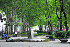
The heated public debate on the refurbishing of Madrid’s Paseo del Prado reminds politicians and urban planners about the communal and ecological dimension of the city, a humanistic vision of the environment to which the recently demised Jane Jacobs dedicated her life and work. (Photograph: Uly Martín)
Luis Fernández-Galiano
The City is a Tree
The city is not a tree. This was the title of the 1965 article in which Christopher Alexander explained that urban design cannot come about in a simple process of successive decisions that fork out like branches. The city is a semi-lattice, he said, and this mathematical term meant that urban form stems from a tangled fabric of choices and chances. Such rejection of the tree pattern was a critique on the technocratic mechanistic order, as well as a defense of the complexity of urban organisms, so the negation of the computer tree paradoxically constituted an affirmation of the biological tree: in its thermodynamic and metabolic dimension, the city is a tree, its growth processes have both the vigor and the fragility of the living thing, and its contrived alterations through pruning and grafting have to be done with a gardener's knowledge and caution. Faced with the colossal mutation and metastasis of the metropolis, we cling to those slow, vegetal certainties in the same way that we grab hold of the paled memories of childhood, and we rise up in rebellion when the scalpel of the planner approaches the luxuriant, shady heart of the city.
When Alexander wrote, the modern certainties had already begun to fade, and the following year they got a definitive slap in the face with the appearance of the mythical books of Aldo Rossi and Robert Venturi, which opened the doors to postmodernity. José Luis Sert – whose retrospective exhibition inaugurated in Barcelona 's Miró Foundation is now in La Lonja of Palma de Mallorca – had published Can Our Cities Survive? in 1942, but this first presentation in English of the canonical urban theses of the fourth CIAM (International Congress of Modern Architecture), held in 1933, soon gave rise to an in-depth revision of the modern creed. This revision centered on recuperating the symbolic monumentality advocated by the historian Sigfried Giedion and on returning to the human scale preached by the critic Lewis Mumford. These were the wickers with which urban design was woven in Harvard in the 50s, a new discipline presented in society in 1956 through a famous encounter – remembered half a century later with a monographic issue of Harvard Design Magazine – that Sert, as dean, organized with the purpose of contributing to the revitalization of American urban centers, then physically gutted by transport infrastructures and socially devastated by the exodus of the middle class to residential suburbs.
A participant of that meeting was an architect's wife who was a writer and editor at Architectural Forum but otherwise lacking in college education, who in time became very famous for her successful confrontation with the all-powerful Robert Moses, chief urban planner of New York, on the issue of the Lower Manhattan Expressway, an overpass that would have destroyed her chosen neighborhood, Greenwich Village. In favor of the unpredictable and heterogeneous dense city (that mixed old and new constructions, rich and poor inhabitants, and vehicles and pedestrians in a permanently changing urban choreography), and therefore critical of Mumford's fixation with the garden city, this woman who Moses and Mumford looked down on as a housewife (the latter called her ‘Mother Jacobs' and the former attributed all opposition to his project to “a bunch of housewives”) published a book in 1961 that changed American urban planning, putting an end to the dominant orthodoxy of the so-called ‘urban renewal': the demolition of old neighborhoods to replace them with high-rises and apartment blocks, scattered between grass meadows and highway knots. The Death and Life of Great American Cities was at once a denunciation of insensitive urban planners and their political patrons, a salute to community participation as an instrument of societal defense against urban outrages, and a preamble to subsequent texts of hers about urban economy from an ethical and organic angle. A year later Rachel Carson published Silent Spring, and since then, movements for the protection of nature have been in tune with this abrasive activist's efforts to protect the diverse and complex vitality of urban ecology.
Jane Jacobs died in Toronto on 25 April (she had been living in Canada since 1968, when she left the United States to save her sons from being drafted for Vietnam), the day after El País published the attack of Carmen Thyssen on Alberto Ruiz-Gallardón regarding the refurbishing of the Paseo del Prado. The protest sparked one of the most impassioned and bitter urban controversies of the recent past. The entire spectrum of the media was mobilized, crowds demonstrated in support of the baroness, and the mayor of Madrid withdrew provisionally, delaying decision-making on the project by six months. Of course, Carmen Thyssen is not Jane Jacobs, because the Spaniard's fame and fortune guarantee her the visibility and audience that the American had to work hard for through her writings, and Gallardón is not Robert Moses either – more worthy of the title would be the engineer of the M-30 ringroad, Manuel Melis, since the architect of the Paseo del Prado, Álvaro Siza, is quite unlikely to take on such a demiurgic role. But the fact is that both the public echo sparked by the baroness's voice of alarm and the denigrating treatment given her remind one of the writer's thorny campaigns in defense of the existing city against the dreams or nightmares of the modern urban planners.
It is not easy to accept a woman without technical credentials daring to challenge so many influential men, bringing together a political mosaic that includes members of the conservative party as well as ecologists or socialists, and galvanizing public opinion against a project endorsed by the refined wisdom of the Porto master, legitimized by a troop of professors, and moved by a well-intentioned determination to reduce vehicular traffic and create a garden where there is now a street. But the solution adopted so radically distorts the city's lazy lines, and so substantially alters current traffic patterns and distribution of tree clusters that it threatens to turn possible advantages into certain damages, and questions the Hippocratic maxim that architects are always supposed to abide by when doing surgery on the city: primum non nocere. In any case, the debate is so sprinkled with unwarranted condemnations, so contaminated by the climate of sectarian animosity that currently dominates the country's political and media scene, and so removed from what Azaña called ‘tempered regions of the spirit' that any judgment must expect to be received more as a product of vested interests than as a fruit of conviction. Could our admiration today for Moses, Mumford or Jacobs have been possible when they were fighting one another in the urban trenches? Is it possible to appreciate Siza's architectural work, Gallardón's political profile and the baroness's civic activism all at the same time? Or must we wait for the cooling of passions that only time and distance can give? On the Paseo del Prado, a lost and found grove awaits the verdict of public opinion: if the city is a tree, let it be proven there.
May 2006
It’s the Economy, Ecologists!
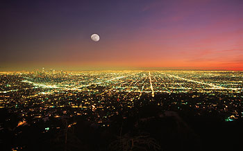
The continuous increase of the oil price – triggered by the multiplication of demand rather than by occasional supply crises – opens a historic period of energy shortage that shall stimulate saving and the use of alternative sources, inviting new reflections in the fields of sustainable architecture and urbanism. (Photograph: Chad Ehlers/Alamy)
Luis Fernández-Galiano
It’s the Economy, Ecologists!
There is no ecology without economy. Beyond the etymological relationship, which places both sciences on common grounds, transfering its logos and its nomos to the shared oikos of our residence on earth, the green science is inconceivable without the melancholy science. Seen from the ‘fiercely human' viewpoint of architecture, the inhabited nature and the artifice of the market are interwoven like warp and weft. But environmental issues are often addressed skipping through the rough territory of financial issues, ignoring or underrating the fact that most of the decisions which shape the world are taken within that frame. At least for this reason, the advocates of sustainable architecture and urbanism should always keep in mind the motto that the political strategist James Carville used in Clinton 's campaign during the 1992 elections, and that has become a catchphrase in the American debate. “It's the economy, stupid!”
Architects talk about sustainability these days not because they have embraced the green creed, but because oil is expensive. This subordination of ideas to facts is not a reprehensible case of opportunism, but a legitimate mechanism of adaptation to a changing world, necessary to ensure the evolutionary survival of social groups and their members. The Marxian verification that conscience follows experience, rather than the other way around, is undoubtedly a criticism of philosophical idealism, an expression of the self-interested nature of knowledge, and a condemnation of the phantasmagoric and intoxicating character of ideology, but also a timely description of adaptative learning. The current fervor for ecological architecture faithfully reproduces that of the seventies, though with some significant variations. As then, it is triggered by the oil shocks that in 1973 and 1979 shattered the energy bases of the economy; but unlike what happened in that decade, contemporary green conscience arises – for now – within a context of economic growth and real-estate boom, where the cold war has been replaced by the conflict with a Muslim world lavish in oil and gas reserves, and in a planet that witnesses the emergence of giants such as China or India with colossal demands for energy, while its price does not prevent the buildup of greenhouse gases that cause global warming.
Within this geopolitical context one can of course argue that buildings and cities are responsible for the greater part of energy consumption, because if we add the cost of air conditioning, lighting and transportation to the energy costs of construction – be it of buildings or urban or territorial infrastructures –, any estimation method shall produce a result of over 50 percent. However, to presume because of this that architects are the inevitable protagonists of the energy dilemmas sparked by the current crisis (in its double dimension of shortage and climatic impact) is a mirage. The decisions that are going to shape our future will be taken in the field of macroeconomics, against the backdrop of the peaceful or military struggles between states for energy, raw materials and water, and in the absence – at short or mid-term – of a global governance that may settle conflicts or safeguard the system's balance. In this scenario of partially self-regulated instability it is easy to forecast changes in the demographic flows and the forms of occupation of the territory spurred by political or economic mutations, but it would be foolish to speculate on their magnitude and their direction, being part of a panorama of technical and climatic uncertainty.
If compared to the resistant and alternative ingenuity of the solar houses of the seventies, with their post-hippy worship of craftwork, their preindustrial defense of autonomous utopia, and their luddite fascination for everything primitive, the contemporary crop of built sustainability has the inequivocal taste of intricate prosperity, normative bureaucracy and symbolic simulacrum: Robinson Crusoe has been replaced by a technocrat. Sustainable construction is today a roaring field, which has its own fairs and congresses, its own magazines and its own prizes, a field nurtured by the demanding regulations and generous subsidies of governments, and a field that tries to make up for its aesthetic handicaps with rankings, homologations and green tags whose ethical aura can give social legitimacy and public exposure to the authors and the works. Reinforced by the presence of corporate firms whose green credentials are an extension of their technological sophistication, and by offices that place their work within a more social perspective, this field is today a meeting point between professional bureaucracies and emerging explorations, but still not a disciplinary territory marked by certainties and conventions.
With all of this, it is paradoxical that the work most quoted as a representative of this new attitude is a New York office skyscraper, the Condé Nast building in 4 Times Square, a project by Fox & Fowle that served as prototype for the development of the LEED (Leadership in Energy and Environmental Design) ratings, the standards created in 2000 by the United States Green Building Council; leaving aside its disappointing aesthetic result, the simple fact of using the high-technology of the skyscraper as an emblem of green architecture – for instance, on the cover of the supplement of The Economist devoted to the subject in December 2004 –, shows to what extent the ecological concerns have seeped into the daily practice of the profession, but also how the means used to address them are simply technological gadgetry and the upgrading of mechanical services. And also a revealing symptom of the power of the economic context in which buildings are produced is the fact that The New York Times headquarters on the same site, with Piano as architect and a commitment to environmental responsibility, had to give up the LEED certification when faced with the financial costs of building in the heart of Manhattan .
Economy, along with politics, imposes its iron law upon technical and social choices, setting guidelines with its trends and marking individual and collective life with its cycles. Those of us who graduated in the summer of 1973 entered the professional field coinciding with the Arab-Israeli war of that fall, which triggered the first oil crisis, and our initial critical and architectural skirmishes where inevitably conditioned by the climate of concern for energy and the economic standstill caused by the rise of fuel prices; a material and ideological context that would be reinforced in 1979 with the Iranian revolution and the second oil crisis, but that would gradually weaken in the following years to later fade away entirely in the second half of the eighties, with the drop in barrel price and the acceleration of economic growth. This situation has been maintained since, with no further frights than that produced in 1990 by the ephemeral invasion of Kuwait by Iraq , with the oil reaching in 1999 prices lower than those of 1974. In the last seven years, however, the barrel price has increased sevenfold.
This context of energy shortage – added to the acknowledgment by scientists of the planet's global warming – has given rise to a new ecological conscience, which takes up issues and authors that had been forgotten during the decades of prosperity, and that for those of us who have lived during the previous period has the narcotic aroma of the déjà vu and the bittersweet taste of lost causes. With more optimism of the will than pessimism of the mind, the green agenda is presented as a renewed secular ethic, but often becomes rather an instrument of political correction in the public relations of governments, institutions or companies. Oblivious to the political or economic context of environmental decisions or perhaps meekly resigned to impotence when faced with the titanic forces that shape our world, the green tag ends up becoming an alibi that endows with the patina of good intentions architecture and urbanism, two activities that cannot be easily separated from the violence they exert over nature.
Construction always uses non-renewable resources and increases the world's entropy. Architects have a faustic pact with excess, so they only surrender to the green syndrome when economy enters recession, and then become advocates of zero growth, austerity and renovation, to later return to messianism and big dreams as soon as consumer confidence recovers. During the present period of transit, with expensive fuels and a booming economy, sustainable architecture is no more than a cocktail of trivial technology that combines thermal sensors, heat pumps and solar panels with old-time recipes on natural lighting and ventilation, orientation and solar protection or thermal insulation and inertia. But if bad comes to worse, all this sweet fantasy will give way to the real dilemma: to build or not to build? Because in the end the only ecological architecture is that which is never built, and the only green architect is the one who refuses to increase the planet's entropy. Meanwhile, us architects have a transparent rather than vested interest in economic growth and in the boom of construction and public works.
April 2006
Spanish Landscapes
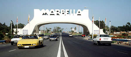
The dissolution of Marbella’s Town Hall has placed urbanism at the center of the political debate, and the first signs of a weakened real estate market puts construction on the very axis of the discussion about the economic and territorial model of a country that seems doomed to choose between prosperity and the landscape. (Photographs: Cordon Press; Marc Ritchie)
Luis Fernández-Galiano
Spanish Landscapes
Marbella has undergone an exorcism. With the dissolution of the City Council and the imprisonment of those responsible, political and judicial Spain tries to drive away the all too familiar demons of speculation and corruption, expel the evil spirits of the healthy body of a young democracy. But Marbella is really the extreme case of a common disease: the penal pathology may reach its worst there, but the symptoms are everywhere. As much the coasts as the edges of cities, and even rural areas that up to now have been intact, are suffering a historic mutation driven by the economic boom and the new demands that come with it. Because of the pain we feel at the thought of the accelerated disappearance of natural landscapes, we tend to describe this process of colonization in medical terms like infection or metastasis. But this impetuous growth can also be interpreted as a result of the vitality of a prosperous and hedonist society that multiplies its needs and desires with impulsive impatience. The territory is always a physical picture of the culture that has molded it and, whether we like it or not, Spain's new landscapes accurately reflect what we are today: well-off, smug and vulgar.
The uncontainable advance of asphalt, just like the real estate bubble itself, is not only a product of corruption or greed. It comes from a social demand for first and second homes that low interest rates and lifelong mortgages have made financially accessible, and that unanimous motorization and the new transport infrastructures have made geographically accessible. In the nineties, urbanized land in Spain increased by 25% (a good 50% in Madrid or on the coast of Valencia and Murcia ). Everywhere, this spread of cement and brick arouses the same contradictory reaction: on one hand, despair at the destruction of the environment; on the other, frenzied acquisition of seaside apartments or houses in the low-density developments of urban peripheries. The town planner Ramón López de Lucio recently took the trouble of documenting the new residential landscapes in the outskirts of Madrid , and the result was as depressing as it was stimulating. To begin with, the low density of this urban environment pushes all activity to the large commercial centers that serve to finance the costs of urbanization, but privatize the collective domain and leave residual public spaces exposed to vandalism. But at the same time, the conventional developments of row houses or low-rise blocks of apartments that form the greater part of the new compounds are uniformly spacious and functional in design, and carried out with a very reasonable degree of material quality. They are homogeneous in their lifeless, self-withdrawn triviality, yet solid, well-equipped and luminous.
Those of us who write in newspapers are in general too old and too elitist to understand that the indifferent anomy of these new urban landscapes do not make them any less desirable, that their abysmal visual mediocrity does not in any way decrease their market value, and that the absence of collective activity in them is not as important to the home buyer as the quality of window frames or the tiling of floors. Urban life has been replaced by suburban life, a way of occupying space and time that also characterizes all the recent developments on the coasts. These new forms of relating to one another and consuming are for many an additional attraction. Never mind if there is no street life; there will be life in a commercial center, around a community swimming pool, or in a backyard barbecue party. Millions of Spaniards have with their mortgages voted for the faded suburbanity of the peripheries and for the massive vacational colonization of the coastline. Both are expressions of economic prosperity, but also of a political democracy that gives governing capacity to municipalities that are powerless in the face of the colossal forces that shape the territory. They may be routinely greedy and occasionally corrupt, but these forces feed on the freedom to choose of real estate buyers, and the landscapes they have shaped faithfully portray the Spanish society of democracy. Moreover, they are electorally devastating, as we have seen in the caricatural case of the Costa del Sol, but also as we witnessed when Britain's New Labour was forced to shelf the Urban White Paper drawn up by Lord Rogers, which included a call to refrain from building on ‘greenfields' (previously undeveloped land), a recommendation that would have antagonized the rising middle classes of the cottage and the SUV that currently make up the demographic and electoral support of any European political center.
In a recent exhibition in Madrid's Círculo de Bellas Artes, the architect César Portela showed his interventions in two Galician landscapes of singular beauty and emotion, The carballeira of Lalín and the isles of San Simón and San Antonio in the estuary of Vigo, two intact natural places which tourist and holiday bulimia has not yet devoured with its unstoppable machinery, and the exhibition's timing with the Marbella crisis made one contemplate the contrast between the way we were and the way we are. The carballeira , a spot in the woods presided by a monumental granite table where 150 neighbors come together for communal celebrations, is a space of archaic poetry that evokes the popular fiesta and the sacred mystery, but also speaks of the frozen time of the village and the stifling rigidity of superstition and habit. The isles of the estuary, the location of an old lazar house and jail, stand out for their melancholic nature and the romantic splendor of their essential constructions, but in this lost world of ashlars and lichens that the architect barely touches with accents of glass, beats an ominous past of illness, punishment and isolation. In contrast with the trivial, ostentatious landscapes of Marbella , the aching beauty of these faded places beckons to us with the magnetic force of the abyss of time. But if we look straight and without the moist veil of aesthetic emotion, we will realize that the new landscapes of narcissist prosperity portray us more accurately than those exact traces of the past, which are preserved only like insects in amber. Hypocritical reader, Marbella is all of us.
April 2006
Inconspicuous Mastery
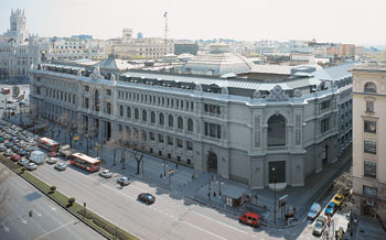
The Bank of Spain has wrapped up its monumental headquarters at the Plaza de Cibeles by closing up the square with a corner built by Rafael Moneo: a project that so respects the language of the original building that it will go unnoticed by nearly everyone, an admirable exercise in subordination to context. Coinciding with its 150th year of existence, the institution holds an exhibition presenting the enlargement project and the entries to the 1978 competition that gave rise to it.
Luis Fernández-Galiano
Inconspicuous Mastery
It is harder to go unnoticed than to attract attention. And at the Plaza de Cibeles, at the symbolic heart of the Spanish capital, little less than impossible. Yet few of Madrid 's people will notice Rafael Moneo's recent enlargement of the Bank of Spain headquarters, however prominently its new corner on Alcalá wraps up the perspective of the Gran Vía. So faithfully does the addition take up the lines of the preexisting construction, that the distracted gaze will simply assume it was always there. Only those residents with particularly good memories will remember José de Lorite's building for Banca Calamarte, long covered as it was with canvases and torn down in 2002 to give way to what now concerns us, the recently finished facades of which—as in the first enlargement, drawn up by José Yarnoz in 1927—reproduce those of the original construction, an eclectic work of the architects Eduardo de Adaro and Severiano Sáinz de la Lastra that opened in 1891. And if now it takes a lot of attention to detect the sutures in the masonry, in a few years only historians will know that the categorical elevation on Alcalá is actually two elevations separated by more than a century.
Naturally, the essential lesson of this small work of Moneo is that one need not use the language of our times to expand a historic building. Heroic modernity established this lesson beyond doubt. To question this dogma of the 20 th -century avant-gardes is to scandalize the defenders of modern orthodoxy, who will probably raise their fists in several directions. For a start, they will point out that the project came about through a competition held back in 1978, and that it therefore goes by the postmodern revisions then in vogue – subsequently discredited – instead of addressing contemporary concerns. They will also draw attention to the fact that as much the unmistakable interior sections as the geometrizing of the decorative details of the façade are evidence of the architect simultaneous sliding toward his own formal language and ironic distancing from classicist codes. Finally, they will stress that the extension rises on so small a piece of the city block taken up by the Bank of Spain that it cannot possibly aspire to offer a modern counterpoint, that it can do no more than complete the preexisting through imitation.
But none of this is entirely true. The competition is indeed remote in time. Suffice it to remember that the central bank has seen four governors since. But the matter came to a dead end when Town Hall denied the institution permission to tear down Lorite's work, a mixed-use building containing offices and apartments that was completed in 1924 and vacated in 1974, after its acquisition by the Bank of Spain. Construction of the corner was delayed for over a quarter-century, but has now finally been carried out in accordance with a definitive project that, while significantly improving the initial proposal, reaffirms the starting hypotheses, which revolve around completing the block with the same language. In the second place, the sections reveals some dissonances that are modern, but these are clearly less important than the symmetrical classicism of the floor plans, and the convincing decomposition of ornamental elements into planes – except for the new caryatids, entrusted without too much luck to the sculptor Francisco López Quintanilla – is closer to Art Déco than to the irony of Venturi, whose playful extension of London's National Gallery in 1986-1991 will be in the mind of many, even as it places itself in a territory that is methodologically much removed from this severe project. Finally, the dimensions of the operation invite but do not necessarily demand contextual discreetness, as several of the 1978 competitors eloquently expressed through a whole gamut of proposals that ranged from the rough modern militancy of Corrales & Molezún or Eleuterio Población to the postmodern provocations of MBM, passing through the schematic historicism of Javier Yarnoz, son of the author of the first extension and himself the author of the less fortunate construction, carried out in the period 1969-1975, on the streets Madrazo and Marqués de Cubas.
Though a small work, both the importance of the institution and the quality of the original building – where the historian Pedro Navascués has with a critic's sharpness detected the coexistence of the establishment's two characters: on one hand its industrial nature on the sober granite plinth, on the other hand its representative role, this in the solemen arches and “Venetian” columns of the main floor, rendered in limestone; a dichotomy that is repeated in the sequence of interior spaces, the more laconic ones along the axis of the corner facing Cibeles, the more palatial ones behind the monumental entrance on the Paseo del Prado –make Moneo's enlargement a uniquely prominent project, one we cannot help comparing to his other interventions along the Prado-Castellana axis, in all of which he has had to confront patrimonial dilemmas, from the exemplary deference to a preexisting mansion in the Bankinter case to the less perfect struggle with Villanueva's work in the Prado Museum (possibly more censurable than the stubbornly controversial brick cube in the Jerónimos church cloister), not to mention the intelligent use of the Palacio de Villahermosa facades for the Thyssen Museum and the joining of the rhetorical hypostyle of Atocha Station with the marquee of Alberto del Palacio.
In perspective, it may be that the most silent works are what end up capping greater critical attention, and that the two banks designed in the sixties – Bankinter and Banco de España – will be judged as being more significant in the course of architecture than the two museums or the station nearby, the mass use of which give them greater public visibility. The long due closing of the Banco de España block has been described in this daily under the title “The Caruana Corner,” and indeed one is tempted to think that the parallel history of the institution and the building has a worthy crowning in its culminating under a governor – one trained in that same public secondary school of Teruel that with teachers like José Antonio Labordeta produced graduates like Juan Alberto Bellock, Federico Jiménez Losantos, or Manuel Pizarro – who is as excellent as he is discreet, with an international career comparable in the economic field only to Rodrigo Rato's, and who in the shaken national wheel has managed – unlike Greenspan and Collina – to act without protagonism, in the manner of good arbiters, as befits the regulatory function of the entity he heads. In the city and in life itself we are constantly coming across works and persons that go unnoticed, not so much because of their low profiles but because of their prudent subordination to an urban or institutional context. It is an attitude that calls for elegance in life and professional skill: no one said it would be easy to fly under the radar.
March 2006
Motor Works
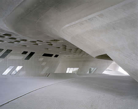
The start of the Formula 1 season is a perfect time to remember the romance of architecture and the automobile, a romance recently rekindled through emblematic buildings designed by Norman Foster for McLaren, Ben van Berkel for Mercedes, Zaha Hadid for BMW, Jakob & McFarlane for Renault, or Massimiliano Fuksas for Ferrari. (Photograph: Klemens Ortmeyer)
Luis Fernández-Galiano
Motor Works
Modern architecture and the automobile were born at the same time, and they may well disappear together. Both shaped the 20 th century, and both are to a fair extent responsible for the consumption of fossil fuels that has given rise to the insomniac territory of an accelerated time. Petroleum nourishes motors, but also buildings and works, and in the end our model of a city is rendered unsustainable as much by energy use in transport as it is by energy use in construction. Of course urban development of the disperse kind based on the automobile is the main link between architecture and energy; but buildings, too, require the consumption of non-renewable resources, not only in their construction but also in their maintenance, and this puts architects in the same frame of mind as manufacturers of vehicles. Although on their own they can do little to modify territorial models, they can do much to construct buildings and fabricate automobiles that consume less energy, a beneficial resolution that appears prominently in the press releases of professional associations and the commercials of car brands. But while architects' congresses and motor trade fairs preach on sustainability, ecological construction, and hybrid vehicles, the building and automobile sectors celebrate their old friendship with a handful of spectacular constructions where intentions to make amends are subordinated to a desire to surprise, to the pedagogy of emotion, and to the calculation of impact.
In his famous book-manifesto of 1923, Toward a New Architecture , Le Corbusier compared the evolution of Greek temples to that of automobiles. Such fascination with the mechanic world made him the main propagandist both of the city at the service of traffic and of architecture inspired by the procedures of industry: two vectors of innovation underlying his titanic (and fortunately never carried out) Voisin Plan for Paris, named after the car manufacturer Gabriel Voisin, as it does the significantly named Maison Citroan. This coming together of construction and automobile was more symbolic than material, and it can said that the marriage between them was really consummated in the anonymous sheds that Albert Kahn built for Ford, factories that were of such pure functionality that Stalin did not hesitate to summon Kahn for the building of a large number of like structures in the Soviet Union, or in the mythical work of Lingotto, where the engineer Giacomo Mattè-Trucco crowned his factory for Fiat, remodeled in the past decade by Renzo Piano, with a test track for cars. In any case Le Corbusier's flirtations with the automobile, just like Melnikov's alluring Parisian garage projects of the same years, marked a publicity romance of undeniable efficacy for both parts, one that lives on to our days. In the interwar period, the master photographed his Villa Stein with an automobile in the foreground, while the firm Daimler-Benz announced its 8/38 Mercedes-Benz with an image of it in front of Le Corbusier's building in the Weissenhof of Stuttgart. Today, the latest car models are routinely advertised against a background of new architecture, as are high-fashion collections, and in turn the major manufacturers of automobiles take pains to complement their interminable production hangars with symbolic gestures entrusted to architectural celebrities, and sometimes they turn to this Formula 1 of the profession even for their research and communication premises.
Good examples of the first variant are Zaha Hadid's latest projects, the BMW's main building in Leipzig and the Science Center in the Volkswagen city of Wolfsburg, besides the automobile museum that Ben van Berkel has almost finished for Mercedes-Benz in Stuttgart. Illustrating the second option are the research centers of McLaren and Ferrari, works by Norman Foster and Massimiliano Fuksas, or Renault's Communication Center, built by Jakob & MacFarlane in the interior of some obsolete industrial sheds. The Anglo-Iraqi's works for German brands both use self-compactable concrete, a technique without which we could not possibly imagine their oneiric forms being forged. Otherwise they are almost diametrically complementary. In the BMW factory in Leipzig, Hadid puts the offices, the laboratories, and the canteen in a Piranesian hank of galleries and platforms which are overflown by ribbons that silently drag the bodyworks of the cars, and which tangle up tightly between three huge production hangars, constructing the piece like a hinge that also serves as an entrance and a showroom for the firm, complete with a souvenir shop. Beside Volkswagen's grand factory in Wolfsburg, the formidable Science Center is a sculptural free-standing volume that lifts up on pachyderm legs a refined landscape of warped concrete. This landscape serves as a support for the experiment stations that are randomly placed on it and that work to spread scientific knowledge while entertaining in the manner of an amusement park. Also meant for exhibition purposes, and also free-standing and sculptural, is the museum created for Mercedes-Benz in Stuttgart by the UN Studio of Ben van Berkel, whose passion for the Moebius Strip comes across here through a clover of warped leaves that is transformed into a spiral ramp that is vaguely evocative of Wright's Guggenheim, but interpreted with spaces that flow in a double helix so that the spectator sliding down from above threads the history of the automobile with that of the company itself.
More sober are the spaces conceived for research and development, such as the exquisite McLaren Technological Center built by Norman Foster in Woking, a plate of glass and steel whose sinuous outline surrounds an artificial lake so as to trace a perfect circle in the bucolic context of the English countryside; or the Research Center of Ferrari, raised by Massimiliano Fuksas in Maranello with three pieces of extreme horizontality and lightness that are piled up weightlessly in the vicinity of the factory. In contrast, the Communication Center of Renault reuses the industrial sheds built by Claude Vasconi in the eighties – the last remains of the huge plant at Boulogne-Billancourt, in the outskirts of Paris, before production was altogether decentralized – and fits them out to accommodate the company's creative advertising staff and sales machinery. For this Jakob & MacFarlane come up with an informal environment of viewable facilities and folded planes imbued with a certain taste of origami-like Californian deconstruction.
Spain has its own motor tradition, brought of late to paroxysmal levels by ‘Alonsomania', and is no stranger to this blooming of automobile architectures. Proof of this are two projects recently set in motion in Alcañiz and Torrejón de la Calzada. The town of the province of Teruel is witnessing the birth of a Motor City, a colossal complex complete with racing tracks, a technological park, and leisure facilities that the government of the autonomous community of Aragón is instigating, having presented it in Madrid on the 2 nd of March through its vice-president, José Ángel Biel, the car race driver Pedro Martínez de la Rosa, and the racing track designer Hermann Tilke. And the municipality of the province of Madrid, in turn, is building a spectacular Museum of the Automotive. Sponsored by Mariluz Barreiros, daughter of the entrepreneur who set up the motor industry in Spain and Cuba, it is designed by Mansilla & Tuñón as a huge cylinder materialized with pressed cars that allude as much to the recycling park it is part of, the La Torre Technical Assistance Center, as to the necessary ecological consciousness-raising in re-use and sustainability that nowadays inspires both the world of architecture and the world of the motor vehicle. Coinciding with the Universal Exposition of Aichi, the firm Toyota presented – a bit in the manner of “concept cars” – an “intelligent and sustainable house” developed by its various research departments which incorporated over a hundred patents. The result was aesthetically mediocre and sociologically out of bounds – a 700-meter house for a country that invented the capsule-hotel. But it is also a revealing example of a by now centenary romance between modern architecture and the automobile: a sexy and fertile relationship that in our times is conceivable only if placed at the service of environmental responsibility.
February 2006
The Oil of Icons
The annual appointment of Arco prompts to comment on the incestuous relationship between architecture and art in times controlled by celebrity, spectacle, media and commerce; the note is illustrated with the last American museum, built by the Genoese Renzo Piano, one of the most influential architects in the field of art according to the Art Review. (Photograph:M. Denancé)
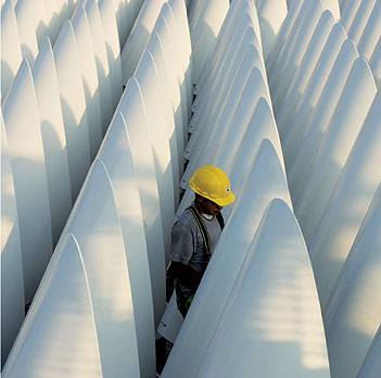
Luis Fernández-Galiano
The Oil of Icons
Between FITUR and SICUR, coinciding with International Fashion Week, ARCO celebrates its 25th anniversary. The fairs preceding and following the art fair at IFEMA serve to mark its boundaries. The International Tourism Fair describes the consumerization of geography, referring to art as entertainment and as an itinerant engine of leisure deranged by a symbolic bulimia, while the International Security Fair delimits the topography of fear, tying up with art as a postmodern religion and a source of the timelessness and sacredness that protects us against contemporary transience and uncertainty. The tourism of art feeds on its fungible luxury, the security of art comes from its spiritual nature, and both – consumable distinction and immaterial protection – find hypostatic union in fashion that is at once fleeting and eternal, material and intangible, whose coinciding International Fashion Fair and Pasarela Cibeles shield ARCO so that no one can say that art is naked, while the Casa Pasarela extends the world of style to the cluttered realm of home décor, protective dress and intimate scene of the rites of collector-ism, which transforms the objects of art of the gods of the home. IFEMA thinks for us.
Twenty-five years after the Guernica’s return, ARCO turns a quarter-century by inviting a country that commemorates the 250th birthday of its star genius. Such an accumulation of anniversaries invites one to contemplate this motley fair in the at once dazzling and dolorous light of another citizen of felix Austria, the late Thomas Bernhard, who made his country and art the main targets of his critical pessimism. It is not easy to imagine the author of The Loser following the footsteps of the exceptional talent from Salzburg in this busy bazaar’s pandemonium of ideological and formal offers, nor is it possible to transfer the thoughtful contemplation of the main character of Old Masters: A Comedy to this carnival of modern masters and postmodern epigones, but only a gaze as caustic as Bernhard’s could do justice to the colossal, consoling, and consensual fiction of contemporary art, where “the suspension of disbelief”– in a manner ironically more literal than in literary fiction – is the only iron rule written on stone on the door that leads into the fair.
The newspaper El País has entrusted the design of its stand to an artist-architect, Juan Navarro Baldeweg, and this fortunate choice serves to illustrate the close contemporary ties that exist between two sister disciplines which the strictest form of modernity tried to keep hygienically separated, but which even then engaged in incestuous cross-fertilization, spawning fruits that were often healthy but every now and then freakish. The less fortunate results of this self-withdrawn in-breeding comes from confusing architecture and sculpture: a confusion that an exhibition titled “ArquiEscultura” equivocally plays with now at the Guggenheim-Bilbao, a singularly appropriate venue for the presentation of such a phenomenon considering that Gehry’s Bilbao Guggenheim has been for the current generation what Wright’s New York Guggenheim or Utzon’s Sydney Opera House was for previous generations. Paradoxically, this sculptural architecture has been pushed to the limbo of midcult by the same people who put it on top, and today the Californian shares with our very own Santiago Calatrava that vast, vague space which – with the permission of Ratzinger and the International Theological Commission – is inhabited by those who, unworthy of the paradise of criticism, neither deserve the tortures of hell, those whose popular success makes a forced stay in purgatory unlikely.
In the limbo of opinion and the heaven of masses, these artist-architects perfectly illustrate the solvent nature of celebrity. Frank Gehry is the star of a documentary filmed by Sydney Pollack, and as apprentice in his studio he has taken in someone like Brad Pitt, who, incidentally, has by now opened his own design office and will for a start be decorating the hotel he is building in Las Vegas with George Clooney. But Gehry’s work is sliding down the mannerist slope of the repeated stroke – “sometimes I feel like a serial killer,” he has joked, “stop me before I do it again.” Santiago Calatrava, in turn, was the architect most flattered by the American media after his project for Ground Zero, and he is at this very moment the first architect since Breuer, back in 1972, to be exhibiting his work in New York City’s Metropolitan Museum of Art, to boot between Fra Angelico and Van Gogh, making true what we had judged as megalomaniac aspirations to compare with Leonardo da Vinci or Michelangelo. But this astronomical rise of his naïf watercolor-ism is in tune with the futuristic kitsch of his latest constructions, provoking a tide of hostility in Anglo-Saxon criticism, which has censured him without mercy.
The magazine Art Review has published a list of 100 people it considers most influential in the art world. Neither Gehry nor Calatrava makes it there, but the list includes four architects whose names and mutations of the past year mark the trends emerging in the world’s fair of vanities or taste. Rem Koolhaas and Zaha Hadid – Pritzker Prize winners in 2000 and 2004, respectively, and formerly master and disciple in the London crucible that the Architectural Association is – made number 14 and number 20 in the previous list, but now drop to 49 and 75. In one case it is perhaps illustrative of general disappointment at how the Dutch architect has moved from the diagrammatic projects and political-ideological collaborations in Documenta exhibitions to the conventionally sculptural and popularly successful works that followed his amazement at the “Bilbao effect.” In the other case it is perhaps also a sign of general exhaustion with the Anglo-Iraqi’s worldwide implantations of fluid forms, multiplied to infinity by the snowball fame of “Casta Diva.”
In contrast, Herzog & de Meuron and Renzo Piano, Pritzker winners in 2001 and 1998 who did not make the previous list, are now in it and high in it, as numbers 11 and 35. In one case it may be evidence of fascination with the relentless material and formal explorations of the Basel partners, a verification of their solid ties to the art scene, which often include collaborations with prominent members of it, and admiration for their museum projects, most recently the New de Young Museum in San Francisco, a piece of exquisite make with copper lining perforated by lights and shadows, one that in time will dissolve in the park it is located in. In the other case it could be acknowledgment of the impeccable efficiency and accurate elegance of the Genoese master, no doubt the most coveted in the demanding universe of patrons, artists, and curators who value as frames for art the refined and luminous silence of his works, effortlessly proven in the most recent of them, the extension of the High Museum in Atlanta, a series of immaculate volumes clad in white aluminum and crowned with a tight forest of skylights rendered with his characteristic material inventiveness.
After this concert of duets, a distracted walk through the ARCO pavilions can suggest that the essential works of our times exist outside this mobile, portable fair, a mix of the commercial center and the academic salon of conventional reputation. Whether because we do not know where its spirit blows, or because the scale of the works overflows this ephemeral city of plaster and celebrities, beyond the metal architectures, perforated volcanoes, or concrete star fields, ARCO is a plateau for a motley audience, solitude inhabited by multitudes, where every celebrity has a spotlight, just as every icon in the stifling penumbra of an orthodox church has an oil lamp burning before it. In a Bolshevik story, the main character is a revolutionary who, at one point, in a crossed gesture of provocative pragmatism and challenging respect, uses the icon’s oil to grease his boots. Perhaps the dazzle of ARCO deserves the same treatment as Byzantine oil lamps, and maybe we ought to walk through its labyrinths with the spirit of the unbeliever before a sacred image, concerned only with finding the best grease for the cracked leather of our shoes, totally unconcerned with the “art-fitur” of consuming and the “art-sicur” of protecting, and the insinuations of “art-catwalk”.
December 2005
Fog in the Desert
The Kuwait meeting introduces a summary of 2006, which aside from taking stock of events and catastrophes, refers to the increasingly superficial nature of architecture, consumed by the media with a voyeuristic appetite for sensations, and each time more incapable of intervening in the deepest strata of the economy or the technology where the political and social changes brew. (Photograph: Anwar Daijallah / Arab Times)
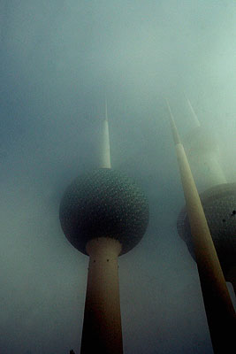
Luis Fernández-Galiano
Fog in the Desert
We do not expect fog in the desert. Nevertheless, we western critics and our counterparts of the Muslim world who have been summoned together in Kuwait by the Aga Khan Foundation are met by a mist that is denser than the mythical British split-pea soup, a phenomenon so unusual as to make the front page of Arab Times, the emirate's English-language daily, blurring the silhouette of the city's architectural icon, the Kuwait Towers, a construction of water tanks that serves as well as a lookout and a restaurant. While dining in one of the towers with Paula Al Sabah, married to a son of the emir – sadly disappeared a few weeks later –, a woman exquisitely educated in the United States like all other members of the tribal elite that runs the country, it occurs to me that the cloud inside which we are conversing is a perfect metaphor for the soft, cottony blindness of the world's privileges. After all, as we savor desserts flown in that same morning from a Parisian patisserie, we are floating many meters above the dunes that hide the lake of petroleum on whose viscous darkness rests the prosperity of the Gulf, but also ours.
The Kuwaitis follow the news of Saddam Hussein's trial with indifference. Gone, almost entirely, are the marks of the invasion that in 1990 provoked the first Gulf War – with unforeseen architectural consequences in Spain, such as the provisional paralysis in Madrid of the twin towers of the Kuwait Investment Office (KIO), after the group's plundering by Javier de la Rosa and Fahad Al Sabah, or the celebration of victory over Iraq through the lyrical Kuwaiti Pavilion at Expo '92 in Seville, which Santiago Calatrava designed as an arch of triumph of moving palm trees. And one hardly remembers that the geopolitical balance of the planet still rests on this fragile hinge where energy reserves cross with the clash of civilizations. These pre-Christmas weeks, passenger planes fly fearlessly over a shaken, pre-electoral Iraq, and in Kuwait people worry more about traffic jams in the highways than about metal detector arches at the entrances to hotels or the routinary checking of undersides and trunks of vehicles. The parliament building designed by Utzon, with its huge canvases of concrete hanging from the sculptural portico, has been entirely restored from the damages it suffered during the occupation, and continues to be the country's most beautiful building, while new skyscrapers built in more corporate styles are sprouting left and right, alongside shopping centers with Californian airs and incomparable luxuries. If we go by the real estate fair that accompanies an ongoing congress of local engineers, we cannot help thinking that Kuwait is preparing to be a second Dubai – the Gulf emirate currently second only to Shanghai in number of cranes.
Contemplated from this Persian or Arabian Gulf on whose fortune our own so much depends, the year's architectural events fade in the blue fog of distance and in the indifference of chance. The cities of the year were Aichi, site of a International Exposition of environmental sustainability themes that accommodated a much praised Spanish Pavilion, a ceramic and chromatic work of Alejandro Zaera and Farshid Moussavi; Istanbul, venue of a congress of the International Union of Architects that awarded its triennial medal to the Japanese Tadao Ando; and London, elected host of the Olympic Games of 2012, beating Paris, Madrid, New York, and Moscow, the day before being the target of a chain of terrorist attacks. But for a year that began under the tragic effects of a tsunami that claimed a quarter of a million victims, perhaps the list of cities ought to include New Orleans, dramatically devastated by the hurricane Katrina; Paris, scene of the decade's worst urban disturbances; Barcelona, where the sinking of the Carmelo quarter brought to light the issue of urbanistic corruption; and Madrid, which saw the Windsor office tower burning and realized how vulnerable the vertical city is: a roster of disasters that would soon include Tokyo, a privileged hub of fashion architectures like Toyo Ito's for Tod's or SANAA's for Dior, but today the epicenter of a political and technical scandal that threatens to cut short Japan's economic recovery, after revelations of the architect Hidetsugu Aneha's falsification of seismic calculations in over fifty buildings, which will now have to be demolished, bringing up a problem that experts say could affect tens of thousands of constructions in the country, thanks to detection of the systematic cost-reducing complicity of architects, builders, and inspectors, often private companies since the sector was liberalized.
Incidentally, this was one of the issues addressed at the Kuwait gathering, and this because it affects that essential factor of security and life without which it is obscene to be lavish in aesthetic considerations, considerations which are perhaps reasonably limited to the lazaret of newspapers' culture supplements, which cannot compete with the juicy polemics of the local news section, the exotic proposals of the travel pages, or the sophisticated lifestyle coverage of the Sunday magazines, not to mention the endless advertising of the real estate sections. After all, it is reasonable to think that the urbanistic mutations of one's own city, the architectural glamor of tourist destinations, or domestic decoration – not to mention the buying of a dwelling, a rite of passage that marks one's stepping from the freedom of youth to the mortgaged chains of maturity – are all eons more interesting than the often lewd ramblings about the physical body of architecture and its fleeting shadows, an activity of idlers like the critics gathered together in the unexpected mists of the Gulf.
To discipline this tameless tribe, and in the spirit of guiding the reader, let me attempt to finish a short adaptation of a transatlantic doctrine in matters of obscenity, one I extract from the instructions offered by a Virginia-based organization called Parents Against Bad Books in Schools, authors of a list of works judged “inappropriate, obscene, or vulgar,” including the likes of Umberto Eco, Margaret Atwood and Gabriel García Márquez. According to The Times Literary Supplement , the ‘badness' of texts is measured with a scale of four registers having to do with sexual content, from B (Basic) to G (Graphic), on to VG (Very Graphic) and EG (Extremely Graphic). Examples are given: B (large breasts); G (large, voluptuous bouncing breasts); VG (large, voluptuous bouncing breasts with hard nipples); EG (large, voluptuous bouncing breasts with hard nipples covered with glistening sweat and bite marks). An equivalent architectural scale to prevent critical pornography could go as follows: B (large volumes); G (large, undulating and agitated volumes); VG (large, undulating and agitated volumes clad with titanium): EG (large, undulating and agitated volumes clad with titanium, with a moist gloss and trembling texture). Such a scale could serve as a guide for architectural critics lost in the fog of exclusive sensuality while the dark pulse of the world beats beneath the sand.
December 2005
Advent Homily
The global market of signature architects is experiencing an inflationary growth that is devaluating the publicity value of spectacular works. Overkill of budgets and symbols combine with the re-emergence of protectionism to trace a panorama of withdrawal that nevertheless has yet to affect the smug banquet of the media. (Photograph: Duccio Malagamba)
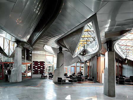
Luis Fernández-Galiano
Advent Homily
There is more vinegar than wine in celebrity architecture. Borrowing Ratzinger's evangelical metaphors, the European city is a vineyard devastated by wild boars, a construction cultivated and gradually being destroyed by economic and mediatic forces that have imposed their animal appetite on the plant-like unhurriedness of urban continuity, offering the compensatory shine of signature architectures as orientational or identity-defining placebos in the mutating territory of globalization. But the proliferation of these landmarks and icons erodes their curative fiction and makes the publicity sonority of their trills fade out in the din of the times, their promesse de bonheur going up in smoke. Ortega deplored the fact that the parliamentary debates of his time were waged between wild boars and tenors, and today's urban dialogues may likewise be a battle between money that assaults and artists who sing, even as the wine of their voices, turned vinegar, no longer makes us drunk. Going back to Benedictine enological theology, having passed the vineyard of wild pigs, symbolic architectures are nowadays elaborated with grapes of the jungle, which produce more hangover than euphoria.
Negative reaction to emblematic works is due not so much to their traditional role of propagandists of power, nor to their contemporary function as movers of the tourist industry. It is due to their uncontrolled proliferation, with the inevitable effect of diluting uniqueness and diminishing quality, when star-architects cease to be able to keep the excellence bar at high level. What else happens in contemporary art museums when the formulaic repetition of collections – presided over in succession by a Moore, a Chillida, or a Turrell near the entrance – deteriorates both the specific profile of the institutions and the generic value of the works, which are produced under the pressure of an insomniac market. In architecture, such metastasis of icons has also nourished protectionist protests, such as the one led by Will Alsop when London won its bid to host the Olympics, through a collective manifesto advocating the protagonism of Britain's new generation in the projects for 2012 so that these do not fall into “Dutch or Spanish hands”; or the one formulated in an open letter to Ciampi and Berlusconi from 35 leading architects, among them Vittorio Gregotti and Paola Portoghesi, that speaks of the proliferation of commissions to foreigners endangering the continuity of an architectural investigation initiated in the thirties that is for Italy an “unrenounceable cultural resource.”
However petty some of these demands may be, they are in tune with the emotional climate of a Europe that is unable to compete with Asia, that is demographically aged, and that through recent constitutional referendums has expressed fear over enlargement toward the East – the famous Polish plumber of the French consultation – or the admittance of Turkey – with the impact of the Islamist murder of Theo van Gogh hovering over Dutch ballots. They also vibrate in resonance with a general sentiment of withdrawal, the result of historic insecurity generated by globalization, which has given rise to a return to more immediate fidelities to village and tribe; and a revival of regional identities that take on a new cultural and political protagonism. But their basic fuel are widespread irritation at the excesses of the star system, a general exhaustion with vedettes who do not always deliver the quality expected of them, and the evidence that local professionals often benefit from the comparison. (This is not exactly the case of the authors of the two manifestos mentioned above: Britain's young architects, besides scorning foreigners, have to contend with the generation of the two lords of high-tech, Foster and Rogers, whose merits cannot be compared with those of their detractors; and it has been some time now since the Italian veterans last built any buildings that can be compared to those of the international stars they are trying to exclude in their country.)
The protectionist tide arrives in Spain toned down by the feeble chauvinism of a country whose self-esteem was injured by the prolonged isolation imposed upon it by the Franco regime, and whose opening to the rest of the world has always been associated with modernity and liberty. But it also arrives here driven by the perception of an unequal exchange (despite wide international recognition, we import more architectures than we export), by the building of client networks in territories of strong identity, and by a lukewarm disappointment with the latest crop of signature architectures, which is not always at a par with the generosity of their budgets and the reputation of their authors. In the exhibition on Spain 's new architecture that opens in February in New York 's Museum of Modern Art , an extraordinary tribute to the excellence of our current construction, nearly a third of the works are by foreign architects. This shows both the breadth of the outlook of Spanish institutions (which make up the greater part of the clientele), and the fascination that figures of the international scene feel for a country where they have not always been able to work in the best conditions, whether because of the traditional programmatic indefiniteness of the public client or because of the no less frequent problem of budget imprecision, but where they have enjoyed a degree of media popularity and political deference that is much less common in other places.
However much we censure the formal or economic extravagances of signature works, we must remember that architects try to give more than they have to, offering society more than society asks of them, and only those who have renounced such self-demanding integrity that is the pillar of professionalism can be sequestered by the censurable smugness of one who gives less than his prestige promises. Sometimes there are accidents, as in the Scottish Parliament, a work of dramatic beauty that represents democracy with unexpected forms, where the near-simultaneous passing away of the architect and the politician who acted as his client triggered a budgetary loss of control that gave rise to an investigation of the very institution, without this financial derailment preventing Enric Miralles from posthumously winning the Stirling, the highest distinction awarded a building by the collective of British architects. But no major project is immune from journalistic polemic and political scandal, and as much the Sydney Opera House as the Pompidou Center or the Guggenheim-Bilbao Museum were capolavori received with the same din that now surrounds the City of Arts and Sciences of Valencia or the City of Culture of Galicia, two titanic works that may likewise one day be their authors' masterworks, even if today we see only the excess of its scale with a guilty conscience that makes wine go sour.
If signature architectures ought to tone down, surely it is because we have in atonement decided to build fewer buildings and more city. For only from the perspective of the physical and temporal continuity of the urban realm can we hope to channel turbulent currents and transform the material world, and only from the angle of prioritizing what is collective can we attempt to ride out the historic tempests that shake our social universe. But it will not be because a generation on the rise or in decline clamors for protectionist measures against foreign stars, or because the great economic agents of the building sector prefer to deal with meeker professionals. High competition in architecture is a demanding sector, and architects who do not live up to expectations in competitions and commissions suffer an immediate erosion of their reputations in the professional or academic environment that later transfers to the public at large and their clientele. It is in this lag that most pathologies proliferate, if we do not classify as such all the madness that every generation builds with the unanimous conviction that it has found the philosopher's stone, when often its works are but the product of aesthetic or intellectual fashions that disappear as suddenly as they came. But the decadence of some celebrities and the intrinsic fleetingness of fashion come together these days to raise an architectural alarm that resembles the “profit warnings” leading corporations publish to inform the market of their profits being lower than predicted, and that here would have deserved the title “advent advice” had I not been afraid of abusing alliteration and rhetoric.
October 2005
Overseas in October
A quick architectural tour of North America gives some impressions of recent works - from Rem Koolhaas’ Prada store in Los Angeles and his library in Seattle to Herzog & de Meuron’s De Young Museum in San Francisco and Walker Art Center in Minneapolis - as well as atmospherical observations of the cultural and political climate across the Atlantic. (Photograph: Mark Darley)
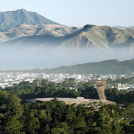
Luis Fernández-Galiano
Overseas in October
I am a suspect. In the course of this fleeting American week I have twice received the four S's that lead to a particularly rigorous check. From New York to San Francisco, chance or the slightest possibility of danger marks travel documents with the ominous SSSS that only a handful of bloggers claim to know how to decipher, and the passenger meekly surrenders himself to a humiliating scrutiny of clothes and luggage in search of signs of explosives or drugs, and an interminable examination and frisking where jokes can be a ground for a penal process. Compared to the unanimous and amiable supervision of immigration agents, the arbitrary opacity of the Homeland Security reveals the extent of the territories that freedom is ceding to fear. It is my third visit to the United States in a year, and I embark on each trip with increased reluctance.
Monday in L.A. dawns with a fog that soon dissolves, and the din of the traffic on the freeways silences the mediatic explosion of the weekend fires, by now just traces of smoke in the distance. On Sunday Eric Owen Moss showed me around Culver City, a fractured suburban utopia of pragmatic sculptural sheds, and I also visited the Prada store on Rodeo Drive, a Rem Koolhaas work that is much less publicized than its sister in New York City's Soho, but that is is better resolved because of the way its routes tangle up with the large staggered wave, more sensual because of the spongy or translucent quality of its exact materials, and more seductive thanks to the maze of galleries that form subterranean shop windows beneath the sidewalks. This first working day of the week I once again pass through Bunker Hill, a hub of civic life regenerated by cultural buildings and the conversion of offices into residential lofts, but also besieged by a somber army of 80,000 homeless people who camp along the edges, drawn to California's benign climate by the closing of psychiatric institutions and the break-up of families. In this city of contrasts, Frank Gehry's Walt Disney Concert Hall raises its beautiful flower of steel on Grand Avenue. Its raised picturesque garden and theatrical entrance spill onto the street, faking an urbanity that is ironically subverted by the interior cascade of stairs channelling the flow of spectators toward the innumerable parking basements. Just a block away, Rafael Moneo's fortress of a cathedral defines its perimeter. The church is marked by the categorical bell tower and it the herringbone pattern of the ceilings and the concrete cross over the alabaster are delicate, but there is something wrong about the access, the building looks drowned from the bordering freeway, and the interior has been disfigured by the proliferation of deplorable imagery, a testimony of the dull sensibility of Cardinal Mahoney, to whom I suppose we must also attribute the atrocious funerary crypt that has Gregory Peck as most famous tenant. And the Caltrans building of Morphosis colonizes the foot of the hill with distracted energy and catastrophic decorations that waver between a titanic reference to the Russian constructivists and a malgré soi tribute to the industrial ready-made or the roadside put-it-together-yourself. My afternoon conference takes place in the SCI-Arc shed, a factory space that brings together professors who have gone from manufactured deconstruction to computerized organicism with students all but exhausted from the formal exacerbation of this exuberant expressionism that nourishes both prosperity and the climate.
Tuesday in San Francisco I devote entirely to the De Young Museum, a work of Herzog & De Meuron I get to visit on the eve of its opening in the company of the building's project director, the indispensable Deborah Frieden. When I came to speak at Berkeley some years ago, I took advantage of the opportunity to verify for myself both the frustration produced by the routinary buildings of Mario Botta and Fumihiko Maki in the urban center's cultural core, and the amazement elicited by the Dominus winery of the Swiss partners in the Napa Valley, an at once brutal and exquisite prism of basalt gabions. Now, after the controversy triggered by the project for the museum, which replaces an early 20 th -century building in Golden Gate Park that was damaged by the 1989 earthquake, it is a joy to find that the building housing the centenary institution is at a par with its artistic-ethnographic collections, and that its composition of pieces interwoven to connect exhibition narratives through deep chinks of light and vegetation in the interior, or its skin of copper that will turn green in time and which is embossed and perforated with a pixelled interpretation of the foliage, will end up convincing the most reticent. Enriched by ex profeso works as enigmatic as Goldsworthy's lyrical fissure or Richter's micro-photographed strontium, and crowned with a 45-meter look-out tower that twists slightly to align with the urban grid, the New De Young is the laconic icon that San Francisco lacked all these years, a luminous meeting place where the city comes together and can be contemplated.
Wednesday in Vancouver revolves around the overwhelming landscapes of the Canadian Pacific, which makes the visitor shudder from the moment he flies over the islands of the gulf, shrouded in the autumn mist. In the intermittent rain I discover the tranquil urbanity of an orderly and friendly city whose population is one-third Asian and whose economy until recently centered around fishing, mining, and wood. Here it is a must to visit the most promising among studios on the rise, and John Patkau leads us to his latest house, a refined residence for a young Chinese millionaire, built in concrete on the water's edge, that features a suspended swimming pool, a hermetic music room for the jam sessions of his rock group, and a bedside photograph that in lieu of a family shows a lineup of his seven luxury cars, for which the garage allows for vertical storage. But the leading local architect is the veteran Arthur Erickson, and after visiting his capolavoro, the monumental and tectonic Anthropology Museum, it is my good fortune to get to lecture in an auditorium that he designed, and that clings to words and movement like a used glove.
Thursday in Seattle has as its inevitable target Rem Koolhaas' Public Lbrary, a huge carved crystal whose Stealth aesthetic has had a curiously polemic-free reception, however much the young accuse the Dutch architect of having attained mastery with a faceted sculpture that contradicts his most extreme postulates, and that in any case orchestrates a polyhedric program with strategic intelligence and material elegance. Largely occupied by humble users, the titles on loan that are shown in real time form an artistic installation that play up its social character. More melancholic was the visit to Frank Gehry's Experience Music Project, a formless amalgam of chaotic iridescent bulges that not even the monorail penetrating it or the fairground proximity of roller coaster redeems, and whose capricious confusion is all the more evident when seen from the top of the Space Needle, the slender observatory that was built for the 1962 World's Fair. The city of Jimi Hendrix is also the city of Steven Holl, but its university chapel would be a disappointment to most: balanced in its implantation and exact in its details, the trivial scenography of the interior, with its low colored lights trying to create a spiritual atmosphere, are decidedly affected and twee, in unfavorable contrast to the constructive pedagogy of the tilt-up walls. In any case it is better than Gehry's blobs and the stilted, cutout pop of Venturi & Scott Brown's museum, works unworthy of a place whose most memorable image continues to be the unanimous spread of Boeing hangars, which Microsoft's virtual universe has not managed to dissolve. Despite the instantaneous and oceanic information available on-line, architects still buy tickets to attend a conference, and this persistence of physical presence does not fail to surprise me.
Friday in Minneapolis is a rainy day and my stopover in the Midwest has no other objective than a visit to the newly opened Walker Art Center, a Herzog & de Meuron project that has been received with lots of praise and a few reservations. All have lauded the way the new halls thread their routes with the old building of Edward Larrabee Barnes, the skill with which the center relates to the avenue and the placid park behind, or the inventiveness of the materials, which include a cladding of aluminum panels that are punched to give them the look of creased paper. But not everyone has understood the random perforations of the outer skin, or the use, in the theater and the openings of the halls, of a decorative pattern that takes inspiration from the sensuality of lace lingerie. Nevertheless it is hard to be objective when touring the place in the warm company of its director, Kathy Halbreich, a New Yorker who has kept high the reputation of a museum that is exemplary for its integrity and consistency. The scale of the Twin Cities also gives me time to experience the unique system of raised corridors that connects all of downtown Minneapolis in a manner out of the reach of its tough winter, explore the precedents of the Guggenheim-Bilbao in Gehry's efficient and stunning Weisman Museum, and lament the clamorous sign of alarm that hovers over Jean Nouvel's career on account of his Guthrie Theater, a colossal work on the banks of the Misssissippi that is his first American job but where every decision and every detail, from the clonal hall to the gymnastic projection over the river, shows a loss of control that does no justice to the institution nor to the architect's track record. Saturday has me flying back home via Chicago. This time I get no SSSS. I am no longer under suspicion.
October 2005
Totem and Catastrophe
The recent natural calamities – the Asian tsunami and American hurricanes – have drawn attention to the vulnerability of the contemporary territory, an extensive and fragile construction that architects mark off with the wrong totems, from the skyscrapers proposed by Calatrava for Chicago to Nouvel’s newly opened one in Barcelona. (Photograph: Calatrava studio)

Luis Fernández-Galiano
Totem and Catastrophe
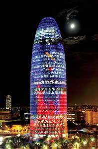
Apocalytic and totemic in the face of mass urbanity: summing up the early Umberto Eco, such could be the dilemma of today's architects. If the semiologist of our pop youth distinguished between the apocalyptics who fear mass culture and the integrated who submit to it, attitudes toward the contemporary city can also be polarized between those who judge the boundless urbanization of territories as an ecological and social tragedy, and those who join in on the real estate tide by raising signs of identity or force. The quarter of a million victims of the Boxing Day tsunami drew attention to the physical fragility of modern suburbanity with devastating emotional violence, and the hurricanes that whipped Louisiana and Texas – from the foretold destruction of New Orleans to the chaotic evacuation of Houston – have likewise shaken the smug self-confidence of the United States with frustration and panic, nourishing millenarian vertigos and mute apocalypses. In such a panorama of risk and uncertainty – accentuated by the natural calamities and the specter of climatic change, but previously opened in history and memory by 9-11 and its echoes, from Madrid's 11-M to London's 7-J – our stars of architecture are either crowning or commencing urban totems that turn their backs on the beat of the world, and we are at a loss how to take them, whether as arrogant icons of masculine affirmation in the face of the tribulations of the times, or as vertical exorcisms pretending to keep vigil over the defenseless slumber of the city besieged by shadows.
A good interpreter of the tremors of our times is the geographer and UCLA professor Jared Diamond. Some years ago he explained the success of the West in Guns, Germs and Steel: the Fates of Human Societies , a Pulitzer Prize winner that sold a million copies. The sequel, Collapse: How Societies Choose to Fail or Succeed , addresses the other side of the coin, the reasons for the failure of some societies of the past, from the inhabitants of Easter Island to the Vikings of Greenland, which serve as an example and a warning for contemporary societies like China, the United States, or Australia whose current development shows the same features that led to the sinking of the former. Among these factors, the determinant for Diamond is the social response to environmental problems, and his persuasive description of the gradual collapse of collective life after the devastation of a fragile habitat – a consequence of social decisions that are more deliberate than inevitable – has produced the expectable impact on the anguished post-tsunami conscience, and one will have generate an even greater one at the settling of the perception of vulnerability that Katrina and Rita have brought to the heart of a country which, caught in the mire of an impossible war, suddenly finds itself defenseless as well in the face of climatic catastrophe: a political and technical crisis that joins with apocalyptic terrorism and the unfathomable mutations produced by science in our biological nature in building for us a nightmare future. Meanwhile, Diamond describes life in Los Angeles suburbs, protected by private police, where people drink bottled water, live on private pensions, and send their children to private schools – so that they do not much care about the deterioration of the police, water supply, social security, and public schools – and he wonders how long before the excluded begin to threaten the rich neighborhoods as in the past they attacked the palaces of Mayan kings or tore down the statues of Easter Island. No fence will keep out the poor, he says, and this is something he need not repeat to those of us who day by day see the news coming in from Melilla and Ceuta (the Spanish cities in the north of Africa, frequently entered by illegal immigrants that climb the fence separating them from Morocco), from a border overwhelmed as much by assaults as by the colossal gradient of fertility and income.
In this shaken planet, the leaders of architecture blindly compete with the social leaders, the former pursuing their narcissistic careers in the same way that the latter concern themselves only with the political or economic ruses that precariously keep the feeble building of an irresponsible nomenklatura on its feet. Take for example two figures whom the media frequently tag as artists and even geniuses, and who for different reasons have been making news of late. One is Santiago Calatrava, who in October opened a solo exhibition of his sculptures, drawings, and models in New York City's Metropolitan Museum of Art; and inaugurated Valencia's Palau de les Arts, a work as colossal and calligraphic as a Flash Gordon comic; who in September, in the company with Hillary Clinton, laid the first stone – or the first beam – of his bristling, lyrical transport hub in Ground Zero; who in August presented Malmö with a twisted skycraper that according to The Architect's Newspaper makes its occupants dizzy; and who in July presented a twisting, Solomonic project – again in organic, mannerist torsion – to materialize in Chicago, cradle of the skyscraper, as the tallest building in the United States, in dialogue with the two local giants, the John Hancock and the Sears towers, so defying in its splendid location, right where the Chicago River meets Lake Michigan, and so disdainful of the security concerns triggered by 9-11 as to have elicited the censure of the developer Donald Trump: “No one in his right mind would put up a building that high in today's horrible world. I don't think it's a real project. It's all a joke.” Well, this same Calatrava who has made the headlines during 2005 is the butt of an anecdote printed in The New York Times which illustrates the self-referential character of contemporary architecture. According to Brian Carley, vice president of the Fordham Company, developer of the Chicago skyscraper that is to be called the Fordham Needle, the architect's wife turned to him during a meeting in Zürich and said: “You know, Brian, whatever you call it, it'll be known as the Calatrava.”
Whether we like it or not, Robertina is right. And if the spectacular, resounding enlargement of the Reina Sofía Museum, opened in September, has been named Nouvel, it is simply a recognition of the mediatic notoriety that now distinguishes star architects, celebrities competing in glitter with their public and private clients. In the Puerta América hotel, opened only four days before, Nouvel has had to share the limelight with the motley cast of designer figures aboard, and this is the only reason why the building of colored canopies is not known by his name, but as “the hotel of the architects” or “the hotel of the stars,” which only reinforces our argument. And in the Agbar Tower , inaugurated by King Juan Carlos in the same month, the protagonism of the architect was so clamorous that this newspaper did not hesitate to title it “Nouvel's tower, new totem of the Barcelona sky.” The royal was relegated to second place both typographically and photographically, as was the president of the company and of La Caixa bank, Ricard Fornesa, who described the building as “a gift to the city.” A gift from the company or from the architect? The extraordinary hype showered on the architect transpires in a context where the hostile takeover bid of Gas Natural (controlled by the Barcelona-based La Caixa) over Endesa, one of the largest electric companies in Spain – which affects corporate headquarters and the geographic localization of power over energy – agglutinates the country's political and economic debate, a matter involving interests far more transcendental than the originality or the extravagance of a concrete shell randomly perforated with pixellated windows and capriciously colored beneath glazed blinds that sheath it like a fantasy condom. Gas Natural, too, has a main office of its own in the making, designed by the late Enric Miralles with the emblematic uniqueness that the firm wished to endow itself with in order to assert its implantation in Barcelona after the merging of Catalana de Gas and Gas Madrid, and after the acquisition of Enagás, the public distribution monopoly, that resulted from the pacts made between the socialist government in Madrid and the Catalan nationalists in 1993.
But the great battles of territories for energy and gas – which hardly dissimulate the aesthetic fencing of the guest artists – are fought in the common field of an indomitable growth that undermines the environmental foundations of our survival. The electric sparkle of our luminous landscapes does not dissipate the dark spots of the future. Blinded by the kilowatt, we forget Katrina and Kyoto . Architects raise illuminated totems, pretending to forget that priapism is an erectile dysfunction. At night in Sin City , its icons look like gods protecting us from the dark, but they are false idols that are impotent in the face of the catastrophe that hangs over the happy smug city. As the British historian Eileen Power wrote, the Romans, blind to what was happening to them, spoke of Roma inmortalis on the very eve of Rome 's fall.
September 2005
Asian Luxury
The fashion cult takes on paroxysmal levels in Tokyo, where many of Japan’s leading architects – and some foreigners – are putting up buildings for the great fashion firms that are spectacular stores and corporate emblems at the same time. Toyo Ito’s work for Tod’s, Sejima & Nishizawa’s for Dior, and Jun Aoki’s for Louis Vuitton are the three latest additions to Omotesando Street, nerve center of sumptuary shopping. (Photograph: Hisao Suzuki/Daici Ano)
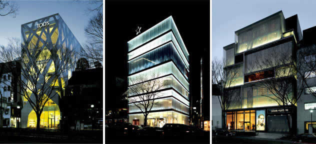
Luis Fernández-Galiano
Asian Luxury
We can't pretend to understand Japan . Anyone visiting this empire of signs empathizes with the perplexity of Bill Murray and Scarlett Johansson in Sofia Coppola's film. Like them, we know that the essential is lost in translation, and that we are strayed in the labyrinths of language and custom. It is not easy to reconcile the exquisite refinement of Japanese calligraphy and gardens with the current hyperbolic keenness on western mercantilism, nor is there a way of mapping out the road that leads from haiku to manga without accepting the traumas of the Japan 's opening up to the world, from Commodore Perry to General MacArthur. Ian Buruma, who knows the country well, believes it excessive to blame its intellectual and artistic dislocations exclusively on the violence of foreign impositions. But surely its exacerbated consumerism is as much a sign of economic modernity as it is an indication of cultural malaise. The passion for fashion in contemporary Japan cannot simply be interpreted in the individualist terms of “emotional luxury” that Gilles Lipovetsky has theorized, as an extreme expression of democratic hedonism and mass narcissism.
The part of Tokyo that was the scene of the closest thing to eternal luxury was Ginza , and after a period of decline triggered by the bursting of the stock market bubble in 1992, it still much is. The area's new seats of high-fashion houses testify to this. These include Renzo Piano's elegant building for Hermès, with its neat facade of glass bricks and its interior characterized by a crystallographic and metallic luminosity, and Jun Aoki's exceptional boutique for Louis Vuitton on Namiki Street, with its prefabricated GRC pieces incrusted with the same white marble used in the Taj Mahal. But the new hub of fashion trademarks is Omotesando Street, where Tadao Ando already constructed the Collezione Building with his laconic concrete surfaces, where Kengo Kuma has erected a multiple structure for LVMH offices and outlets with a monumental latticework of vertical larchwood slats, and where the Swiss partnership of Herzog & de Meuron has carried out for the Italian firm Prada what is without a doubt the most dazzling of all, a faceted crystal with rhombuses of bubbly glass that is set on the site with the blasé precision of an excessive jewel.
This luxury fashion street has now brought in new neighbors, and the curiosity their fascinating facades arouse is at a par with the disappointment that their routinary interiors produce. As a matter of fact, the architects called in to create these commercial icons are almost never commissioned to design the interior spaces, which tend to be entrusted to the decoration department of the firms themselves. This separation of responsibilities partly explains the divergence of the results, but does not ease one's irritation at the gap that stretches between the aesthetic and symbolic elevated objects of the projects and the resigned acceptance of a conventionally ostentatious interior imagery. Both in Toyo Ito's work for Tod's and in Sejima & Nishizawa's for Dior and Aoki's for Louis Vuitton, the promesse de bonheur announced by its urban setting is frustrated as soon as one enters. Should you, reader, wish to maintain the suspension of disbelief of literary fiction and architectural fiction, don't go. Just enjoy the exterior images.
Tod's, with its delicate facade of concrete cut out like a cardboard to evoke tree branches, is a nighttime icon of extraordinary efficiency, and a daytime icon that manages to draw attention to itself, burdened as it is amid a deplorable clutter of constructions and an awkward footbridge over the street's mad traffic. Once you step inside, however, the vulgarity of the spaces and the mediocrity of the details, from the false ceilings to the handrails of the stairs, render the work unworthy of the author of the Sendai mediatheque. Dior, with its subtle translucent walls of durved acrylic panels and the intelligent use of guidelines to distort perception of space with a succession of real and fictional slabs, is intriguing and seductive from the sidewalk, but perplexing when it becomes evident that the minimalist abstractions of the classical moldings and the academic paneling of upmarket traditionalism has little to do with the couple that designed the Kanazawa museum. And Louis Vuitton, with its ironic piling of suitcases and trunks clad with glass and metal mesh, manages to pass on to the interior part of the richness of space suggested by the enigmatic layered facade, but here, too, the efficient organization of the complex is not as attractive as a sensual exploration of the surfaces.
In the three examples, the facade is better than the interior, the walls win over the spaces, the skin beats the organs. All in keeping, for sure, with architecture at the service of cosmetics. Only the strictest fundamentalists of functional modernity will censure the prevalence of appearance over experience. For which reason it seems sensible to reiterate the recommendation about limiting the architectural consumption to the consumption of virtual images. This reporter, lost in translation , has suffered an overdose of reality, but promises to mend his ways.
Julio 2005
Piano ‘lontano’
The Genoan architect Renzo Piano has become the world’s most sought after architect while maintaining artisan control over his work. In June, the start of construction work in the Chicago Art Institute and the opening of the Zentrum Paul Klee in Bern drew attention to his exceptional popularity in the field of buildings for culture, where in the United States alone he has ten in the making. (Photograph: Michel Denancé)
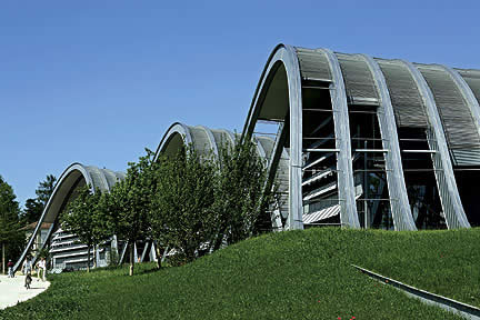
Luis Fernández-Galiano
Piano ‘lontano’
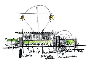
He gets hundreds of offers a year, but accepts only three or four. A project lasts an average of five years, and it is impossible to personally tackle more than twenty at a time. In his Genoa studio at Punta Nave, each one of twenty works is a pin on the wall across his desk, where sketches, drawings, and working details are superposed on one another to give the architect an abbreviated panorama of how the project is progressing. When not traveling to check on job sites, Renzo Piano divides his time between his Paris and Genoa studios, two offices reigned by a luminous order and a contained scale – neither employing more than 50 persons – that make it possible to maintain a family atmosphere and close contact with the materials characterizing what chose to call itself a Building Workshop, and where computers and pencils coexist with tools and machines used for making prototypes and models. Piano has not let success distort his artisan work method, refusing to expand, declining most commissions or competition invitations, rejecting offers to teach outside of the studio, and limiting his public appearances to two or three a year, these almost always in connection to exhibitions of his work.
Such a reticent attitude has nevertheless not prevented the Genoan from building all over the world, because his popularity rests precisely on the universality of his language: exact geometries, exquisite details, and luminous spaces. An architecture based on order, construction, and clarity is irresistible, and it is no wonder that his balanced mix of exactitude and inventiveness fascinates clients and colleagues alike. Clients find in Piano a purified professionality that is able to reconcile budgets, timetables, and programs with a unanimously acceptable clean aesthetic, and an attention to context and the environment that makes it possible to present his projects are socially and ecologically responsible. And colleagues admire the Building Workshop's ever experimental attitude, which makes each new work an exploration journey, and the technological refinement that manages to combine the pedagogical rigor of assemblages with the tactile sensuality of the materials.
A proof of Piano's popularity among institutional clients is the extraordinary number of ongoing projects he has in the United States alone, an area or market that can be considered the most competitive. In New York City he is busy with the skyscraper of The New York Times , right on Times Square; the enlargement of the Whitney Museum of Art, a commission significant not only on account of the museum itself but also because of the mythical building by Marcel Breuer that houses it, and which recently got a unanimous go-ahead from the very exigent board of trustees; the extension of the prestigious Morgan Library, due to open this next spring; and Columbia University's new campus, situated out in the Bronx and the size of the Manhattan one. In Boston he will be enlarging another museum, the Isabelle Steward Gardner Museum , and though negotiations are currently on hold, in Cambridge he is to do the same for Harvard University 's Fogg Art Museum , for which James Stirling did a first enlargement two decades ago. Also enlargements are his projects for the Chicago Art Institute, construction for which has just begun with a lot of media fanfare; the High Museum in Atlanta, a large, nearly 20,000 square meter container scheduled to open in the fall; the California Academy of Sciences in San Francisco; and last but not least the Los Angeles County Museum of Art (LACMA), an important commission that, as in the Whitney case, replaces a Rem Koolhaas who could not or would not adapt to the institution's functional and financial demands.
The list is indeed impressive and one can understand the malaise of many American architects who, feeling left out, attribute Piano's success to the desire of the clients to play a sure card – few museums in the past years have been as well-received by both public and the critics as the Genoese architect's two Texan buildings, the Menil Collection of 1987 in Houston and the Nasher Sculpture Center of 2003 in Dallas. But the long list of works in progress does not justify the bitterness of the Architectural Record, which tags him between question marks as a “default architect,” nor the imperious terms in which professionals like Steven Holl have been demanding a share in the Columbia campus commission. But Piano argues that making architecture “simple, subtle, and serene” is neither simple nor risk-free, and other colleagues of the English-speaking world acknowledge this merit of his in generous terms. The last annual survey of The Architects' Journal showed the Italian to be the living architect whom professionals of Great Britain most admire, ahead of Norman Foster and way ahead of Richard Rogers and Glenn Murcutt, who come in third and fourth. This despite Piano's having capped London 's most meaty commission, which has just obtained final permission from Livingstone's mayoralty: a sharp glazed skyscraper that will be Europe 's tallest and that is already commonly known as the “Shard of Glass.”
That Piano's museums do not elude risks is evident in his most recently completed work, three waves of steel in the outskirts of Bern that bring together the work of Paul Klee – an artist who was born in Switzerland and died there, although he never held Swiss citizenship, and who is buried close to the place. Here the Italian architect avoided repeating the contained pattern of his very popular and praised Beyeler Foundation in Basil. Instead he conceived a topographic and sculptural gesture, so memorably unique, that alludes to the undulating terrain of hills and has had as many defenders as detractors. Among the latter is Sunday Times critic Hugh Pearman, whose chronicle begins in this manner: “I used to think that Renzo Piano was the best international architect in the world. He was not in-your-face showy, like Frank Gehry. Not in thrall to technology, like his old chum Richard Rogers. Not puritanical, like Norman Foster.” But in time he reveals his disappointment, seeing in the Paul Klee center no empathy with nature, but the formalism typical of works aspiring to be tourist landmarks and citizen icons, omitting the idea that the three waves, rendered in steel with techniques evoking shipbuilding, are supposed to represent the cut of the relief through the existing road. He also deplores the lack of natural light in the exhibition zones, ignoring the fact that the delicate fragility of the painter's drawings and watercolors compelled the architect to dispense with the top lighting of his other museum projects. To be sure, the loquacious waves may be an unusual setting for displaying the small works of an intimate, silent artist. Nevertheless, the unexpected emotion elicited by the frozen swell makes the risk of experimentation and incomprehension worthwhile. An architect who is able to choose his clients can also allow himself to disconcert the critics.
March 2005
Philip Johnson, Master of Infidelity
The dean of American architecture passed away on 26 January, after an intense life, full of contradictory episodes, and a long career which allowed him to flirt with different styles and turned him into a public figure, a constant presence in the media. Johnson played his skills as author of buildings, cultural patron and arbiter of trends. (Photograph: Morgana Vargas Llosa)
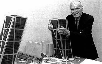
Luis Fernández-Galiano
Philip Johnson, Master of Infidelity
“Philip’s dead.” Peter Eisenman need not say the surname. We know whom he is talking about. For half a century Philip Johnson has been so big in the New York architectural scene that everyone simply calls him Philip. I am surprised when Peter calls again. Just an hour ago we have been talking about the Harvard president’s sexist statements on women and science and Manuel Fraga’s chances in Galicia. Now he is taciturn, moved. Johnson was his godfather in Manhattan’s moneyed and cultured elites, and also the only person in the world who intimidated him. The times I saw them together, I could not help noticing their unique father?son relationship. Years ago it was I who relayed him the news of Aldo Rossi’s unexpected death. Now it is Peter who informs me before the obituaries appear on the web. It is almost eight in the evening, so I call the newspaper and commit to sending thirty lines in half an hour. That way the piece can make it tomorrow with a text by the daily’s correspondent. As I write, I cannot push away the memory of Philip’s eyes, sparkling behind round Le Corbusier spectacles that he, ever a Mies van der Rohe devotee, adopted as a paradoxical sign of identity.
His 45 years of personal partnership with the gallery owner David Whitney may make one think otherwise, but Philip Johnson was a master of infidelity. Fortunately unfaithful in his political convictions, since having worked in Louisiana for the fascist Huey Long and attended Nazi Party rallies in Nuremberg, having left New York’s Museum of Modern Art to devote himself exclusively to extremist militancy from 1936 to 1940, when, fortunately, politics abandoned him, after World War II he designed a synagogue and obtained the forgiveness of the Jewish financial magnates whose donations nourished the New York cultural institutions his career would unfold in. Alternatively unfaithful in his professional situation, which fluctuated between the practice of architecture, corporate patronage, and the exercise of criticism, so that in him the roles of author, patron, and arbiter of trends were confused. And inevitably unfaithful in his stylistic adherences, which passed from modernity to deconstruction through abstract classicism and historicist postmodernity: in 1932, with an exhibition in the New York MoMA, he introduced in the United States what he and Henry-Russell Hitchcock named “International Style”; in 1988, or 56 years later, with another MoMA exhibition he consecrated the fractured architecture of deconstruction.
I met him the year after that, while in Los Angeles as a visiting scholar at the Getty Center for the History of Art and the Humanities. We were introduced by Frank Gehry, whom he saw often at the time and who had just finished the Schnabel House, a huge residence in Brentwood built like a still life of pieces of different shapes and materials. Philip Johnson happened to be in town and wanting to visit the house, so Gehry made arrangements with the Schnabel family for us to go together, and so it was that I spent a few hours in the company of the mythical octogenarian architect. He showed up with David, and in the course of the thorough tour of the house I was struck by the contrast between his physical fragility and his intellectual sharpness. He had to be held by the elbow to negotiate the steps and obstacles of the incident?filled yard and interiors, and the vulnerable skeleton of his frail figure was most at odds with the teasing sparkle of his gaze, the quickness of his replies, and the ease with which he would shift Marna Schnabel’s conversation toward her teenage daughter, butt of his jokes and attention.
On that occasion I was able to interrogate him on his preferences of the moment and, inevitably, his experiences in 1930s Germany and his relationship with Mies. But the more extensive conversations would take place five years later, when I visited him in New Canaan in the company of Eisenman and family, and later in his New York apartment. That Sunday excursion to the Connecticut estate where Johnson spent his weekends, and where he now has chosen to die, gave me the rare privilege of seeing “in person” the nine constructions, scattered around in the beautiful, tree-filled landscape, through which the architect wished to sum up his ever-shifting aesthetic biography, from the mythical Glass House of 1949 to the then recently completed Gatehouse. Here he sequestered me for nearly an hour, asking me more questions than I could him. Some of the pieces were garden structures, such as the pond’s “classical ballet” style temple – his most reviled period, in both his own and his partner’s opinion – or the metal fabric nursery cage he conceived as a tribute to Gehry. Two were storage-galleries for his extraordinary collection of paintings and sculptures. Only two were used on an everyday basis: the opaque guesthouse he and David stayed in, the Glass House being climatically impossible to inhabit, just like Mies’s Farnsworth House; and the postmodern library, with its huge contemporary and historic volumes, that Johnson used as a studio.
Notwithstanding the idyllic surroundings, I will never forget being struck by the austerity in which he lived. This is something I have seen in other American millionaire-patrons, such as Dominque de Menil, for whom Johnson built a modest house in Houston that speaks more of a teacher than an oil tycoon and who would introduce the architect in Texas, the state where some of his finest works are located, or Phyllis Lambert, through the intercession of whom Mies and Johnson obtained the commission for the Seagram Building – in whose Four Seasons Restaurant the architect for decades played the role of master of ceremonies of the American scene – and who lives in Montreal with a laconism that belies the architectural center she finances. (Years ago I took her out to dinner in Madrid with Peter Eisenman, and on the way to the restaurant we stopped for a close look of the KIO Towers; whereas the New Yorker got a kick out of finding references to his Checkpoint Charlie work in the facades, Lambert refused to step out of the car, so angry was she at Johnson’s drifting from his Miesian origins.) Later I would see his Manhattan apartment, in the tower that César Pelli built for the MoMA, having snatched the commission from Johnson himself. Small and low-ceilinged, it made the high-backed, Venturi-designed chairs in the dining room seem oversized. There, as we made preparations for an AV Monographs issue to celebrate his 90th birthday (a project aborted because the break with John Burgee in 1992, after 25 years of professional partnership, had placed an embargo on all of the firm’s drawings), I dared to suggest that he put some kind of order in MoMA’s permanent architecture collection, then displayed with neither concord nor criteria. “I don’t dare tell them anything” – he had long let go of his responsibilities in the museum – “because they still take it as an order.” (In the wake of the museum’s reopening in Manhattan, the architecture section – named after Johnson, incidentally – remains deficient, in contrast to the splendid art collection exhibited on the floors dedicated to Alfred Barr.)
Too powerful at the MoMA, in New York society, and in American architecture – he received the first Pritzker Prize, orchestrated the second for Barragán, and oversaw the award’s initial steps –, he aroused as many furious detractors as he attracted devotees. Michael Sorkin wrote ‘philippics’ in The Village Voice, coining an entire literary genre for censuring his fickleness, his inconsistency, his formalist triviality, while other young critics like Jeff Kipnis or Mark Wigley praised his versatility and adaptability, his sensitivity to the spirit of the times. Having been educated in the lambasting of Johnson (my teacher Alejandro de la Sota would make detailed comparisons of the Glass House and the Farnsworth House in order to show to what extent the disciple was unworthy of the master Mies), but also having visited most of his works, I must say that both sides are well-founded. In his determination to emulate Mies van der Rohe, Johnson hired Franz Schulze, author of the German master’s celebrated biography, to write up his own. Published in 1994, the resulting book – where both his episodes of fascist militancy and his complicated sentimental life take up a significant place – was a mirror he did not like looking at. Nevertheless he once again in mea culpa acknowledged the error of his totalitarian youth, attributing it in part to an erotic fascination with the Nazi aesthetic, and appeared on the cover of Out, the voice of homosexuals, to announce that he would design the world’s largest church for gays and lesbians.
Because of the newspaper’s rush, I write a page threaded by his structures in New Canaan. I believe it is in this museum-park, donated to the country, that his memory will live on in most perfect, innocent form. Historians will prefer the MoMA’s sculpture garden, from where one discerns the top of the AT&T skyscraper (the model of which he appeared with on the cover of Time magazine), like a visual oxymoron connecting the modern Johnson to the postmodern, the institutional, the corporate, the cultural, and the mediatic ones. As I wrap up this piece, newsflashes begin to come on the web: a deplorable text of Associated Press and an article by Paul Goldberger that The New York Times must have had ready since prehistoric times in which the critic wrote for it. Like Javier Marías, I still cannot fathom how people can write obituaries ahead of time. Maybe it is professional, but I find it obscene. At the newspaper they decide to illustrate the information with a 1979 picture of Johnson with the AT&T model, after not finding the one we published in May 1996 with the architect embracing the model of the KIO towers. Had it been up to me, I would have used the photograph Arnold Newman took of him in July 1949. Johnson is taken from behind in his Glass House, lost among the reflections of the trees like a character in an oneiric and improbable story, larger than life like his own life. Thanks for calling, Peter.
February 2005
Sudden Beauty
The inauguration on 4 February of Herzog & de Meuron’s library in Cottbus marks the start of an annus mirabilis for the Basel studio, which finishes the new De Young museum of San Francisco in March, presents the Walker Art Center of Minneapolis in April, and opens the Allianz Arena of Munich in May. Until the 8th of that month the Netherlands Architecture Institute hosts a monographic exhibition on its work that is accompanied by the launching of a perfume created by the partners. (Photograph: Erica Overmeer)
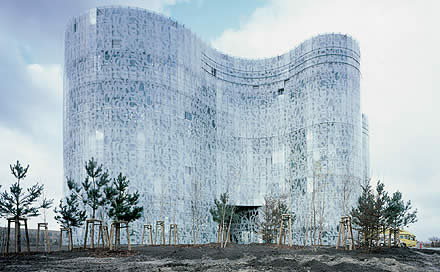
Luis Fernández-Galiano
Sudden Beauty
Algae, vin chaud, and tangerine are among the ingredients of
“Rotterdam,” the perfume produced by Herzog & de Meuron
to celebrate the exhibition of their work in the Dutch city. The Olfactory
Object, as the architects call it, contains hashish, patchouli, and Rhine
water, the river that connects Basel to Rotterdam. It is being distributed
in a limited edition of 1,000 15-ml bottles. And its strong scent sticks
to the skin as tenaciously as images of their works stay in the retina.
Jacques Herzog had for years been talking about creating a perfume that
would bring to mind “oil paint, wet concrete, or hot asphalt on
which it has rained,” fascinated as he was by the capacity of smells
to store memory and evoke past experiences or spaces, “almost like
an inner film”. The classrooms of our childhood, an old kitchen,
or a church during mass are among the places that would be conjured by
their olfactory objects, the first of which has been materialized on the
occasion of the Netherlands Architecture Institute exhibition, which under
the title “Beauty and Waste” presents a formidable collection
of objects, texts, and models illustrating the creative process of the
Swiss duo.
Beauty is not a word used frequently in art and architectural criticism of our times, but it suits this obstinate exploration of aesthetic emotion that leaves in its wake such a large residue of spoils, failed attempts, and abandoned experiments: wastes of progress in penumbra that advances with setbacks and losses to produce objects of such exact perfection as to seem effortlessly delivered. Like the light elegance of the leaping athlete belying the painstaking preparation behind the movement, the assertive naturalness of the works of Herzog & de Meuron is such that one does not suspect the meanders and mazes of the road taken, documented in Rotterdam through a multitude of discardings that stress the protractedness of the process. In the garden of forking paths, the architect feeling his way in the foliage is once in a while helped by a flash of lightning, and such glare in the dark of night is what some call inspiration.
This is exactly what happened in 1997, when, while designing Ricola’s marketing offices (their third project for the manufacturer of herbal candies), their sketches of compact structures with pitched roofs suddenly yielded a star-shaped plan with a transparent perimeter, dissolving the volume in the surrounding vegetation – an unusual proposal that would later be stretched to a whole series of fractured projects. It also happened in the work that is to open now, a university library in an East German town close to the Polish border. Herzog & de Meuron won the 1994 competition for this commission with a project of prisms, with skins inscribed in them, that recalls their library in Eberswalde (another university facility in old East Germany, designed the same year), but would eventually build it with the ameba-shaped floor plan conceived in 1998 – an extrusion of the expressionist curve that would likewise have progeny in the production of the office. But both the star and the ameba appear in the regular pattern of everyday work as flotsam of the shipwreck of history, intuitions rescued from past fortunes that rise to the surface of awareness to keep us afloat, more than as ecstatic gleams in the dark forest of mystics.
The undulating perimeter of the Cottbus library is of course meant to make it unique, so that it can serve as a landmark and an emblem of renewal in a campus built in 1945 with buildings characterized by disciplined dimensional and material homogeneity. Nevertheless, its fluid form – defined by a curtain of glass on which an abstract pattern of typographical origins is engraved, rendering the sculptural volume immaterial by making its organic outline disappear in the sky – does not come from any overwhelming emotion or random caprice of the architects. Rather, it comes from an eminent lineage of crystalline curves that has its origins in the glass skyscraper of Mies van der Rohe – the theoretical project of 1922 – and stretches on to the Trade towers erected by Coderch in 1968-1973 or the Willis Faber Dumas building raised by Foster in 1971-1975, passing through the inevitable episode of the Aalto waves that so admirable repeat the vases designed for Savoy restaurant in 1937, and which became symbols of lacustrine Finland.
Inside the glass membrane, the nine floors are organized around cylindrical communications cores, and they are sectioned by straight interruptions in such a way that no two are alike and none of them takes up the whole area. The result is a wide variety of spaces and reading rooms with different heights and degrees of privacy: an arrangement the architects call heterotopic and non-hierarchic – predictably to counter the bureaucratic homotopy of the postwar socialist campus – and that in its contrast between the pseudopods, nuclei and digestive vacuoles of the cellular plan and the perpendicular precision of the cuts uses a very Aaltian compositional device, albeit interpreted here with a playful randomness and jazzy rhythm that gives no hint of the placid movement of the exquisite skin, the monochromatic and translucent subtlety of which is not easy to reconcile, incidentally, with the chromatic frenzy of some of the interiors.
A work initiating a hectic chain of openings (the pneumatic dirigible of the Munich stadium, the Allianz Arena, and two important American museums, namely the Walker Art Center in Minneapolis and the De Young in San Francisco), the Cottbus library brings to the fore architecture’s relationship with formal innovation and aesthetic originality, a theme that is a must in any commentary on the work of a studio that, after carnival beginnings with Beuys in 1978, has always collaborated with artists – from the projects done with their Basel neighbors Helmut Federle and Rémy Zaugg to recent works carried out with Adrian Shiess or Ai Wei Wei, passing through their constant relations with photographers Margherita Spiluttini and Thomas Ruff – and often built for institutions or clients of the art world, the milestone here being the Tate in London. In an extensive conversation with the photographer Jeff Wall, who incidentally will from May to September be running a show in the Schaulager of the Swiss partners, Jacques Herzog addressed these questions with abrasive lucidity, recognizing his debt to the romanticism of Novalis or Goethe’s cloud drawings and expressing the incompatibility between his image?loving sensuality and the protestant iconoclast fervor that nourishes artistic abstraction, but also admitting his respect for the “ordinary,” regulation-oriented architecture of Haussmann or Hilberseimer, which in our days is manifest in the repetitive regularity of China’s new cities: “The problem for architecture today is not lack of freedom but freedom! Today our designs look much more spectacular and nobody can criticize us for lack of inventiveness or richness of form. Actually the problem is the richness itself, countless variations that flood the world of architecture and art, and generate a kind of blindness. The problem, as always, is to escape the tyranny of innovation.” Thus spoke the author of the Cottbus library and the perfume “Rotterdam.” Listen to him.
February 2005
What is bothering me?
The public presentation of Madrid’s Hotel Puerta América
(designed by 18 international teams including the likes of Foster, Nouvel,
Isozaki, Hadid, Chipperfield, Pawson, Arad, Mariscal, and Victorio &
Lucchino, and due to open its doors in May) constitutes a milestone in
the use of architectural stars as marketing strategies, a practice on
the rise that is causing as much critical malaise as mediatic merriment.
Luis Fernández-Galiano
What is bothering me?
It will be a good thing, I am told at the newspaper, to do something on the Puerta América, a Madrid hotel that has commissioned the decoration of each of its floors to a different architect, and that was presented to the public on 19 January with much media hype. Situated on the Avenida de América, beside Sáenz de Oíza’s Torres Blancas apartments, it is still unfinished. The early launching has essentially been a marketing operation, one meant to maximize returns on the intervention, in its design, of a well-nourished group of international stars, who took part in the presentation by explaining their intentions. Never mind the architecture of such insufferable triviality – a core of elevators joining two 12?story wings with rooms on both sides of the corridors – that Jean Nouvel hardly manages to dissimulate through a lining of colored canopies with poetic phrases that looks like a kindergarten mural. And never mind the hilariously pompous statements of the developers, a hotel chain claiming to have conceived its flagship as “a cultural manifesto where different cultures, creeds, and races are present.” The fame of the personalities involved has ensured the project extraordinary coverage. (This newspaper alone featured it in its culture section in a whole page titled “A Hotel by 18 Stars”; in its real estate section under “A Crazy Hotel,” where it was profusely illustrated; and in its travel section under “At the Hotel with Foster and Zaha Hadid,” naming the two Pritzkers of the so-called dream team who, incidentally, did not turn up in the promotional event). There is indeed no doubt about the subject’s journalistic pull. What is it, then, that is bothering me?
Mayor Alberto Ruiz-Gallardón appeared declaring his support in a project that reflects “what Madrid is and wants to be,” rejoicing in the city’s being a “capital of world architecture” and praising both the diversity of the participants and the entrepreneurial excellence of an initiative that, through an investment of 75 million euros, will add 342 rooms to the Spanish capital’s hotel capacity, a factor to be considered by the International Olympic Committee when it decides on the venue of the 2012 Games. Of course the heterogeneity of the interior design offers a thematization of floors – quite like those vacation hotels where one can go for the Versailles suite or the Texan ranch, the Polynesian hut or the Tirolese cottage – that singularizes the installation in an economy of supply. The orange canopies on the edge of the highway that connects Barajas Airport to the city center will mark “the hotel of the architects”, a place that will, moreover, require multiple views for the experience to be complete, as in “I still have to try the Zaha floor.” (In his memoirs, referring to offices, the recently remarried developer Donald Trump convincingly explained the advantages of notoriety, and how fashionable buildings designed by fashionable architects were rented out sooner.) On the other hand the hotel business is essentially a real estate business, and if you think about it, so is an Olympic bid. There is a clear synergy between the project and Madrid’s vying to host the Olympic Games that endorses its being of political interest. What then, again, is bugging me?
Hotel-museum and museum-hotel were the hyperboles used in ARCO director Rosina Gómez-Baeza’s presentation to describe what to her is a “crucible of cultures and a symbol of creative freedom.” In this club sandwich of signature interior decoration there is not much room for fusion or mixture, so metaphors of the crucible-cocktail family seem inappropriate. Another matter is the creative freedom of the tasting menu or the cheese assortment tray, though presented here in the confectioner’s variety of a multi-tiered cake or puff pastry. Freedom is, in effect, the key word of the project, and multilingual fragments of Paul Éluard’s “Liberté” appear on the canopies in schoolchild’s handwriting so that no guest misses the motto of the operation. Never mind that the 1942 poem was a political text thrown from the air over occupied France, one whose rote-facilitating psalm structure was meant to make it an instrument of emotional mobilization in the anti-fascist struggle. Here it is with frivolous prestidigitation transmuted into an emblem of artistic freedom in its most banal sense, the absence of rules and picturesque extravagance. Nouvel stretches the libertarian discourse to the sexual field, claiming to have been inspired by “The Naked Maja” in the creation of scenes of “licentiousness,” in the same way that his colleague Kathryn Findlay assures us that their designs stimulate “rest and orgasm.” Whether a hotel-museum, as the directress of the contemporary art fair would have it, or a partouze like those described by Catherine Millet, this orgiastic babel of stars of architecture and fashion is of glaring artistic interest. What then is bothering me?
In the end, what’s important is not so much the journalistic, political, or artistic guarantee as the indisputable fact that a handful of architects of consolidated talent lends itself to participate in a project of this nature. It doesn’t do to call it just another job, presumably a well?paid one – although fees have for confidentiality reasons not been revealed – and leading to other commissions – Foster has announced that the same chain has with a budget of 172 million euros assigned him to build a hotel and a separate residential building in London, and surely there are more such commitments and promises –. Without a doubt the problem is not one of interior design, which is simply a way of practicing architecture that many of the participants have successfully subscribed to at some time or another. Using the term Frank Lloyd Wright used to revile Richardson, neither is it a problem of exteriorism, entrusted here to Nouvel, in his capacity as specialist in carrosseries et capots besides author of excellent hotels, and it is a field that Albert Viaplana, for example, practiced to no reproach in the Hilton of Barcelona’s Diagonal. Neither can we attribute the bad feeling to the general hotel project itself, because while it tends toward disconnected fantasy of the Morris Lapidus or Disney kind, it has in fact yielded works of exemplary rigor like Arne Jacobsen’s SAS or typologically innovative buildings like John Portman’s atrium-hotels, not to mention highly refined interiors like Andrée Putnam’s or Philippe Starck’s for Ian Schrager, who, incidentally, also entrusted an in the end unexecuted project to Rem Koolhaas in conjunction with Herzog & de Meuron. If I am feeling bad, it is for other reasons.
I do not find it in me to accept that the author of the Millau viaduct, a masterwork of engineering and a new symbol of France, should busy himself with the second floor of a techno?seedy construction. I would rather not know that the author of Berlin’s Museumsinsel project, a refined assemblage of historical architectures and laconic contemporary pieces, is participating in this rushed promotional parade. I cannot agree with the author of the monastery of Novy Dvur in the Czech Republic, a polished exercise in enlargement that competes with the Cistercian work in austerity, needing to take part in this excessive, motley party of designers and couturiers. And beyond the perfect British trio of Foster, Chipperfield, and Pawson, perhaps nothing irritates me more than the childish use of Paul Éluard’s heroic anaphora at the service of petty advertising. Whoever it is whose idea this was ought to be asked the question McCarthy was asked: have you no shame? Indeed, the Pritzker family awards its prize without significantly improving architectural quality in the hotel chain it owns, and it is no less true that architects have openly joined the fame game of luxury and fashion. Neither the hotelier-patrons nor the architect?stars are exempt from reproach in the tango of publicity and design that has acted out its latest episode in Madrid. But those of us who write in newspapers would do well to listen to the words of this daily’s Ombudswoman, who in view of the media’s increasing loss of credibility suggests we follow the advice of an editor of The Washington Post: “Let’s go back to writing on injustices and insults, to telling what the authorities don’t want known… let’s recover the taste for good writing and refuse to fill newspapers with press conferences.” So be it.
January 2005
The Architect’s Dream
The year that bids farewell by sweeping away lives and constructions leaves in its violent ebb a bunch of books bent on interpreting architecture as a language of forms expressing ideas: texts by the likes of Moneo, Eisenman, Koolhaas, and Venturi & Scott Brown make an intellectual fresco of the past decades of a discipline that is as shaken as its times.
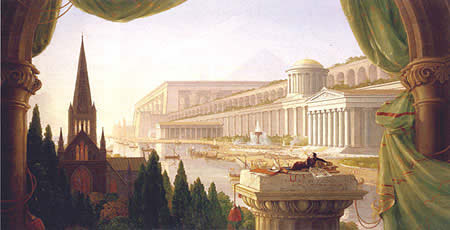
Luis Fernández-Galiano
The Architect’s Dream
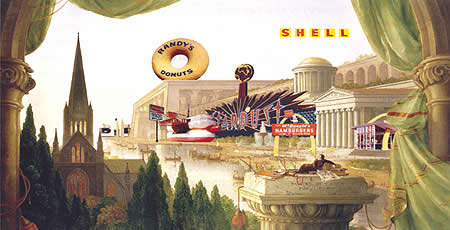
The earthquake of Lisbon brought on Pombal’s Baixa and the Jesuit decline. Once the tears and the streets dry up, the coasts devastated by the seaquake of Aceh will surface again with reconstructed huts for tattooed surfers and theme villages for sexual tourists, but it is unlikely that that catastrophe of the Indian Ocean will transfer power to Indonesia’s Islamic rebels or Sri Lanka’s Tamil terrorists. Our hedonist society easily metabolizes the fracture as part of the disorder of the times, and emergency architecture is integrated into the ecosystem of disaster as a brief hiatus between two phases of the commercial colonization of consumer territory. Confronted with images of the tsunami, Peter Eisenman brings up scenes of the Houellebecq in Platform and Rem Koolhaas may have felt himself transported to the landscapes of his childhood in Southeast Asia, but both suspect that those artificial edens will reappear with the figurative populism canonized in Las Vegas by Robert Venturi and Denise Scott Brown, not with the shaken forms of the former or the broken volumes of the latter. Architecture tries to understand its times in order to take part in it, whether by expressing its ruptures or attempting repair. Thus does theory – critical or narcotic, explicit or hidden – guide the drawing hand of architects.
The three mentioned above are particularly current in the publishing world (Yale has just released a selection of Eisenman’s writings from 1963 and 1988, Gustavo Gili has produced a Spanish translation of Koolhaas’ mythical Delirious New York of 1978, and Harvard offers Venturi & Scott Brown’s latest book, based on lectures the couple gave there in 2003). Moreover, with the late Aldo Rossi, they are among eight selected by Rafael Moneo to illustrate “theoretical anxiety” in contemporary architecture, in a recently printed volume that has its origins in lessons Moneo himself taught at Harvard during the school years 1992-93 and 1993-94. Published by Actar using the transcription of the Spanish versions of the classes, delivered in Madrid’s Circle of Fine Arts in 1995, along with the very same slides projected then, Moneo’s long-awaited tome also discusses the “design strategy” of four other architects chosen for the degree of formal and artistic investigation contained in their work (Herzog & de Meuron, Frank Gehry, Álvaro Siza, and the deceased James Stirling). The resulting series is then an efficient pedagogical introduction to the architectural panorama of the past decades. Free of jargon, always intelligent in the interpretation of the work of his colleagues, occasionally abrasive in impeccably reasoned censures, the book is a testimony of Moneo’s mastery as a professor and a critic. More suggestive than his own history and theory writings, a part of which is compiled in Italian by Daniele Vitale, in a pocketbook of Umberto Allemandi, the eight lectures are a model of disciplinary curiosity and intellectual generosity: not many creators devote so much attention and analytical effort to the work of contemporaries. Over and above anecdotal discrepancies (one cannot, for example, easily take Stirling’s last work as indicator of a change of course and ignore the role played in its design by Walter Nägeli), this group portrait by an insider deserves the success of Vasari, and perhaps also its long publishing life.
A less easy read, Eisenman Inside Out sums up the first 25 years of the New York architect’s theoretical production in 19 texts connected by the thread of a preoccupation with forms and a determination to formulate what he calls “a discourse on the interiority of architecture,” an essentialist expression that more or less refers to the deep structures that condition the composition of buildings and, when all else fails, their external appearance. Abounding in references to the Italian Renaissance masters that his teacher Colin Rowe familiarized him with, namely Alberti, Palladio, and Scamozzi, the book presents articles on historic figures of the Modern Movement, such as Mies van der Rohe, Le Corbusier, and Terragni, but above all it deals with the author’s own contemporaries. Alison and Peter Smithson, James Stirling, Philip Johnson, Michael Graves, Aldo Rossi, and John Hejduk are subjects of specific texts, Robert Venturi is often cited as a counterpoint, and both Rem Koolhaas and Frank Gehry are mentioned for emphasis on their differences with the analytical method proposed. Exquisitely edited and meticulously illustrated, the volume is the best introduction to the thought of the one who has most tenaciously worked for the syntactic subversion of contemporary architecture, a testimony of whose persistent influence was recently made by Moneo on getting admitted into the Academy of Fine Arts. Titled “On the concept of the arbitrary in architecture,” Moneo’s speech spans anything from the Greeks to Gehry but deals with Eisenman more lengthily than any other architect, ancient or modern.
Rem Koolhaas wrote Delirious New York while residing in the city as a member of the IAUS (Institute for Architecture and Urban Studies), an effervescent hub of theoretical renewal spearheaded by Eisenman. Although that “retroactive manifesto” for Manhattan as a paradigm of metropolitan congestion won immediate fame, it has taken 25 years for a Spanish version to come to pass. Finally we have it, expertly translated by Jorge Sainz, a must for anyone who has not read a work that Moneo considers to be key to an understanding of architecture of the past quarter-century, notwithstanding the author’s belonging to “an elite that has lost contact with the masses,” as the Navarrese master unexpectedly describes him. Incandescent in its dizzying, fragmented text, hypnotic in its fascinating sequence of historic images, Koolhaas’ amour fou for Manhattan is also a lucid reflection on the future of urbanism and the city that begins with accepting economics and technique as driving forces of a modernization process whose scenario and model is the metropolis.
That invitation to learn from Manhattan was in a way a reply to Learning from Las Vegas, published in 1972 by Robert Venturi and Scott Brown (with Steven Izenour), specifically to its pop defense of commercial symbolism and suburban iconography. Three decades later, the couple returns with another manifesto of a book, Architecture as Signs and Systems, which is along the same line of the two works signed by Venturi alone: the very influential Complexity and Contradiction, his “gentle manifesto” of 1966, and the less read Iconography and Electronics upon a Generic Architecture of 1996, a compilation of writings ranging from his thesis of 1950 to the “not so gentle manifesto” of 1994. In the collection of texts comprising their latest book, Venturi and Scott Brown champion a mannerist architecture as being the only architecture suitable to a multicultural society, and defend pluralism and pragmatism against aesthetic minimalism and the ideological purity of late modernity. Profusely illustrated and painstakingly orchestrated between the two authors (Venturi’s texts invite us to take architecture as a sign instead of as a space, while Scott Brown’s urge us to learn from urbanism so as to interpret architecture as patterns and systems; hence the duality of the title), the work presents itself as a reflection of “a pair of loners” with neither followers nor school, but both the narcissistic abundance of self-citations and the pittance of references to their contemporaries are more reflective of the conceited isolation that followed their loss of popularity in the eighties, and which the temperate recovery of esteem in the dawn of the new century has not altered. What good are all these theoretical anxieties when the earth shakes? We are not sure what we want of architecture – whether we want it to explain to us or console us, represent us or cure us. Susan Sontag is no longer around to instruct us on the quake and its metaphors, but volcano-loving architects will do well to remember that exactly a year before the tsunami of San Esteban, on 26 December 2003, a twelve-second tremor destroyed the fortress of Bam facing “The Tartar Steppe.” It also caused 37,000 Iranian deaths. But Dino Buzzati’s novel and Valerio Zurlini’s movie had framed our gaze in such a way that we closed our eyes to adobe architecture. Venturi proposed his own version of The Architect’s Dream. It would be good to know what ours is.
October 2004
The Airport and the Village
American polls will settle this Tuesday the question of the presidency of the planet’s most powerful country, but also a cultural tug of war affecting feelings and values. Airport and village scenes give architectural form to the symbolic division between the cosmopolitan anonymity of secular society and the essentialist identity of the community settlement.
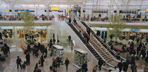
Luis Fernández-Galiano
The Airport and the Village

Tuesday’s vote is between the airport and the village. The United States will elect a president, but they will also be choosing between two ways of life and two urban models. The most divided American electorate of the past quarter?century will decide between totemic figures, Democrat Kerry and Republican Bush, who, however, beyond their stands on the war in Iraq or the financing of health care, represent metropolitan cosmopolitanism and community essentialism, respectively. This cultural strife between the new Babylon of skyscrapers and the new Jerusalem of suburban communities finds its perfect architectural expression in the scenography of two recent films. One is Steven Spielberg’s The Terminal, which takes place entirely inside an airport: a California hangar was turned into a huge set for the filming of the story of a traveler trapped in a bureaucratic labyrinth. The other is M. Night Shyamalan’s The Village, inaccurately presented in Spain as The Forest but set, precisely, in a fictitious 19th century village: a lost valley amongst the woods of Pennsylvania served to situate the everyday life of a group of families isolated from the world.
The Brownian frenzy of the innumerable extras recruited in Los Angeles to represent the heteroclite multitude of an international airport contrasts with the peaceful existence and frozen time of the agrarian community, in the same way that the metal structure and glass roofs designed by the artistic director Alex McDowell (who had already worked with Spielberg in Minority Report) are the counterpoint of the farms and farmhouses built by the team of the production designer Tom Foden and the artistic director Michael Manson. In both cases the sets are convincing thanks to the use of authentic constructions. The Terminal required 650 tons of steel, real escalators, bona fide commercial franchises, and an organization that intelligently combined the tree?shaped supports and huge curved trusses of the latest generation of airports. For the village, in turn, the houses, the school, the bakery, the blacksmith’s, the meeting room, etc., had to be built with real foundations, and unlike the usual movie sets, they had to be totally functional, almost actually usable.
Paradoxically, the plausible architectures are settings for unusual situations: an individual involuntarily imprisoned in a Kafkan junction, a community voluntarily locked up in an archaic utopia. But it is such exceptional situations, precisely, that make it possible to expose the contrived nature of real life or whatever truth there can be in a shared fiction. The executive producer of The Terminal is Andrew Niccol, producer and screenwriter of The Truman Show and director of Simone, two films that are emblems of contemporary simulation. The director of The Village has sprinkled his own dream world with previous works like The Sixth Sense, Unbreakable and Signs. Pedagogically, the opposition between the hypermodern, hypertechnological architecture of the airport (which amalgamates recent examples of the likes of Norman Foster or Renzo Piano) and the timeless forms of the village (more premodern than postmodern, no matter how much it evokes the traditionalist essentialism of Aldo Rossi or Léon Krier (is a metaphor of the caesura between the secular cosmopolitanism of progressive America and the community nostalgia of deep America: a confrontation between reason and faith that still describes the lines of fracture of the empire’s politics.
Nevertheless Viktor Navorski (Tom Hanks), star of The Terminal, is saved from the absurdity that a remote violence has thrown him into, thanks to the spontaneous solidarity of a small group of employees who in the anomy of the airport reconstruct the community spirit of the village. And Lucius Hunt (Joaquin Phoenix), main character of The Village, is spared from death through the rupture of isolation and a resorting to the technological means of outside civilization, ending the obscurantism of a community united by fear and myth with his exploratory and irreverent spirit. The airport and the village contain within them their own contradiction, and such ambiguity represents the stratified complexity of the USA’s current electoral dilemma better than the trivial simplifications that are making people choose between Michael Moore’s Fahrenheit 9/11 and Mel Gibson’s The Passion of The Christ. Hillary Clinton can be a paradigmatic example of metropolitan rationality, but she did also write It Takes A Village to explain Democrat sensibility to the community fabric that is indispensable for raising a child; and Karl Rove may align conservative Christians to the Republican cause, yet that will be not prevent multinationals, which have no other credo than money, from considering Bush their candidate.
Between the urbanity that civilizes or corrupts and the virtuous or immobile culture of the rural world is an old confrontation that, stretching America’s foundational puritanism with the contemporary emergence of evangelical fundamentalism, is perceived today under the ironic impact of the “clash of civilizations.” Coined by the same Huntington that now warns us about the dangers of multiculturalism and immigration, this is a concept that ten years ago replaced Fukuyama’s voluntarist “end of history.” One same September day, Aznar in Washinton, D.C. and Zapatero in New York City expressed antithetical views of that vigorous political and emotional struggle between Mars and Venus with a discursive elementality that avoided expressing either the extreme modernity of Christian and Islamic fundamentalism or the solid conservative foundations of secular rationalist pragmatism. Cosmopolitanism or piety, anonymity or identity, technology or tradition, airport or village: the masks of Halloween have already prognosticated the result, but the scriptwriter of this story, like García Márquez, maintains the suspense til the very end.
October 2004
Scottish Inquiries
Queen Elizabeth opens today the new Scottish Parliament, a posthumous work by Enric
Miralles that takes the lyrical and experimental language of the Catalan architect to
paroxysm, but whose budgetary disorder – it has cost ten times more than estimated
– led to a parliamentary research that made its conclusions public this past 15
September.
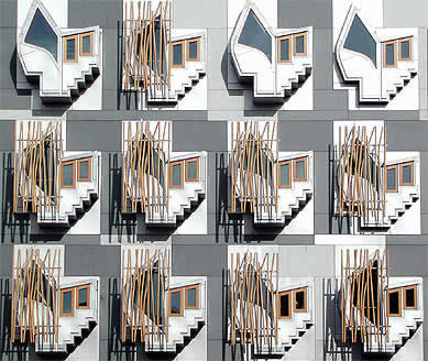
Luis
Fernández-Galiano
Scottish Inquiries
Lord Fraser differs from Bismarck. Whereas the German chancellor deemed it best not to know how sausages and laws are made, the British Parliament, in the tradition of “light and shorthand clerks,” has conducted a survey to shed light on the construction of the building where Scottish laws will be made, specifically on how a work budgeted at 60 million euros has cost over 630 million euros. Reading the report – a 270-page book put up for sale, at 15 pounds Sterling, on 15 September – makes one wonder if it would not indeed be preferable, after all, to ignore how sausages, laws, or buildings are made, and especially buildings where laws are cooked up and that, precisely on account of that, perhaps, manage to materialize in legal dark zones. After several months of court appearances that have made the Holyrood Inquiry a stream of scandalous revelations, both on TV and in the newspapers, Lord Fraser’s well-balanced report is as illustrative and entertaining as it is disturbing: this exercise of democratic transparency shows the extreme inefficiency of and waste incurred by democracy itself.
Enric Miralles, the author of the project, passed away in 2000. So did Donald Dewar, the project’s enthusiastic promoter – first in his capacity as Scottish minister within Britain’s Labour government that set the bases for autonomy, and as Scottish Prime Minister after the first legislative elections. How easy it would have been to blame the dead architect and client for the delays and the financial recklessness that have multiplied the parliamentary seat’s cost tenfold. But the report deplores the evasion of responsibility manifested by practically all the deponents – Lord Fraser assures us that “It wis’nae me” was the common denominator of the hearings – and avoids naming scapegoats, preferring to spread out its censures ecumenically. Evaluating in fair terms the cost increases provoked by the enlargement of the building’s usable floor area by a third, or by the additional security measures deemed necessary in the wake of 9/11, the main reproach falls upon the contracting method used – a fast-track system that, in the name of a paradoxically ill-attained quickness of execution, makes the drawing up of the project overlap with the tenders of the job, thereby keeping the budget in a permanent state of revision. But neither the politicians responsible nor the architects are spared chastisement.
Aspiring to become “the most important patron of the architecture of government for 300 years,” ever in search of quality, Dewar approved all the changes and cost increases, as would the Scottish Parliament commission that later replaced him in the role of client, a group of MPs with no experience in building work issues. The studio of Miralles, in turn, appears in the report as having been ill-fit to address the demands of a work of such a scale, and in constant conflict with RMJM, the Edinburgh office it was associated with. The Architects’ Journal tells us how both Benedetta Tagliabue - Miralles’ widow who now heads his practice - and the directors de RMJM, after testifying in court, received written word from Lord Fraser warning them ahead of time that they would be objects of censure in the public report. The Tory sourly laments the BBC’s omission of interviews that were made with Dewar and Miralles for the as yet unedited program The Gathering Place, and that could have served as testimonies of two deceased protagonists. In his opinion, nothing sums up his report better than a handwritten note, dated March 1999, of the consultant Ian McAndie: “Nobody tells Enric to think about economy with any seriousness.”
The climate of opinion in what is already a cause célèbre is perhaps reflected in the diagnosis of a Scottish MP, Margo MacDonald: “There was a faint rosy aura around all things Catalan and up pops Enric, who was a charming man. But it was a shame and a disaster that he was chosen as architect, and it was possibly a scandal as well.” In this atmosphere of indignation, the critics attacked on the most disparate grounds. Defenders of heritage regret that Parliament is not a historic construction like the Assembly Building of the Scottish Church. Local businessmen deplore the French wood, Chinese granite, and Japanese steel, all contrary to the initial promise that Scottish materials would be used. And the members of parliament moan the lack of flexibility of the floor plan, the excessive concrete of the claddings, and the darkness of the offices, lit as these are by calligraphic windows that have become the project’s most characteristic feature but which the building’s users deem to be more suitable to the intense light of the Mediterranean than to the climate of Scotland. When the building got flooded at the end of August, making it necessary to vacate the police offices in the basement, the caricaturist Hellman grabbed the opportunity to festively recall the metaphor of capsized boats that had originally inspired the project, and that now is inevitably associated with the economic and functional sinking of the parliamentary boat.
Lord Fraser’s report is emphatic in declaring that it does not make aesthetic judgments, recalling that the decision of the jury that selected Miralles in 1998 was unanimous, and offering examples of emblematic projects that were controversial while under construction only to become universally accepted icons on completion. It also stresses that the main confrontation of a symbolic nature that came to pass between the architect and the client, having to do with the shape of the chamber, did not have significant repercussions in the cost. Miralles preferred an arch arrangement because, as he stated in capital letters in his first brief, “the seats of Parliament are a fragment of a larger amphitheater where citizens can sit in the landscape,” whereas the MPs demanded a horseshoe that would enable them to look at each other. A compromise was reached. Tagliabue brings up these intentions when she tells of how the studio wanted to relate the building to nature and the city, thereby avoiding as much the centralized parliamentary models put forward by Le Corbusier and Louis Kahn as the more recent representations of democracy with emphatically transparent buildings.
The head of the Barcelona firm tells Diseño Interior that the public enters the parliament from the square of Holyrood Palace, whereas the politicians come in through a higher level. In this way, they cross each other but never touch each other. “The day the Scottish people want to protest,” she adds, “they will be able to do so in the public amphitheater that we have built at the foot of Parliament.” The contents of Lord Fraser’s report may give them reason to do so, what with its sordid details of endless struggles over fees and its accounts of ludicrous episodes like the designation of the late Miralles as the project’s “primary player” with ultimate responsibility for decisions made in the course of its execution. But just as the emotion of art is independent of its price, and just as the artificial prolongation of a formal language as unique as Miralles’ is doubtful, we are not sure we want to know everything that takes place in the opaque labyrinths of creation or politics. Without withdrawing admiration for that exemplary exercise of Anglo-Saxon democracy that the Holyrood Inquiry has been – the report ends with a laconically humorous note saying that it was delivered in keeping with the foreseen budgets and deadlines – Bismarck may have also been right in recommending blissful ignorance in matters of edible innards and the innards of power.
September 2004
Venice: Lions and Chimeras
The 9th International Architecture Exhibition of the Biennale di Venezia offers a
full panorama of recent projects. Under the title of “Metamorph” the official
section presents the changing forms of the latest currents, and 42 national pavilions
complete that vertiginously varying vision with a polyhedric picture.
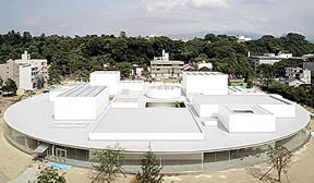
Luis Fernández-Galiano
Venice: Lions and Chimeras
The lion of St. Mark is a chimera. It appears that the bronze figure representing Venice’s patron saint is a 4th-century chimera that came from the eastern Mediterranean. The city, then, has in its possession not only the Evangelist’s body, brought in from Alexandria by 9th-century crusades, but also his sculptural symbol. It is an image that different mostras of the by now centenary Biennale have handed out as an artistic or cinematographic trophy. And few events have deserved to be feted with Golden Lions as much as the latest Mostra di Architettura, an exhibition so profusely supplied with projects of monstrous beauty and imaginary nature. Baudelerian in its exaltation of convulsive beauty, surreal in its penchant for exquisite corpses, and postmodern in its celebration of ruptures and torsions, the Biennale put together by Kurt Forster under the motto “Metamorph” explores a territory rich in fractal topographies and digital warpings, a terrain as molded by biomorphic expressionisms as it is veiled by shadows or reflections, and surely closer to Kafka than to Ovid in its register of organic mutations and formal traumas. As much for architects who discovered Venice by way of Ruskin’s Gothic rigorism as for those who came through Tafuri’s Renaissance and critical prism, this Biennale promises to be tiresome and pedagogical.
Peter Eisenman received the Golden Lion for his entire career, culminating an Italian year highlighted by the publication of his book on Terragni, the honoris causa doctorate in Rome’s La Sapienza, and the formidable installation of the Castelvecchio of Verona, a dialogue with Scarpa that is still visitable, as is his intelligent scenography in the Biennale itself, where the formal journey that leads from Palladio and Piranesi to the work of the New Yorker, with a stop at the author of the Casa del Fascio, is materialized in a syntactic promenade through an architectural chimera built with slices of buildings juxtaposed like anatomical fragments of the mythical animal. The Golden Lion for works presented in the official section fell upon two projects of the Japanese studio SANAA (Kazuyo Sejima and Ryue Nishizawa): the nearly finished 21st-Century Museum of Contemporary Art in Kanazawa – an unorthodox complex of exquisite prismal halls enclosed in a glass circle that subjects the program’s random demands to the luminous rigor of geometry – and the as yet uncertain enlargement of Valencia’s IVAM. The light serenity of these two atmospheric museum proposals contrasts with the torment that shakes the Biennale’s landscape of projects. Finally, the Golden Lion for Best National Pavilion went to Belgium’s, a pòvera installation of blackboards and screens on Kinshasa – selected in the pre-Biennale competition organized by the young Flemish Institute of Architecture – that from a post-colonial anthropology angle formulates essential questions about the immaterial nature of urbanity in the chaotic, dynamic context of a country over which still hangs the ominous shadow of that Congo of Leopold that brought western arrogance to the very heart of Africa.
Other sections distinguished projects of young teams like those of Denmark’s Plot (Julien de Smedt and Bjarke Ingels) in Stavanger and London’s FOA (Alejandro Zaera and Farshid Moussavi) in Basel, two provocative proposals that amalgamate construction and landscape to imagine a topographical urbanity; works that use tormented geometries to test spatial innovations, such as the Japanese Shuhei Endo’s sheet metal loops that confuse interior and exterior, or to express political ruptures, such as the fissures used by the Austrian veteran Günther Domenig to fracture the intimidating regularity of Nazi architecture in the Documentation Center of Nürnberg; and major projects linked to events, such as Martínez Lapeña & Torres’ esplanade that constitutes the central piece of the Barcelona Forum, or the Swimming Center that the Sydney office of PTW is building in the heart of Olympic Beijing amid much difficulty and controversy that the prize may help overcome (tribulations, incidentally, that it shares with the two grand “missings” in this year’s Venetian event, namely OMA/Koolhaas and Herzog & de Meuron, both with colossal projects for Beijing 2008 that are under revision by the Chinese authorities). Finally, the award for best installation went to that put together by the photographer Armin Linke in collaboration with the architect Piero Zanini, and for best photograph among those assembled by Nanni Baltzer the jury chose one of the planet Mars taken by the NASA probe the day after the capsule Genesis crashed into the Utah desert!
But beyond the random details of awards, visitors to the Venetian macro-exhibition – which unfolds on warped plinths designed by Asymptote in Corderie of the Arsenal, in the labyrinthian packet of the Italian pavilion, or in the dispersed flotilla of national pavilions in the Giardini – will have the chance to verify both the centrifugal confusion of contemporary architecture and its determination to carve itself a niche in the mediatic scene. From the disturbing spectacularity of the Japanese pavilion, which documents the half-puerile, half-pedophile culture of the so-called otaku, solitary youngsters obsessed with computer games and manga, to the insistent reinventing of the Danes, who have imported a luxury curator – Bruce Mau, the Canadian graphic designer who does things with Koolhaas – to emulate Madonna, passing through the publicity efficiency of the British Pavilion with its canonization of personalities, or the critical intelligence of the German, which shows signature architecture implacably gobbled up by the spread of garbage urbanism, the journey through this indigestible accumulation of attention-seeking objects is bound to provoke a certain melancholic sense of saturation. Though it has become fashionable among movie stars like Brad Pitt, architecture cannot compete with Hollywood, and on the very day of the awarding of the Golden Lions, fifteen years after Pink Floyd’s concert before the loggetta of the Sansovino, those who went to the showing of Spielberg’s Shark Tale on the colossal stage set up on St. Mark’s Square will understand, without the help of explanations, that the spectacle of music or movies is not easy to recognize as equivalent to the more modest and persistent presence of the building in the city. Bellerophon managed to kill the Chimaera with the help of Pegasus, but architects will need more than a winged horse to confront the monsters that the dream of reason engenders. Beside St. Mark’s winged lion, the Hellenistic figure of a warrior on a crocodile represents Venice’s original patron, St. Theodosius, in his struggle with the dragon. This image of the protector of Byzantine armies could perhaps serve as an alternative emblem of the necessary confrontation between architects and the chimeras of their imaginations.
September 2004
The Enemy´s House
The domestic asceticism of those who have wielded terror on western society
contrasts with the futuristic mannerism of the buildings that contemporary technology
produces. On the third anniversary of 9-11, the recreation of Osama Bin Laden’s
Afghan house in London’s Tate Gallery is the architectural counterpoint of the New
York Museum of Modern Art’s exhibition on skyscrapers, which features three projects
for Ground Zero.
Luis Fernández-Galiano
The Enemy´s House
Osama Bin Laden’s house is the cell of an ascetic. Reconstructed by the British artists Ben Langlands and Nikki Bell as an interactive digital model (after documenting the latest known dwelling of Al Qaeda’s leader with photographs and videos (the hut of stone, adobe, brick, and wood is a shelter of penitential purity that extends its pòvero laconicism to the humble arbor that shades the terrace over the river: an uninhabited bunker, but also an oneiric refuge of elemental architecture whose minimalist purification, worthy of John Pawson or Peter Zumthor, perhaps owes as much to the retina of the authors as to the stripped elegance of the war and spiritual leader. Tom Ford praised the impeccable style of Hamid Karzai, imposed as Afghanistan’s president after the war, what with the karakul sheep’s fur and the cape of green silk that express the country’s ethnic diversity, but the syncretic dress of the politician cannot compete with the effortless refinement of the Arab terrorist. For Osama Bin Laden appears on the screens of Al Yazira arrogant and beautiful like Mahoma and with the same serene perfection that characterizes his house, the recreation of which, carried out by the London partners for the Imperial War Museum and in its capacity as finalist of the Turner Prize, is on display in the Tate Gallery starting October 20. In contrast to the silence of the author of September 11, the third anniversary of the tragedy coincides, in New York, with the boastful echoes of a Republican convention that reaffirms the macho vigor of a president at war, and with the final numbers of a show that through the aesthetics of titanism has enabled the Museum of Modern Art to expel the shadows that the destruction of the World Trade Center’s twin towers threw on high-rise construction. Visitable in MoMA-Queens until September 27, this exhibition-exorcism presents 25 works and projects of the past decade, selected by the museum’s architecture curator Terence Riley and the engineer Guy Nordenson by virtue of the technical, urbanistic, and programmatic innovations they put forward, and the result is an unorthodox panorama that reflects both the material capacity and the spiritual confusion of the west, both its physical power and its intellectual impotence. Hardly absolved by precision projects like Norman Foster’s (the ballistic Swiss Re tower in London and the Brancusi/Noguchi mix of the Brit’s entry to the WTC competition (nor by provocative proposals like the loops of Peter Eisenman and Rem Koolhaas (the unexecuted Max Reinhardt Haus in Berlin and the CCTV headquarters in Beijing whose execution is still in question (the selection testifies to the poor architectural quality of majority of the symbols of our industrial society’s technical and economic musculature).
The uneven contest between the hut and the skyscraper arouses conflicting sentiments. On one hand Bin Laden’s primordial house recalls that of other anti-modern terrorists. A case in point is the very famous Unabomber that Richard Barnes’s dramatic photographs gave a mythical aura to, a cottage in the Montana woods that was transferred to a San Francisco warehouse to serve as proof of derangement of the individual on trial for sending explosive parcels to engineers and scientists. It was not far removed from the modest accommodations (described in detail in the U.S. Congress report on the 9-11 attacks) of the members of the squad of Mohammed Atta, an architect and urban planner who was preparing a doctoral thesis on vernacular Islamic construction at the time he piloted a Boeing into a Manhattan skyscraper. To be sure, the Hitler who himself loved academic architecture lived the bohemian life of a self-taught student, urban drawer and pertinacious music lover before initiating the long march toward the German Chancellery and the Berlin bunker. On the other hand, these elemental dwellings refer to the beginnings of architecture, whether the rationalist enlightenment present in the treatise writer Laugier’s original hut and Aldo Rossi’s elegiac shacks, or the Adamic lineage that Americans attribute to the Thoreau of Walden Pond (a replica of the cottage in the woods was built last year to celebrate the literary work’s 150th anniversary), Asians to the Gandhi of the distaff, and Europeans to the Heidegger of the Black Forest cottage, where the pre-Socratics stumbled upon the swastika in their abyssal exploration of technical modernity’s fragile foundations.
Naturally, the primitive emotion of the elemental turns our sympathies towards economizing and the astringent purity of the hut, especially if we compare it to the strident clutter of forms that skyscrapers are today, from Ground Zero itself, where Daniel Libeskind’s trivial winning project has been vulgarized even more by successive revisions – The New York Times describes the architect who 18 months ago capped the planet’s most coveted commission as “the incredible shrinking man,” and the MoMA, which has worked on much lowered standards in its skyscrapers exhibition, excludes Childs & Libeskind’s Freedom Tower from a selection that includes three entries to the competition – to the emerging Moscow of millionaires and gangsters, where the Dutch Erick van Egeraat has designed five picturesque towers based on canvases of five artists of the Russian avant-garde – Alexandra Ekster, Vasili Kandinski, Kazimir Malévich, Liubov Popova, and Alexandr Rodchenko – or to the Shanghai that is as fascinating for the number of projects it is carrying out as it is disappointing for the scanty attractiveness of its high-rises. The formidable versatility of contemporary technology makes it possible to build anything at all, sparing architecture the rigorous discipline of necessity and situating it under the banner of a narcissistic spontaneity that often results in a formal dazedness, a caricature of the artistic liberty of the statue of that name, where Bartholdi’s sculpture and Eiffel’s structure are superposed with distracted autonomy.
But however seductive it is from the angle of the arrogant hypertrophy of the architecture of the Empire, the house of Bin Laden is the house of the enemy, and the American “neocons” ruling the world from George W. Bush’s White House know this only too well. Disciples of Carl Schmitt via Leo Strauss – master of the ideologist Irving Kristol, Supreme Court Justice Clarence Thomas, and Deputy Defense Secretary Paul Wolfowitz through the Allan Bloom whom Saul Bellow portrayed in Ravelstein – this tight intellectual group follows the German jurist in distinguishing between friends and foes and making such distinction a basis of policy, and it is in favor of active intervention, the large State, and a strong presidency, precisely what The Economist points out as the three characteristics of Bush’s mandate. It is this same group that has sparked interest in Hitler’s jurist among sectors of the Marxist left that are critical of postmodern nihilist relativism and the hypocritical impotence of neoliberalism, which has reduced the political sphere to the free market economy and the ethics of human rights. With Weberian realism, Schmitt never mistook the inimicus that we can evangelically love with the hostis inevitably placed by his otherness on the opposite side of the trenches, and this is perhaps the essential distinction that reveals itself in an autumn of growing terrors, shrinking resources, and migrant identities, in this September that already foretells November.
July 2004
Stealth Aesthetic
The Seattle Public Library is the Dutch Rem Koolhaas’ most important American
work. Recalling the faceted volumes of the famous invisible fighter, the F-117 Stealth, it
has been received in the United States with rare critical acclaim in the wake of an
opening ceremony that culminates the architect’s most prolific season.
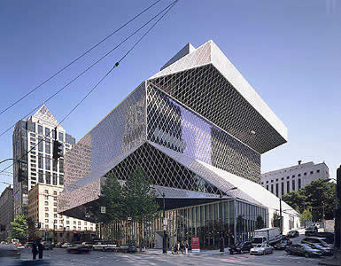
Luis Fernández-Galiano
Stealth Aesthetic
Jacob will never forget the day Rem Koolhaas introduced him to the pleasures of the flesh. The son of the director of the Seattle Library had decided to give up his vegetarian diet and the architect treated him to dinner in Wild Ginger, ordering all the meat on the menu for the young man to start getting familiar with. So goes the story told by his mother to John Marshall in the Seattle Post-Intelligencer, where she expresses as much enthusiasm for the Dutchman’s paternal gesture – “Rem acted like a father figure to my son” – as for the building for which she has been both client and driving force. But Deborah Jacobs is not alone in expressing torrential admiration for the latest work of the controversial architect from Rotterdam. In Time Ricard Lacayo writes: “If Picasso painted a library, this is what it would look like,” and in The New York Times Herbert Muschamp begins his column with the statement that “in more than 30 years of writing about architecture, this is the most exciting new building it has been my honor to review”.
Indeed the library’s opening is a milestone in the career of Koolhaas, who up to now had been unlucky in his American projects. In the past five years he has suffered the cancellation of four major commissions: the main site of Universal Studios in Los Angeles, a Manhattan hotel designed in collaboration with Herzog & de Meuron, and two important art museum projects, the new LACMA building in L.A. and the enlargement of New York’s Whitney (entrusted in the end to Renzo Piano). He has seen his Guggenheim Las Vegas close down and change use after only fifteen months. And he has experienced the bittersweet reception of critics, as much for the extravagant Prada store in New York City – he has finished another one in Beverly Hills this July – as for his abrasive student center in the mythical campus built by Mies van der Rohe for the Illinois Institute of Technology (IIT) en Chicago. But exactly five years ago, in 1999, Rem Koolhaas drew up two extraordinary buildings characterized by violently faceted geometries. The Public Library of Seattle and the Casa da Música of Porto are now reaching completion, almost simultaneously, just months before the opening of the unique Embassy of the Netherlands in Berlin. Together these three buildings have put the Dutch architecture back on an Olympus of unanimous recognition.
In Seattle – a city many associate only with the technological futurism of Boeing and Microsoft, but which has also incubated commercial revolutions like Amazon and Starbucks – Koolhaas has built the central piece of an ambitious library renovation operation for which US$196 million of public funds was set aside in 1998, US$165 million of which was invested in this particular project. Unexpectedly selected over Steven Holl, a native of the city, after a quick visit of the library’s patrons to his European works, the Dutch architect has carried out the project with the help of a local engineering firm and placed it under the responsibility of a Seattle-born member of his staff, Joshua Ramus. The library’s 35,000 square meters (not counting the 7,000 of underground parking) are organized on five superposed and shifted “platforms” interspersed with zones assigned for children, access, consultations, and reading. The whole thing is closed off with a glass and steel facade that folds up, with origami-like weightlessness, to adapt to the piling of platforms, which is arbitrary only in appearance. Most of the platforms are supports to a publicly accessible collection of books shelved along two large ramps that make for functional and spatial continuity on four levels, something the architect already tried to do in his 1993 project for two libraries in Jussieu. Here the visual richness of the interiors, marked by vertiginous perspectives, luminous drops, and diagonal foreshortenings and accentuated by clear-cut finishes, the red and yellow flashes of the stairs and corridors, and the plant patterns of the Petra Blaisse carpeting is comparable to the iconic categoricalness of the exterior, whose ambiguous and reflecting crystallography of a vertical and random greenhouse superposes the changing variation of viewpoints on a single memorable image.
Maybe it is true that this geometric decomposition has the fragmented air of analytical cubism, and the landscapes of Horta de Ebro may indeed have been present in the retina of the critic who likened him to Picasso. The most skeptical will for their part see only a sculptural volume of sharp-edged abstraction that refers to the most ornamental Art Déco, the tiresome triviality of so-called Czech cubism, or the shimmering decoration of casinos and nightclubs of the fifties. Nevertheless the project also takes inspiration from the luminous expressionism of the Alpine architecture of Bruno Taut and the early Bauhaus, reconciles Venturi and Eisenman in combining an indifferent mesh of structural rhombi that almost look like textiles with a multi-faceted composition that evokes the Max Reinhardt House, and makes the formal lessons of Herzog & de Meuron’s Prada in Tokyo converge with what Koolhaas himself has called the “Stealth aesthetic” in remembrance of the F-117, the famous invisible fighter plane whose uniquely folded shapes in the nineties fascinated architects who saw in them a simultaneous manifestation of artistic deconstruction and the philosophical pli: Derrida and Deleuze reunited in a fatal and lethal weapon, a seductive and ominous war object serving to abbreviate French theory.
Such aesthetic of folded geometries is present in another Koolhaas building, designed at about the same time, that too approaches completion these days. This is the Casa da Música of Porto, a large auditorium that was conceived on the occasion of the Portuguese city’s turn as European culture capital in 2001, and that – besides the shift from glass to concrete – differs from the American library in that the elements of the program are dug into the volume, as against the volume resulting from the sealing off of a complex of superposed elements. In the end the true value of the Seattle project may be not so much the brilliant stylistic statement as the intelligent orchestration of uses in well-defined platforms that prevent the communal zones from getting encroached upon by storage, a gangrene all too habitual in building rhetorically called indistinct or flexible. This as well as the creation of terraces, suspended like flying carpets, that make one’s use of or visit to the building a breathtaking experience. Koolhaas has written that his angular constructions wish to mark “Seattle’s new modernity,” just like the shaken electrical waves of Frank Gehry’s Experience Music Project, financed by the same Paul Allen who created Microsoft with Bill Gates and who weeks ago successfully sent an animation craft to space, initiating the age of privately promoted aeronautics. But such a formal reference has little meaning at a time when the Dutch architect has just proposed a colossal project of neo-Aztec airs for a bookstore in Beijing that would triplicate the volume of the American library. Koolhaas can be as omnivorous in matters of style as in matters of cuisine, and only an uncontrollable penchant for the dangers of the trapeze strings together his carnivorous or cannibal architecture.
May 2003
The Construction of the Disaster
Peter Eisenman’s projects in Galicia express the disorder of the times and
exorcize the threat of chance: the City of Culture already molds its topographic imprint
facing Santiago de Compostela, while the proposal for the Deportivo football club of La
Coruña brings the swell of the sea all the way to the stadium.
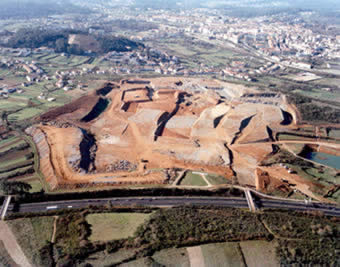
Incluimos a continuación el texto de Luis Fernández-Galiano publicado en el diario madrileño El País.
Luis Fernández-Galiano
The Construction of the Disaster
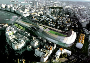
Don’t say it was a dream. The bird’s eye view of the City of Culture of Galicia is a near-tactile testimony of ongoing construction, and yet the landscape molded by the moving of soil gives an oneiric impression. Set between the highway and the historic center of Santiago de Compostela, the vast territory carved by machines into folds and pleats spills at the edges like clay around a distracted potter, fluid and unexpected like mud after a downpour of rain, plastic and pulsatile like the melting mechanism of a surreal canvas. This organic geology of tongues and throats is to date the largest and grandest work of Peter Eisenman, a seventy-year-old architect who confronts his capolavoro with the impetuous imprudence of a seventeener. “Peter, it can’t get any better...” “Maybe we should leave it as is!” But the colossal piece of land-art is only the frozen image of a work in progress, and the adventure of ongoing construction is summed up in the photograph shot.
Winner of a competition held in 1999, Eisenman’s project is a compendium of the formal interests that have nourished his architecture for the past three decades: the distorted grids of the syntactic sixties, the artificial excavations of the historicist eighties, and the blurred foldings of the fractured nineties. A computer fusion of the grooves of a scallop shell and the five streets of the city’s old quarter, the random geometry of the complex - meant to accommodate a mosaic of cultural uses, from an opera house and a museum to a library and newspaper archive - frays into rueiros that melt in the smooth relief of the rural landscape. For some it will essentially be Galicia’s own Guggenheim, a spectacular manifestation of the media power of contemporary architecture. For others it is more likely to be Manuel Fraga’s Escorial, a titanic monument able to compete in stubborn permanence with the great works of the past. And to most it will come across as a risky exploration of the disorder of the times, a visionary rehearsal of “the construction of the disaster.”
Eisenman frequently cites The Writing of the Disaster, one of the essential texts of the recently deceased Maurice Blanchot, and his architecture shows the same exigent fascination with denial, the same radical search for emptiness, the same deliberate vertigo towards nothingness; but also the same penchant for paradox, word games, and abstruse formalism. His works go up in a physical world, but do not stay up without an elaborate scaffolding of texts and drawings: construction gets mixed up with writing, and each building becomes a book. The one on Santiago is entitled Code X, and this simultaneous reference to his tenth house, known as House X, and to the medieval manuscripts where the xacobeo myth originated reveals the architects’ liking for conceptive inventiveness and Baroque enigmas. Jacques Derrida, with whom he had a long relation of collaboration and friendship, on some occasion wrote an essay entitled “Why Peter Eisenman Writes Such Good Books”, and it is easy to explain the tribute if we think of their shared passion for luminous intelligence and hermetic language: the black light with which the critic Rafael Conte summarized Blanchot at the moment of farewell. Now Peter the Obscure mentions the posthumous eulogy of Blanchot by Derrida, and in this final connection between his two favorite authors (triangulated at a distance by the huge figure of Emmanuel Lévinas) we perceive the tense lines that weave his intellectual mesh. To be sure, it seems extravagant to establish links between a faceless author who dedicated his life “to literature and the silence it demands”, and an architect of inevitable celebrity whose activities come with the noise and fury of the age of spectacle. But in Eisenman’s oxymoronic devotion to Blanchot beats the spiritual curiosity and the love of danger that has led him, a Jew of German origins who is building a Holocaust memorial in Berlin, to collaborate with Albert Speer, son of Hitler’s architect of the same name; or to nurture the friendship with Leon Krier, an architect of diametrically opposed style - who, by the way, contributed considerably to the critical rehabilitation of the senior Speer’s monumental classicism -, with whom Eisenman has exhibited recently at Yale University, and towards whose aesthetic extremism he is irrepressibly attracted. In the end, the scheme Eisenman likes to present seems plausible: if his generation was divided between Venturi and himself, and the following was split between Koolhaas and Krier, Koolhaas’ rediscovery of Venturi is duly balanced out by his encounter with Krier, in a new scheme of alignments whose fracture lines are no longer formal, but ideological.
But this Jacobine architect is now also a Jacobean, and as an honorary Galician he makes the construction of the City of Culture compatible with a major project in La Coruña, the remodeling of the Deportivo club’s stadium. In the proposal, the stadium stretches all the way to the beach with undulating tentacles containing a hotel, offices, shops, and apartments, blending the sport complex in with the urban fabric and rearranging the club’s services and image with an icon that ought to satisfy Depor president Augusto César Lendoiro and the city mayor Francisco Vázquez, two personalities known to be political and personal enemies. Mission impossible? Not for Eisenman, a football fan who follows the ups and down of the careers of Tristáns and Valeróns closely and whose track record boasts two other stadium projects: that of the Arizona Cardinals in Tempe, currently under construction, and the Olympic stadium of Leipzig, which in the wake of the German city’s recent designation as candidate for the Games of 2012 sees the moment of its building get closer.
Organic and expressionist like the City of Culture, the Depor project also belongs to the realm of dreams, but in these flaccid shapes flowing lazily toward the foamy water are a calmness and a voluptuousness that are more drowsy than dreamy, and its appendices resembling the arms of a giant squid embrace the city with a horizontal laxness that never quite form the nightmarish profile of creatures of oceanic abysses. Both here and in Santiago, the agitation of disorder and the construction of disaster is more an exorcism than an exaltation: the Atlantic swell invades the city with a huge catastrophic wave, but this seismic tsunami solidifies into an amiable and protective eddy that shoos away the threat of convulsive times. Oil spillings and oil wars congeal and petrify in the threshold, and the viruses of pneumonia and intolerance stop short in the metaphoric mask of arrested movement. But don’t say it was a dream.
April 2003
Jørn Utzon, Pritzker Prize 2003
The Pritzker Prize for 2003 has gone to the Danish architect Jørn Utzon (b.1918),
considered the last of the Scandinavian masters and author of one of the 20th
century’s iconic buildings, the Sydney Opera House. The award, created by the Hyatt
Foundation 25 years ago is akin to a Nobel in terms of prestige and is endowed with
$100,000. Utzon will emerge from his retreat at Porto Petro in Mallorca to travel to
Madrid’s Real Academia de Bellas Artes de San Fernando for the 20 May award ceremony.
This year’s award jury praised the oeuvre of this master of masters (his disciples
include Rafael Moneo, also a Pritzker Prize winner), considering that his built work is
“timeless and exemplary”. This year’s jury, presided by Lord Rothschild and
formed by the late Fiat chief, Giovanni Agnelli, who passed away in January, historian Ada
Louise Huxtable and architects Carlos Jiménez, Jorge Silvetti and Frank Gehry (Pritzker
winner in 1989), noted the timeless and exemplary character of Jørn Utzon’s body of
work. The Danish architect who, after the Sydney odyssey built himself a house in Mallorca
and gradually retired from the world of architecture, will receive in Madrid the
profession’s highest recognition and the warm homage of colleagues who in spite of
his absence have not forgotten him.
Although he left professional practice prematurely and voluntarily, does not frequent architectural circles and is not fond of tributes, no one has forgotten Jørn Utzon. He has not only mentored masters such as Rafael Moneo - even now, his personality and work attract an admiration bordering on fervor among younger architects and students.
The son of a naval engineer whose yacht designs are still in production, Jørn Utzon was born in Copenhagen in 1918. Attracted first by his father’s profession and later influenced by a sculptor uncle, he finally saw architecture as the best channel for his passion for drawing. On ending his studies at Copenhagen’s Royal Academy of Fine Art in 1942, Utzon, like many other Danes, went to Sweden, a neutral country in World War II, where he worked until the end of the conflict. There he saw first hand the work of Erick Gunnar Asplund, later working in the studio of Alvar Aalto, and with Frank Lloyd Wright, whom he visited in Wisconsin. During the following decade, he traveled tirelessly around the world, and discovered in Mexico the platforms built by the Mayas to raise their temples above the jungle. In a 1962 magazine article, Platforms and plateaus: Ideas of a Danish Architect, Utzon describes the sensation he felt on passing the tight tangle of vegetation to the broad horizon visible from these platforms, comparing it with the feeling of seeing the sun emerge in Scandinavia after endless weeks of darkness and rain. In his Sydney masterpiece, delicate shells of concrete similarly rest upon a robust base. Utzon was absent at its 1973 opening, and no one mentioned his name in the speeches. He had resigned the commission in 1966 after years of intense struggle to preserve the integrity of the project, in which the values that have now seen him earn the Pritzker Prize are evident: extraordinary formal invention, intuition as a builder, sensitivity to the quality of materials and a capacity to interpret the potential of location.
We are including here an essay by Luis Fernández-Galiano, published on Madrid newspaper El País on the ocassion of the awarding of this Prize.
Luis Fernández-Galiano
Great Dane
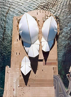
To celebrate its 25th anniversary, the Pritzker Prize goes to a great Dane who a quarter-century ago had already made history. In 1978 Jørn Utzon received the Gold Medal of the Royal Institute of British Architects, a prestigious centenary award that this year has gone to his disciple and now fellow Pritzker awardee Rafael Moneo, and by then his creative life was substantially completed. Five years before, the wind-swollen crustraceous shells of the Sydney Opera House had unfolded to a bittersweet sail, after a long process full of discrepancies that in 1966 had finally removed the architect from his work and the country itself; and while the already symbol of Australia opened without its author, Utzon designed what was to be his last capolavoro, the church of Bagsvaerd, an exquisite cloistral shed with roofs of sheet metal and undulating ceilings of concrete outside his native Copenhagen, which on completion in 1976 wrapped up a career marked by a fascinating formal inventiveness.
Behind was the vernacular topography of the Kingo Houses, with the landscaping intelligence of their courtyards arranged in sequences and the tactile sensibility of their brick masonry, designed shortly before the opera house competition that gave Utzon the equivocal prize of fame, and soon after extended with another model residential development, the Fredensborg complex. Behind, too, was the unique project of a museum for the artist Asger Jorn, a cluster of buried jars or coconuts tangled up with ramps that joins the Einsteinturm and the New York Guggenheim with Kiesler and Ronchamp. Behind was his first Mallorca house, a grave and archaic precinct of stone, geometry and light where he became a recluse from 1973. And behind was the definitive project of Kuwait’s National Assembly, a labyrinthian bazaar in penumbra with solemn arcades made with concrete canopies which echo Chandigarh, whose monumental architraved prefabrication took years to complete, only to be damaged in the Gulf War and reconstructed with little fortune later.
When the Scandinavian architect became an honorary and secret Majorcan, he was already recognized as one of the great masters of the second half of the century: a disciple of Aalto, whose traces were everywhere in his work, from the fan-shaped Birkehøj houses to the waves of Bagsvaerd, but also an original architect who engaged in dialogue as much with the late work of Wright and Le Corbusier as with the contemporary projects of Tange, Niemeyer, or Kahn; a laconic humanist who reconciled tectonic industrialization to pre-industrial archetypes, and the elementary construction of modernity to the timeless eloquence of the anonymous or historic architectures visited in his frequent travels; and a formal innovator who cystallized the lyrical essence of his architectural explorations in new types like the platform crowned by a baldachin of light roofs.
Since then, this hero castaway in his island refuge has been the object of numerous critical attempts to make his figure resurface. Some point him out as the expressionist and eclectic visionary who in Sydney spawned the genre of mediatic constructions of the society of spectacle, never failing to mention that the Saarinen of TWA fame was in the jury that approved of the flying sails. Others have preferred to revive him by praising the organic wisdom of his residential works, emphasizing the silent elegance of his Danish developments and Majorcan houses. Still others have retraced his career from the perspective of the situationist poetics of the formless, placing the project for Jorn and the CoBrA connection in the core of his artistic experience.
It is hard to tell which of these assessments has weighed most in the decision to give
him the Pritzker, which for the second time will be awarded in Spain, and again to a
Scandinavian architect - the 1997 ceremony was held in a Guggenheim still under
construction in Bilbao to honor the Norwegian Sverre Fehn. But the author of that Sydney
of titanium that rises on the banks of the Nervión was in this year’s jury, and one
cannot help suspecting that, more than the ecological Utzon or the Jorn-Jørn connection,
it was the Australian icon that prodded the Pritzker brotherhood to celebrate its silver
anniversary with this architect of gold: a metal that fetches a high price in times of
uncertainty, and a safe asset in times of change.
April 2003
Asia on one hand, Europe on the other
The Dutch Rem Koolhaas, conspicuous absentee in the competition for New York’s
Ground Zero, compensates his exclusion from America’s symbolic heart by designing an
icon for Asia and a new identity for Europe: a loop of a skyscraper for Chinese television
in Beijing and a bar code flag for the European Commission are two emblematic projects of
an architect of XL ambitions.
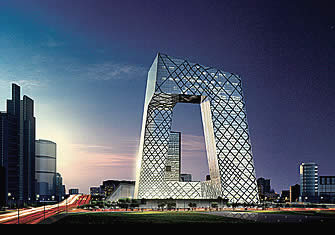
Following is a text by Luis Fernández-Galiano published in El País.
Luis Fernández-Galiano
Asia on one hand, Europe on the other
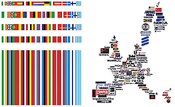
And New York in the distance. The results of the Ground Zero competition were announced on February 27, and the next day The New York Times graciously divided its front page between a picture of an ecstatic Daniel Libeskind beside the model of his project and the last news about the preparations for war in Iraq. In the same issue of the world’s most influential daily, a full-page ad paid by an American physician and scientist recalled the 70th anniversary of the Reichstag burning, expressing the fear that 9-11 could have sparked a similar effect: the transformation of a technically and culturally advanced democracy into an authoritarian and militaristic regime. Three weeks later, the U.S. invasion of Iraq marked a turning point in contemporary history, opening a sea of discord between the U.S. government, European public opinion, and Asian interests. One cannot help thinking that the planet’s current disorder was triggered by the destruction of the World Trade Center, nor judging the reconstruction of the Twin Towers in the context of the United States of America wagging its bellicose imperial muscle at its old partners in Europe and its new competitors in Asia.
The so-called “commission of the century” fell upon a Polish Jew who is an American citizen and lives in Berlin, after a fierce debate that had Herbert Muschamp as its most abrasive protagonist. The architectural critic of the NYT lambasted Libeskind’s project as demagogic, kitsch, and agressive, “a war memorial to a looming conflict that has scarcely begun,” against the pacific idealism of its rival in the final round, the project of the group THINK (contemptuously called “a couple of skeletons” by Libeskind). In defense of the winning proposal rose Ada Louise Huxtable, architectural critic of The Wall Street Journal ( a newspaper that those days was emphatically warning its readers about the danger that a larger and stronger Europe would pose for the United States), who lauded the ritual and commemorative archaism of the Park of Heroes and the Wedge of Light, the two public elements of this “architecture of memory” that provoked applause and tears when presented to the public; Robert Ivy, editor of Architectural Record, who urged the NYT to hire another architectural critic; and Nina Libeskind, the architect’s wife and partner, who after Muschamp’s censures told a reporter that she “would’ve killed the guy on the spot.” European critics for their part have dismissed the project as commercial, superficial, and populist. Some would have preferred the grid of towers envisioned by Eisenman et al.; others, the monumental sheafs of the team of the Spaniard Zaera; many, the “endless columns” of Foster with Anish Kapoor, a simultaneous tribute to Fuller and Brancusi; and all have deplored the absence of Rem Koolhaas, leading interpreter of the spirit of Manhattan since his Delirious New York of 1978.
The Dutch architect has long been considered the best representative of “Americanism,” the fascination of the European avant-garde for the carefree audacity of American construction, of which the skyscraper is the paradigm. But the author of S,M,L,XL has also succumbed to the passion of the Russians, from his youthful fixation with Leonidov to his adult interest in the tenacious, 75-year stability of the communist regime; to a curiosity about Africans, singularly expressed by his explorations of the spontaneous inventiveness that ensures the survival of chaotic metropolises like Lagos; and to the generalized awe at the muscular vitality of Asia’s Pacific Rim, whose brutal and vulgar growth he described with admiring ambiguity in his work about the Pearl River Delta. And now it is the same hermetic and titanic China that lets him participate in the debate generated by the Ground Zero proposals through a huge building in Beijing, a 550,000 m2, 600 M project that won an international competition and whose emblematic value for the Asian colossus is comparable to that of the new World Trade Center for Americans.
Destined to be the main headquarters of Chinese television, and scheduled for completion before the Beijing Olympics in 2008, Koolhaas’ first skyscraper consists of a bar that bends several times to form a twisted loop, the underlying idea being to smoothly connect all the departments of the company. But according to the architect, its unique shape also addresses the call to rethink skyscrapers in the wake of 9-11, through high-rise buildings “that are not about height and that can define a place rather than simply occupy it.” The 230 meters of the new CCTV headquarters will as a matter of fact make it Beijing’s tallest construction (very far, though, from the world records currently being reached in Shanghai and Hong Kong, and sure to be surpassed in the future by several of the 300 towers that will soon go up in the Chinese capital’s new business district), but this is a rather secondary circumstance. What made Koolhaas prevail over Toyo Ito, Dominique Perrault, KPF, SOM, and a number of Asian firms was the uniqueness of his formal strategy, with the two leaning towers joined at the base and the top to shape a gigantic window and baldachin that will serve as a logo for the state-controlled TV network, and perhaps also for the Olympic Games and the city of Beijing. Indebted to some recent projects (Steven Holl’s diagrammatic Retaining Bars in Phoenix or Peter Eisenman’s Max Reinhardt Haus in Berlin) but also to works like Philip Johnson’s KIO Towers in Madrid (which Koolhaas judged as exemplary when local architects took it for no more than a crude expression of the decline of politics and culture in the early nineties) and to canonical designs of the avant-garde like El Lissitzky’s wolkenbügel (cloud ironer), the loop of the CCTV is decked with an irregular grid drawn by the engineer Cecil Balmond as a materialization of structural efforts, and yet seeming as superficial as the diagonal grids of Libeskind’s facades in his Ground Zero proposal, or the textile patterns of the same Libeskind with Balmond in London’s Victoria & Albert. In the final analysis, Koolhaas is giving Beijing a spectacular icon that reflects both the communicatory ambition of China’s totalitarian capitalism and its determination to adapt to the symbolic codes of western economies, and it is in the acceptance of this mediatic commerciality where his clairvoyance and cynicism are to be found.
Identical intellectual features are present in the work Koolhaas undertook for the European Commission, after an invitation of its president, Romano Prodi, to take part in a debate on the European capital. The heterogeneous nature of European institutions and the utilitarian condition of its political project inspired Koolhaas to represent the continent as a motley collage of trademarks, and propose a new continental flag that resulted from merging national ones in a chromatic bar code, a brilliant synthesis that simultaneously expresses Europe’s fragmentation and its provisional cohesion through commercial and economic interests. But this hedonistic and prosperous Europe that is more Kantian than Hobbesian, and more given to consumerism than to the imposition of an identity, fell into its own crisis after 9-11, and broke apart altogether in the U.N. Security Council debates that preceded the Iraqi war. Along with other Pritzker winners, Rem Koolhaas has been invited to compete for the enlargement of the United Nations headquarters in New York, a mythical building of his admired Wallace Harrison that postwar political idealism wanted as the seat of a world government. But this pillar of the pacific organization of a diverse planet is now seriously damaged, and hopes for its architectural regeneration are as scarce as the prospects of an ironic flag being placidly accepted by a divided and hesitating continent. It is not easy to augur good times for a Europe of Venus when the world comes under the sign of Mars.
March 2003
Construction Games
The Dutch team MVRDV (Winy Maas, Jacob van Rijs and Nathalie de Vries) proposes to
renew residential construction through an aleatory and playful combination of the same
elementary forms that are used in the utilitarian architecture of industrial sheds,
construction-site cabins and barrack huts.
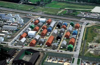
Following is a text by Luis Fernández-Galiano published in El País.
Luis Fernández-Galiano
Construction Games
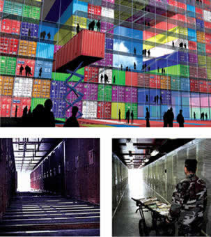
Monopoly is not a construction game, but a real estate game. The winner is whoever manages to put houses and hotels in the city’s best areas, bankrupting the other players with his greedy tolls. The colorful wooden prisms, cylinders, pyramids and arches of old building sets - similar in concept to the mythical Froebel blocks that were part of the childhood of so many modern masters, from Wright onward - introduced children to geometric order and static balance. In contrast, Monopoly’s houses and dice train the young in investment strategies and risks, providing a more dynamic, realistic and cynical model of the contemporary city, a territory governed by money and chance. Contrary to the defiant and symbolic vertical constructions of traditional building sets, the horizontal landscape of real estate games represents the urbanism of economic forces and compulsive consumerism, a world where ruin is not the physical tumbling down of ambitiously piled up pieces, but the financial collapse of erroneously acquired buildings, and a competitive struggle which could be described by the blunt phrase one can read in Texas car stickers “he who dies with the most toys wins.”
From the air, the Hageneiland development looks like a Monopoly board, with its modular houses of lively colors placed on the repeated squares of a regular site, manifesting the mix of chance and purpose that characterizes the game. Built on the site of an old airfield near The Hague, which explains its exact geometry and horizontality, a feature in any case frequent in the artificial landscapes of a country of polders, this residential islet is reserved for pedestrians, consigning parking to the perimeter. The dwellings come in one-, two-, up to eight-unit pieces that are arranged with homogeneous irregularity on four bands of uniform width, forming a tidy, dream village. The rigorous repetition of a structural system - concrete gable ends and party walls combined with normalized frames and facades - is softened by mixing the materials and colors of the claddings - brick tiles, wooden shingles, aluminum sheets and polyurethane panels - to achieve a strangely seductive complex, at once naïve and metaphysical, strict and stochastic, friendly and archetypal like a child’s drawing, but also capricious like the fortuitous camp of a fairy tale king.
One of five finalists for the Mies van der Rohe Award, to be announced the first week of May, this work of the Rotterdam studio MVRDV (Winy Maas, Jacob van Rijs and Nathalie de Vries) is part of the experimental journey of a young team that in little over ten years has produced a wealth of memorable projects, from the warped sections of the VPRO television station to the overhanging drawers of the Wozoco apartments and the surreal superposition of landscapes in the Dutch pavilion of the Hannover Expo, all based on a capacity to create complexity with simple elements that are mixed and grouped in casual combinations or labyrinthian interlockings; a procedure that comes as much from the Dalinian paranoiac critical method of their mentor, Rem Koolhaas, as from the anthropological experiments, in the fifties, of Aldo van Eyck and Alison and Peter Smithson, who along the lines of Huizinga’s homo ludens tried to make architecture a serious game. The same combination of precision and delirium is present in another recent residential project of the team, a block named Silodam that over an industrial wharf of Amsterdam groups an amazing variety of apartments in a colossal monolith, the prismatic rigor of which is decked with an unexpected collage of facade types, fenestration rhythms, materials, colors and textures that result in a unique patchwork that refers as much to the picturesqueness of the traditional Dutch city as to the surrealist game of exquisite corpses.
MVRDV’s hallucinatory rationalism reaches a provisional paroxysm with its City Container project for Rotterdam’s Biennial of Architecture, a piling up of mysteriously weightless containers that in their candidly chromatic schematism reinterpret with videogame futurism and kindergarten aesthetic the old modern obsessions about the industrial normalization of architecture. But this gaiety that tries to alleviate the oppressing anomy of contemporary urbanity is a product of the same sweetened infantilization of Disney or Las Vegas, in contrast to the container cities that proliferate in the agglomerations of the Third World and the peripheries of the First: scenes of survival where characters as destitute and upright as Aki Kaurismäki’s man without a past protect their dignity between walls of metal sheet; or precincts of reclusion like Guantánamo’s Camp Delta, built with standard steel containers by Indian and Filipino laborers at the service of Halliburton (U.S. Vice President Dick Cheney’s old company), and where Taliban captured in the Afghanistan campaign remain caught in the legal limbo of an American army base whose rigorous material order conceals the scandalous juridical disorder of its persistence.
For any architect, the extreme logic of military constructions - just like the disciplined functionalism of industrial structures and engineering works - possesses the bittersweet lure of need, and ends up being as hypnotic as the fierce perfection of war machines. These ante-bellum days, the media are with undisguised admiration transmitting to us the formidable logistics of a titanic expeditionary army. The screens and newspapers show us instant cities springing up: the canvas-lined balloon-frame camps in Kuwait, the prefabricated wooden barracks in Spain’s Rota base, and the large hospital tents or elaborate command tents that have, with their textile efficiency, replaced the roulottes bristling with antennae of the last Gulf War. The ominous, choreographic spectacle of a moving military city hits us with the formal violence of the shed and container dwellings of the toylike cities by the young Dutch architects, but this fascination becomes discouragement when events lead toward a fatal denouement and we cross the ides of March with the terrible conviction that construction games were but a prelude to war games.
This week we have also learned that Daniel Libeskind - symbolic traumatologist of the West in the wake of the success of his Jewish Museum in Berlin - will be reconstructing New York’s World Trade Center with a commercial and elegiac project superficially decorated with diagonals and fractures, and we have seen with dismay how even on the emblematic site of modern terror - the sources of which the philosopher Peter Sloterdijk has found in the toxic gas of the First World War -, architectural games are in the end mere real estate games. While the Ground Zero of Manhattan’s Babel has failed to preserve its heart as a memorial of trembling air, Baghdad’s Babylon waits for the ire of the empire to unleash a torment of fire over future grounds zero where terror will continue to brew.
March 2003
Babel vs. Babylon
The Iraqi conflict is transforming the planet’s political landscape, but also
has an architectural and symbolic dimension. The emblems of American democracy clash
head-on with the icons built by an Arab world that fails to reconcile Islam with
modernity.
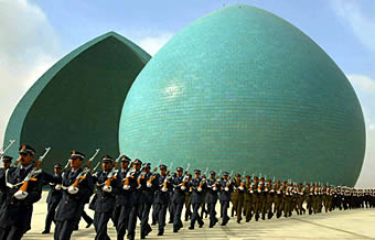
Following is a text by Luis Fernández-Galiano published in El País.
Luis Fernández-Galiano
Babel vs. Babylon

Wars destroy individual lives and collective symbols in equal parts. In the conflict that is closing in on the Near East, the terrible threat of urban bombings is cynically softened with the promise to respect the despot’s monuments, but the victims of this wave of violence will find little consolation in such sparing of architectures. If there is an architecture that deserves respect, it is the architecture of the city, that formidable human creation that has traveled in time from the Fertile Crescent all the way to the Manhattan Babel where Baghdad’s future is being dealt these days. After a century of colossal urban holocausts, the Empire should not taint the dawn of the third millennium with the crepuscular fire and blood of an urbicide in Babylon. According to the American media, the Pentagon’s plan is to launch more cruiser missiles on the first day of battle than were used in the forty days of the Gulf War of 1991, following a strategic concept baptized as “Shock and Awe” whose objective is to annihilate the enemy’s will to fight in one stroke, through a sudden devastation resembling Hiroshima. With the prospect of an anonymous apocalypse, the innumerable casualties of which would be concealed under the pious denomination of “collateral damage,” the canonizing of architectural landmarks by the pamphlets of the so-called Coalition is intolerable: it is as if the megalomaniac monuments of an Asian satrap deserved more respect than the vulnerable lives of so many people.
No one - and much less the politician - can ignore the muscular power of symbols. But when the inanimate emblem takes priority over human life, a heinous crime implants itself in the gaze that judges the world and the hand that acts upon it. In a recording broadcasted by Qatar’s TV channel Al Jazeera shortly before the U.N. Security Council session on Valentine’s Day, a voice claimed to be Osama bin Laden’s once again celebrated the destruction on that September 11 of the “idols of the American infidel,” presenting the extermination of thousands of persons as the mere elimination of a symbol. However, the architects who have these past months presented proposals for the replacement of the Twin Towers - on a site which was immediately given the name used to indicate the epicenter of a nuclear explosion, Ground Zero - have seen for themselves how this devastated plot cannot call itself the defiant seat of the USA’s economic power, nor the inevitable memorial of a young empire’s wounded pride, without simultaneously acknowledging its sorrowful status as a unanimous cemetery. After the trauma of 9-11, the federal government set about thoroughly documenting three other national icons - the Statue of Liberty, the Capitol dome and the presidential busts of Mount Rushmore - to facilitate reconstruction in case of terrorist attacks on them, and it is obviously the same kind of ingenuous obsession with symbols that underlies the disconcerting concern for Saddam Hussein’s monuments in Irak.
The most representative constructions of the Baathist regime commemorate the war with Iran and frame the ceremonial spaces of Baghdad. The Shaheed or Martyrs’ Monument - initiated in April 1981, a few months after the start of the protracted conflict with Iran, and finished in 1983 - is formed by two halves of a sectioned dome. Clad with tiles of a turquoise color, its onion shape evokes the cupolas of mosques. A work of the sculptor Ismail Fattah al Turk with the engineers of Ove Arup (the same firm that had managed to raise the colossal shells of the Sydney Opera House ten years before), the dome with a 40-meter diameter was built with a cost of 250M euros in the middle of a man-made lake, and its titanic combination of vernacular representation and à la Kapoor abstraction has since then fascinated numerous visitors. Chosen by American pamphlets as Iraq’s most characteristic monument, on February 16 (the day after the massive anti-war demonstrations worldwide) it again made the headlines as the scene of a parade celebrating the anniversary of the so-called massacre of Al Amirya, a refuge in Baghdad where 400 civilians perished during the first Gulf War. Almost at the same time as the Shaheed, and also surrounded by a large artificial landscape, rose Saddam’s second emblematic project, a Monument to the Unknown Soldier that combines a gigantic slanting disc - inspired by a traditional shield but closer to a flying saucer or a giant clam - with a futuristic ziggurat that is a reinterpretation of Samarra’s famous minaret.
Conceived in 1985 and built after the end of the war with Iran in 1988, the Arch of Victory is the third of Saddam’s great monuments and completes the dictator’s program of urban icons. Formed by two pairs of swords that meet forty meters above a broad avenue, the double arch marks the far ends of a processional axis, on one side of which rises a grandstand crowned by an enormous canopy resembling a shell. The swords refer to the Arabian leader who defeated the Persians in the year 637, making way for the Islamization of Iran, and the fists that brandish them are supposed to be modeled on Saddam’s own hands. Scene of the regime’s most spectacular ceremonies, the nocturnal images of the parades with fireworks recall the mass rallies of Nazi Germany, but with a kitsch touch of postmodern representation: “a combination of Nuremberg and Las Vegas,” says Kanan Makiya, the exiled dissident who in 1991 published, under the pseudonym Samir al Khalil, an abrasive book about this unique monument, at once totalitarian and pop. In his memoirs, published the year after, General Schwarzkopf mentioned having suggested to Colin Powell that it be blown up: “to my surprise, Powell was all for it, although he suggested we check with the President first, and a couple of days later Pentagon lawyers vetoed the idea.”
Saddam Hussein, fond as he is of monumental architecture, does not seem to share such scruples when it comes to breaking the symbolic spine of his enemies. On February 27, 1991, withdrawing from Kuwait, the Iraqi forces burned down the National Assembly building, a masterwork of the Danish architect Jørn Utzon that had been inaugurated only a few months before, and which HOK subsequently reconstructed at a cost exceeding 70 million euros. In spite of the fact the Kuwaiti democracy is more or less fictitious - a parliament of dignitaries of ephemeral existence, in a country where most of the population lacks citizenship and where women still do not have suffrage - Utzon’s orderly labyrinth and concrete canvases were a sign of change and hope that Saddam’s troops did not hesitate to destroy, moved by the same hostility that North Korean propaganda shows when it places the emblems of American democracy as the target of their missiles. It is likely that the fourth airplane of September 11 was headed for the Capitol, and this Islamic aggression would have been more real a threat than the irate messages of Pyongyang posters. But Saddam Hussein is neither Osama bin Laden nor Kim Jong II: his military dictatorship is far from religious fundamentalism, no matter how much his ambassador to the U.N. ritually begins his speeches by invoking Allah; and his crumbling cruel regime simply does not have the nuclear weapons with which Korea’s deified lunatic has been regularly threatening the United States and his own neighbors, however much its stubborn resistance to disarmament is succeeding to divide and weaken the EU and NATO as the very real risk of nuclear proliferation has never done before. Impoverished and exhausted, the people of Iraq do not deserve to star in the last chapter of what W.G. Sebald called the “natural history of destruction.” In the final analysis, the symbols of American democracy are ours too, and the Empire really does not need to affirm its reputation by chastising the wretched paradise of Baghdad with a thousand and one nights of pain.
January 2003
Glass Shells
Norman Foster’s Swiss Re and Jean Nouvel’s Agbar are corporate towers in London and Barcelona whose superficial resemblance to glass shells conceals very divergent architectural conceptions.
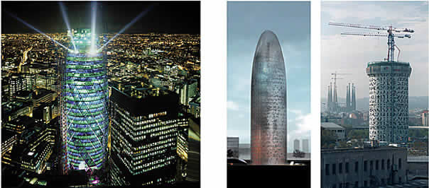
Luis Fernández-Galiano
Glass Shells
They look similar, and in truth are worlds apart. Erect and streamlined, the Swiss Re and Agbar towers seem to soften the mineral frigidness of their glass skins with their roundness, letting the wind or the gaze of the pedestrian slide along their surfaces and adapting their domed summits to symbolic penetrations in fluids or orifices. But in internal organization these crystal totems are rigorously antithetical, and whereas Norman Foster’s skyscraper in London’s City uses the regular structure of the flower, pineapple or corncob, Jean Nouvel’s in Barcelona’s Plaza de las Glorias adopts the displaced arrangement of a vertebrate’s trunk: while the tower of the insurance company Swiss Re evokes the implacable geometry of plant architectures, that of the Compañía de Aguas de Barcelona protects with its randomly perforated exoskeleton the uneven section of animal anatomies. Foster’s work is a geodesic bubble of glass and steel, stretched to the shape of a vertical dirigible; Nouvel’s is a cylindrical bunker of concrete coated with aluminum and glass, extended by extrusion to its parabolical tip. And if the London cigar divides its interior into floors of six petals and triangular courtyards along the facade that coil in an eddy around a stalk or central core, the Barcelona missile situates its spinal column of vertical communications in an off-center position that shifts the work zones to the area of the thorax organs or the white of the egg whose section it imitates.
In Swiss Re, every design decision - from the triangulation of the facade to the circulation of air in the diagonal courtyards - seems to be derived from an impeccable structural and functional logic, and the result is an object of rare perfection, posed in the crowded and mediocre heart of London’s financial district like a spacecraft able to transport us to the planet of milk and honey that modernity has so often promised us in vain. In the Agbar tower, in contrast, all design elements - from the aleatory arrangement of openings in the concrete stem to the changing colors of the aluminum panel cladding - could be said to be products of the architect’s intuition, sensibility, or even caprice, and if the shaft currently under construction now shocks for an unexpected hermetism barely alleviated by musical perforations, when the building finally sports its glass skin it will rise in the disorderly context of the Plaza de las Glorias like the immaterial, ghostly and evanescent presence prefigured by its author. Such differences in architectural conception have a bearing on the image of the corporate occupants: the London headquarters is more egalitarian, with its shared bioclimatic terraces and its common greenhouse on top, whereas the Barcelona one is rather more hierarchized, with its transparent dome for top executives crowning the bastion with portholes for rank and file employees.
Although the two skyscrapers have similar dimensions and both are in cities with little tradition in or sympathy for high-rise construction, they are destined to differ in their urban impact. Swiss Re soars 40 stories and 180 meters but is flanked by two other rather anonymous towers and stands on the site of a previous skyscraper (the Baltic Exchange, razed after being seriously damaged by an IRA attack in 1992). Because of this, only its peculiar shape will become a topic of discussion, and on this account, both the contrast with its nondescript neighbors and its generous concessions to pedestrians - made possible by its circular floor plan - are sure to guarantee a favorable reception. Agbar, in contrast, rises 32 floors and 142 meters in such splendid isolation that it can only engage in long-distance dialogue with the towers of Gaudí’s Sagrada Familia, and will inevitably become a landmark of singular visibility and symbolic relevance, auguring the heated polemic that Josep Acebillo has tried to channel by comparing the building to a camel’s hump, which far from being “an ugly and unnecessary bump” makes the animal faster and more resilient (Barcelona’s urban planning chief has perhaps not heard the joke about a camel being a horse designed by a committee... or an architect).
Both projects have precedents in the previous oeuvre of their authors, but here again there is a divergence, because while the London work basically presents itself as a repeatable prototype in line with modernity’s normalizing and universalist mission, the Barcelona proposal endeavors to come across as a specific building determined by the place and the occasion, in harmony with the emblematic individuality of postmodern objects and languages. In the case of Foster, the elongated spheroid that the media has nicknamed “gherkin” comes from his 1971 collaboration with Buckminster Fuller in the design of an integrated work environment, with different platforms in a single space covered by a geodesic dome. Named Climatroffice, it was a futuristic proposal that technical and computer resources have allowed to materialize thirty years later. As for Nouvel, the ovoid and flou menhir that will vanish with the help of a chromatic dermis of reddish or bluish panels and a graphic epidermis of serigraphed or translucent glass pieces has its origins in the Tour sans fin that won the 1989 competition (with Foster on the jury, by the way) for a skyscraper beside the Grand Arche of La Défense in Paris, a tower of bold sveltness (1:10) and colossal height (400 meters) whose tip was to fade into the sky, and which was never built; but the Barcelona project puts special emphasis on the fact that the execution in concrete of its cavernous volume responds to the Mediterranean climate and light with thermal inertia and reduced openings, its rounded shape echoes Gaudi’s spires and the wind-eroded rocks of Montserrat, and its frozen-geyser look can be presumed to be a reference to the water company that is to occupy it, and who knows, maybe even to the Buigas fountains on Montjuïc.
Whatever the case, the execution of each glass shell is a formidable technical feat and a unique urban spectacle. In London, the extraordinary precision of the assemblage, using bolts, of the steel tubes that every two stories and 20º of aperture go about triangulating the load-bearing facade is comparable only to the painstaking exactitude of the frames of the enclosure, placed modularly at intervals of 5º, and only the fire-prevention guidelines, which make it compulsory to protect the structure with insulation and a subsequent aluminum carcass, somewhat reduce the elegance and lightness of this admirable work. And in Barcelona, the exigent tolerances in the adjustment of the thick concrete wall with the subsequent aluminum and glass cladding should put to test the rigorous professionalism of the building’s co-author, b720, a Spanish group headed by the architect Fermín Vázquez that is also working with Nouvel in Madrid’s Reina Sofía museum, and with the British David Chipperfield in projects in Catalonia, Galicia and Aragón. September 11 threw many shadows on the future of skyscrapers, but seems not to have affected these European works. Neither does it seem to have intimidated the architects, Foster included, who have submitted defiant proposals for New York’s Ground Zero, nor those who continue to draw up highly unique towers for Asia’s Pacific coast, such as the loop-shaped one designed by Rem Koolhaas for Chinese television in Beijing. But today the shadow of the terrorist attacks closes in on other lands, placing different shells on the eve of another Kristallnacht.
December 2002
Dead Seas
The Sea Museum of Vigo is a posthumous work of the Italian Aldo Rossi. Shortly after its opening, the black tide of the Prestige reached its vicinity, having devastated the Death Coast along which the lighthouse of Punta Nariga and the cemetery of Fisterra, both by the museum’s co-author César Portela, are situated.
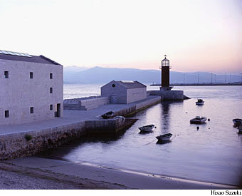
Luis Fernández-Galiano
Dead Seas
The museum of the sea is the coast. In this thin and shifting line that separates two worlds and threads two ecosystems together, the sea manifests itself in its splendor and threat. No display is more emotive, and no exhibition more didactic, than the interminable fractal perimeter where the swimmer and the shipwrecked meet. The most gorgeous showcase and the most eloquent panel pale before the lyrical and rhetorical musculature of its foamy outline. Maybe this is why the Sea Museum of Aldo Rossi and César Portela colonizes the coast with distracted sheds that pretend to be almost involuntary, elemental forms of a vernacular naturalness that could well go unnoticed, assuming an elegant anonymity in extreme deference to that which is the real museum: the sea’s encounter with firm land. This sad and stormy December, Galicia exhibits its stained coastline like an elongated museum about the fragility of the technical universe, the vulnerability of the natural environment, and the impotence of our preventive systems. But this ominous black line is also entangled in scenes of spontaneous invention, tumultuous determination, and united efforts that with the sea as backdrop reveal the best side of our strange, at once predatory and altruistic species.
In its melancholic solitude, the Sea Museum presents a landscape outside of the realm of time that invites one to think beyond the current barrage of reproaches, offering its hermetic and archaic volumes as an emblem of stubborn persistence in the face of the fortuitous tempests of opinion. Amid the beautiful, exhausted choreography of volunteers in raincoats, the work of Rossi and Portela raises its stripped geometries to delimit a theater of memory, a metaphysical precinct of indifferent granite that resists the rough aggression of the sea just as the sea tolerates abrupt abuses and painstaking acts of repair. The industrial sheds of the museum - which incorporates the remains of an old canning factory -, the primeval house that accommodates the aquarium over the dock, and the toy-like lighthouse at the far end of the breakwater make up a sparse still life representing the sea with the lyrical, mythical violence of a fairy tale. Plagued by a viscous spillage, the Galicians have every reason to be disheartened and angry, but the silent, primordial architecture of their marine museum is a hopeful symbol of the resistant tenacity of the elemental against the volatile storms of ephemeral history.
The premature death of Aldo Rossi impregnated this work with the perfume of an elegy. Built earthily on the edge of the water, it is the antithesis of his light floating theater, and its petrous aplomb expresses the solid certainty of inert matter, against the fluid, watery agitation of life around. A building of limits, solemn and severe, it sticks to the retina through innocent reiteration, like mollusks to rocks, determined to survive in memory the way its masonry withstands time, and it hides its timeless monumentality behind a casual conjunction of schematic pieces bordering on the picturesque in the coloristic cube of the seaside tavern. With this marine memorial, the architect who summed up his theoretical revolution in an enlightened cemetery left an abbreviated and deserted city that only oblivion will inhabit in the end. It is the essential indifference of nature that gives the museum its desolate, tragic aura, while the mineral impassivity of its geometry is what freezes its forms in a still landscape.
By a necessary chance, the Galician architect who brought this project to a conclusion executed two others along the stretch of the seashore most chastised by the black tide of the Prestige. If the Sea Museum rises in the calm interior of the estuary of Vigo, both the lighthouse of Punta Nariga and the cemetery of Fisterra are on exposed locations along the Death Coast, and these two works of César Portela are currently besieged by that dark and toxic paste that has given new meaning to the toponymy, turning the seaboard into an abject marine cemetery and the repetitive museum of a dramatic catastrophe. The Nariga lighthouse, built with Cyclopean stone blocks and granite ashlars, holds its lantern of steel and bronze atop the cylindrical shaft that rises from the triangular plinth, at once the prow and the bastion of a rocky, water- and wind-beaten promontory. And the Fisterra cemetery, laid out with cubes of granite on the edge of a path that descends to the sea, scatters the elemental geometry of the blocks of niches to shape an organic rueiro, decorating the finis terrae with a funerary garland.
Sooner constructions of consolation than architectures of trauma, museum, lighthouse, and cemetery form a luminous and enlightened trilogy that deserves to be proposed as a sign of innocent reason against the guilty logic of the technical sphere. More a habit than an accident, the oil spilling is part of the foolish structure of economies industriously built on the compulsive consumption of fossil fuels, and this energy bulimia of the West is more responsible for the disaster than the plundering greed of corporations or the mean incompetence of politicians. Dead seas of petroleum are indispensable to a world of inequalities, as they are to military conflicts, mass tourism, or automobile-dependent suburban life. All of this was eruditely and eloquently explained by a radical humanist who died in Bremen early this month, near-forgotten as an inconvenient residue of the Utopian thought of the sixties. But Ivan Illich was a lucid and generous wise man who questioned the routinary certainties of a docile universe, and it is only the resigned conformity of these leaden times that has managed to bury, with contempt, the impassioned blade of his critical intelligence. Beneath the sand of Santander’s Sardinero beach, that we once walked together, tar blobs can now be found, after the oil spill reached the Bay of Biscay. Cynics will think that under the paving stones was the beach, and under the beach the tar. But under that black paste are sand and water in motion, healing the wounds of the sea and stirring the dead work of a culture that disdains life.
December 2002
Navarro Carves the Auditorium of Vitoria in Silver
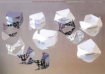
As a result of an international and finally very restricted competition - where also
the Sevillian Guillermo Vázquez Consuegra and
the Swiss Herzog & de Meuron participated - the
Cantabrian Juan Navarro Baldeweg will build in Vitoria, next to the small palace of
Zulueta, a Center for Music and Scenic Arts.
The program included two halls, one for symphonic music with a frontal configuration, and
a smaller one for chamber and experimental music, aside from several technical areas,
rehearsal rooms and dressing rooms. In the winning proposal, both halls are set inside a
glass prism in a matte-silver tone, carved as a mineral, to which is superposed a large
latticework mesh upon which float the drawings of vegetal calligraphy suspended by way of
a tensegrity type structure. For its part, the palace proposed by the studio of Basel
recalls a dense monolith, since the technical premises accommodate between the halls and
the cubic enclosure; however, the importance of the scenic spaces makes them overflow in
smaller elements. Lastly, Vázquez Consuegra went for a more horizontal configuration,
partially buried to reduce its impact; a large covered square unfolds at the foot of the
building as a spontaneous stage that links the auditorium with its close surroundings.
The 34.5 millions of Euros of the foreseen budget shall be financed by the Department of
Cultur, the Basque Government, the Regional Council of Álava and the City Council of
Vitoria.
December 2002
Francisco Mangado, on the Outskirts of Ávila
The studio of Francisco Mangado will build a congress center outside Ávila. The Castilian city thereby adds to the long list of localities that in little time will strengthen their equipment with a center of these characteristics, among others Pamplona and Palencia (both by Mangado as well), Córdoba (Rem Koolhaas), Jerez (Nieto & Sobejano) or Cartagena (Cano & Selgas). Mangado's proposal - which carried the day in a multitudinous competition of 117 entries - makes the most of the topographic conditions of the terrain to extend a large esplanade at the foot of the wall, whose stone mass establishes a dialogue with the different granite elements of the new complex, among which the one corresponding to the exhibition hall adopts the irregular profile of a rocky outcrop. The second prize went to the team formed by Arana, Moreno, Perea & Ruiz, and the third was granted ex-aequo to Aranguren & Gallegos, and to Domínguez & Izquierdo.
November 2002
Eccentric Albion
From the new Town Hall of London by Norman Foster to the Space Center in Leicester by Nicholas Grimshaw, the latest works in the United Kingdom combine naive futurism with the Anglo-Saxon tradition of eccentricity. All these constructions reveal an imaginative vitality and experimental curiosity under which beats the old romantic and organic vein of British architecture and a sentiment of nostalgia for the ecological Utopias of the sixties.
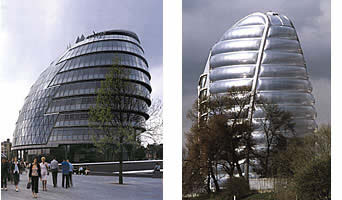
Luis Fernández-Galiano
Eccentric Albion
Before New Labour’s cool Britannia, the visionary Albion claims his rights: English imagination is sentimental. Sentimental is the recently completed Town Hall of London, a glassy head that faces the Thames through a zigzag mask; and sentimental too are Norman Foster’s latest projects for the British capital, the geodesic bullet-shaped skyscraper for Swiss Re in the City, and the infinite metal wave that is the grandstand of the new racetrack in Essex. Sentimental is the pneumatic and translucent tower of the Space Center in Leicester, which contains two colossal rockets in its cushioned silo; and sentimental was Nicholas Grimshaw’s previous work in the series of millennium milestones financed by the National Lottery, the Eden Project, a gigantic greenhouse that stretches its bubbling plastic roof over the pit of a Cornwall quarry. The eccentric, galactic futurism of these projects combines the old romantic and organic vein of British architecture with a sentiment of nostalgia for science fiction and the ecological Utopias of the sixties.
London’s new Town Hall, indeed, is described by its author as a form borne almost exclusively out of energy and sustainability arguments. From the more or less hemispheric volume that makes it possible to minimize the surface to be sealed, thereby improving thermal management, to the contrast between the large glazed opening on the north and the staggered composition of the south facade, which avoids excess sunshine through the shadow cast by the successive breaks, most of the decisions taken in this project are related with the desire to create a model building that, being the seat of local power, should exemplify environmental responsibility. If to this ecological sensibility we add the transparency that many consider to be de rigeur in democratic institutions, and the symbolic way of putting the citizens above their representatives, done here through a circulation ramp that spirals over the plenary session hall, then the ingredients of the recipe are not too unlike those of the Reichstag, and Foster has in fact used in this smaller work many of the ideas and the team involved in the construction of the German parliament.
Unfortunately, the final result is not as brilliant as that attained in Berlin, and despite the technical feat of executing its complex geometry and the demanding perfection of the finishes in a private development (the London Town Hall is just a tenant, in tune with the privatizing fever of Blair’s Labour), British architects recently elected the municipal headquarters as one of the least appreciated among contemporary works. And this occurred in a survey where Renzo Piano and Norman Foster himself (whose recent Praemium Imperiale has allowed him to complete the architectural grandslam) turned out to be the two most admired among living architects, and where a work of the latter was found to be among the favorites of those interviewed - the British Museum, with its large warped glass canopy floating over the courtyard.
Be it a crashed spacecraft, as described by Ken Shuttleworth, the Foster partner in charge of the project, or a glass testicle, as called by Ken Livingstone, the mayor who now occupies it, the London Town Hall is not its architect’s finest work. Both the clumsiness of the volume and the uncomfortable encounter between the strips of windows and the triangulated shell of the lookout (from which one can see the Tower of London and another Foster project that uses the same geodesic structure with greater force, the Swiss Re headquarters, popularly known as the ‘gherkin’) damage the formal result of a building that, nevertheless, has the candid charm of science fiction, evoking at once the organic mechanism of a medieval helmet and the mechanical organism of an interplanetary shuttle, among whose spiral rings it is easy to imagine Fritz Lang’s Maria or Superman’s scoundrels, inevitable inhabitants of a metropolis that is also a naive space odyssey.
The same childish fascination with the future underlies the Space Center of Leicester, a science museum organized around a large plastic silo where satellites and rockets are displayed, and within whose amiable folds families and schoolchildren discover the poetry and adventure of space travel, a mythical and nostalgic journey where NASA astronauts mix with Flash Gordon characters. Built in the decaying edges of Leicester with the purpose of becoming the emblem of this Midlands city, just like Foster’s ‘armadillo’ for Glasgow or Libeskind’s War Museum for Manchester, the architect, Nicholas Grimshaw - trained by the way in Foster’s studio - chose the material he had successfully used in his extraordinarily popular Eden Project greenhouse: a transparent plastic known as ETFE (ethyltetrafluorethylene), used here as inflatable three-layer pillows weighing only 1% of the equivalent glass cladding.
In Cornwall, this plastic film was arranged in small hexagonal bubbles that gave the work an air halfway between Buckminster Fuller’s technovisionary geodesic domes and the pneumatic architectures of hippy festivals, putting the Eden in first place, along with Ronchamp, among the favorite buildings of British architects. In Leicester it takes the form of a pile of sausages that is inevitably perceived like a playfully obese organism, translucent like a titanic jellyfish and padded like the space suits of Tintin in the Moon. Nevertheless, as in Foster’s London Town Hall, the naive Star Wars esthetic does not demean the rigorous effort to optimize energy flows in the building, which uses mechanisms of passive thermal control and a double pump air system that increases pressure in the cushioned construction whenever it must resist wind forces (the plastic sheet weighs less than the air inside it, and on its own lacks any resistance).
Similar in dimensions and budget - a little over 40 meters tall in both cases, and the total cost of about 60 million euros for the Town Hall is doubled for the Space Center only because of its many auxiliary constructions - the galactic bubble of London and the alien larva of Leicester testify to the imaginative vitality and experimental curiosity of a romantic and organic, pragmatic and visionary, sentimental and eccentric Albion. The Cartesian rationalism of the continent would do well do pay heed to the strange isle of the English impatient
